This past weekend I cited this article from the Economist that looked at the rise of online dating as a way of couples meeting. There was some debate about which channels of interaction/attraction still worked or were prevalent. And it turns out that, in general, the online world is the world today.
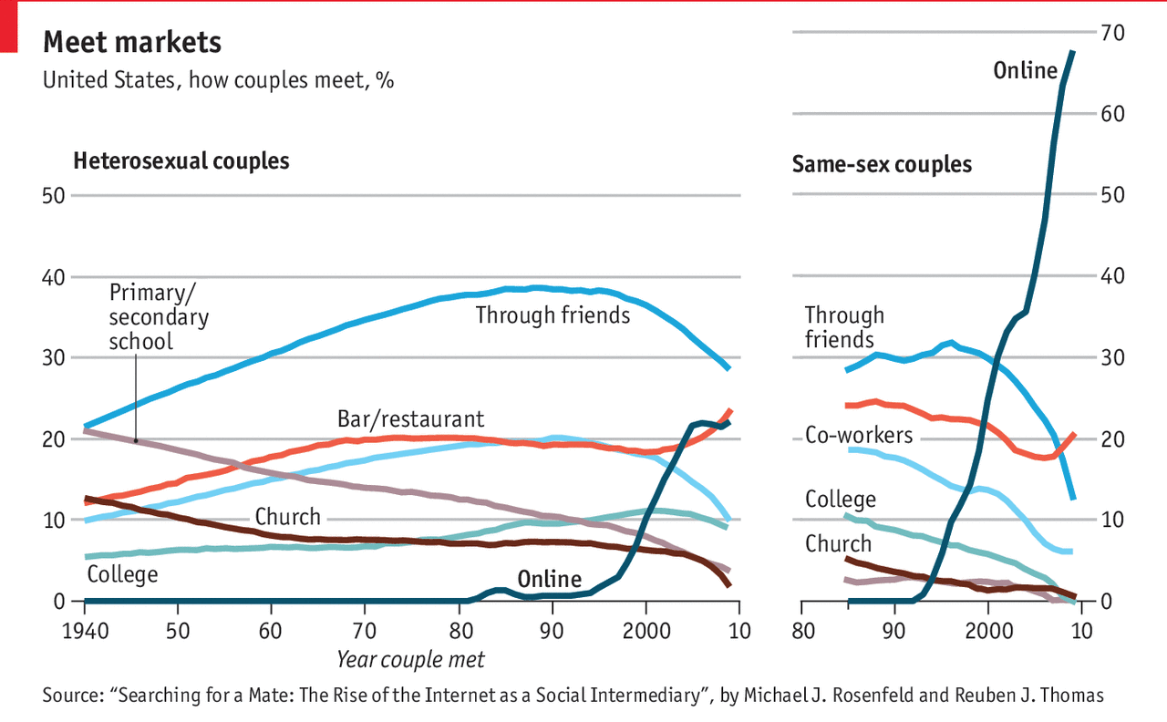
My problem with the graphic is that it is a bit too spaghettified for my liking. Too many lines, too many colours, and they are all overlapping. I probably would have tried a few different tricks. One, small multiples. The drawback to that method is that while it allows you to clearly analyse one particular series, you lose the overlap that might be of some interest to readers.
Second, maybe don’t highlight every single channel? Again, you could lose some audience interest, but it would allow the reader to more clearly see the online trend, especially in the heterosexual couple section of the data. You could accomplish this by either greying out uninteresting lines or removing them entirely, like that primary/secondary school series.
Third, I would try a bit more consistent labelling. Maybe increase the overall height of the graphic to give some more vertical space to try and label each series to the right or left of the graphic. You might need a line here or there to connect the series to its label, but that is already happening in this chart.
However, I do like how the designers kept the y-axis scale the same for both charts. It allows you to clearly see how much of an impact the online dating world has been for homosexual couples. My back-of-the-envelope calculations would say that is more than three times as successful than it is for heterosexual couples. But that insight would be lost if both charts were plotted on separate axis scales.
But lastly, note how the dataset only goes as far as 2010. I can only imagine how these charts would look if the data continued through 2018.
Credit for the piece goes to the Economist Data Team.
Leave a Reply
You must be logged in to post a comment.