From last week’s New York Times, a look at the Supreme Court by age and political leanings. They’ve gotten a lot more conservative.
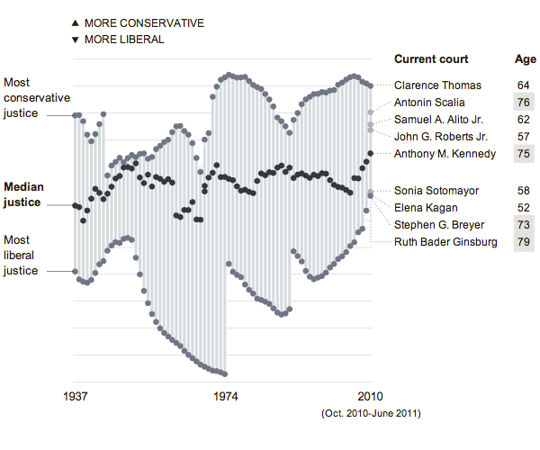
From last week’s New York Times, a look at the Supreme Court by age and political leanings. They’ve gotten a lot more conservative.

As the Supreme Court is likely to scrap the mandate provision of the health care law—without which sick people are left to pay higher premiums if they can get coverage at all—later today, the New York Times looks at the impact of removing the health care law changes the number of people without health insurance.
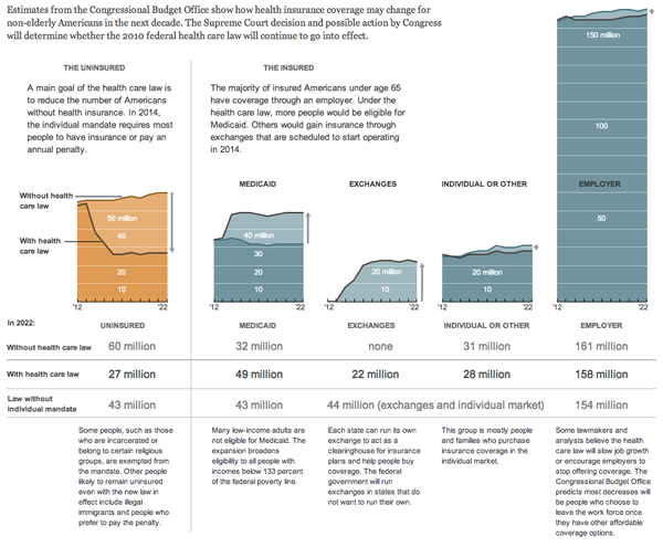
Credit for the piece goes to Lisa Waananen.
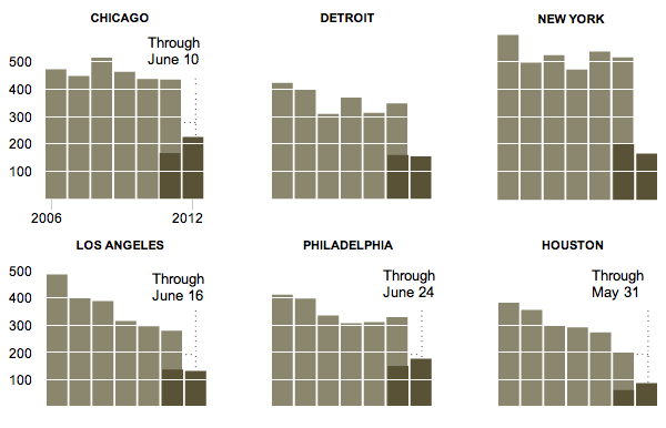
From the New York Times we have a graphic that looks at homicides across several different US cities. And in Chicago, they are up significantly from this point last year. So too is Philly, but I like to think of that as an outpouring of brotherly love.
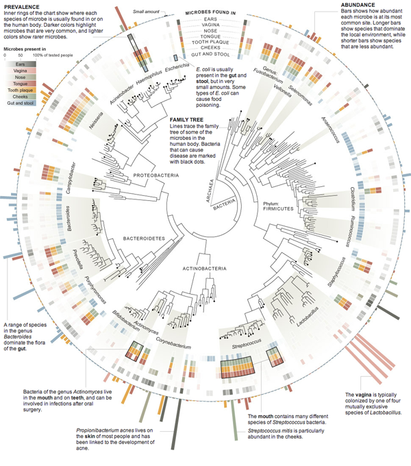
People are nothing more than dirty stinking apes. Especially when it comes to microbes. On Monday the New York Times published an infographic that visualised the data on the prevalence and abundance of different microbes across a sample of over 200 individuals. That is to say the visualisation looks at where microbes are most common and just how common they are in that location.
And not in the polite Galactica way, but more in the let’s drill you, rocks, and split you open. I could go in further detail about the injection of fracking fluids, but let’s leave the double entendre alone and talk about Marcellus Shale. It’s a layer of rocks in the dirt that contain natural gas. It’s a pain in the gas production industry (sorry) and thus is only economically viable when fuel prices are high.
So in the 21st century with high fuel prices, energy companies are hydraulically fracturing (fracking) the rock to suck out all the natural gas. But this might be (probably is) causing environmental problems and thus human health problems. Ergo the controversy. This has now reached New York and so the New York Times created a simple map with some key layers of information to explain the controversy there.
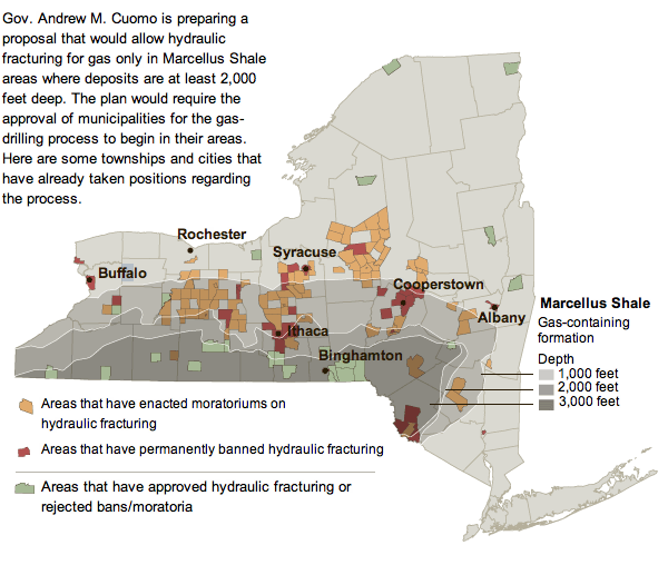
Note the useful layers of depth of the shale and where those intersect (or do not) with areas that have banned or endorsed fracking.
Western Pennsylvania has had similar problems, and the Philadelphia Inquirer has had an interactive special on their website up for a little while now. And by interactive infographic I mean largely just a play-through of static images. Unfortunately, the online content is not of the best resolution and leaves much to be desired. Fortunately the graphics would appear to be quite informative especially as part of a series. A pity they are not entirely legible.
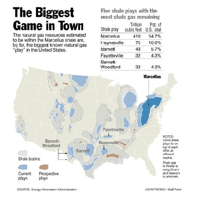
Credit for the Inquirer piece goes to John Tierno.
Infographics and interactive pieces need not always be about data. Sometimes they can help you find things far more practical than levels of Canadian defence spending or changing demographics. Sometimes they can help you find new summer cocktail recipes. Like this piece from the New York Times.

And if you’re me, you can add the experiments to your running tally of drinks as new data points.
Credit for the piece goes to Jacky Myint, Emily Weinstein, Des Shoe, and Tony Cenicola.
It’s like a log cabin. But taller. A lot taller. The New York Times reports with an infographic on a nine-story block of flats (apartment building for us Americans) in London called the Graphite Apartments that was built almost entirely of timber.

Credit for the piece goes to Mika Gröndahl.
In a rare infographic misstep, the New York Times published an incorrect diagram detailing the centre of the Earth.
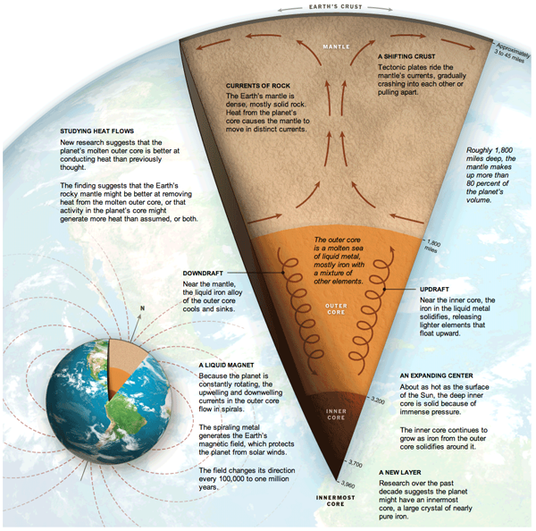
Clearly, anyone who knows anything about science knows that it is not a solid core of iron at the centre of the Earth, but dinosaurs. And I see no dinosaurs in this diagram.
Credit for the piece goes to Jonathan Corum, Ritchie S. King, and Frank O’Connell.
On Sunday the New York Times featured a small graphic highlighting the disparity in growth rates across the G-20 if broken into the ‘core’ G-8 and then what one might call the emerging markets of the G-11.
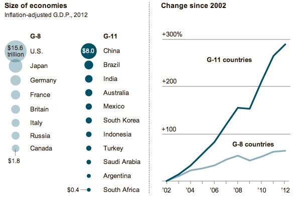
The charts are small yet compelling in telling the story of how the two different groups are performing. However, I was left wanting to better understand the comparisons between the sizes and growth of the various countries. The areas of circles are difficult to compare and aggregates mask interesting outliers. So, using what I imagine to be the same data from the IMF, I took a quick try at the data to create my own infographic.
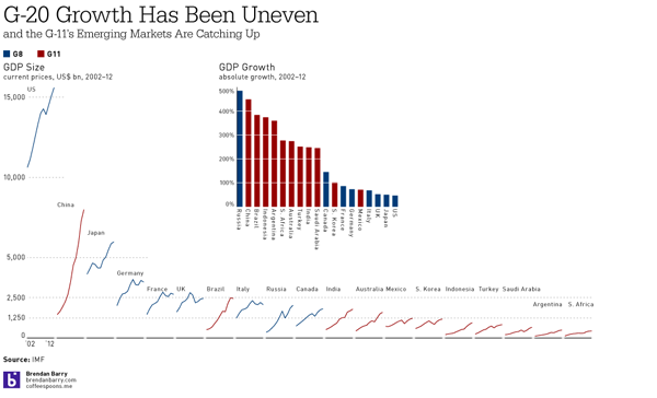
Indeed, interesting stories began to appear as I plotted the data. Russia is a member of the G-8, but perhaps has more in common with the G-11. After all, Russia’s growth was nearly 500%. Similarly interesting were Canada and Australia. The former, a G-8 country, was the only G-8 country besides Russia to have greater than 100% growth. And Australia, certainly not an emerging market in most senses, experienced nearly 300% growth. Whereas the emerging markets of Mexico and South Korea lag behind the rest of the G-11.
Then, when plotting the sizes of the economies, China was no surprise as the second-largest economy. However, that Brazil has managed to already surpass the G-8 economies of Italy, Russia, and Canada was a bit shocking. And Brazil looks nearly ready to surpass the UK, but for its apparent recent downturn. Also interesting to note are the Financial Crisis dips in GDP across most countries. Some countries, like China, unsurprisingly did not suffer greatly. However, that Japan and South Africa kept on a steady pace of growth was unexpected.
All of that would have been missed but for a slightly deeper dive into the IMF data. And a few hours of my time.
It’s that time of year when young men and women step outside into the big, real world and realise just how much money they owe to various creditors. Yay. The problem, however, has continued to get worse for students. This interactive infographic by the New York Times explains just how so by comparing student debt to costs.
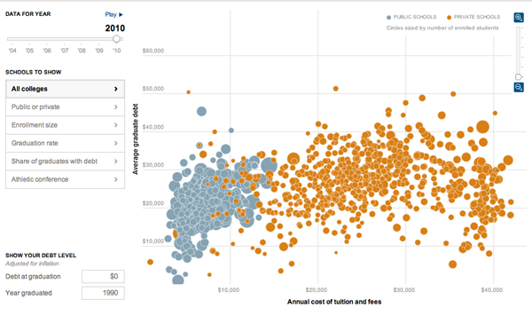
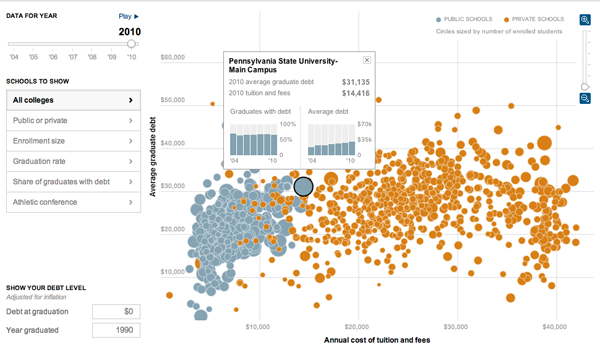
While the bubble chart is also available in map form—though I don’t find that particularly useful myself—the more interesting added layer of complexity comes from the data displayed when the user selects a specific university.
Credit for the piece goes to Jeremy White, Andrew Martin, Andrew W. Lehren, and Archie Tse.