Infographics and interactive pieces need not always be about data. Sometimes they can help you find things far more practical than levels of Canadian defence spending or changing demographics. Sometimes they can help you find new summer cocktail recipes. Like this piece from the New York Times.
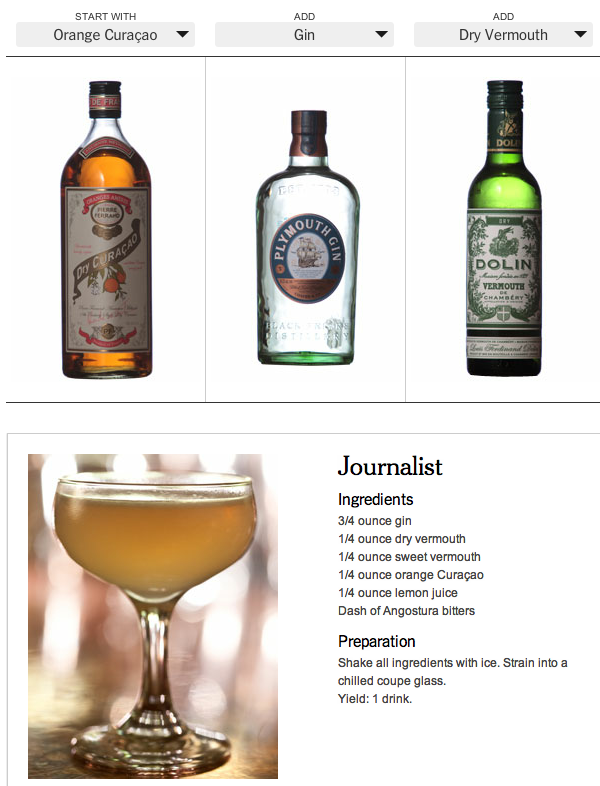
And if you’re me, you can add the experiments to your running tally of drinks as new data points.
Credit for the piece goes to Jacky Myint, Emily Weinstein, Des Shoe, and Tony Cenicola.
Author: Brendan Barry
I am a graphic designer who focuses on information design. My day job? Well, they asked me not to say. But to be clear, this blog is my something I do on my own time and does not represent the views of…my employers. I think what I can say is that given my interest in information design—be it in the shape of clear charts, maps, diagrams, or wayfinding systems—I am fortunate that my day job focuses on data visualisation. Outside of work, I try to stay busy with personal design work. Away from the world of design, I have become an amateur genealogist and family historian. You will sometimes see that area of work bleed into my posts.
View all posts by Brendan Barry