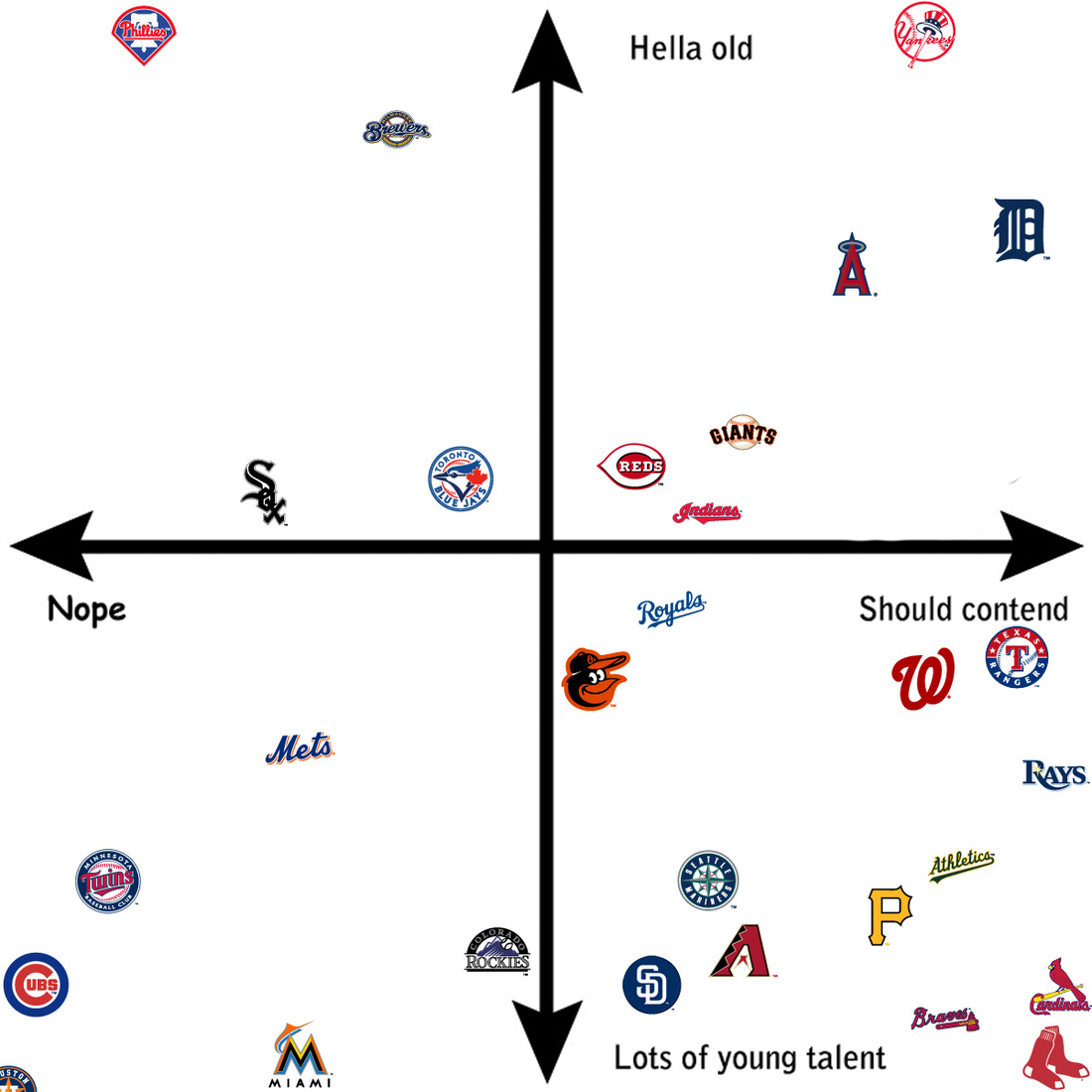
Spring training has begun for baseball fans. The glow from the Red Sox victory last October is fading as we now wonder if we can repeat. Fans of other teams now wonder if this is their year. Over at SB Nation, an article plotted 29 baseball teams—ignoring the Dodgers— and looked at their chances in the upcoming years. The article continues using the chart to explain which teams fall where.
Baseball windows
And for the designers, note the type choice for “Nope”.
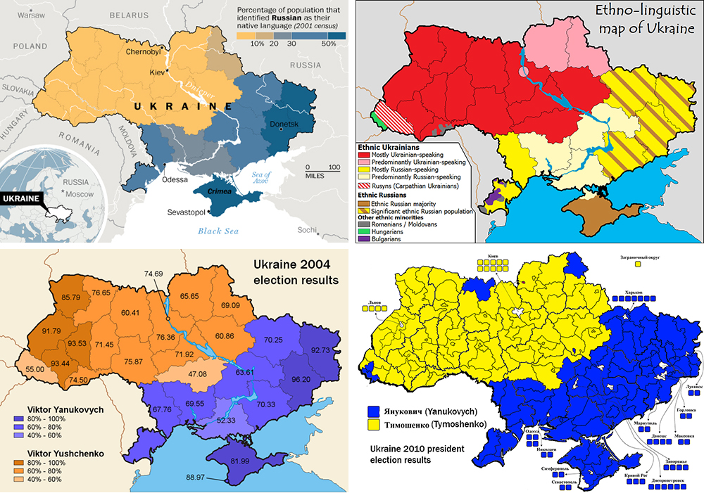
Not “the Ukraine” as it is (admittedly) fun to do in pop-culture references to Seinfeld. This comes from the Washington Post and the article tries to show that the protests in Kiev are not necessarily a vast majority against the government. Certainly the opposition is strong, but there is also a very strong pro-government movement. Why? Because in the broadest of senses, Ukraine is where the West, i.e. the European Union, meets the East, i.e. Russia.
A divided Ukraine
Credit for putting this all together goes to Max Fisher. Credit for each of the original graphics is to their respective designers whom I cannot identify.
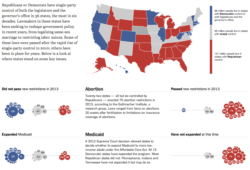
Today’s piece comes from this past weekend. The New York Times looked at how states fell on various politically sensitive issues, e.g. abortion and same-sex marriage, depending upon the political control of the executive and legislative functions of each state. In other words, which states have passed legislation to regulate abortion or same-sex marriage? States controlled by Democrats, or states controlled by Republicans?
The overall lay of the land and two issues
I am not terribly keen on the clustered bubbles. Showing the population of each state could be handled better by different chart forms. But to a certain extent in this piece, the population figures are secondary to the aggregate of people living in blue or red states. And in that case, while you cannot easily visualise the number of people living in the aggregates, you can at least get a feel for which group is home to more people.
Credit for the piece goes to Haeyoun Park, Jeremy Ashkenas, and Mike Bostock.
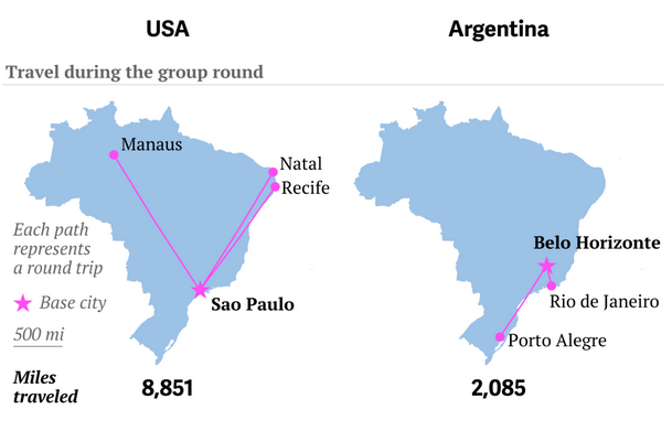
Well, travel for the teams, not you. It’s a big issue in Brazil because unlike the last couple of times, the teams need to travel big distances to reach the cities where they play their matches. Thankfully, to explain just how far some of these distances are for some of these teams, Quartz put together a nice article with quite a few graphics.
This graphic in particular juxtaposes the travels of the US team and the Argentinian team. Who do you think has it easier?
US and Argentinian travels
Credit for the piece goes to Jason Karaian and Ritchie King.
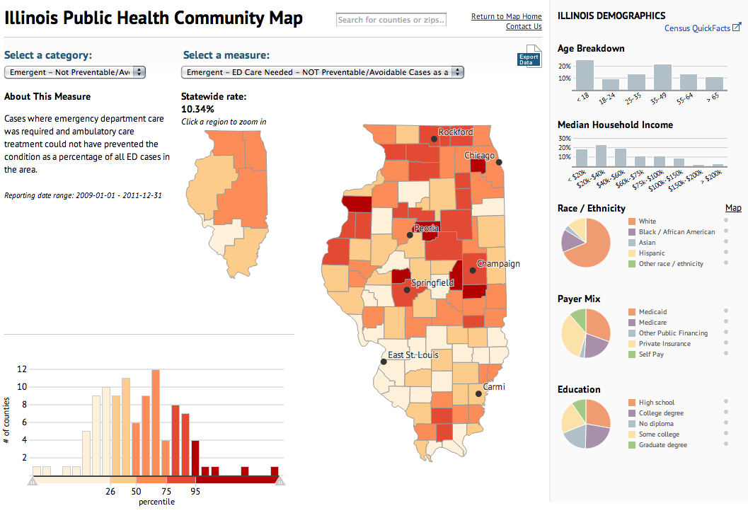
Today’s piece maps and charts comes from the Illinois Department of Public Health. The piece combines maps and charting components to detail preventable hospitalisations and emergency room use in the state of Illinois.
Public health map
Ordinarily I would prefer just one map, however, in this case the designers realised that a regional map—with its larger surface area—need not be as large as the county map. Some additional elements worth noting is the area devoted to the human explanation of the categories, which might otherwise be difficult to understand.
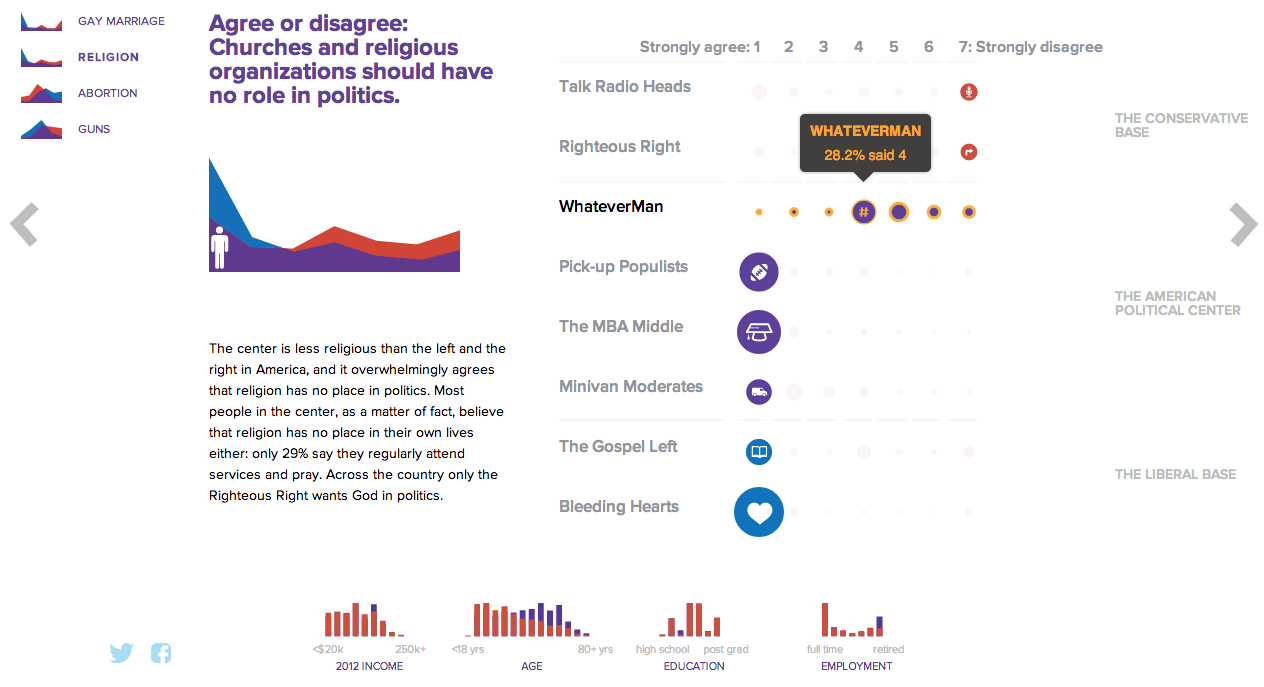
NBC News and Esquire magazine published results from their August survey of some 2000+ respondents that attempted to define the New American Center, i.e. the political persuasions of the majority of the country excepting the radical right and the loony left. For the purposes of Coffee Spoons, I am most interested in looking at the data visualisation and the infographics that result.
Both NBC News and Esquire visualised the results. While I could write two long blog posts looking at both of them, for today, it is more important to look more at the fundamental design difference between the two.
NBC News opted for a design direction emphasising data first. Perhaps because NBC is a news platform, their focus was on the clean communication of the data. Looking
NBC News results
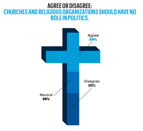
On the other hand, Esquire opted for a more sensationalised direction. The same data points used for the screenshot above creates this graphic below. Not only is less data is contained, less context given, less subtlety and nuance captured, it also is just difficult to read. Is the 59% supposed to be the area of the cross filled in? Its length? Why is it three-dimensional? Where are the Snowdens of yesteryear? At first glance, I ignore the horizontal wings and focus solely on the vertical length of the main bar.
Esquire results
For a useful representation of data, I think NBC News clearly wins. But that both organisations used the same data to craft their separate results, this story on the New American Center is useful for comparing two different design directions and the results thereof.
No designers are specifically mentioned, at least not that I could find, so credit for each piece goes to its respective owner, i.e. NBC News or Esquire.
Normally this would be a Friday post. But, for those of you fellow Red Sox fans who happen to live near enough to Fenway to go catch a game, Wednesday night is Dollar Beard Night. This graphic by the Red Sox details the different types of beards worn by Red Sox players this year. It’s like the bunch of idiots of 2004.
The Red Sox beards
Wednesday night if you show up to Fenway with a beard, you can get a $1 ticket for Dollar Beard Night. Hence why posting this Friday would do you fellow Red Sox fans no good.
…and not just any bankers but central bankers (the ones who establish policies at a national level), are rather under represented as this graphic from the Economist details. It is a nice use of small multiples with bar charts over time. Each bar is a 0–50% of the total membership of a central bank board and the share that is dark represents the number of women. Clearly for the countries selected not a single one has had a board of more than 50% women. Sweden and South Africa are the only two countries shown that have had 50% participation from women central bankers—though Norway and Denmark (for a period of time) have been consistently close.
Women central bankers
Credit for the piece goes to C.W., P.A.W., L.P., and P.K.
A little while ago the Washington Post published this graphic on Metro ridership. But not just anybody’s ridership, that of the individuals who sit on the DC transit agency’s board. After all, should not those overseeing Washington’s transit agency be intimately familiar with the conditions faced by DC commuters?
How agency board members ride their transit agency…
The graphic is a really nice use of small multiples and shading and tinting to indicate which lines are travelled by specific persons. An icon of a bus denotes bus ridership. This is a very good piece.
Credit for the piece goes to Wilson Andrews, Dana Hedgpeth, Mark Berman, and Luz Lazo.
Corporate taxes are always a fun discussion point. Who pays too much? Too little? Not at all? In May, the New York Times published an interactive piece examining US companies and their effective tax rates from 2007 through 2012.
At its core, the piece is a bubble chart along one axis that plots the tax rate for the company, with the bubble sized proportionally to said company’s market capitalisation. Colours reinforce the tax rate plotting, but are not themselves necessary. I think they would have been better tied to something along the lines of industries or profit or sales growth.
Overall corporate tax rates
Of course that was when I saw the button for viewing the data by industry. The view of all companies is broken up into a series of charts about each particular industry. And of course, if you want information on a particular company, the smart search/filter is particularly useful.
Corporate tax rates by industry
Credit for the piece goes to Mike Bostock, Matthew Ericson, David Leonhardt, and Bill Marsh.