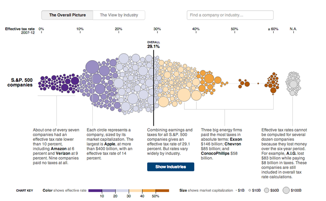
Corporate taxes are always a fun discussion point. Who pays too much? Too little? Not at all? In May, the New York Times published an interactive piece examining US companies and their effective tax rates from 2007 through 2012.
At its core, the piece is a bubble chart along one axis that plots the tax rate for the company, with the bubble sized proportionally to said company’s market capitalisation. Colours reinforce the tax rate plotting, but are not themselves necessary. I think they would have been better tied to something along the lines of industries or profit or sales growth.

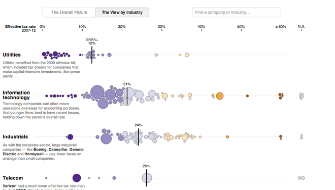
Of course that was when I saw the button for viewing the data by industry. The view of all companies is broken up into a series of charts about each particular industry. And of course, if you want information on a particular company, the smart search/filter is particularly useful.

Credit for the piece goes to Mike Bostock, Matthew Ericson, David Leonhardt, and Bill Marsh.
Leave a Reply
You must be logged in to post a comment.