Tag: bar chart
-
Russo-Ukrainian War Refugees: 5 April
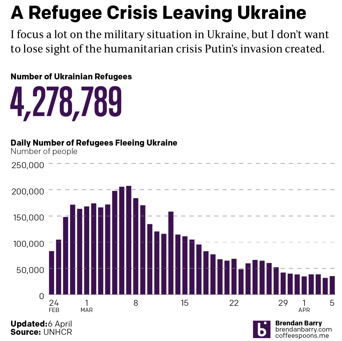
Just a quick update as I try to update my battle map. Today we’re taking another look at the refugee crisis Putin created in eastern and central Europe. Over four million Ukrainians have left Ukraine and millions more have been displaced internally within Ukraine. Whilst we may hope they will eventually return home, the photos…
-
Where’s the Axis
We’re starting this week with an article from the Philadelphia Inquirer. It looks at the increasing number of guns confiscated by the Transportation Security Administration (TSA) at Philadelphia International Airport. Now while this is a problem we could discuss, one of the graphics therein has a problem that we’ll discuss here. We have a pretty…
-
Can You Hit the High Notes?
This is an older piece that I stumbled across doing some other work. I felt like it needed sharing. The interactive graphic shows the high and low note vocal ranges of major musical artists. Interactive controls allow the user to sort the bars by the greatest vocal range, high notes, or low notes. Colour coding…
-
Slaveholders in the Halls of Congress
Taking a break from going through the old articles and things I’ve saved, let’s turn to a an article from the Washington Post published earlier this week. As the title indicates, the Post’s article explores slaveholders in Congress. Many of us know that the vast majority of antebellum presidents at one point or another owned…
-
Philadelphia’s Wild Winters
Winter is coming? Winter is here. At least meteorologically speaking, because winter in that definition lasts from December through February. But winters in Philadelphia can be a bit scattershot in terms of their weather. Yesterday the temperature hit 19ºC before a cold front passed through and knocked the overnight low down to 2ºC. A warm…
-
Covid Update: 29 September
Last week when I wrote my update on Covid-19, we had seen a few signs for optimism, but in other states the news was hard to interpret or, in the case of Pennsylvania, not going the right way at all. So where are we this week? In some ways, not a lot has changed over…
-
Covid Update: 22 September
It’s been a little over a week now since my last update on Covid-19 in Pennsylvania, New Jersey, Delaware, Virginia, and Illinois. So where do we stand now, especially since last week we had seen a split with some good news and some not so good news? Well let’s start with where we had good…
-
Misleading Graphics Aren’t Limited to US Elections
Last week I wrote about how CBS News’ coverage of the California recall election featured a misleading graphic. In particular, the graphic created the appearance that the results were closer than they really were. This week we had another election and, sadly, I find that I have to write the same sort of piece again.…
-
Correcting CBS News Charts
One of the long-running critiques of Fox News Channel’s on air graphics is that they often distort the truth. They choose questionable if not flat-out misleading baselines, scales, and adjust other elements to create differences where they don’t exist or smooth out problematic issues. But yesterday a friend sent me a graphic that shows Fox…
-
Covid Update: 13 September
It’s been a little less than a week since our last Covid-19 update for Pennsylvania, New Jersey, Delaware, Virginia, and Illinois. At the time we had just come back from the Labour Day holiday here in the United States and that left us with two big questions. First, what would the data show after we…