Last week I mentioned how the rate of decline in new cases had begun to fall significantly, largely due to two factors. The first is good, that we are reaching low levels of new cases overall, but the second is bad, that we see a large proportion of the population hesitant to receive their vaccines. (The vaccines have been proven safe, effective, and they’re free. If you haven’t received your shots yet, I highly encourage you to do so.)
This past week that trend for new cases largely continued. But another issue I was concerned about was a slight uptick, given that last Sunday’s daily new case data was higher than the previous Sunday’s. So as we look at the chart of new case curves, how are we doing?
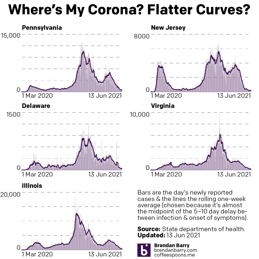
Good news. Those numbers are back on the decline and, in fact, the daily numbers from this Sunday are lower than those of even two weeks ago. We would have had a more muddled picture if the numbers were lower than last week, but still higher than two weeks ago. This leaves me more assured that the numbers are in fact still headed down and the few upticks are outliers and not a trend.
I also wanted to point out another data point this week. This coming week will mark the one-year anniversaries of the summer lows we saw in 2020. These were the points at which Covid-19 was at its lowest ebb after the initial spring wave and then the rise in cases beginning in late summer and early autumn. This most recent spring, despite the initial burst of reopening, our new case levels never fell to anywhere near the summer lows.
I will chart more of this likely next week as we hit all but one of those milestones. But as a teaser, today, 14 June was the lowest point for Delaware, which on that day had a seven-day average of 46 new cases per day. The average heading into today’s data release? 33. Or in other words, Delaware is averaging almost 25% fewer new cases now than it was at last year’s summer nadir.
But as we head into the week, you can see from the charts above that the numbers for all five states are quite low. Pennsylvania and Illinois lead, but are also some of the most populated states in the country. They sit at 403 and 336, respectively. New Jersey and Virginia, more middle-tier states in terms of population, are also fairly close with their new cases as their averages begin the week at 168 and 143, respectively. Delaware, as we noted above is sitting on 33.
So what about deaths? Last week I discussed a pattern of bottoming out, especially for Pennsylvania and Illinois. Unfortunately, I also noted how Pennsylvania had an aberrant large, one-day spike of deaths that influenced the seven-day average.
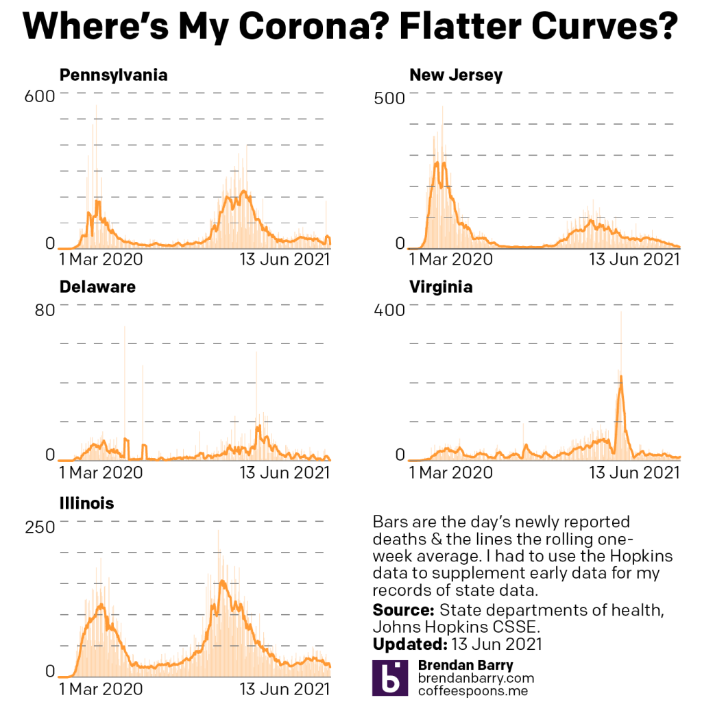
This week you can clearly see that spike in Pennsylvania phasing out of the data set. That’s good, because it allows us to begin to evaluate the true state of Pennsylvania’s average. That average? 18, which is squarely in line with the average before the spike. In other words, Pennsylvania may have indeed bottomed out.
Illinois, however, has resumed a slight push downward, as the seven-day average yesterday just hit 16, down three from Saturday’s 19. I’ll want to see that trend persist throughout the week before saying that Illinois has resumed declining death rates, but it’s a good start to the week.
In New Jersey and Delaware we continue to see falling numbers of deaths. This time last week we saw a small cluster of deaths that brought Delaware up from 0.3 deaths per day to 2.3. But Delaware is now back down to 0.3, perhaps the lowest it reasonably expected to be. New Jersey had just managed to fall below 10 deaths per day, and it’s nearly halved that at it enters the week at 6.3.
Virginia, unfortunately, is the outlier. Deaths had slipped below 10 for over a week. And last week they fell as low as 7.7. But as of yesterday they have climbed back over 10. We need to watch this week to see if there is truly a rising number of deaths or if we are seeing the emergence of more of a bottom or floor in terms of deaths.
Finally we have vaccinations.
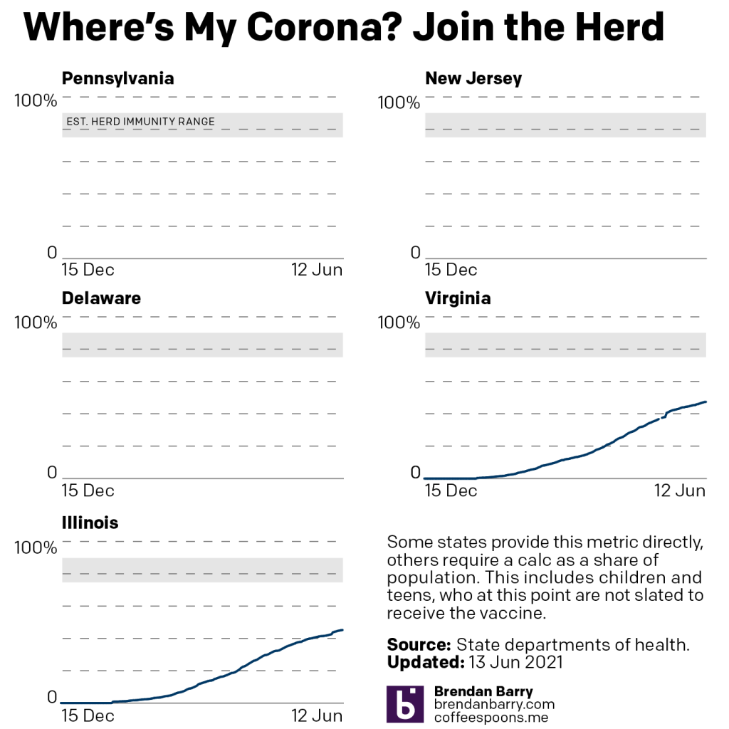
Unfortunately, the City of Philadelphia’s website has been broken for over a week and they’re now only reporting updates twice a week anyway. In other words, the data for Pennsylvania isn’t great. Because while we can report the rest of the Commonwealth, the City of Philadelphia—excluding the suburban counties—on its own represents nearly 13% of Pennsylvania. That’s a huge chunk to be missing.
That leaves us with Illinois and Virginia.
The good news is that they are going up and that Illinois just hit 45% fully vaccinated. Virginia is now at 47%. The bad news is that it took a week for both states to climb up one percentage point. More evidence that vaccinations are slowing dramatically with millions left unvaccinated.
And we’re going to need them to get vaccinated. Consider the United Kingdom, another Western country doing well in its vaccination programme and that had decided to increasingly open up large swathes of its economy.
That is now on hold for another four weeks. The UK had planned to end its lockdown on 21 June, but that will now be extended into the end of July. And it’s all due to the Delta, formerly Indian, variant that has taken root in the UK. It’s more transmissible than the earlier UK variant, which the UK called the Kent variant.
The Delta variant has emerged in small numbers here in the US. But in order to prevent another surge that could threaten our healthcare systems, we need to get people vaccinated. It’s not inconceivable that the US may need to reinstate restrictions or full lockdowns if the Delta variant were to take root and swamp the US healthcare system.
And so I will end this post as I began it. If you haven’t started your vaccination process, I encourage you to do so. The vaccines have been proven safe and effective. And if you’re worried about cost, they’re free.
Credit for the piece is mine.
Leave a Reply
You must be logged in to post a comment.