As all my readers probably know, I love London. And in loving London, I love the Tube and the Oyster Card and all that goes along with Transport for London. But, I have noticed that sometimes when I take the Underground, there are segments where it gets a bit loud, especially with the windows open. The Economist covered this in a recent article where they looked at some data from a London-based design firm that makes noise protective gear. (For purposes of bias, that seems important to mention here.)
The data looks at decibels in a few Underground lines and when the levels reach potentially harmful levels. I took a screenshot of the Bakerloo line, with which I am familiar. (At least from Paddington to Lambeth.) Not surprisingly, there are a few segments that are quite loud.
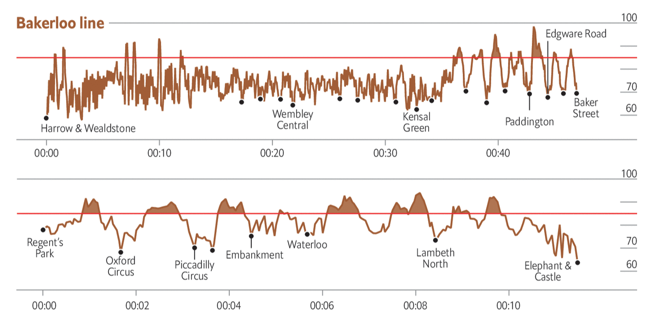
I like this graphic—but like I said about bias, I’m biased. The graphic does a good job of using the above the 85-decibel line area fill to show the regions where it gets loud. And in general it works. However, if you look at the beginning of the Bakerloo line noise levels the jumps up in down in noise levels, because they happen so quickly in succession, begin to appear as a solid fill. It masks the importance of those periods where the noise levels are, in fact, potentially dangerous.
I have had to deal with this problem often in my work at the Fed, where some data over decades is available on a weekly basis. One trick that works, besides averaging the data, is thinning out the stroke of the line so the overlaps do not appear so thick. It could make it difficult to read, but it avoids the density issues at the beginning of that chart.
All in all, though, I would love a London-like transport system here in Philly. I’d rather some loud noises than polluting cars on the road.
Credit for the piece goes to the Economist Data Team.
Leave a Reply
You must be logged in to post a comment.