So two weeks ago I posted about the graphics in a BBC article about how London has surpassed New York in terms of murders, due to a spate of stabbings in the British capital. Well, somehow I missed this: an article from the Economist that rebuts that point. And it does it brilliantly.
Lies, damned lies, and statistics.
I think everybody who works with data knows that adage. Now, I am not using it to say that the BBC—or the numerous other media outlets that ran the story—lied. Just that it is easy to change the story based on the data, how it is presented, or which subsets of the data are selected.
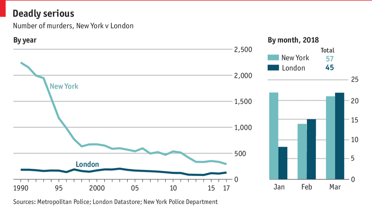
The Economist’s article points out that the surpassing of New York is a short term data point, a worrying short term trend, definitely, but they then look at the data. They select two timeframes and look at them side-by-side.

And that is what I love about this piece. It shows the long-term context of New York having a far-higher medium-term history of murder (some 28 years of data is shown). When I was growing up in the 90s, murders in New York—and to be fair almost all large American cities—was just something that was a known fact. During that time, London hovered below 200 or so, compared to the 2000+ in early 90s New York.
But then they also show the short term, which does point to a steady rise in London murders. But, the data could also show a one-time dip in the murders in New York. But they also show that the total number of deaths is still higher in New York than London, despite the three months of data.
Murder is not good. But these graphics are a good example of how selecting different time series for the same data set, and then showing which parts of the data to show. The earlier BBC piece, and my revision of it, did not show the total deaths. Nor did either piece show the longer timeline of data.
Credit for the piece goes to the Economist graphics department.
Leave a Reply
You must be logged in to post a comment.