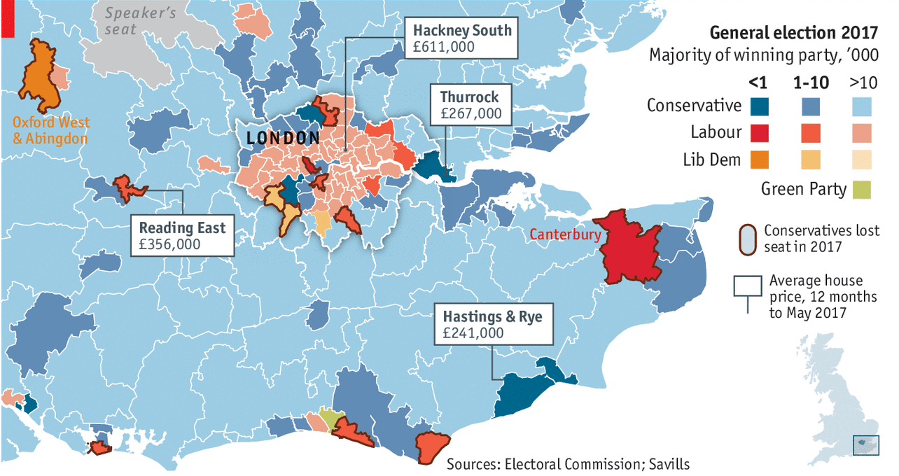
We have a nice little piece from the Economist today, a look at the electoral majority for London-area constituencies and how their housing prices may begin to draw out priced-out Labour votes from London proper.

What I really like from the design side is the flip of the traditional choropleth density. In other words, we normally see the dark, rich colours representing high percentages. But here, those high majority constituencies are not the ones of focus, so they get the lighest of colours. Instead, the designers point attention to those slimmest of majorities and then offer the context of average home prices.
Credit for the piece goes to the Economist’s Data Team.
Leave a Reply
You must be logged in to post a comment.