Whence do US Retail Sales Come?

Today’s piece comes from the Wall Street Journal. It looks at US retail and foodservice spending through different types of stores.

Retail sales by store type

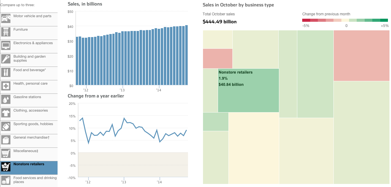
I take issue with a few things, firstly the tree map. Because it’s not really a tree map. Another thing I am not keen on is the comparison feature in the piece. The user can select up to three types of stores to compare. And while the result works in the line chart—three lines—the bar chart devolves into a near useless component. There is no easy way to compare the actual lengths of the individual bars short of mousing over and scribbling down each individual datapoint. In the particular case here, I likely would have changed from bars to line. Because that way I can compare the actual magnitude of each store type.

Credit for the piece goes to Dan Hill.

When is Hummus Not Hummus?

The subject matter of this one interested me. I am new to hummus. Well, sort of. I never ate it before moving to Chicago. But when I did, I understood it to be essentially a dip made from chick peas. According to an article from Quartz, It turns out that’s what most Americans believe. Even if they’re not necessarily buying it. Literally (sort of). Because some popular brands contain no chick peas. (Disclosure: I work for the company that provided some of the market sizing data used in the piece.)

Kind of needs chickpeas.

Credit for the piece goes to David Yanofsky.

After the Curtain Dropped

Last week we covered the fall of the Berlin Wall and the lasting impact in former East Germany vs. former West Germany. This week we look at a piece from Bloomberg Businessweek that looks more broadly at Eastern Europe.

Looking at GDP per capita

The piece scrolls with the charts updating based upon the available text. And within that text are highlighted keywords with which the user can interact to highlight data within the charts.

Credit for the piece goes to Alex McIntyre, Peter Coy, Christopher Cannon, and Blacki Migliozzi.

We All Have to Die…But How?

As the title says, we are all going to die one of these days. But what are the odds that Ebola will kill you? Turns out it is fairly small. Smaller than your pyjamas catching on fire and killing you. Or even your regular clothes catching fire. How did I know that? Well, the Washington Post put together a nice interactive piece to do just that. It starts you out at Ebola and works up to the most likely causes of death. If you are looking for your morning pick-me-up, this might not be it. Fair warning.

Small chance Ebola will kill you

Credit for the piece goes to Richard Johnson and Lazaro Gamio.

Looking at Languages

Languages can be fascinating things. And not necessarily just in Klingon. Vox has a post using 23 maps and graphics to look at language. As usual with these sorts of things, some are good. Others not so much.

Old World languages
Old World languages

Credit for the highlighted piece goes to Minna Sundberg via Dylan Matthews.

Satellites

Naturally we have talked a lot about Rosetta and Philae the last few weeks. While Philae has exhausted its battery supply, Rosetta continues to orbit Comet 67P as that satellite’s own satellite. But what about Earth? What about our satellites? Thankfully the folks over at Quartz mapped that out for us in this great graphic. It portrays all the known functioning satellites in Earth’s orbit, their range, and launch weight.

Earth's satellites
Earth’s satellites

You can switch which variable colour encodes, e.g. country or age. And then by clicking on a satellite you can see its orbit height—this can also be animated. And for a neat little bit, the grey circle with the dotted line represents the International Space Station. The dot its launch weight, the dotted line its current weight. The one I have selected is the X-37B unmanned space plane operated by the US Air Force.

Credit for the piece goes to David Yanofsky and Tim Fernholz.

Can You Land Philae

Today is Friday, so let’s take it a bit easy. You have heard of Philae and the comet landing. But we also know now that it bounced upon landing. But could you do any better? The BBC produced this game to let you try to do just that.

Landing Philae
Landing Philae

Credit for the piece goes to the BBC graphics department.

Mapping Equal Populations

After a week of some depressing material. Let’s lighten things up. Since, you know, it is a Friday.

Two weeks ago we looked at comparisons of actual geographic area. These are sometimes useful comparisons. But more often than not we are talking about the people that live in said areas. And speaking as someone who has lived in either suburbs of big cities or within big cities my entire life, comprehending the not-do-dense rural flyover states is a bit hard to do. Thankfully Ben Blatt over at Slate put together a nice interactive piece that allows you to get a better sense of just how empty the middle of the country really is. (Hint, it is empty.)

Here we take a look at comparing the East and West coasts to Chicago. Turns out you have to go pretty far from the shores of Lake Michigan to equal the population of the two coasts. That’s a lot of flyover.

Coasts vs. Chicago
Coasts vs. Chicago

Credit for the piece goes to Ben Blatt.

Drawing Down America’s Presence in Afghanistan

The United States and its allies are slowly beginning to pull out of Afghanistan. While several thousand troops will remain, the total will be nowhere near the peak figure a few years ago. This graphic from the Washington Post details just how this transition has been occurring.

The anti-surge
The anti-surge

Credit for the piece goes to Richard Johnson.

Philae on 67P

In a few hours—not long after this blog post is published—we should know whether or not the washing-maching sized probe Philae has successfully landed on comet 67P/Churyumov-Gerasimenko. The operation is very complicated, this is a moving and spinning comet with a boulder-strewn surface dotted with ice spires. And as of a few hours the lander was having problems with the gas thrusters designed to slow the lander to a hover above the comet surface. Space is hard. So to explain what is happening and the scale of the things involved, we have an illustration from the Washington Post.

How big is the comet?

Credit for the piece goes to Bonnie Berkowitz, Patterson Clark, and Richard Johnson.