Last week I covered a lot of Red Sox data. And your feedback has been fantastic. I think you can look forward to more visualisation of sportsball data. But since this is not a sports blog, let us dive back into some other topics. Like today’s piece on economic growth.
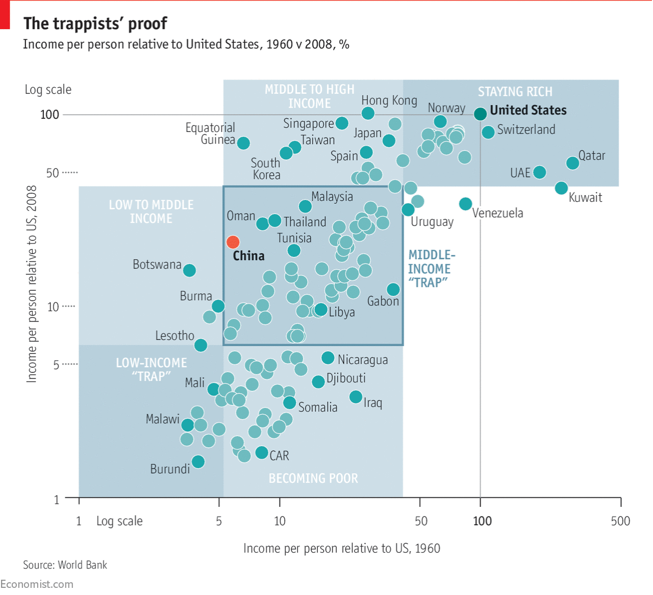
It comes from the Economist and explores the development history of national economies relative to that of the United States. The point of the chart was to illustrate what the researchers determined was the middle income trap, a space in which countries develop and become semi-rich, but then can never quite escape.
It’s a trap! (Unless it isn’t.)
The Economist makes the point that the definition of middle income matters. The range is enormous and one statistic says that it could take 48 years to graduate at a healthy rate of economic growth. I wonder is this bit, however, could also have been charted. The show don’t tell mantra works well here for setting up the problem, but a chart or two showing that exact range could have supplemented the text and perhaps made it more digestible.
Credit for the piece goes to the Economist Data Team.
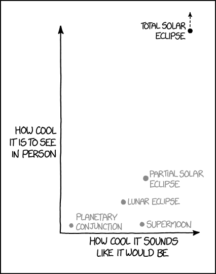
Did you really think we were done with eclipse coverage? (Actually we still will not be, there were some other neat eclipse coverage pieces I want to look at.) But today is Friday and so we look to lighter (and I find humourous) coverage, this week from xkcd.
Off the charts
My only quibble would be that the partial solar eclipse could be nudged further up the y-axis. I thought it was rather fantastic to witness. (But you better bet that come 2024 I will be travelling to see totality.)
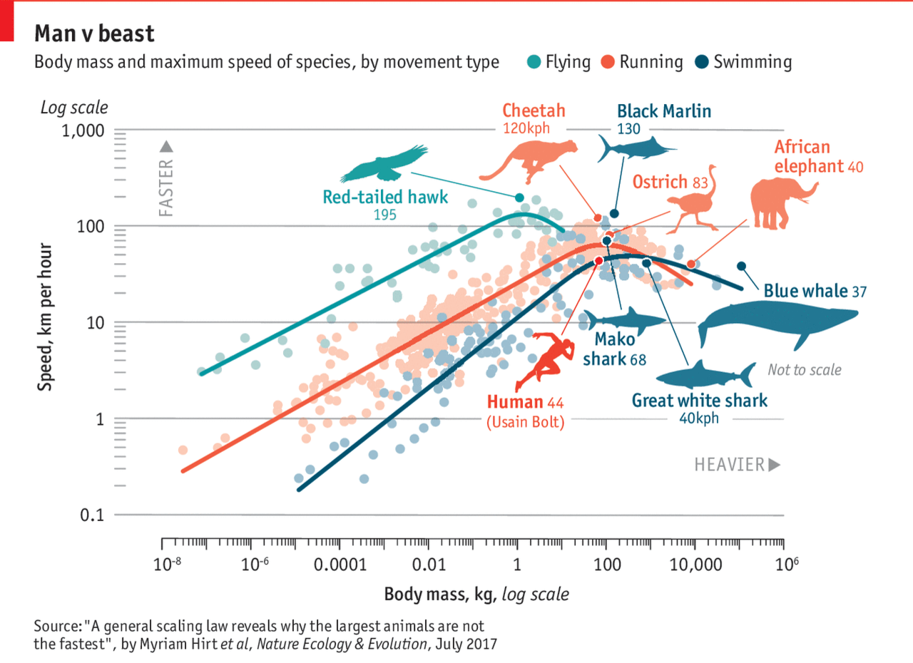
About two weeks ago, Michael Phelps raced a shark. What will they not do for television ratings? The Economist took the basic premise and then had an insightful piece about the speed of animals compared to their size. The whole notion of animals get faster the larger they get. Well, to a point, the Economist found. The graphic is a bit complex, perhaps, in their use of a log scale on both the x and y axes. But they have cute little illustrations of everyone’s favourite animals. So it all balances out in the end.
Man vs. Nature
But there is real science in the piece and it is worth a quick read.
Credit for the piece goes to the Economist graphics department.
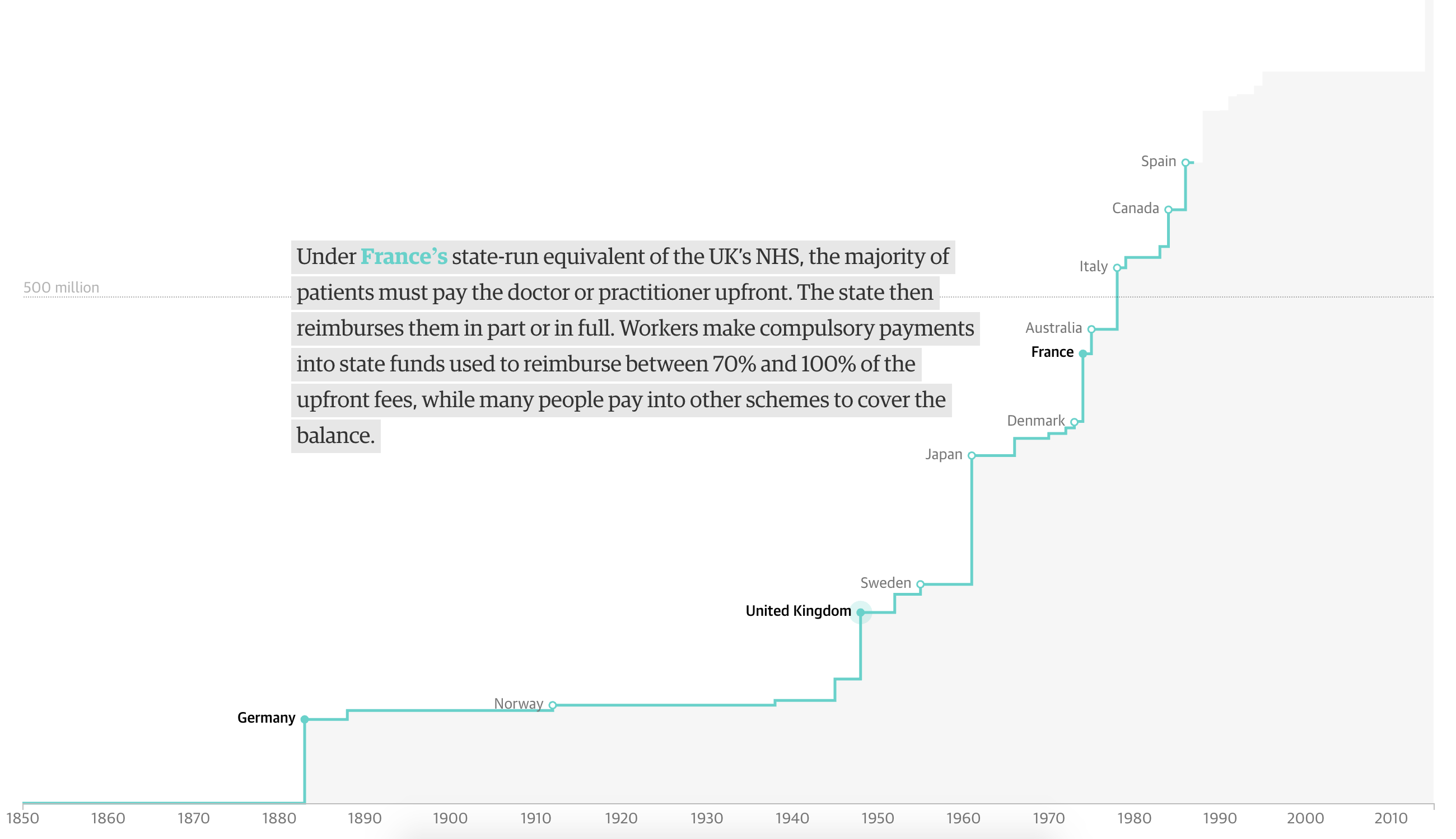
In this piece from the Guardian, we have one of my favourite types of charts. But, the piece begins with a chart I wonder about. We have a timeline of countries creating universal healthcare coverage, according to the WHO definition—of which there are only 32 countries. But we then plot their 2016 population regardless of when the country established the system. It honestly took me a few minutes to figure out what the chart was trying to communicate.
This is the only graphic I’m not sure of in the entire piece.
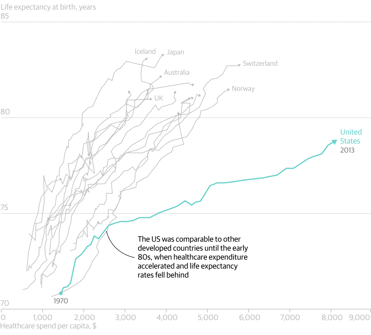
However, we do get one of my favourite charts: the scatter plot over time. And in it we look at the correlation between spending on healthcare compared to life expectancy. And, as I revealed in the spoiler, for all the money we spend on healthcare—it is not leading to longer lives as it broadly does throughout the world. And care as you might want to blame Obamacare, the data makes clear this problem began in the 1980s.
Someone’s getting cheated out of a lot of money. Oh wait, that’s us…
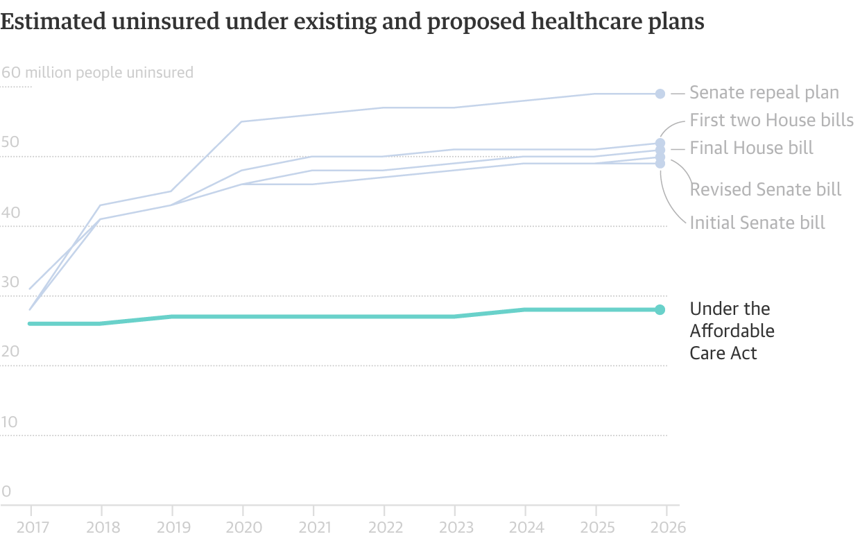
And of course Obamacare is why the Guardian published this piece since this is the week of the Vote-a-rama that we expect to see Thursday night. The Republicans will basically be holding an open floor to vote on anything and everything that can get some measure of repeal and/or replace 50 votes. And to wrap the piece, the Guardian concludes with a simple line chart showing the number of uninsured out to 2026. To nobody’s surprise, all the plans put forward leave tens of millions uncovered.
When all the options look bad, why not work with what you have?
It is a fantastic piece that is well worth the read, especially because it compares the systems used by a number of countries. (That is largely the text bit that we do not cover here at Coffeespoons.) I found the piece very informative.
Credit for the piece goes to the Guardian graphics department.
But at least today is Friday. Also Cinco de Mayo. And so in addition to trying to find some mezcal tomorrow—anybody know a good spot in Philly?—we can wrap this week up with something on the humourous side.
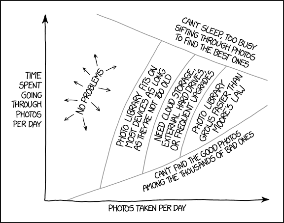
My mobile is a few years old now and I’ve been taking lots of the photos the last few years. Last weekend I reached a point where I could no longer take photos. Consequently I have been going back through all my old photos. And so this piece from xkcd seemed rather appropriate.
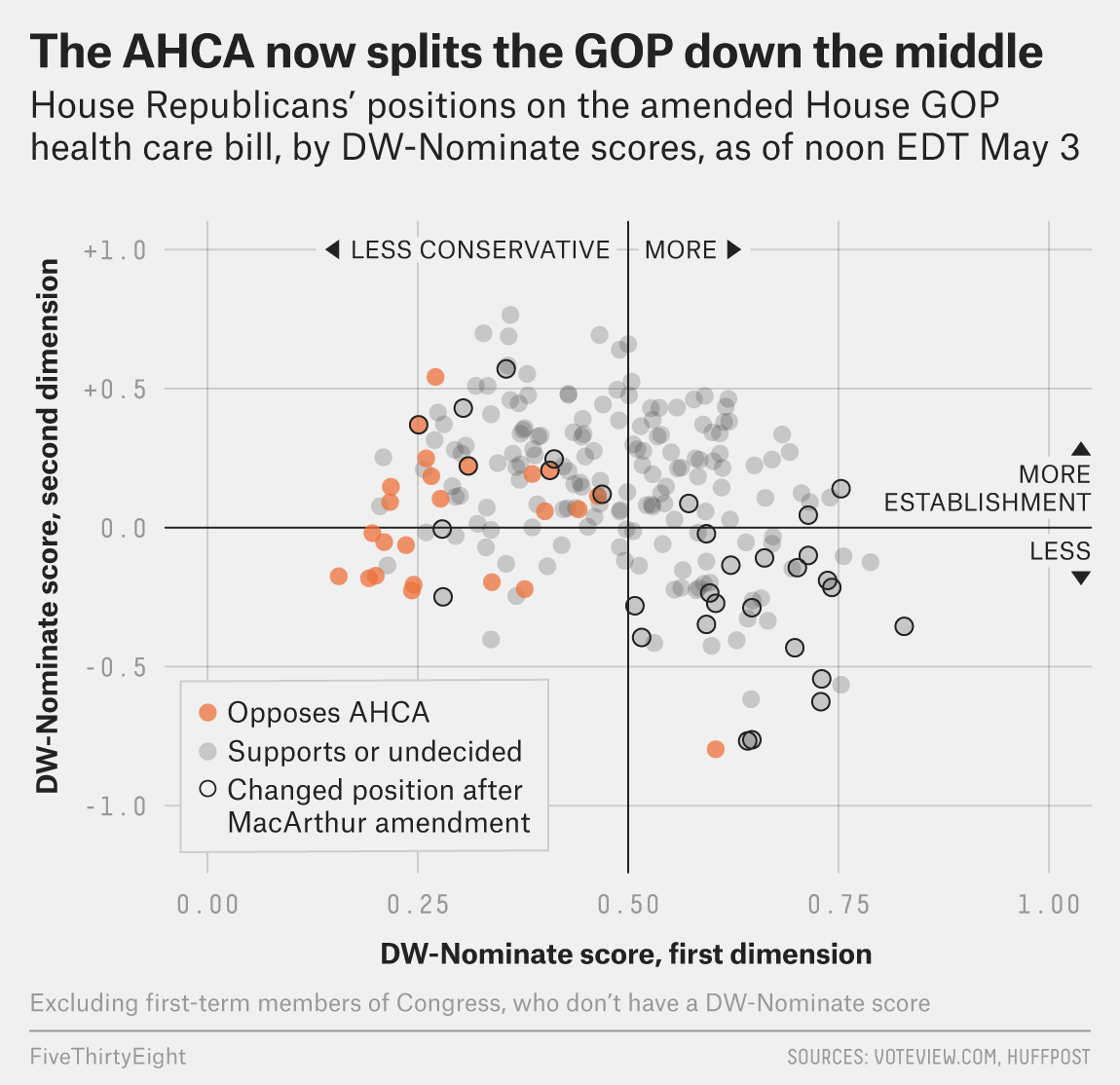
Well as of last night, we are having yet another vote on AHCA, better known as Trumpcare. I will not get into the details of the changes, but basically it can be summed up as waivers for Obamacare regulations. And as of last night, $8 billion over five years to cover those at high-risk. What about after five years? What if, as experts say, that sum is insufficient and it runs out before five years are up?
This is still a bad bill.
But thankfully we have FiveThirtyEight who looked at support before the Upton amendment—the $8 billion bit—and found that the bill could still fail because of a lack of moderate support.
Round and round we go
The basic premise is this: In order to get the conservative Freedom Caucus, which scuppered the bill a few weeks ago, on side Ryan et al. had to make the bill more conservative. They likely had to make it cover fewer people at a higher cost. I say likely because Ryan is not sending this to the Congressional Budget Office (CBO) to score the bill, something typically done to see how much it costs and whether it might work. Problem is, by making the bill more conservative, they push away moderate Republicans. Yes, Virginia, they do exist.
Today’s question is whether an $8 billion throw-in will buy in enough moderate votes.
Another day, another story about the administration to cover with data-driven graphics. We are approaching Trump’s 100th day in office, traditionally the first point at which we examine the impact of the new president. And well, beyond appointing a Supreme Court justice, it is hard to find a lot of things President Trump has actually done. But on his 99th day, he will also need to approve a Congressional bill to fund the government, or else the government shuts down on his 100th day. Not exactly the look of a successful head of state and government.
Why do I bring this up? Well, one of the many things that may or may not make it into the bill is funding for Trump’s wall that Mexico will pay for, but at an undetermined later date, because he wants to get started building the wall early, but late because he promised to start on Day 1.
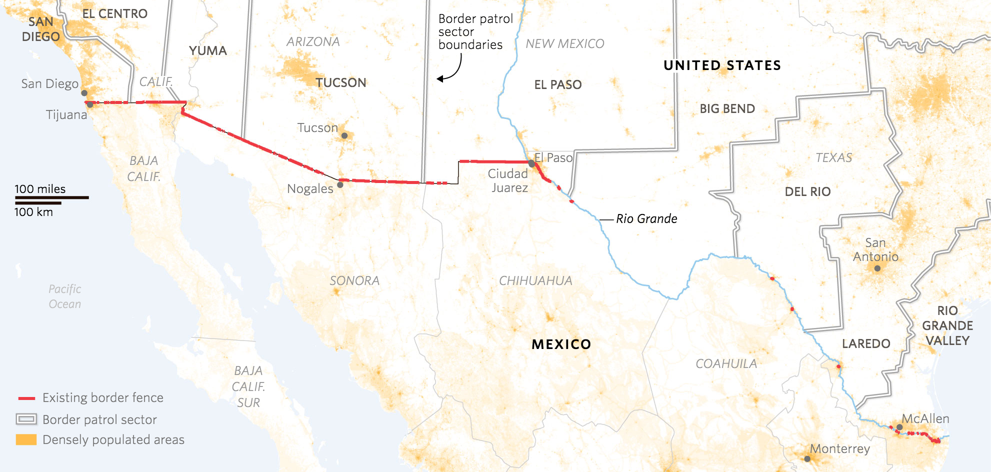
Several weeks ago the Wall Street Journal published a fantastic piece on the current wall bordering Mexico. It examines the current state of fencing and whether parts of the border are fenced or not. It turns out a large portion is not. But, the piece goes on to explain just why large sections are not.
The wall today
You should read the full piece for a better understanding. Because while the president says building the wall will cost $10 billion or less, real estimates place the costs at double that. Plus there would be lawsuits because, spoiler: significant sections of the border wall would cross private property, national parks, and Native American reservations. Also the southern border crosses varied terrain from rives to deserts to mountains some lengths of which are really difficult to build walls upon.
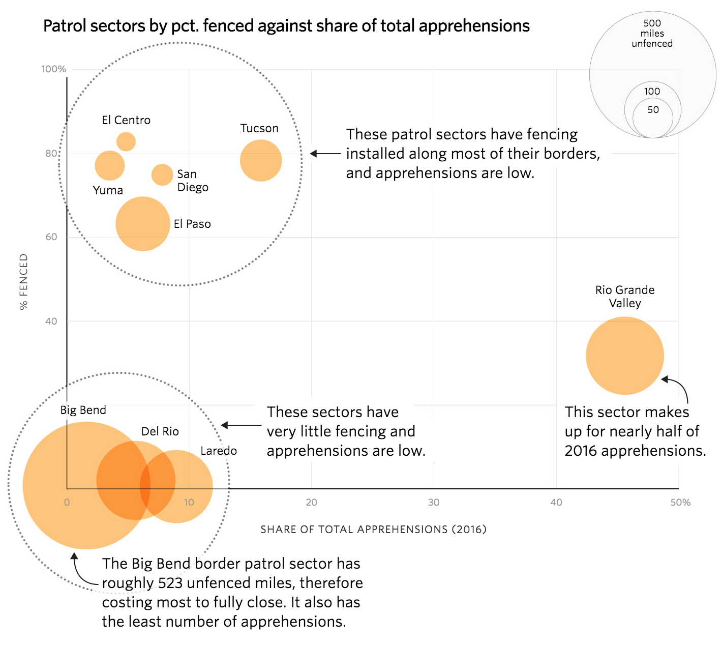
But the part that I really like about the piece is this scatter plot that examines the portion of the border fenced vs. the number of apprehensions. It does a brilliant job of highlighting the section of the border that would benefit most significantly from fencing, i.e. a sector with minimal fencing and a high number of apprehensions: the Rio Grande Valley.
Where would more fencing make more of a difference
And to make that point clear, the designers did a great job of annotating the plot to help the reader understand the plot’s meaning. As some of my readers will recall, I am not a huge fan of bubble plots. But here there is some value. The biggest bubbles are all in the lower portion of fenced sectors. Consequently, one can see that those rather well-fenced sectors would see diminished returns by completing the wall. A more economical approach would be to target a sector that has low mileage of fencing, but also a high number of apprehensions—a big circle in the lower right of the chart. And that Rio Grande Valley sector sits right there.
Overall, a fantastic piece by the Wall Street Journal.
Credit for the piece goes to Stephanie Stamm, Renée Rigdon, and Dudley Althaus.
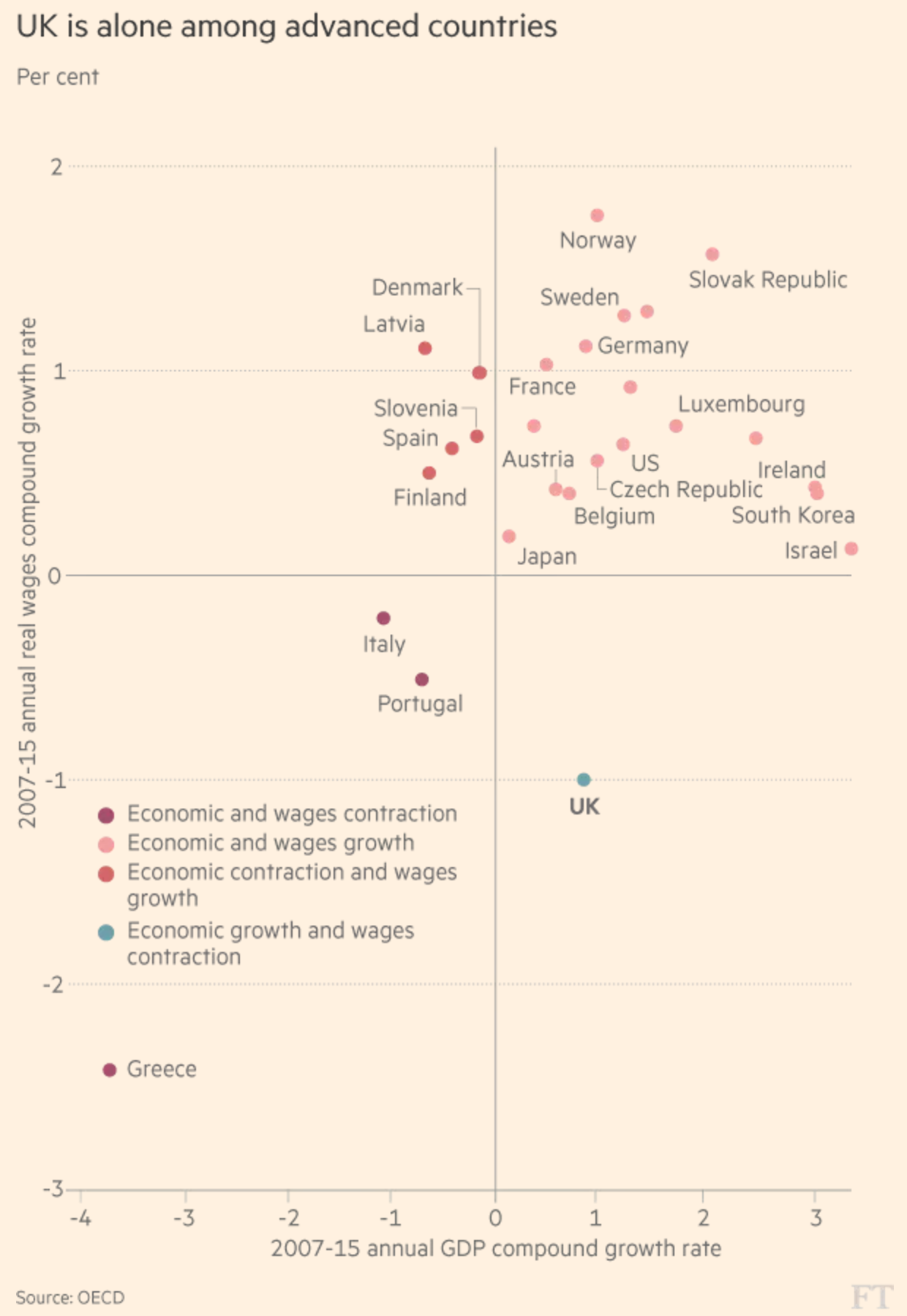
We have a scatterplot from the Financial Times that looks at wage and economic growth across the OECD, focusing on the exception that is the United Kingdom. And that is not an exception in the good sense.
The UK had the rare privilege of experiencing economic growth—that’s good—while simultaneously wages fell—that’s bad. But I wanted to comment on the chart today.
I would have designed this a little bit differently
Straight off the bat, the salmon-coloured background does not bother me. That is FT’s brand and best to stick to it and make your graphics work around it. Possibly the colours in the plot could use a bit of a push to increase separation, but that is more a design quibble. Instead, I am not too keen on the colour coding here.
Not that the colours need not be applied, but why to the dots? Note how the dots of a colour fall into one of the quadrants. Instead of having people refer to the legend, incorporate the legend into the chart by moving the labels to the plot background. You could colour code the labelling or even colour the quadrants to make it a bit clearer.
Credit for the piece goes to the Financial Times graphics department.
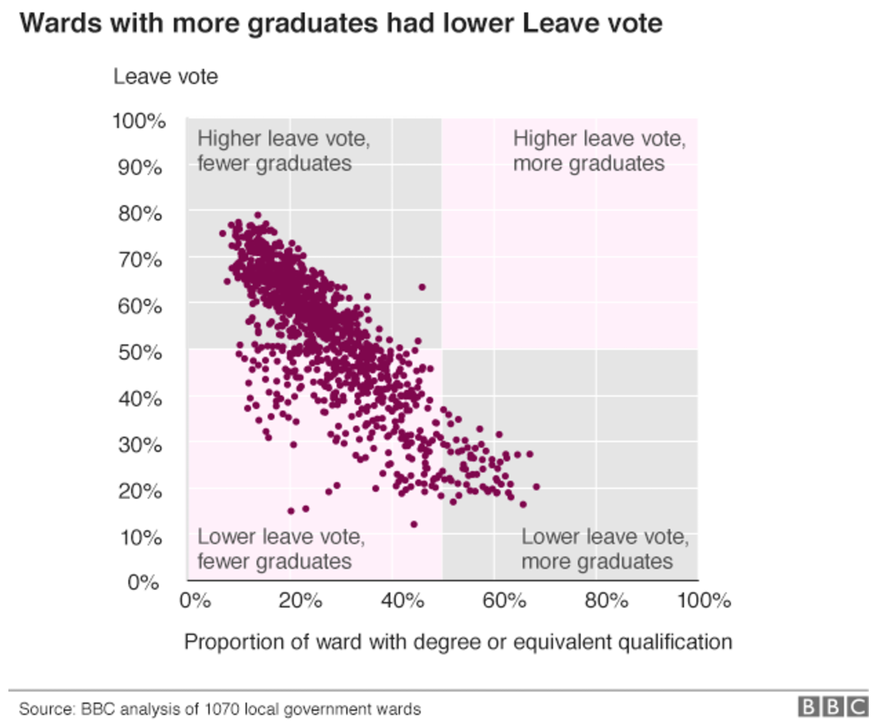
So this isn’t quite a shocker, but the BBC gained access to more granular Brexit vote data, and then examined the results against demographic data. The conclusion, a lower education level best corresponded to voting to leave the European Union. Again, we all sort of knew that, but this provides an even larger, richer sample size.
Still a sad result
What is interesting from the American perspective is how that compares with the election of Donald Trump. In that case as well, lower levels of education correlated well with votes for Trump.
Of course now I will be closely following the elections in the Netherlands, France, and Germany this year to see if the same lower education level corresponds to the vote in favour of populist, nationalist political parties, e.g. Marine le Pen and Geert Wilders.
Credit for the piece goes to the BBC graphics department.
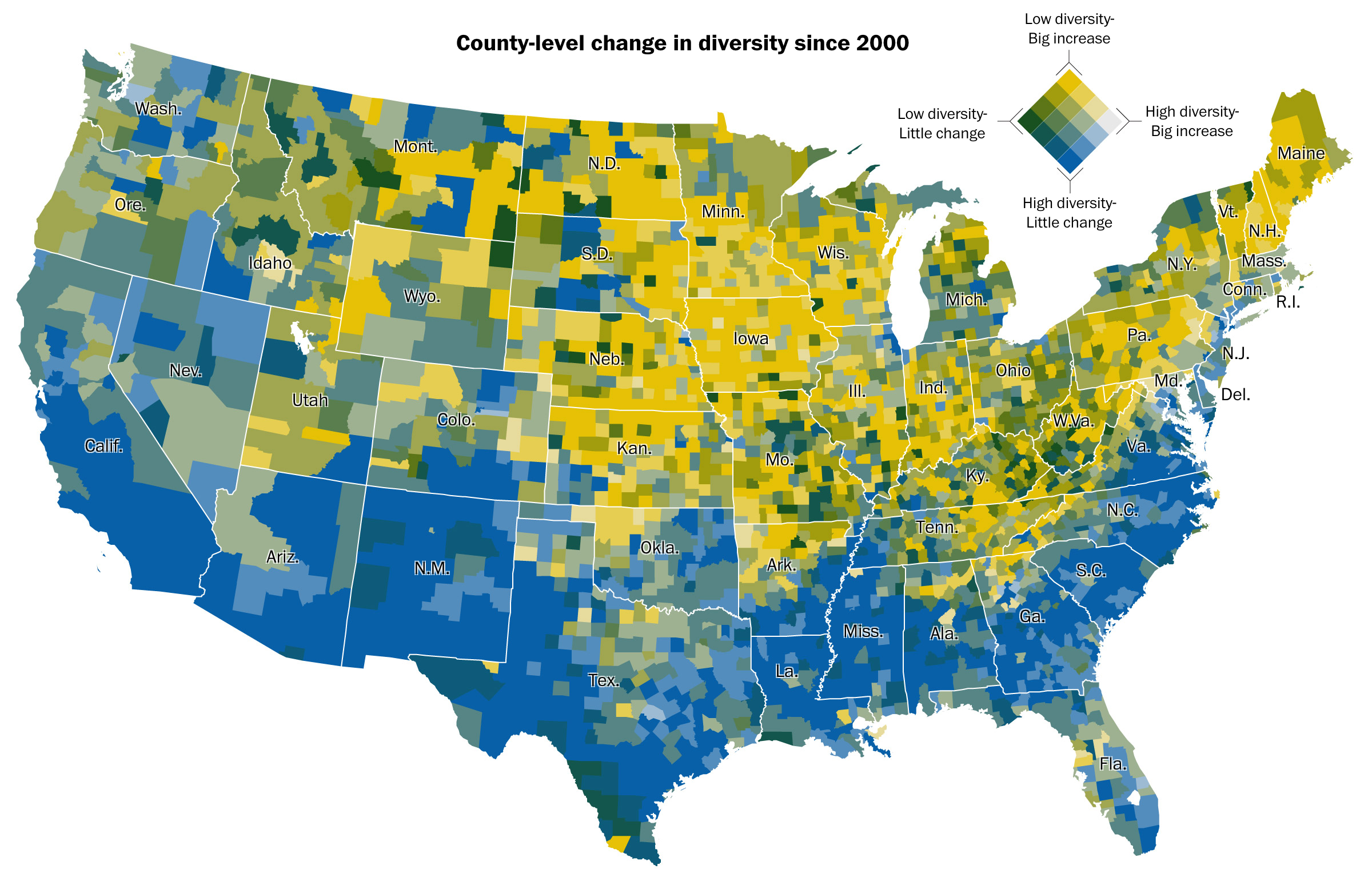
Today’s post is a choropleth map from the Washington Post examining diversity in the United States and how fast or slow diversity is expanding. Normally with two variables one goes instantly to the scatter plot. But here the Post explored the two variables geographically. And it holds up.
The colours are perhaps the only part holding me up on the piece’s design. Are blue and yellow the best two colours to represent level of diversity and growth? I lose some of the gradation in the yellows, especially between the big increases in diversity. Can I offer a better solution? No, and maybe there is not. But I would love the chance to explore different palette options.
Where America is diverse or not, and how much it’s changed
As you well know, I am not a big fan of always plotting things on maps. I call them the silver bullet. However, in this instance, there are clear geographic patterns to the four different scenarios. Of course this soon after the election I would love adding a third variable: how the counties voted in the presidential election. Maybe next time.
Credit for the piece goes to Dan Keating and Laris Karklis.