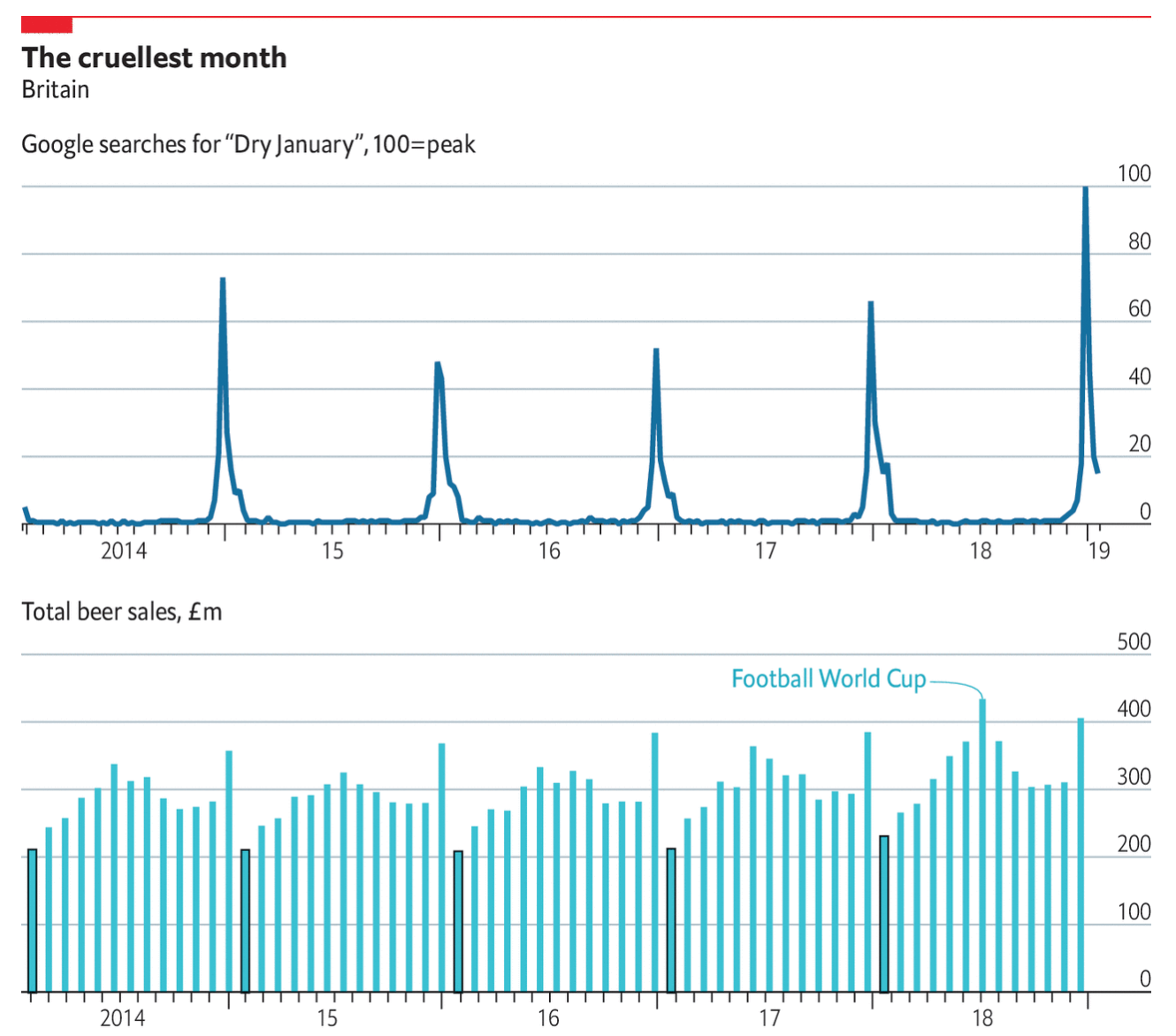
January has ended, and with it for, apparently, a very few Britons, Dry January. The Economist looked at alcohol consumption, using a proxy of beer sales, and compared that against the number of times people searched for “Dry January” on Google.

What I really like about this chart is that it does not try to combine the two series into one. Instead, by keeping the series separate on different plots, the reader can clearly examine the trends in both searches and consumption.
You also run into the problem of how to overlay two different scales. By placing one line atop the other, the user might implicitly understand that as higher or better than the lower series when, one, that may not be true. Or, two, the scales are so different they prevent the direct comparison the chart would otherwise imply as possible.
Here, the designers rightly chose to separate the two plots, and then highlighted the month of January. (I also enjoy the annotation of the World Cup.) I might have gone so far as to further limit the palette and make both series the same colour, but I understand the decision to make them distinct.
But, overall, as the piece points out, drinking in Britain seems to correlate to the weather/temperature. People go out to the pubs more on warmer days than colder. But regardless of any post-holiday hangover, they still consumer beer in January.
I’ll drink to that.
Credit for the piece goes to the Economist Data Team.
Leave a Reply
You must be logged in to post a comment.