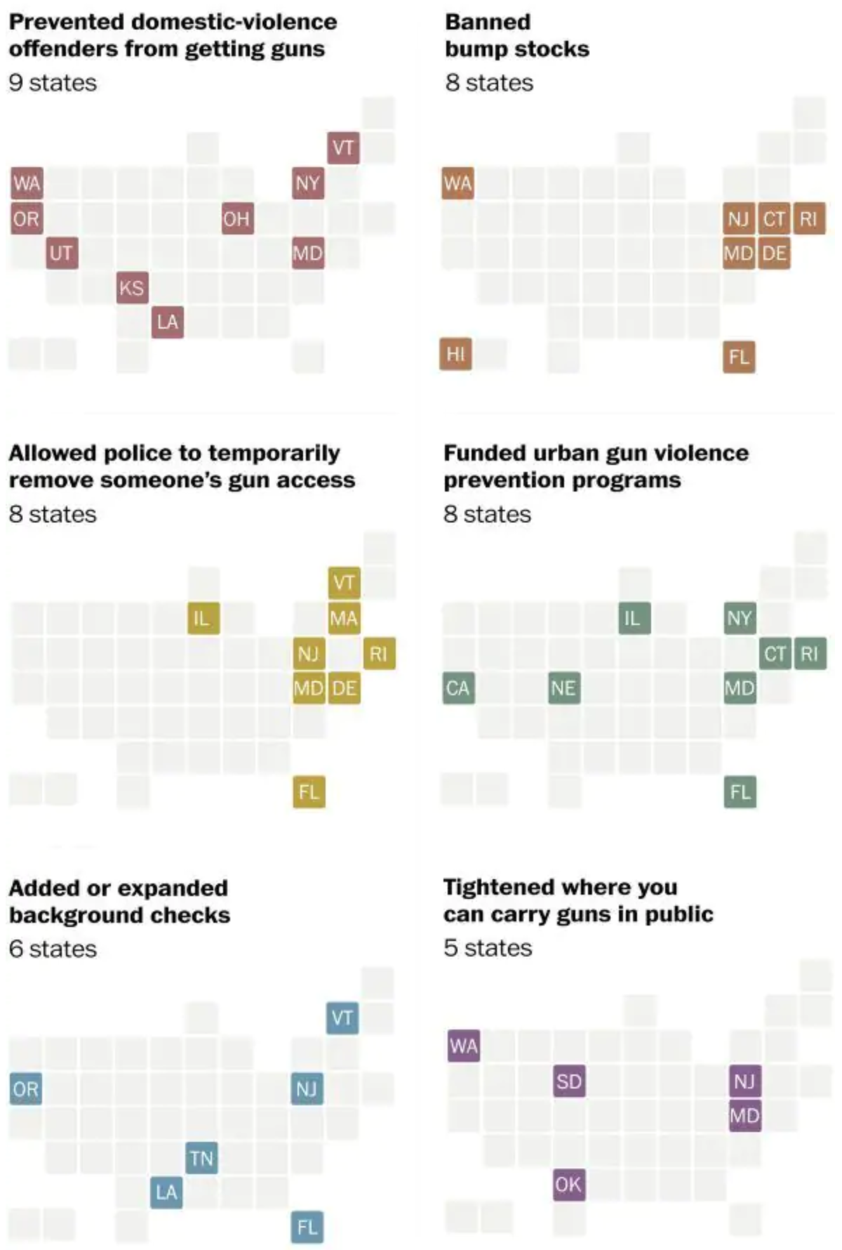
A few months ago I covered an editorial piece from the New York Times that looked at all the action, by which I mean inaction, the federal government had taken on gun violence in the wake of some horrific shootings. Well on Saturday the Washington Post published an article looking at how there has been action on the state level.

It used a series of small multiple maps of the United States with states represented as tiles or boxes. States are coloured by whether they took action in one of six different categories. It is a pretty simple and straightforward design that works well.
The only thing I am unsure about is whether the colours are necessary. A single colour could be used effectively given that each map has a clear title directly above it. Now, if the dataset were to be used in another chart or graphic alongside the maps where the types of action were combined, then colours could be justified. For example, if there was a way to see what actions a state had taken, i.e. pivot the data display, the different colours could show what from the set the state had done.
And in Pennsylvania’s case, sadly, that is nothing.
Credit for the piece goes to Amber Phillips.
