The Wall Street Journal put together a nice piece about the uptick in elementary school shootings, both in the number of shootings and the number of deaths. It used two bar charts, regular and stacked, and a heat map to tell the story. The screenshot below is from a graphic that looks at the proportion of school shootings that occur at elementary schools. They are not as common, but as other graphics in the article show, they can be quite deadly.
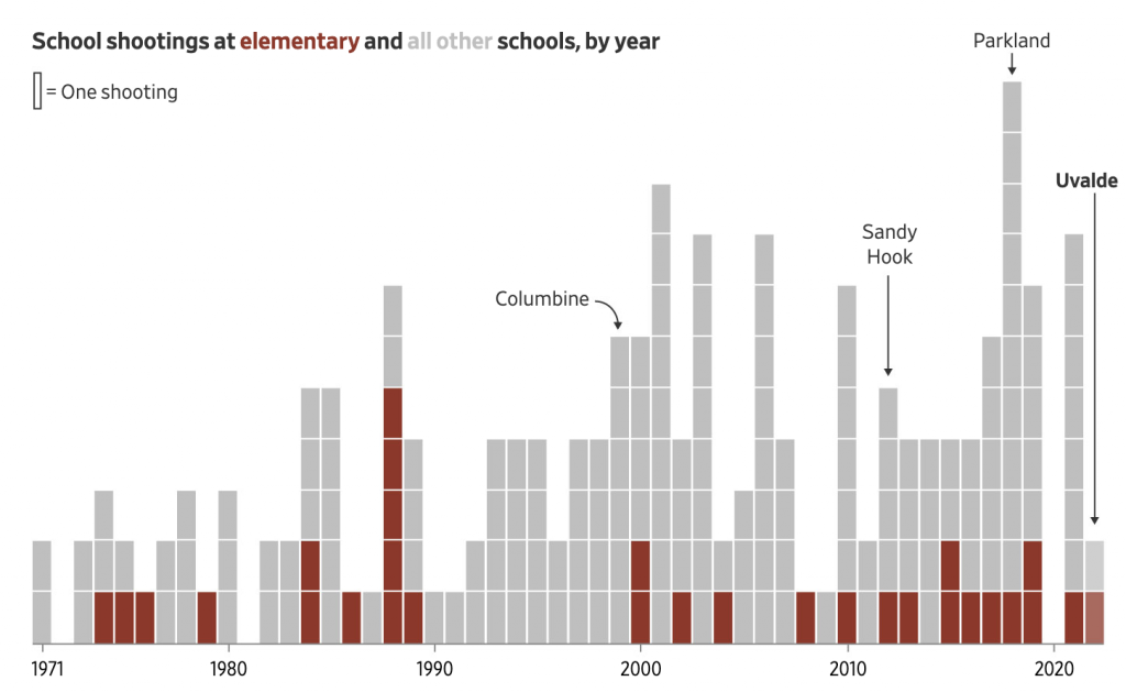
The graphic above does a nice job of distilling the horror of a tragedy into a single rectangle. That is an important task because it allows us to detach ourselves and more rationally analyse the situation. Unfortunately the analysis is that yes, Virginia, things really have been getting worse.
Overall the article is simple but soberingly effective. School shootings are a problem with which American society has not dealt and my cynical side believes with which we will continue to not deal.
Credit for the piece goes to James Benedict and Danny Dougherty.