A few weeks ago here in the United States, we had the mass shootings in El Paso, Texas and Dayton, Ohio. The Washington Post put together a piece looking at how mass shootings have changed since 1966. And unfortunately one of the key takeaways is that since 1999 they are far too common.
The biggest graphic from the article is its timeline.
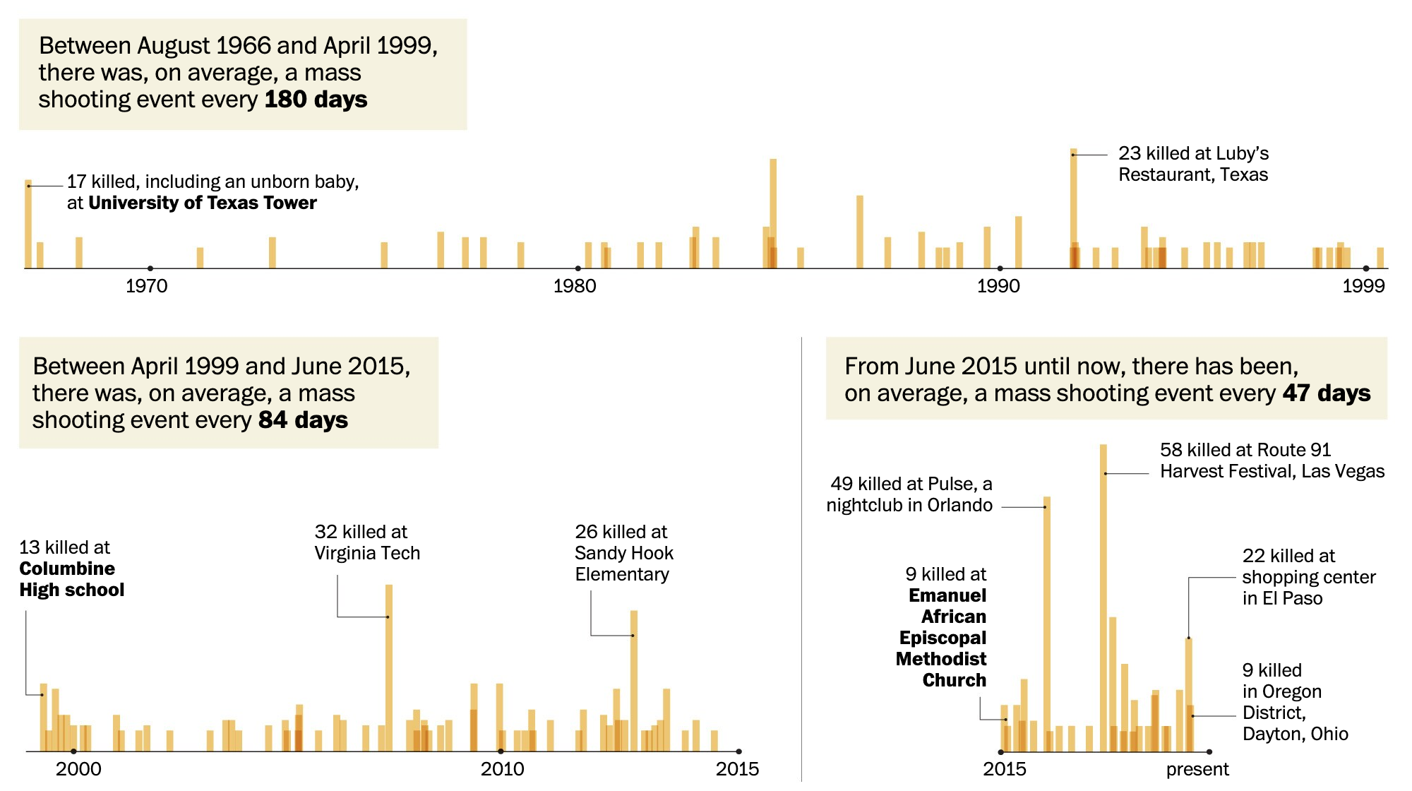
It captures the total number of people killed per event. But, it also breaks down the shootings by admittedly arbitrary time periods. Here it looks at three distinct ones. The first begins at the beginning of the dataset: 1966. The second begins with Columbine High School in 1999, when two high school teenagers killed 13 fellow students. Then the third begins with the killing of 9 worshippers in a African Episcopal Methodist church in Charlestown, South Carolina.
Within each time period, the peaks become more extreme, and they occur more frequently. The beige boxes do a good job of calling out just how frequently they occur. And then the annotations call out the unfortunate historic events where record numbers of people were killed.
The above is a screenshot of a digital presentation. However, I hope the print piece did a full-page printing of the timeline and showed the entire timeline in sequence. Here, the timeline is chopped up into two separate lines. I like how the thin grey rule breaks the second from the third segment. But the reader loses the vertical comparison of the bars in the first segment to those in the second and third.
Later on in the graphic, the article uses a dot plot to examine the age of the mass shooters. There it could have perhaps used smaller dots that did not feature as much overlap. Or a histogram could have been useful as infrequently used type of chart.
Lastly it uses small multiples of line charts to show the change in frequency of particular types of locations.
Overall it’s a solid piece. But the timeline is its jewel. Unfortunately, I will end up talking about similar graphics about mass shootings far too soon in the future.
Credit for the piece goes to Bonnie Berkowitz, Adrian Blanco, Brittany Renee Mayes, Klara Auerbach, and Danielle Rindler.
Leave a Reply
You must be logged in to post a comment.