One Million Covid-19 Deaths

This past weekend the United States surpassed one million deaths due to Covid-19. To put that in other terms, imagine the entire city of San Jose, California simply dead. Or just a little bit more than the entire city of Austin, Texas. Estimates place the number of those infected at about 80 million. Back of the envelope maths puts that fatality rate at 1.25%. That’s certainly lower than earlier versions of the virus, which has evolved to be more transmissible, but thankfully less lethal than its original form.

Sunday morning I opened the door to my flat and found the Sunday edition of the New York Times waiting for me with a sobering graphic not just above the fold, nor across the front page. No, the graphic—a map where each dot represents one Covid-19 death—wrapped around the entire paper.

Above the fold
Full page
Full spread

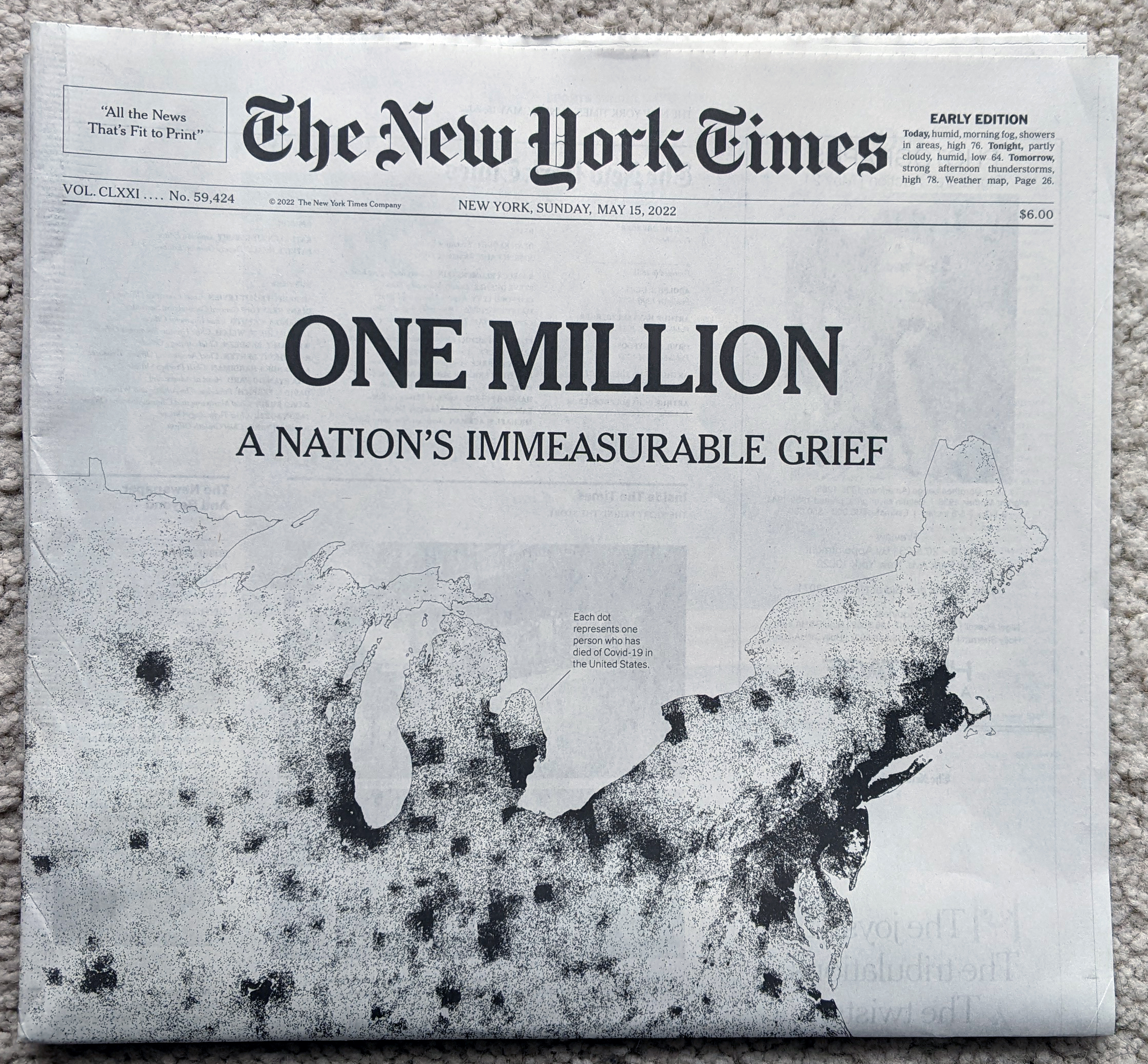
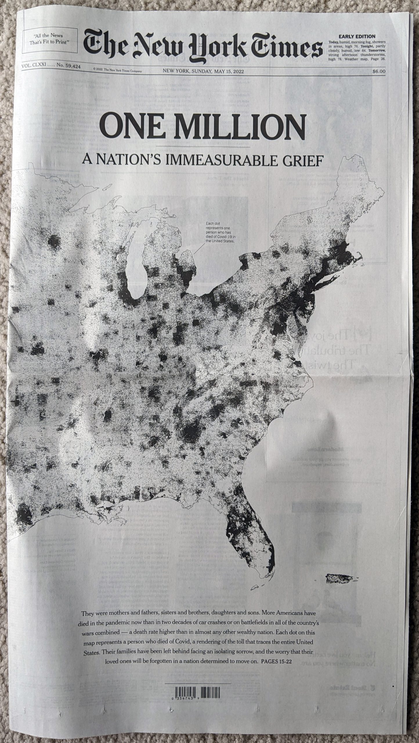
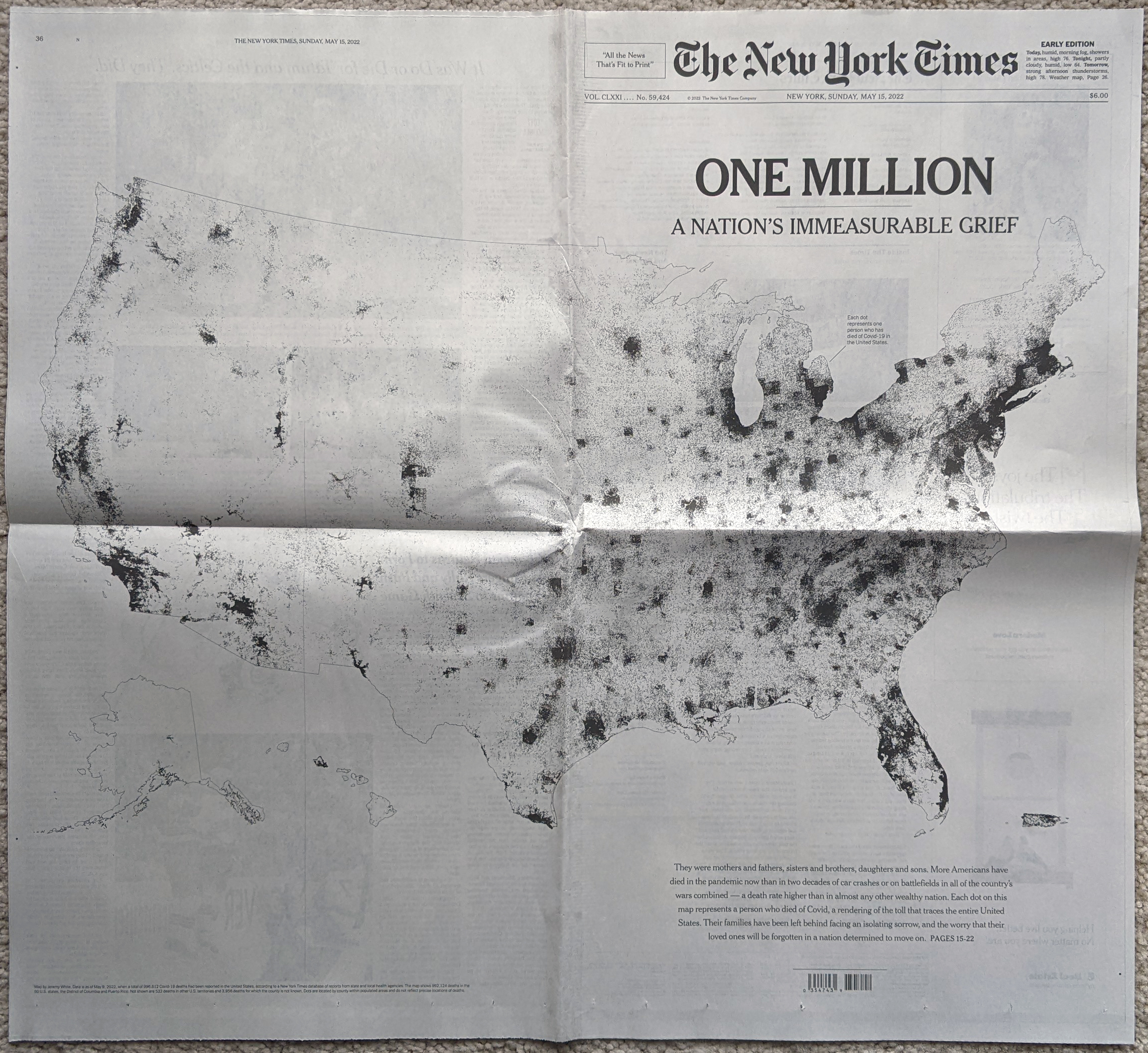
You don’t need to do much more here. Black and white colour sets the tone simply enough. Of course, a bit more critically, these maps mask one of the big issues with the geographic spread of not just this virus but many other things: relatively few people live west of the Mississippi River.

Enormous swathes of the plains and Rocky Mountains have but few farmers and ranchers living there. Most of the nation’s populous cities are along the coast, particularly the East Coast, or along rivers or somewhat arbitrary transport hubs. You can see those because this map does not actually plot the locations of individual deaths, but rather fills county borders with dots to represent the deaths that occurred within those limits. That’s why, particularly west of the Mississippi, you see square-shaped concentrations of deaths.

A choropleth map that explores deaths per capita, that is after adjusting for population, shows a different story. (This screenshot comes from the New York Times‘ data centre for Covid-19.

A somewhat different story

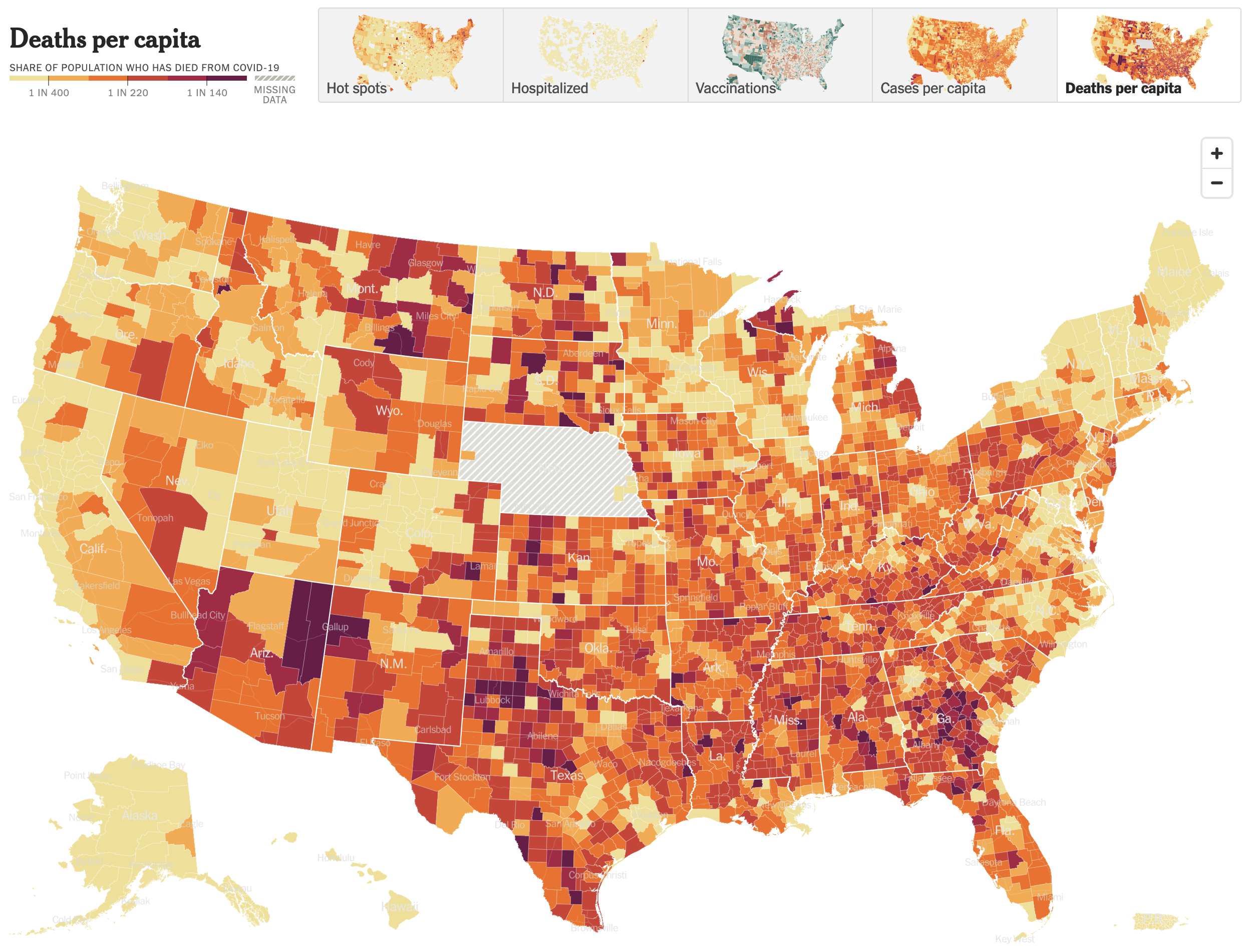
The story here is literally less black and white as here we see colours in yellows to deep burnt crimsons. Whilst the big map yesterday morning concentrated deaths in the Northeast, West Coast, and around Chicago we see here that, relative to the counties’ populations, those same areas fared much better than counties in the plains, Midwest, and Deep South.

A quick scan of the Northeast and Mid-Atlantic states shows that only one county, Juniata in Pennsylvania, fell into the two worst deaths per capita bins—the deeper reds. Juniata County sits squarely in the middle of Pennsyltucky or Trumpsylvania, where Covid countermeasures were not terribly popular. No other county in the region shares that deep red.

Look to the southeast and south, however, and you see lots of deep and burnt crimsons dotting the landscape. This doesn’t mean people didn’t die in the Northeast, because of course they did. Rather, a greater percentage of the population died elsewhere when, as the policies enacted by the Northeast and West Coast show, they didn’t need to.

After all, injecting bleach was never a good idea.

Credit for the piece goes to Jeremy White.

Black Holes and Revelations: Remastered

Two years ago I posted about how the Event Horizon Telescope Collaboration managed to take the first photograph of a black hole, in particular a supermassive black hole at the centre of the M87 galaxy, one of those galaxies far, far away that we see at a long time ago.

This morning, the same group of scientists released the first photograph of Sagittarius A*, the supermassive black hole at the centre of our very own Milky Way Galaxy. The BBC article I read this morning included the photo of the black hole, which you should definitely check out because of its importance in the history of astronomy. But, for our purposes here on Coffeespoons, I wanted to look at the diagram the designers at the BBC made to explain the photograph.

So cool.

The designer used some simple white lines with a thicker stroke for the axis and defining features and a thinner line to point to elements of the photo. In particular I like the dotted line for the black hole, because there is no real way to photograph the hole itself since it consumes all the light we would need to image it. Instead, we photograph the “black hole” at the centre of the accretion disk, all the super heated gas and matter slowly swirling around and collapsing into the singularity. We also get two axes to show the size of the ring and that of the black hole itself. The ring measures a diameter of about 63 million kilometres. The distance from the Sun to Mercury, the closest planet to our Sun, is 58 million kilometres.

Supermassive indeed.

Well done, science. Well done.

Credit for the piece goes to the graphics team at the BBC.

Political Hatch Jobs

Earlier this week I read an article in the Philadelphia Inquirer about the political prospects of some of the candidates for the open US Senate seat for Pennsylvania, for which I and many others will be voting come November. But before I get to vote on a candidate, members of the political parties first get to choose whom they want on the ballot. (In Pennsylvania, independent voters like myself are ineligible to vote in party primaries.)

This year the Republican Party has several candidates running and one of them you may have heard of: Dr. Oz. Yeah, the one from television. And while he is indeed the front runner, he is not in front by much as the article explains. Indeed, the race largely had been a two-person contest between Oz and David McCormick until recently when Kathy Barnette pulled just about even with the two.

In fact, according to a recent poll the three candidates are all statistically tied in that they all fall within the margin of error for victory. And that brings us to the graphic from the article.

It would be funny to see a candidate finish with negative vote share.

Conceptually this is a pretty simple bar chart with the bar representing the share of the support of those polled. But I wanted to point out how the designer chose to represent the margin of error via hatched shading to both sides of the ends of the red bar.

In some cases the hatch job does not work for me, particularly with those smaller candidates where the bar goes negative. I would have grave reservations about the vote should any candidate win a negative share of the vote. 0% perhaps, but negative? No. I also don’t think the grey hatching works as well over the grey bar in particular and to a lesser degree the red.

I have often thought that these sorts of charts should use some kind of box plot approach. So this morning I took the chart above and reworked it.

Now with box plots.

Overall, however, I really like this designer’s approach. We should not fear subtlety and nuance, and margins of error are just that. After all, we need not go back too far in time to remember a certain candidate who thought she had a presidential election locked up when really her opponent was within the margin of error.

Credit for the piece goes to John Duchneskie.

All the Colours, All the Space

Everyone knows inflation is a thing. If not, when was the last time you went shopping? Last week the Boston Globe looked specifically at children’s shoes. I don’t have kids, but I can imagine how a rapidly growing miniature human requires numerous pairs of shoes and frequently. The article explores some of the factors going into the high price of shoes and uses, not very surprisingly, some line charts to show prices for components and the final product over time. But the piece also contains a few bar charts and that’s what I’d like to briefly discuss today, starting with the screenshot below.

What is going on here?

What we see here are a list of countries and the share of production for select inputs—leather, rubber, and textiles—in 2020. At the top we have a button that allows the user to toggle between the two and a little movement of the bars provides the transition. The length of the bar encodes the country in question’s market share for the selected material.

We also have all this colour, but what is it doing? What data point does the colour encode? Initially I thought perhaps geographic regions, but then you have the US and Mexico, or Italy and Russia, or Argentina and Brazil, all pairs of countries in the same geographic regions and yet all coloured differently. Colour encodes nothing and thus becomes a visual distraction that adds confusion.

Then we have the white spaces between the bars. The gap between bars is there because the country labels attach to the top of the bars. But, especially for the top of the chart, the labels are small and the gap is at just the right height such that the white spaces become white bars competing with the coloured bars for visual attention.

The spaces and the colours muddy the picture of what the data is trying to show. How do we know this? Because later in the article we get this chart.

Ahh, much better. Much clearer.

This works much better. The focus is on the bars, the labelling is clear, almost nothing else competes visually with the data. I have a few quibbles with this design as well, but it’s certainly an improvement over the earlier screenshot we discussed. (I should note that this graphic, as it does here, also comes after the earlier graphic.)

My biggest issue is that when I first look at the piece, I want to see it sorted, say greatest to least. In other words, Furniture and bedding sits at the top with its 15.8% increase, year-on-year, and then Alcoholic beverages last at 3.7%. The issue here, however, is that we are not necessarily looking at goods at the same hierarchical level.

The top of the list is pretty easy to consider: food, new vehicles, alcoholic beverages, shelter, furniture and bedding, and appliances. We can look at all those together. But then we have All apparel. And then immediately after that we have Men’s, Women’s, Boys’ , Girls’, and Infants’ and toddlers’ apparel. In other words, we are now looking at a subset of All apparel. All apparel is at the same level of Food or Shelter, but Men’s apparel is not.

At that point we would need to differentiate between the two, whilst also grouping them together, because the range of values for those different sub-apparel groups comprise the aggregate value for All apparel. And showing them all next to Food is not an apples-to-apples comparison.

If I were to sort these, I would sort by from greatest to least by the parent group and then immediately beneath the parent I would display the children. To differentiate between parent-level and children-level, I would probably make the bars shorter in the vertical and then address the different levels typographically with the labels, maybe with smaller type or by putting the children in italic.

Finally, again, whilst this is a massive improvement over the earlier graphic, I’d make one more addition, an addition that would also help the first graphic. As we are talking about inflation year-on-year, we can see how much greater costs are from Furniture and bedding to Alcoholic beverages and that very much is part of the story. But what is the inflation rate overall?

According to the Bureau of Labour Statistics, inflation over that period was 8.5%. In other words, a number of the categories above actually saw price increases less than the average inflation rate—that’s good—even though they were probably higher than increases had been prior to the pandemic—that’s bad. But, more importantly for this story, with the addition of a benchmark line running vertically at 8.5%, we could see how almost all apparel and footwear child-level line items were below the inflation rate. But the children and infant level items far exceeded that benchmark line, hence the point of the article. I made a quick edit to the screenshot to show how that could work in theory.

To the right, not so good.

Overall, an interesting article worth reading, but it contained one graphic in need of some additional work and then a second that, with a few improvements, would have been a better fit for the article’s story.

Credit for the piece goes to Daigo Fujiwara.

Madagascar

Well we made it through the week. Yesterday we looked at plate tectonics and the future shape of the world. So today it’s time to look at a map recently made by xkcd. Specifically it looks at the world through the lens of Madagascar.

Now try to roll it up onto a sphere.

Greenland isn’t as big as it looks on Google Maps. So this piece fixes that by placing Madagascar in its place.

Credit for the piece goes to Randall Munroe.

The Continents Will Fall Off the Flat Earth

To be clear, we know the Earth is round. At least most people know that. Some people delude themselves. We also know that sitting atop the mantle we have plates of rock that move around. Sometimes they slip underneath others. Other times they collide and crumple. Plate tectonics explain why there are so many similarities between continents separated by an ocean.

But while that explains historical connections, what does it say about the future? The fact is that we don’t know for certain. Luckily a recent BBC article explored four different scenarios. And they included graphics, here’s a screenshot of one of them.

They called this scenario Aurica

The graphics are pretty simple with green continents and blue oceans. But they work really well for showing the scenarios. The maps also include black lines for subduction zones, i.e. lines along which the plates that define the ocean floor, and the white lines represent mid-ocean ridges. Those are where the ocean plates diverge and in the process create new ocean floor. The designers also included some labels to help the audience understand just what green shape came from today’s continents.

Credit for the piece goes to the BBC graphics department.

The Potential Impacts of Throwing Out Roe v Wade

Spoiler: they are significant.

Last night we had breaking news on two very big fronts. The first is that somebody inside the Supreme Court leaked an entire draft of the majority opinion, written by Justice Alito, to Politico. Leaks from inside the Supreme Court, whilst they do happen, are extremely rare. This alone is big news.

But let’s not bury the lede, the majority opinion is to throw out Roe v. Wade in its entirety. For those not familiar, perhaps especially those of you who read me from abroad, Roe v Wade is the name of a court case that went before the United States Supreme Court in 1971 and was decided in 1973. It established the woman’s right to an abortion as constitutionally protected, allowing states to enact some regulations to balance out the state’s role in concern for women’s public health and the health of the fetus as it nears birth. Regardless of how you feel about the issue—and people have very strong feelings about it—that’s largely been the law of the United States for half a century.

Until now.

To be fair, the draft opinion is just that, a draft. And the supposed 5-3 vote—Chief Justice Roberts is reportedly undecided, but against the wholesale overthrow of Roe—could well change. But let’s be real, it won’t. And even if Roberts votes against the majority he would only make the outcome 5-4. In other words, it looks like at some point this summer, probably June or July, tens of millions of American women will lose access to reproductive healthcare.

And to the point of this post, what will that mean for women?

This article by Grid runs down some of the numbers, starting with laying out the numbers on who chooses to have abortions. And then ultimately getting to this map that I screenshot.

That’s pretty long distances in the south…

The map shows how far women in a state would need to travel for an abortion with Roe active as law and without. I’ve used the toggle to show without. Women in the south in particular will need to travel quite far. The article further breaks out distances today with more granularity to paint the picture of “abortion deserts” where women have to travel sometimes well over 200 miles to have a safe, legal abortion.

I am certain that we will be returning to this topic frequently in coming months, unfortunately.

Credit for the piece goes to Alex Leeds Matthews.

The Pandemic’s Influence on Home Design

I took last week off for the Orthodox Easter holiday. But I am back now. For some of the time I was away, I stayed at an old stone farmhouse that the owners renovated into a short-term rental. That made me think about what I would want or need in my own space. Of course the pandemic has changed much of both where we work and live. For many of us the two overlap significantly.

This article from Axios detailed some of the findings from a survey that investigated how the pandemic changed the wants and needs of homeowners and homebuyers. Using the survey’s findings, an architectural firm designed a concept home embodying those changes and that’s what this screenshot captures.

That’s a big home.

It’s pretty straightforward as far as graphics go. We have a flat two-dimensional floor plan of what the architects called the Barnaby. The graphic does a nice job of keeping the furniture and fixings in white and then using colour to indicate the flooring options, hardwood of course.

If you want to read more about the house itself, in addition to the article the company behind the design has a site about the house itself.

But it’s definitely not an old stone farmhouse.

Credit for the piece goes to Garman Homes.

Waiting for the Family Tree

I spent the past weekend in Harrisburg, Pennsylvania on a brief holiday to go watch some minor league baseball. That explains the lack of posting the last few days. (Housekeeping note, this coming weekend is Orthodox Easter, so I’ll be on holiday for that as well.)

Whilst in Harrisburg I did other things besides watch baseball because minor league games are so much faster now. (Maybe more on that in another post.) So after a Sunday afternoon match, I grabbed my camera and went for a walk about town. Mostly I photographed buildings and things, but at one point I came upon a gentleman sitting reading a paper on a bench.

Except it wasn’t a person; it was a statue.

Entitled “Waiting”, the statue portrays a bespectacled man reading a newspaper with a briefcase and an upturned brimmed hat sitting neatly atop said briefcase. (I’d show you the photo, but it’s still on my camera waiting to be downloaded.)

I was curious what the man was reading. Was it relevant? Did it say something important? Or was it lorem ipsum or placeholder text?

As it turned out, the paper told the story of a founding family of Harrisburg via article headlines. But on the front page, we had a nice little family tree diagram. And that’s what makes this anecdote germane to this blog.

But what does it say?!

I cannot read the specific details, nor did I want to. The paper was angled downwards, light was fading as the sun was setting, and this was backlit enough already.

The sculpture dates from 1992, making that headline the most recent article. From that, I will probably be able to do some of my own research and create my own version of that family tree, because I could not read it and now I’m curious. But what appears to be happening is primarily the ancestors of one line of one person’s—this gentleman’s?—parents. But critiquing it further is complicated by the illegibility of the chart.

Of course I should point out that the point was probably not a legible genealogical descent chart, but rather to in a quick visual show the person in particular comes from a long line of people, presumably public servants all or most.

Credit for the piece goes to the sculptor, Seward J. Johnson Jr.