Onwards and Upwards

Yesterday SpaceX launched the Falcon Heavy rocket on its maiden voyage, and then recaptured several, though not all, of its reusable rockets. The Falcon Heavy represents the most powerful rocket available to mankind today, though NASA’s Saturn V of the Apollo programme era was considerably more powerful. That was all the stuff you could read in the news yesterday and today.

But how much more powerful? Thankfully we have the Economist who put together a nice graphic detailing not just the standard size comparisons of the Falcon series to the Saturn V and other famous rocket systems, e.g. the Space Shuttle and its boosters. The Economist graphic also adds information about the payload capabilities and timeframes for either historical operation or expected service dates.

It's big and powerful, but SpaceX still has a long way to go…
It’s big and powerful, but SpaceX still has a long way to go…

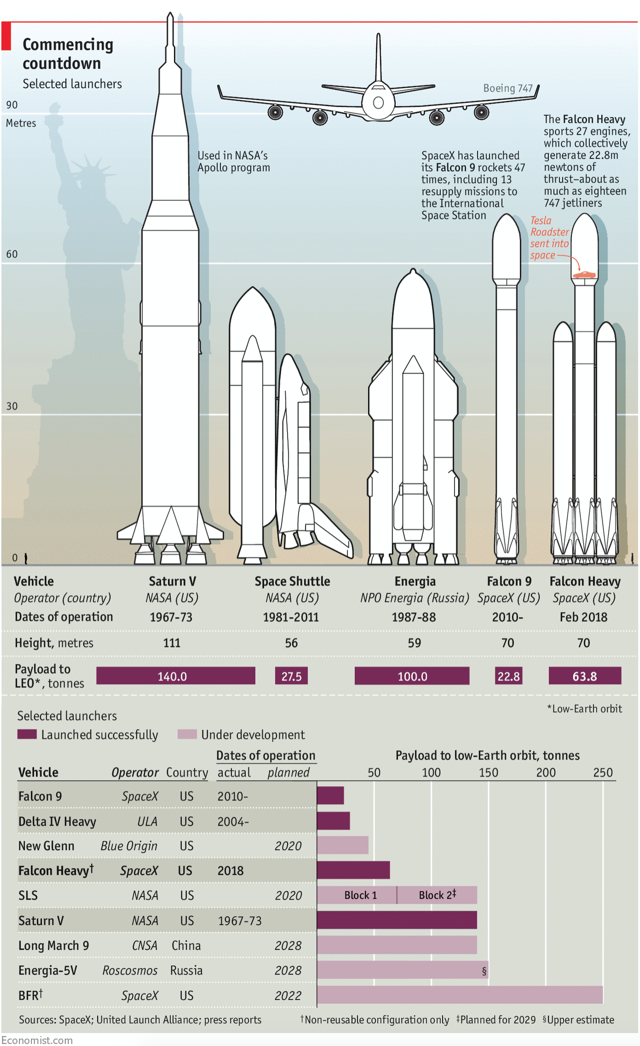
From the illustrative side, there were three really nice touches. First, the faint Statue of Liberty to give the rocket height context to famous landmark buildings. Two, the little human figure on the left-hand side to give context to ourselves, these things are big. Three, the ridiculousness of the Saturn V is captured by having its peak break the top frame of the chrome or graphic device, i.e. the red bar, standard on Economist graphics.

Overall a solid piece. (Yes, I know these are liquid fueled.)

Credit for the piece goes to the Economist’s graphics team.

The World Grows On

January is the month of forecasts and projections for the year to come. And the Economist is no different. Late last week it published a datagraphic showcasing the GDP growth forecasts of the Economist Intelligence Unit. I used to make this exact type of datagraphic a lot. And I mean a lot. But what I really enjoy is how successfully this piece integrates the map, the bar chart, and the tables to round out the story.

Take a note at how the chart distributes the bins as well

The easy thing to do is always the map, because people like maps. They can be big, and if the data set is robust, full of data and colour. But maps hide and obscure geographically small countries. And then you have to assume that people know all the countries in the world. Problem is, most people do not.

So the bar chart does a good job of showing each country as equals, a slim vertical bar. In such a small space, labelling every country is impossible, but the designers chose a select number of countries that might be of interest and called them out across the entire series.

Lastly, people always like to know who is #winning and who is a #loser. So the tables at the extreme ends of the chart showcast the top and last five.

I may have rearranged some of the elements, and dropped the heavy black rules between the bins on the legend, but overall I consider this piece a success.

Credit for the piece goes to the Economist Data Team.

So Much for Jamaica, (Ger)Man

Last week we saw a lot of news break, and then here at Coffeespoons we had the usual American Thanksgiving holiday with which to contend. So now that things are creeping back to a new normal, let us dive back into some of the things we missed.

How about those German coalition government talks?

Remember two months ago when we looked at Die Welt and the German election results? Well it turns out that the FDP, the liberal (in the more classical sense that makes them more centre-right) Free Democrats, have walked away from coalition talks with Chancellor Angela Merkel’s CDU/CSU party (it’s actually two separate parties that have an alliance) and the Green Party. That leaves Merkel with the the Social Democrats as the only other option to form a majority government. (She could attempt to hold a minority government, but from her own statements that appears unlikely.) But the Social Democrats do not appear too keen on joining up in a grand coalition.

So where does Germany stand? Well thankfully the Economist put together a short article with a few graphics to help show just how tricky putting together a new coalition government will be.

Crossing the finish line…

In terms of design, there is not too much to stay here. The colours are determined by the colours used by the political parties. And the 50% vote threshold is a common, but very useful and workable, convention. The only thing I may have done to emphasise the lack of change in the polling data is a line chart to show the percentage point movement or lack thereof.

Credit for the piece goes to the Economist Data Team.

Trumping (Most) All on Twitter

Initially I wanted today’s piece to be coverage of the apparent coup d’état in Zimbabwe over night. But while I have found some coverage of the event, I have not yet seen a single graphic trying to explain what happened. Maybe if I have time…

In the meantime, we have the Economist with a short little piece about Trump on Twitter and how he has bested his rivals. Well, most of them at least.

Trumping one's rivals
Trumping one’s rivals

The piece uses a nice set of small multiples to compare Trump’s number of followers to those of his rivals. The multiples come into play as the rivals are segmented into three groups: political, sport, and media. (Or is that fake media?)

Small multiples of course prevent spaghetti charts from developing, and you can easily see how that would have occurred had this been one chart. But I like the use of the reddish-orange line for Trump being the consistent line throughout each. And because the colour was consistent, the labelling could disappear after identifying the data series in the first chart.

And worth calling out too the attention to detail. Look at the line breaks in the chart for the labelling of Fox News and NBA. It prevents the line from interfering with and hindering the legibility of the type. Again, a very small point, but one that goes a long way towards helping the reader.

I think the only thing that could have made this a really standout, stellar piece of work is the inclusion of another referenced data series: the followers of Barack Obama. At 97 million followers, Obama dwarfs Trump’s 42.2 million. Would it not be fantastic to see that line soaring upwards, but cutting away towards the side of the graphic would be the text block of the article continuing on? Probably easier for them to do in their print edition.

Regardless, this is another example of doing solid work at small scale. (Because small multiples, get it?)

Credit for the piece goes to the Economist Data Team.

Phillip’s Curves are Flatlining

I’ve worked on a few scatter plots of late and so this piece from the Economist grabbed my attention. It examines the correlation between unemployment rates and inflation rates. Broadly speaking, the theory has been that low unemployment rates lead to high inflation rates. But the United States has had low unemployment rates now for a few years, but inflation is around that ideal 2% realm. This theory is called the Phillips Curve.

Straightening out the curve…

The graphic does a nice job of showing three data series all in one plot. Normally, I would argue for splitting the chart into three smaller plots, a la the small multiples. But here, the data aligns just well enough that the overlapping is minimal. And smart colour choices mean that each data range appears clearly separate from the rest. A nice thoughtful addition is the annotations to the time period are set in the same colour as the dots themselves.

My only two quibbles: One, I would probably increase the height of the chart to better show the trend line. I find that for scatter plots, a more squarish profile works better than the long rectangle. Overall, though, a really well done chart. Second, I would consider adding a zero line to the x-axis to show 0% cyclical unemployment. But that might also not be terribly useful, because you can see how the curve should move regardless of that natural line.

Full disclosure: the Economist article cites a paper from the Philadelphia Fed Research Department, which employs me.

Credit for the piece goes to the Economist Data Team.

Murder Rates in the US

Yesterday we looked at an article about exporting guns from one state to another. After writing the article I sat down and recalled that the copy of the Economist sitting by the sofa had a small multiple chart looking at murders in a select set of US cities. It turns out that while there was a spike, it appears that lately the murder rate has been flat.

Chicago is higher than Philly, to be fair

It’s a solid chart that does its job well. That is probably why I neglected to mention it until I realised it fit in with the map of Illinois and talk about gun crimes yesterday. Because there is plenty of other news through data visualisation that we can talk about this week.

Credit for the piece goes to the Economist Data Team.

Speaking Freely About Free Speech

Last week the Economist published an article looking at the attitudes of the young at university in the United States. The examination was sparked by the recent-ish waves of news about stifled speech on campuses. Thankfully, we have a long-running survey from those on the ground in our universities and it reveals some interesting facts. You should head on over to the article if you want the full set, but in general, to perhaps nobody’s surprise, the media is exaggerating the confrontations we have seen.

You said what?
You said what?

My only quibble with the graphic is the height of the small multiples. I probably would have increased the height a little bit to allow any real fluctuations over the years to show more readily. But, for all I know, that could have been a limitation of the space in which the designers had to work, i.e. converting a print graphic to work on their blog.

Credit for the piece goes to the Economist’s Data Team.

The Middle Income Trap?

Last week I covered a lot of Red Sox data. And your feedback has been fantastic. I think you can look forward to more visualisation of sportsball data. But since this is not a sports blog, let us dive back into some other topics. Like today’s piece on economic growth.

It comes from the Economist and explores the development history of national economies relative to that of the United States. The point of the chart was to illustrate what the researchers determined was the middle income trap, a space in which countries develop and become semi-rich, but then can never quite escape.

It's a trap! (Unless it isn't.)
It’s a trap! (Unless it isn’t.)

The Economist makes the point that the definition of middle income matters. The range is enormous and one statistic says that it could take 48 years to graduate at a healthy rate of economic growth. I wonder is this bit, however, could also have been charted. The show don’t tell mantra works well here for setting up the problem, but a chart or two showing that exact range could have supplemented the text and perhaps made it more digestible.

Credit for the piece goes to the Economist Data Team.

How Bad is the Rohingya Crisis?

Pretty bad.

Less than a week after posting about the satellite views showing entire villages razed to the ground, we have a piece from the Economist looking at refugee outflows. And they are worse than the outflow of refugees during the Rwandan genocide back in 1994.

To be clear, they are not saying that nearly a million people have been killed—though there is quite a bit of evidence to say the Burmese security forces are cleansing the state of Rakhine of one of its primary ethnic groups.

That is a lot of people fleeing Burma

But when it comes to the chart, I am not quite sure what I feel about it. It uses both the x and y axis to show the impact of the refugee outflow. But the problem is that we are generally rubbish at comparing areas. Compounding that, we have the total number of refugees represented by circles, another notorious way of displaying areas. (Often people will confuse the circle’s area with its radius or diameter and get the scale wrong.)

I wonder, would a more straight forward display that broke the dataset into two charts would be clearer? What if the designers had kept the Marimekko-like outflow display, but represented each crisis and its total outflow as a straight bar chart to the right of the timeline? (I do think the timeline is particularly good context, especially since it highlights the earlier persecution of the Rohingya.)

Credit for the piece goes to the Economist’s Data Team.

Rising Tides, Rising Disasters?

One more day of Harvey-related content. At least I hope. (Who knows? Maybe someone will design a fantastic retrospective graphic?) Today, however, we look at a piece from the Economist about the rising number of weather-related disasters, but thankfully falling numbers of deaths. The piece has all the full suite of graphics: choropleths, line charts, and bar charts (oh my!). But I want to look at the bar chart.

A timeline of disaster causes around the world

I cannot tell from this chart whether there has been any change in the individual elements, the meteorological, hydrological, or climatological disasters. And unfortunately stacked bar charts do not let us see that kind of detail. They only really allow us to see total magnitude and the changes in the element at the bottom of the stack, i.e. aligned with the baseline. So I took their chart and drew the shapes as lines and realigned everything to get this.

My take
My take

You can begin to see that meteorological might be overtaking hydrological, but it is too early to tell. And that right now, climatological causes are still far behind the other two.

Credit for the piece goes to the Economist Data Team.

Credit for mine goes to me.