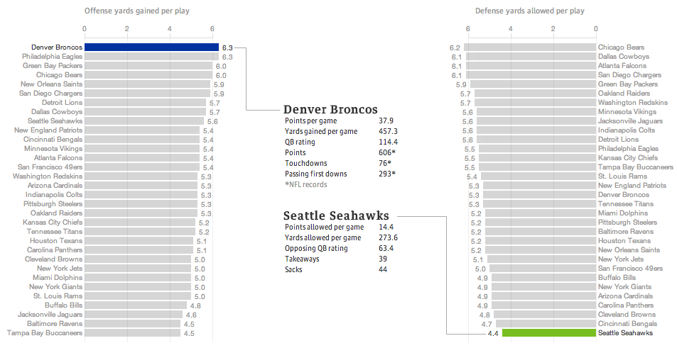
Last night the United States enjoyed a little (American, not rest-of-the-world) football match wherein two squadrons competed upon the pitch for the glory of their squadron colours. Thankfully for those of us who wanted a preview of the match on data’s terms, well, the Guardian put together a fantastic piece breaking down some of the numbers.
The Best Superbowl Match-up
The data is not terribly complicated—I still think baseball makes the most use of advanced metrics, though it helps they play more than 10 times as many games per season. The Guardian looked at yards gained or lost per play by the offence or defence, respectively. Click through the link to explore the other charting forms used, in particular the four quadrant scatter plot and the small multiples that follow. Also, a sophisticated and restrained colour palette allows the user to clearly understand when he or she is viewing the Denver–Seattle matchup or the historic match-ups of the NFL.
Regardless of the quality of the presentation, we shall see Monday morning—I am writing this Sunday afternoon—whether this piece will still hold with its talk of the best match-up ever.
And hey, for all this talk about the best offence, look at which squadron is ranked second. Fly, Eagles, fly.
Credit for the piece goes to the Guardian’s US Interactive Team.
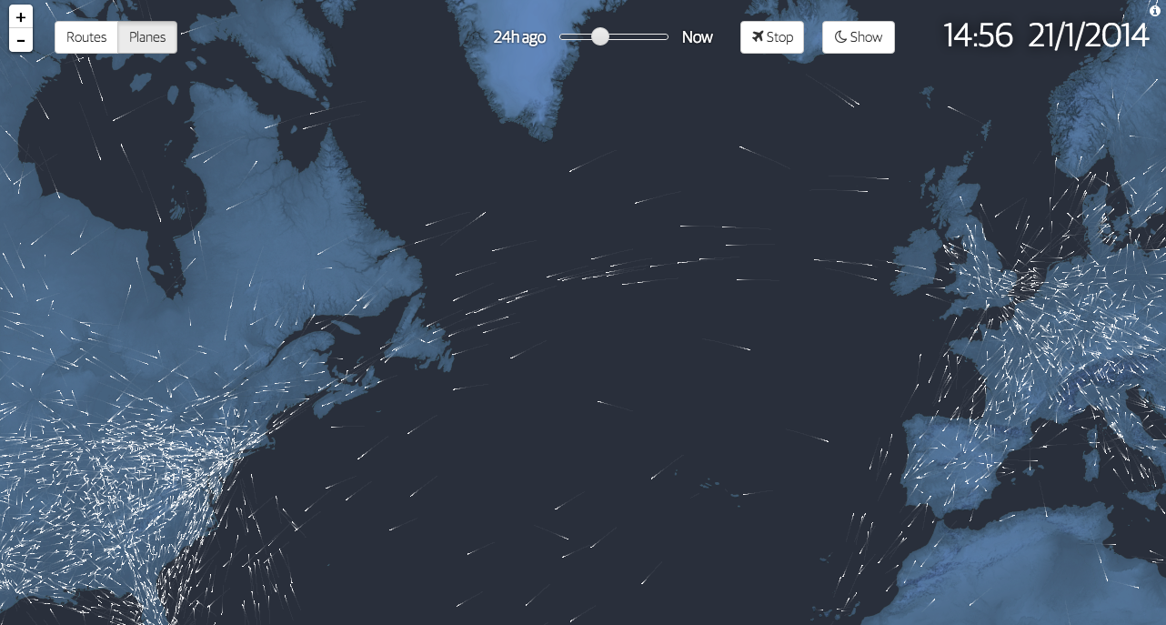
100 years ago we began to fly commercially. We moved beyond daredevil stunts and novelty and created air travel into a business. To commemorate the history, the Guardian commissioned this interactive graphic story to celebrate said history. It includes charts, narration, and near real-time data on actual flights mapped out as in the introductory element captured below.
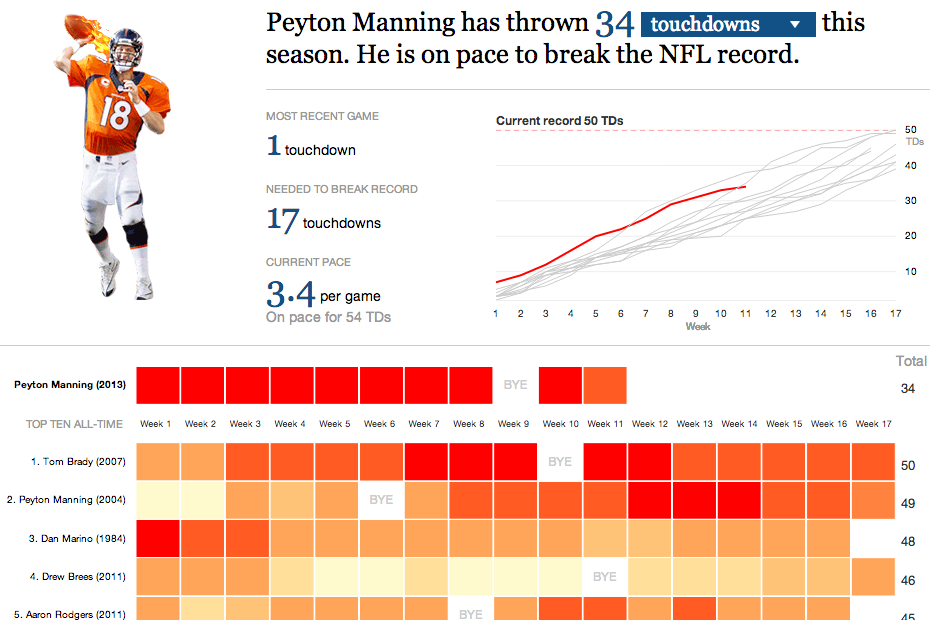
On Sunday night the Denver Broncos played the New England Patriots. The contest sported two of the game’s best quarterbacks: Tom Brady and Peyton Manning. This interactive graphic by the Guardian detailed how, in this season alone, Manning is putting up record numbers.
Comparing Manning’s stats
Credit for the graphic goes to the Guardian US interactive team.
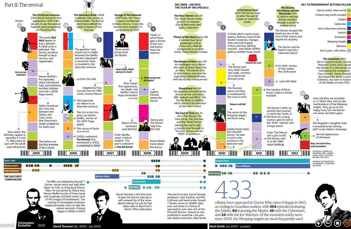
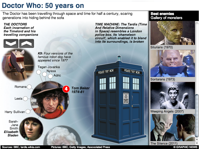
Doctor Who? Exactly. This weekend, Saturday in fact, is the 50th anniversary of British sci-fi show Doctor Who. That is not to say it has been airing for 50 years. In the 1990s and early 2000s the show was off the air, living on only in audio broadcasts and novelisations. But in 2005, the show was relaunched and it slowly began to acquire a new generation of followers. Some, like your author, have watched it in the States first via SyFy since 2006.
Still 50ish years of television about time travelling through space in a blue police box makes for lots of data. And so back in March Simon Rogers created this infographic to explain some of the history of the show.
The Guide to Doctor Who
If you intend on watching the 50th special this weekend—or Monday in some movie theatres here in the States—and you want to brush up on the timeline of the Doctor and his travelling companions, the Guardian also has this graphic.
The Guardian’s gallery of Doctors
But of course the BBC, which produces Doctor Who, has a more in-depth site about the history of the character and the show. Did I mention the content is displayed within the TARDIS? I know, it’s bigger on the inside.
The BBC’s inside the TARDIS
Have you ever watched the show? Do you have a favourite Doctor? A favourite companion?
Credit for the first Guardian piece goes to Simon Rogers.
Credit for the second Guardian piece goes to the Guardian’s Graphic News team.
Credit for the BBC piece goes to Christopher Ashton, Christine Jeavans, Helene Sears, Tian Yuan, Nick Davey, and Ben Fell.
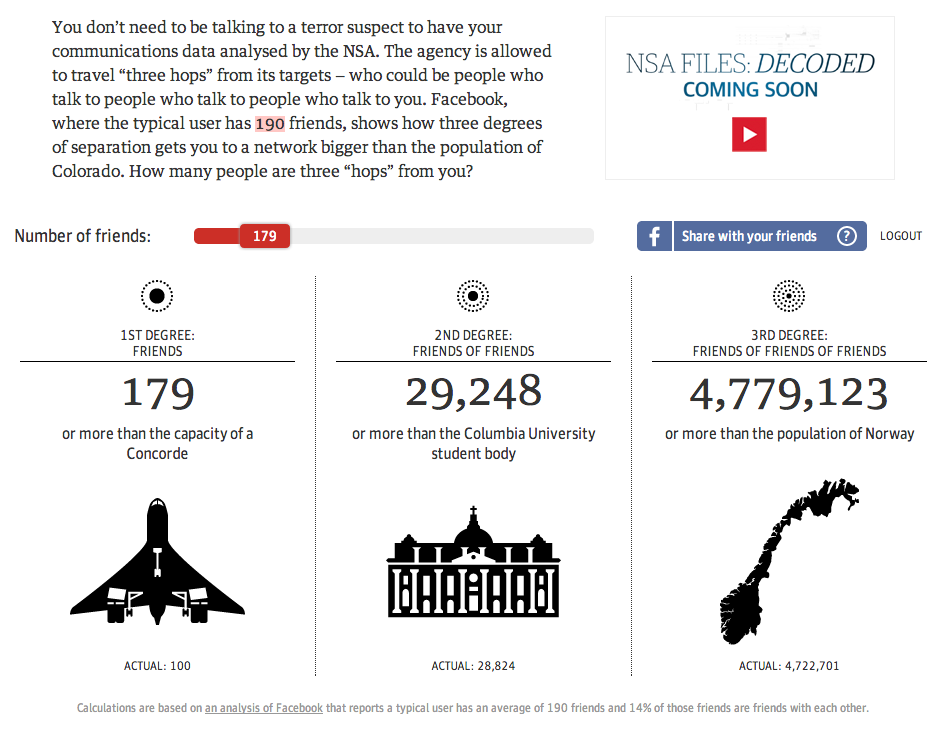
The thing with the NSA spy scandal is not that it collects data on Americans. But it collects data on the Americans that the Americans that the Americans know. Three degrees of separation can actually be quite a few people whose privacy is violated in the name of security. The Guardian has an excellent piece that shows you as in you yourself—if you grant access to your Facebook profile—how many people could be investigated because you know them.
My personal three hops
Well, I hate to tell you, Norway. But apparently, with me you are far from safe. Or at least a Norway-sized chunk of the American population. More seriously, this is a great piece that personalises an abstract sort of concept. Not just through the use of your own personal data, but by using (potentially) familiar items to contextualise scale. How many people is 190? Almost two Concordes worth. How many is 4,779,123 people? More than the population of Norway. You know, a country. Well done, Guardian.
Credit for the piece goes to the Guardian’s US Interactive Team.
Two and a half years ago an earthquake and then tsunami devastated Japan. But it was the tsunami that crippled the Fukushima nuclear power station and created the world’s worst nuclear disaster since Chernobyl. Unfortunately things are still not working properly and the plant is still leaking radioactive particles into the local environment. This interactive guide from the Guardian illustrates just what Tepco, the power company responsible for the plant, is trying to do to prevent further radiation from leaking into the ocean.
Location of silt fences
Credit for the piece goes to Paddy Allen and the Graphic News.
Happy Friday, everyone. Today’s post comes via colleagues of mine in London, who shared with me the Guardian’s selection of 16 useless infographics. They are shit infographics. Well, at least one is. Check them out and you’ll understand.
Using maps to explain maps…
Credit for the selection goes to Mona Chalabi. Credit for each infographic belongs to the infographic’s respective designer.
Edward Snowden is still on the run; he is still in the transit area of Moscow’s Sheremetyevo Airport without a passport to enter Russia. But if ever succeeds in extricating himself from his current predicament, Snowden presumably will seek to land in a country without an extradition treaty with the United States.
So in this interactive piece, the Guardian explores which countries have such treaties. The list serves as an index to the actual treaty texts. Beneath the globe are samples of different texts that show how an extradition treaty is drafted. The last piece highlights three countries that are possible options, but also options that have extradition treaties in place.
Extradition Treaties with the United States
Credit for the piece goes to the Guardian US Interactive Team.
While the Superbowl was two weekends ago, I have been sitting on this post for a little while. Probably because I really just don’t understand the sport. But over at the Guardian, the interactive team put together an interactive infographic that looked at payroll spending for each team by position and by overall position, i.e. offence vs. defence.
Admittedly I found the position part not as interesting, probably because of my aforementioned lack of understanding of the game. But the small-multiples-based exploration of the offence vs. defence numbers was quite interesting. It allows the user to highlight their preferred team and then sort the view by offence, defence, or special teams.
The overview shows the breakdown of spending by teamSelecting a team highlights its dataSorting the data by one of the four metrics atop the table, in this case offence
Credit for the piece goes to the Guardian US interactive team and Harry J. Enten.
Earlier this week, the Office of National Statistics in the United Kingdom released census results for England and Wales. (Northern Ireland and Scotland are reported separately.) England has more people than expected, most likely because of undercounting of immigrants, and Wales is now some three million and counting. There are fewer Christians than expected—and fewer Jedi than I expected—as the ranks of the non-religious grow. But from of course all of this comes a bevy of visualisations. These are but a few, but if anybody finds others worth nothing, please feel free to send them my way.
Straight from the source is a set of interactive mapping applications from ONS that compare 2001 data to 2011 data. As best it can, census districts are compared on a one-to-one basis, but with boundary changes that isn’t always possible. Clicking on district provides one with details about the responses for that area.
% Christian across England and Wales% Christian in North Devon
Perhaps the one thing missing from these—and it may well owe to the aforementioned boundary changes—is a map of changes to see which areas have been most impacted. Or a map of the results compared to the average to see where the average can be found and where the positive and negative extremes can be found.
An infographic from the Guardian looks at the overall dataset with quite a few maps and then circle-y things. While the large map is the white population in 2011, the remaining maps are before and after comparisons. Again, an interesting look would have been perhaps deviations from the average or of the actual change per district.
UK Census results visualised
I appreciate the impact of the main story, the increasing diversity of England and, to a lesser extent, Wales. London in particular is now minority white. However, I am less keen on the circle-y things and that data could probably have been presented in a clearer, more direct fashion. I am not a fan of red, yellow, and green traffic light colours, but I also recognise that the Guardian is working within their brand on this.
Unfortunately this interactive map of Northern Ireland’s national identity does not quite work for me. I appreciate the toggle between the different response options, however, I find the responses themselves hard to compare. The colours remain the same, but the scales for the results change. For those identifying as Northern Irish, the top value is clearly less than those identifying as either British or Irish. But I would have liked to have seen the scales for British and Irish to closer match. I also find the black background distracting and overwhelming the colours. I wonder how the result would have worked if treated with the above aesthetic.
British identity in Northern Ireland
The BBC took a stab too with a section devoted to the results. Unlike the ONS visualisation above, however, the side-by-side comparison is forced to be smaller with the included text. And when one zooms into a particular district, the map degrades into crude polygons—a particular pet peeve of mine—that would be unrecognisable to someone familiar with the intimate geographic details of their home region. (Yes, simple shapes make the files smaller for overview maps, but when seen up-close, they lose their value by making ugly maps.) Also, the colours and bins in this particular view are not as informative as in the view above.
Christianity in England and WalesChristianity in North Devon
The BBC, however, did create a small graphic for an article that showed population changes in the districts, alas the colours did not work as well as one would hope.
Population Change
That’s a lot for people to digest, but, overall I think the clearest visualisations go to the ONS. They lack the commentary that can be brought by journalism organisations, e.g. the BBC, but one needs a clear and powerful visualisation before one can start writing an analysis.
Credit for the ONS results goes to the ONS Data Visualisation Centre, for the Guardian infographic credit goes to Paul Scruton and Mark McCormick, for the Northern Ireland piece credit goes to John Burn-Murdoch, and credit for the BBC goes to the BBC.