Income vs. Life Expectancy

Today’s post comes via the New York Times. It’s a simple concept, but shown clearly in this collection of scatter plots. Growth in income for many counties has meant a growth in life expectancy. Unfortunately, not all counties are prospering and so the gap between rich and poor, and therefore the long-lived and shorter-lived, has grown.

Household income vs. life expectancy for men

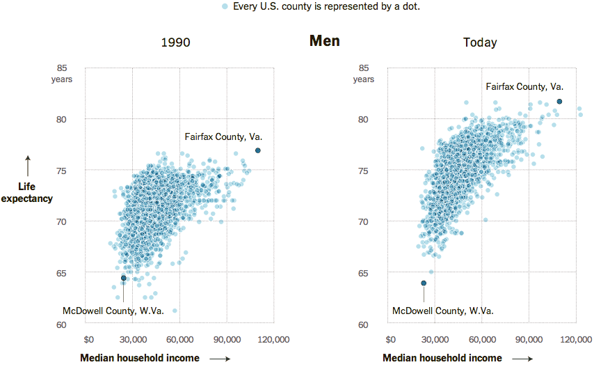
Perhaps the only criticism I have about this piece is that for the highlighting of Fairfax County, Virginia and McDowell Country, West Virginia, an additional component could have summarised the growing gap between the two. For example, a bar chart along the axes of each could measure the growth in income disparity and the growth in life expectancy disparity.

Credit for the piece goes to Alicia Parlapiano.

Jade Rabbit

In December, China landed a rover named Jade Rabbit on the Moon. The South China Morning Post created a nice infographic to explain the lunar landing and place it in the context of other missions to the Moon.

Cropping from the infographic

Credit for the piece goes to Adolfo Arranz.

One Proposal to Simplify the Tax Code

Republican congressman Dave Camp, Chairman of the House Ways and Means Committee (basically responsible for the tax code), wants to simplify the tax code. This nice graphic by the Washington Post basically sums up the changes.

Proposed bracket simplification

Credit for the piece goes to the Washington Post graphics department.

Venn Diagrams

Seth Meyers debuted his new show last month. And in the debut he used Venn diagrams to tell jokes. And while I was going to poke fun at Arizona, the opportunity for the joke disappeared a few weeks ago. So instead, I will take the time to show another.

The setup:

Who could this be?
Who could this be?

The punchline:

Not me.
Not me.

Credit for the piece goes to Seth Meyers.

Mobile Data Visualisation

Today’s post is not news-related for a change. (Don’t worry, I’ll likely get back to that next week.) Instead, we have a new collection of mobile data visualisations curated by Sebastian Sadowski. You can choose to see either smartphone or tablet visualisations and then filter by visual form.

Smartphone Data Visualisation

Credit for the site goes to Sebastian Sadowski, to the various works to the various designers.

Maps Being Useful

I often rail against the use of maps. I often hear “They’re pretty!” or “They’re colourful!” or “But I really do know where Guatemala is!” or “I can see my house!”. They’re often just a crutch, unless you can use them to show an actual geographic distribution. Thankfully from Quartz we get a series of small multiple maps that look at the geographic distribution of top trading partners for a select set of geographies.

Global trade
Global trade

For this set, I think the colours could be the same and perhaps the chosen country perhaps outlined or otherwise signalled on the map. (Only because my utter lack of faith in people being able to identify countries on a map.) Still, it’s a good piece overall that makes nice use of maps.

Credit for the piece goes to David Yanofsky.

Malaysia Airlines Flight 370

Ukraine has dominated the news much of the last few weeks. But the new 24/7 international news story is the missing aircraft (at least as of my writing this) that was Malaysia Airlines Flight 370. There are presently two nice graphics I have seen attempting to explain the story. The first, a cropping of which is below, is from the Washington Post.

The Washington Post piece

The second piece, again another cropping, is from the South China Morning Post.

South China Morning Post's graphic
South China Morning Post’s graphic

Credit for the Washington Post piece goes to Gene Thorp, Alberto Cuadra, Laris Karklis, and Richard Johnson.

Credit for the South China Morning Post piece goes to the South China Morning Post graphics department.

Answering Some More Questions About Ukraine

So Ukraine is even more of a mess and in less than a week’s time, the Crimean people will vote in a referendum on whether they want to remain a part of Ukraine or rejoin Russia. This graphic of mine is an attempt to answer some questions—though hardly all I wanted—about Ukraine, Crimea, and about what the Russians have been doing. (To be fair, the Russians still don’t admit that the troops and soldiers are theirs. But really, I mean come on, we all know they are.)

Why Crimea?
Why Crimea?

Bad Film February

Did you go to the cinema in February? Well, according to some research done by Slate, what you watched probably sucked. I’m just glad I never went last month. Maybe March will be a little bit better.

Bad films seem to define February

Credit for the piece goes to Chris Kirk and Kim Thompson.

World War II Bombs in Hong Kong

Last month, police in Hong Kong defused a 2000 pound (900 kilogram) bomb found undetonated since World War II. The South China Morning Post created a small graphic to diagram just what the bomb was and how it was delivered (by US aircraft) to Hong Kong.

The 2000 pound bomb
The 2000 pound bomb

Credit for the piece goes to Adolfo Arranz.