Sankey Shows Starters Sticking with Sticky Stuff

I spent way more time trying to craft that title than I’d like to admit. Headline writing is not easy.

Quick little piece today about Sankey diagrams. I love them. You often see them described as flow diagrams—this piece is in the article we’ll get to shortly—but they are more of a subset within a flow diagram. What sets Sankeys apart is their use of proportional strokes or widths of the directional arrows to indicate share of movement.

The graphic in question comes from an article about Major League Baseball’s (MLB’s) problem with “sticky stuff”. For the unfamiliar, sticky stuff is a broad term for foreign substances pitchers put on their fingers to provide better grip on the baseball. A better grip makes it easier to create movement like sliding and sinking in a pitch there therefore makes it harder for a hitter to hit it. Back when I was a wannabe pitcher, it was spitballs and scuff balls. Now professionals use things like Spider Tack. These are substances that allow you to put the ball in the palm of your hand, then turn your hand over to face the ground and not have the ball fall out of your hand.

So the graphic looks at starting pitchers and how their spin rate, the quantifiable measure impacted by sticky stuff, of their fastballs has changed since MLB instituted a ban on sticky stuff. (It had actually long been in place, see spitballs for example, but had rarely been enforced.)

Showing a small number of pitchers have managed to increased their fastball spin rates

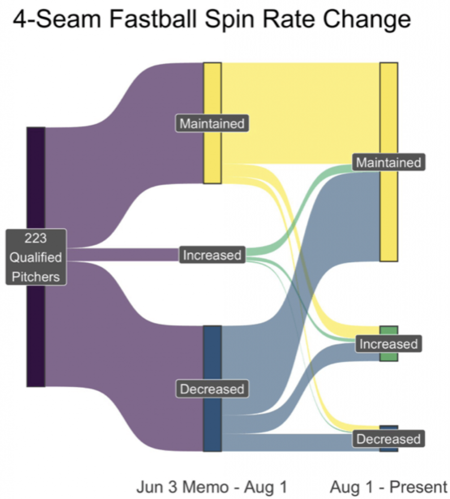
This graphic explores how 223 pitchers saw their spin rates change in the first two months after the change in policy was announced to the nearly month after that period.

Sankeys use proportional width not just to show movement from category to category but the important element of what share of which category moves to which category. For example, we can see a little less than half of starting pitchers saw their spin rates stay the same after the policy change and another almost equal group saw their spin rates decrease. That’s probably a sign they were using sticky stuff and stopped lest they get caught.

But we can then see of that group, maybe 1/6 then saw their spin rates increase again over the last month. That could be a sign that they have found a way to evade the ban. Though it could also be they’ve found new ways of gripping or throwing the baseball. Spin rate alone does not prove sticky stuff usage.

Similarly, we can see that in the group that maintained their spin rate, a small group has found a way to increase it. Finally, a small fraction of the original 223 saw their spin rates increase and a fraction of that group has seen their spin rates increase even further.

This was just a really nice graphic to see in an article from the Athletic about sticky stuff and its potential return.

Credit for the piece goes to Max Bay.

Angela from Jamestown

Today we move from royalty to slavery. Earlier this week the Washington Post published an article about an African woman (girl?) named Angela. She was forcibly removed from West Africa to Luanda in present-day Angola. From there she was crammed into a slave ship and sent towards Spanish colonies in the Caribbean. Before she arrived, however, her ship was intercepted by English pirates that took her and several others as their spoils to sell to English colonists.

The article is a fascinating read and for our purposes it makes use of two graphics. The one is a bar chart plotting the Atlantic slave trade. It makes use of annotations to provide a rich context for the peaks and valleys—importantly it includes not just the British colonies, but Spanish and Portuguese as well.

My favourite, however, is the Sankey diagram that shows the trade in 1619 specifically, i.e. the year Angela was transported across the Atlantic.

Too many people took similar routes to the New World.

It takes the total number of people leaving Luanda and then breaks those flows into different paths based on their geographic destinations. The width of those lines or flows represents the volume, in this case people being sold into slavery. That Angela made it to Jamestown is surprising. After all, most of her peers were being sent to Vera Cruz.

But the year 1619 is important. Because 2019 marks the 400th anniversary of the first slaves being brought into Jamestown and the Virginia colony. The Pilgrims that found Plymouth Bay Colony will not land on Cape Cod until 1620, a year later. The enslavement of people like Angela was built into the foundation of the American colonies.

The article points out how work is being done to try and find Angela’s remains. If that happens, researchers can learn much more about her. And that leads one researcher to make this powerful statement.

We will know more about this person, and we can reclaim her humanity.

For the record, I don’t necessarily love the textured background in the graphics. But I understand the aesthetic direction the designers chose and it does make sense. I do like, however, how they do not overly distract from the underlying data and the narrative they present.

Credit for the piece goes to Lauren Tierney and Armand Emamdjomeh.

Israeli Electoral History

One of the important stories of last week that was not black hole related was that of the re-election of the Likud Party in Israel, a party headed by Benjamin Netanyahu. This will be his fourth consecutive time as prime minister plus a fifth back in the late 1990s. Of course, he is facing an expected arrest and charges on corruption, so how long he might remain in office is yet to be determined.

However, the Economist put together this great piece using a Sankey diagram showing the ebbs and flows of the various political parties in Israel since its founding.

It's definitely not a two-party system…
It’s definitely not a two-party system…

Obviously, this is only a partial screenshot, but it does a great job showing those changes. Most impressive is the designers’ ability to show the continuity of the evolving parties and the name changes and the splits and recombinations.

Credit for the piece goes to the Economist Data Team.

The London Job Exodus

Brexit is bad for Britain. Here is some proof from an article by Bloomberg that looks at where London-based banking jobs are headed post-Brexit. Spoiler alert, not elsewhere in Britain. The article purports to be more of a tracker in that they will add on data about jobs moving places when news breaks. But I cannot verify that part of the piece.

What I can verify is a sankey diagram. Underused, but still one of my favourite visualisation forms. This one explores where companies’ London-based banking jobs are moving. Right now, it clearly says Frankfurt, Germany is winning.

Look at all those job…

As sankeys go, this one is pretty straightforward. Aesthetically I wonder about the colour choice. I get the blues and that the banks are coloured by their ultimate destination. But why the gradient?

But conceptually the big question would be what about London? I probably would have kept London in the destination set. While many jobs are likely to leave Britain, some will in fact stay, and those lines will need to go somewhere in this graphic.

The piece also makes nice use of some small multiple maps and tables. All in all, this is a really solid piece. It tells a great—well, not great as in good news—story and does it primarily through visuals.

Credit for the piece goes to Gavin Finch, Hayley Warren and Tim Coulter.

Tracking the Women Running for Office

Yesterday we talked about a static graphic from the New York Times that ran front and centre on the, well, front page. Whilst writing the piece, I recalled a piece from Politico that I have been lazily following, as in I bookmarked to write about another time. And suddenly today seemed as good as any other day.

After all, this piece also is about women running for Congress, and a bit more widely it also looks at gubernatorial races. It tracks the women candidates through the primary season. The reason I was holding off? Well, we are at the beginning of the primary season and as the Sankey diagram in the screenshot below shows, we just don’t have much data yet. And charts with “Wait, we promise we’ll have more” lack the visual impact and interest of those that are full of hundreds of data points.

Still too many unknowns. But at least these are known unknowns…

But we should still look at it—and who knows, maybe late this summer or early autumn I will circle back to it. After all, today is primary day in Pennsylvania. (Note: Pennsylvania is a closed primary state, which means you have to belong to the political party to vote for its candidates.) So this tool is super useful looking ahead, because it also shows the slate of women running for positions.

Aside from just the number of women running, today's primaries will be fascinating because of the whole redistricting thing
Aside from just the number of women running, today’s primaries will be fascinating because of the whole redistricting thing

I really like the piece, but as I said above, I will want to circle back to it later this year to see it with more data collected.

Credit for the piece goes to Sarah Frostenson.

Brexit and the British General Election

On 8 June, Britons will go to the polls in a general election that Prime Minister Theresa May called to increase her parliamentary majority. The United Kingdom faces a number of issues—I am looking at you housing and the NHS for starters—but Brexit is on the minds of a lot of people.

That makes sense, because if you recall the nation split 52–48 to leave the European Union last June. But, as the Financial Times explained the other day, that split is not as even as it used to be and that may have significant ramifications for the Conservative Party not to mention Labour and the Liberal Democrats.

The author explains the piece in nice detail, but this graphic including along with the article does a fantastic job showing the movements.

Who's moved where?
Who’s moved where?

As you can probably guess, I am a huge fan of the annotations. Although I would argue that the centre and lower two, by being placed over the graphic, may be a bit illegible. But the concept is fantastic. It shows you just how difficult it will be for Labour and the Lib-Dems to beat May in June.

Credit for the piece goes to John Burn-Murdoch.

Could Marine Le Pen Have Won?

Well not likely—it was going to be tough regardless.

Today’s piece is also from the Wall Street Journal and it was posted Saturday, the day before the election. It used a Sankey diagram to explore the support that Le Pen would have needed to draw from every candidate in the first round to get over the 50% mark in the second round.

Turns out she didn't get the maths
Turns out she didn’t get the maths

If anything this chart is not the story. The story is that the final count I saw put Macron not on 60%, but on just over 66%.

Turns out she couldn’t.

Credit for the piece goes to Stacy Meichtry and Jovi Juan.

Scottish Independence?

I was having a conversation with a mate the other night about what Brexit means for Scottish independence. This mate, however, is an American. Because when American politics are depressing and nonsensical, we turn to British pol—wait, never mind.

Despite the overall UK vote to leave the European Union, Scotland (and London, and Northern Ireland) voted overwhelmingly to remain. But since part of the whole vote no to independence thing was remaining part of the EU thing, shouldn’t Scotland now be well positioned for IndyRef2?

I read this article from the Guardian back in January and meant to share it with you all, but I somehow forgot about it. So at long last, it turns out no, not so much. The whole thing is worth a read; it uses YouGov survey data to break out voters into different camps. And what sort of nails the argument is this graphic.

About that independence…

There are four/five groups of Brexit/IndyRef1 voters that then get sorted into two/three IndyRef2 results (yes, no, maybe I don’t know?). And what you can see is that yes, a significant number of those who voted to Remain in the EU, but voted no to Scottish independence would now vote for independence. But, an almost equal number of those who voted to Remain and also voted for Scottish independence would now vote against Scottish independence. In effect, these two voter movements are cancelling out any potential gains for a future Scottish independence vote.

Credit for the piece goes to the YouGov graphics department.

2016 Holyrood Elections

Last week Scotland voted for its parliament, Holyrood. The Scottish National Party did well enough, the Conservatives picked up quite a few seats, and Labour lost quite a few. The Guardian put together this piece looking at the results and the stories contained therein. But I want to focus on the graphics, the big piece of which was a map of Scotland with each constituency represented by a small Sankey diagram.

Scotland's results
Scotland’s results

You see that generally, Scotland is a sea of yellow, surging blue, and diminishing red. But what about the numbers for each constituency? The interactive nature of the chart lets you see the 2016 results mousing over the constituency.

Aberdeenshire West results

Normally I would say that a piece like this is missing an easy way for someone to find their own constituency, however, this is not a results page, but an article on the results, so something like a search bar is not necessary.

What I really enjoy, however, is that when the story breaks down the results by regions, the map becomes an abstracted series of squares used to highlight the constituencies in focus. It is a really nice reuse of the concept and the overall graphic.

Talking about Glasgow

Credit for the piece goes to the Guardian’s graphics department.

The History and Future of Data Visualisation

From time to time in my job I hear the desire or want for more different types of charts. But in this piece by Nick Brown over on Medium, we can see that there are really only a few key forms and some are already terrible—here’s looking at you, pie charts. How new are some of these forms? Turns out most are not that new—or very new depending on your history/timeline perspective. Brown illustrated that timeline by hand.

A timeline of chart forms

Worth the read is his thoughts on what is new for data visualisation and what might be next. No spoilers.

Credit for the piece goes to Nick Brown.