Sweet Summer Air of Subway Cars

For those of my readers who live in a city where the subway or underground is a great means of getting around the city, you know you really miss that late Saturday night/early Sunday morning bouquet in the air. Though as this New York Times piece explains, sure it smells bad, but that air is probably safer than you dining indoors at a restaurant or even a child attending class in person.

The piece focuses on New York City subway cars, but they are very similar to the rest of the stock used in the United States. It uses a scrolling reveal to show how the air circulation and filtration systems work. Then it concludes with a model of how a person sneezing appears, both with and without a mask. (Spoiler, wear a mask.)

It’s a really nicely done and informative piece. It compares the rate of air recycled in a subway car to that of several other locations, and the results were a bit surprising to me. Of course, early on in the pandemic before we began to fully understand it, the threat was thought to be from contaminated surfaces—and let’s be honest, there are a lot of contaminated surfaces in a New York City subway car—but we now know the real risk is particles breathed/coughed/sneezed out from one’s mouth and nose. And we can now see just how efficient subways are at cycling and filtering that air.

Credit for the piece goes to Mika Gröndahl, Christina Goldbaum, and Jeremy White.

All the Little Spacecraft

Early tomorrow morning, weather permitting, NASA’s Perseverance rover will blast off from Cape Canaveral on a six-plus month trip to Mars. There, hopefully it will land successfully and join all the rovers that have come before.

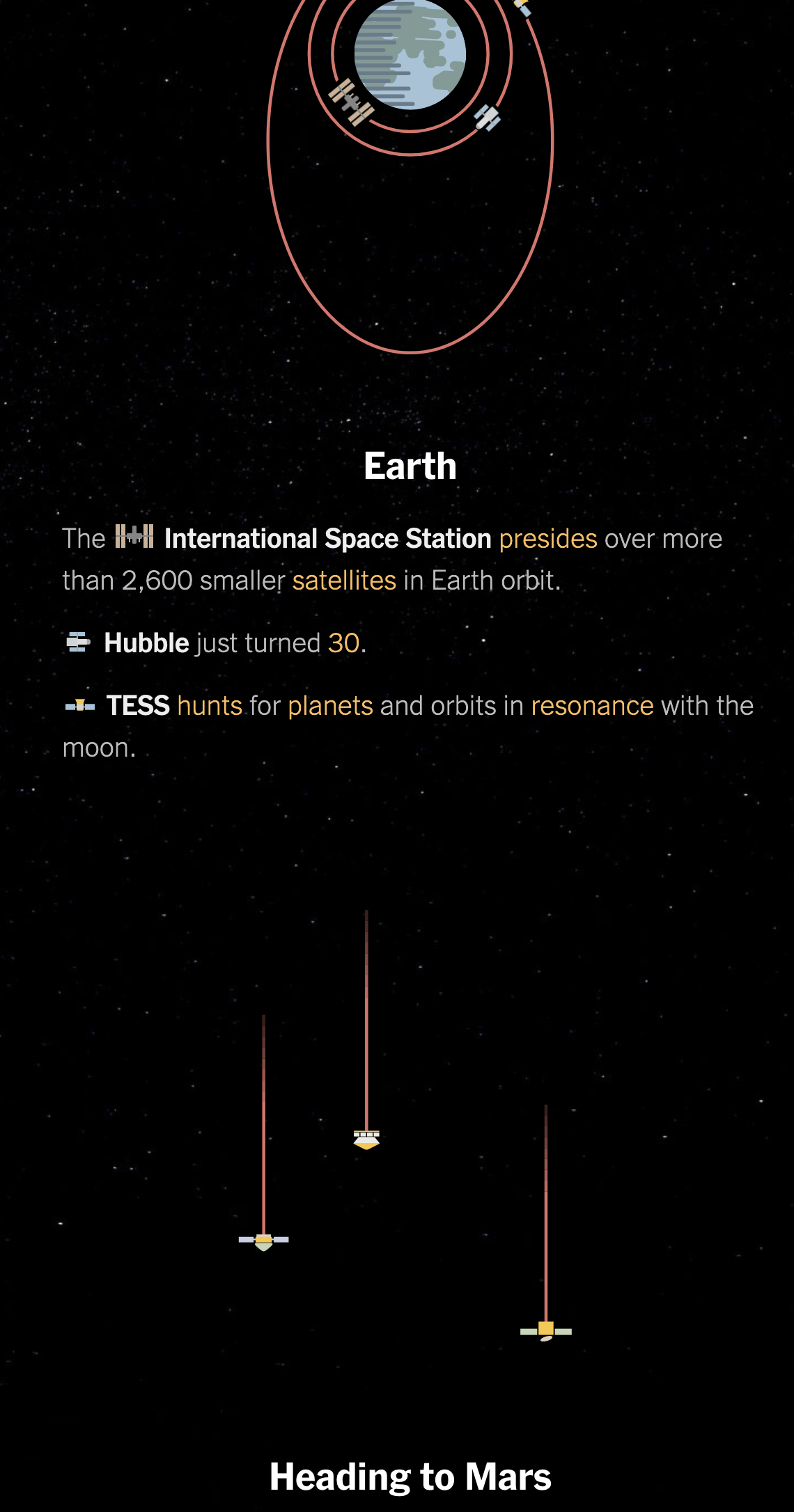
And so this piece from the New York Times feels appropriate. It’s a great illustration of all the spacecraft we have sent into space, including the active and inactive, with some notable exceptions.

What spacecraft are in orbit of Earth and headed to Mars.

I really like how it pays attention not just to the planets and their satellites (like the Moon), but also the comets, asteroids, and even the Lagrange points. And it does this all with small illustrations of the spacecraft.

Credit for the piece goes to Jonathan Corum.

UK–Narnia Border

Yesterday the United Kingdom was supposed to leave the European Union. Again. Boris would rather be dead in a ditch. But he’s neither dead nor in a ditch. And the UK is still in the EU. So let’s enjoy the moment and reflect on this xkcd piece from the other day. And then enjoy the weekend.

But what about the UK–Shire border? Or UK–Westeros?

Credit for the piece goes to Randall Munroe.

Leaf Peeping

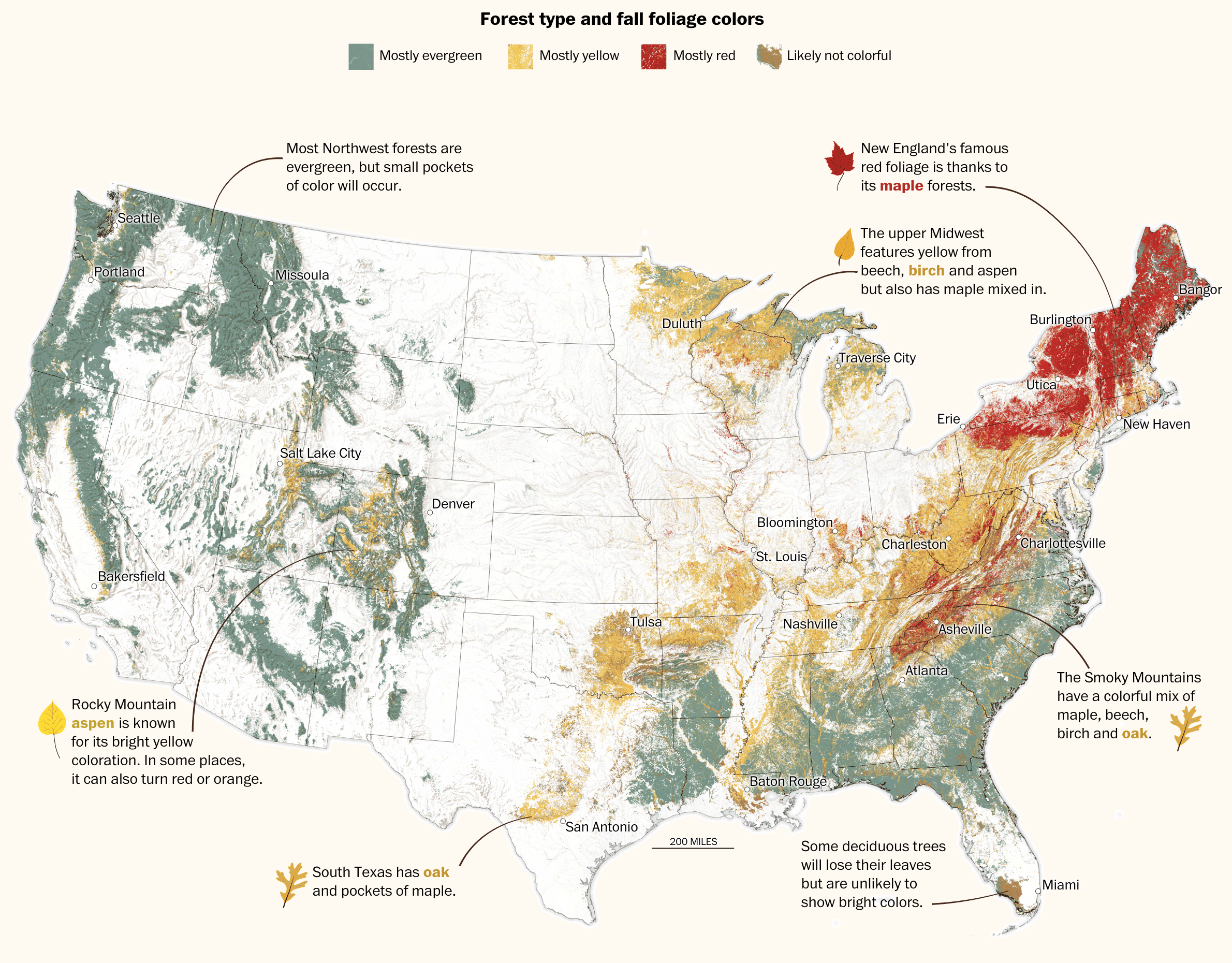
Autumn arrived this week in Philadelphia. And with the cooler weather came blustery winds blowing yellowing leaves from city trees. The yellows and reds of trees beneath blue skies makes for some great photography. But what is really going on? Thankfully, the Washington Post published an article exploring where and why the leaves change colour (or don’t).

The star of the piece is the large map of the United States that shows the dominant colours of forests.

All the colours
All the colours

Little illustrations and annotations dot the map showing how particular trees (whose leaf shapes are shown) turn particular colours. The text in the piece elaborates on that and explains what is going on with pigments in the leaves. It adds to that how weather can impact the colour change.

Later on in the piece, a select set of photos for specific locations show at a more micro-level, how and where leaf colours change.

Overall, a solid piece for those of you who enjoy leaf peeping to read before this weekend.

Credit for the piece goes to Lauren Tierney and Joe Fox.

Childhood Video Games: You Can Never Go Home

Well, we all made it to Friday. And for those of us here in the States, our bank holiday weekend starts at some point this afternoon. Consequently, here is a post from xkcd that basically describes my childhood and when I would draw the layouts to linear scrolling video game landscapes for Mario.

Admittedly, it really has nothing to do with data visualisation or design, but we can make a tenuous connection to video game design.

What about Luigi?
What about Luigi?

But everything is now a standardised and bland national chainstore. And before anyone asks, yes, my favourite game was SimCity. Unfortunately there I only had the power to lay out public transit systems. Strangely, it and later variations avoided the concept of multi-use zoning.

So whenever your weekend begins today, enjoy your holiday.

Credit for the piece goes to Randall Munroe.

Lunar Cycles

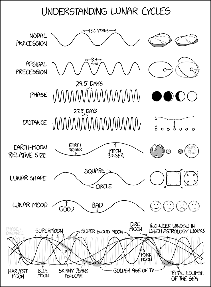
Yesterday in the early hours of the morning was technically the latest full moon. And so since today is Friday and we all made it to the end of the week, it seems like a good time to let xkcd educate us all on lunar periodicity.

But what about lycanthrope correlations?

Credit for the piece goes to Randall Munroe.

How Warm Will It Get?

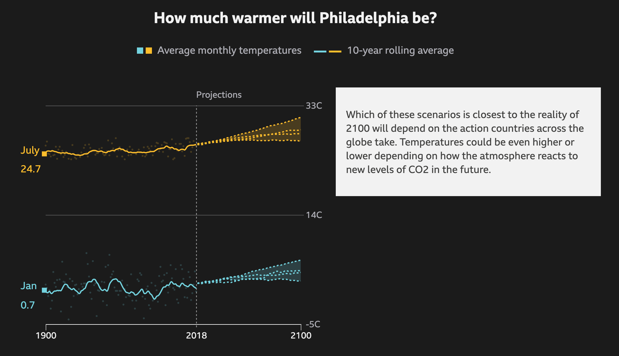
In Philadelphia, this summer has been warmer than average. But with most recent years being warmer than average, that might not mean much. However, a valid question is that with climate change, how much warmer will the city get on average? The BBC recently published an article that explored the temperature changes in cities around the world according to several different models for best to worst case scenarios.

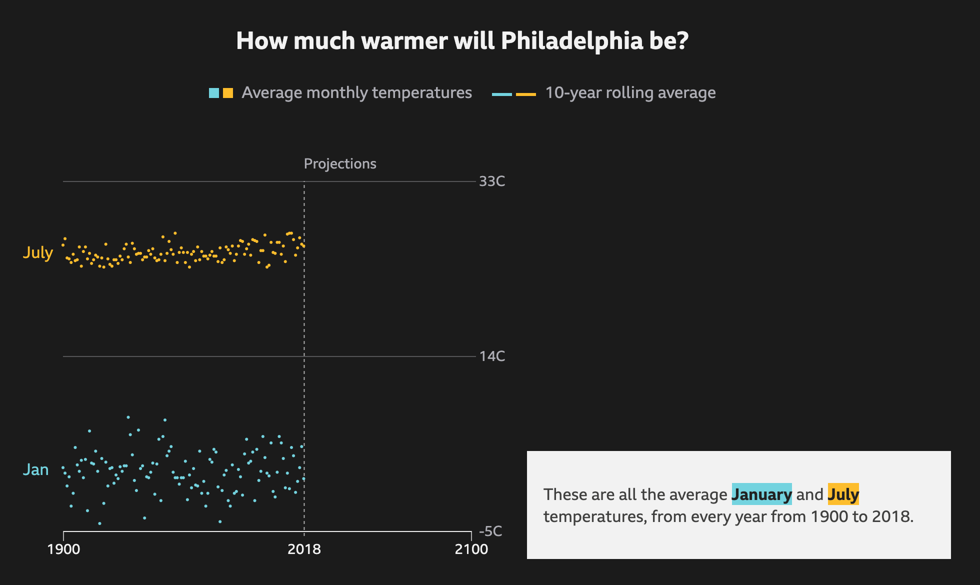
The raw data so to speak

It does a nice job via scrolling of showing how the averages work as a rolling average and the increase over time. It runs through each scenario, from best case to worst case, as a dotted line and then plots each in comparison to each other to show the range of possible outcomes.

Ew. Just ew.
Ew. Just ew.

I know that dark or black background is in style for big pieces. But I still do not love them. Thankfully the choice of these two colours work here. The dotted lines also work for showing the projections. And in the intermediate steps, not screencaptured, the previous projections go dark and only the current one is highlighted.

Thankfully the text boxes to the right capture the critical numbers: the actual projection numbers for the monthly average. And they tie them to the lines via the colours used.

Not shown here are a few other elements of the piece. The top of the article starts with a spinning globe that shows how the average temperature across the globe has already changed. Spoiler: not well. While the spinning globe adds some interactivity to the article, it by definition cannot display the entire world all at once, like flat, two-dimensional projections do. This makes it difficult to see impacts across the globe simultaneously. A more standard projection map could have worked really well.

Lastly, the article closes with a few stories about specific locations and how these temperature increases will impact them. These use more illustrations and text. The exception, however, is a graphic of the Arctic that shows how summer sea ice coverage has collapsed over the last few decades.

Overall this is a strong piece that shows some global impacts while allowing the user to dive down into the more granular data and see the impact on some of the world’s largest cities.

Credit for the piece goes to BBC Visual and Data Journalism team.

Notre Dame Almost Did Collapse

Back in April the famed Notre Dame cathedral in Paris caught fire and its roof and spire spectacularly collapsed. At the time I looked at a few different pieces, including two from the New York Times, that explored the spread of the fire. Several months later the Times has just published a look into how the firefighters saved the cathedral from collapse.

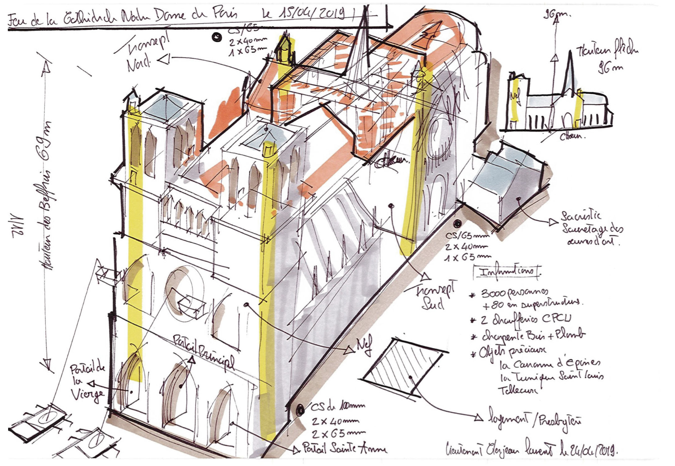
The graphics are the same amazing illustrated models from before. Now with routes taken by firefighters and coloured areas indicating key equipment used in the fight to preserve what could be saved. But the real gem in the article are a series of graphics from the firefighters themselves.

Some pretty hot sketches here

Naturally the annotations are all in French. But this French firefighter and sketch artist detailed the progress of the battle during and in the days after the fire. It makes me wish I could read French to understand the five selected sketches the Times chose to use. And I love this line from the Times.

For all the high-tech gear available to big-city fire departments, investigators still see value in old-school tools.

If you are interested in the story of how the cathedral was saved, read the lengthy article. If you just want to see some really amazing and yet wholly practical sketches, scroll through the article until you get to these gems.

Credit for the overall piece goes to Elian Peltier, James Glanz, Mika Gröndahl, Weiyi Cai, Adam Nossiter, and Liz Alderman.

Credit for the sketches goes to Laurent Clerjeau.

New Orleans Dodges a Bullet

Hurricane/tropical storm Barry has been dumping rain along the Gulf Coast for a few days now. But prior to this weekend, the biggest concern had been for the city of New Orleans, which sits besides the swollen Mississippi River. The river was running already high at 17 feet above normal, and with storm surges and tropical rain levels forecast, planners were concerned not with the integrity of the city’s levee system, rebuilt in the aftermath of Hurricane Katrina, but simply whether they would be tall enough.

So far, they have been.

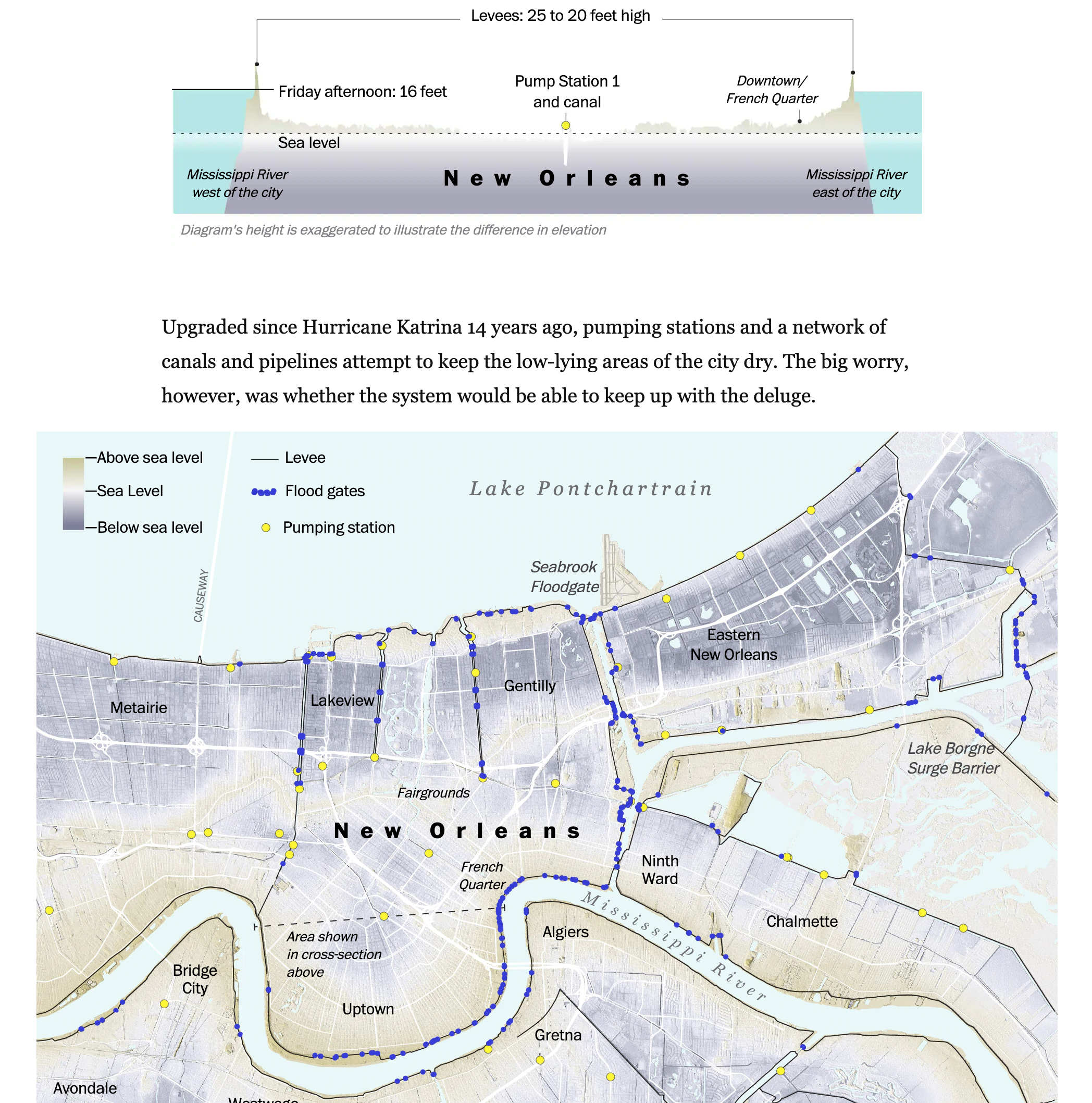
The Washington Post tracked Barry’s course with the usual graphics showing forecast rainfall amounts and projected tracks. However, the real stunner for me was this cross section illustration of New Orleans that shows just how much of the central city sits below sea level. The cross section sits above a map of the city that shows elevation above/below sea level as well as key flood prevention infrastructure, i.e. levees and pumping stations.

A lot floodable space

The unmentioned elephant remains however. The National Oceanic and Atmosphere Administration’s extreme climate change impact forecast says the water around New Orleans might rise by nearly 13 feet by 2100. Clearly, that is still well below the 20 feet levees of today. But what if there were to be a 17 feet high Mississippi River atop the additional 13 feet? 30 feet would flood the city.

Credit for the piece goes to John Muyskens, Armand Emamdjomeh, Aaron Steckelberg, Lauren Tierney, and Laris Karklis.