In Philadelphia, this summer has been warmer than average. But with most recent years being warmer than average, that might not mean much. However, a valid question is that with climate change, how much warmer will the city get on average? The BBC recently published an article that explored the temperature changes in cities around the world according to several different models for best to worst case scenarios.
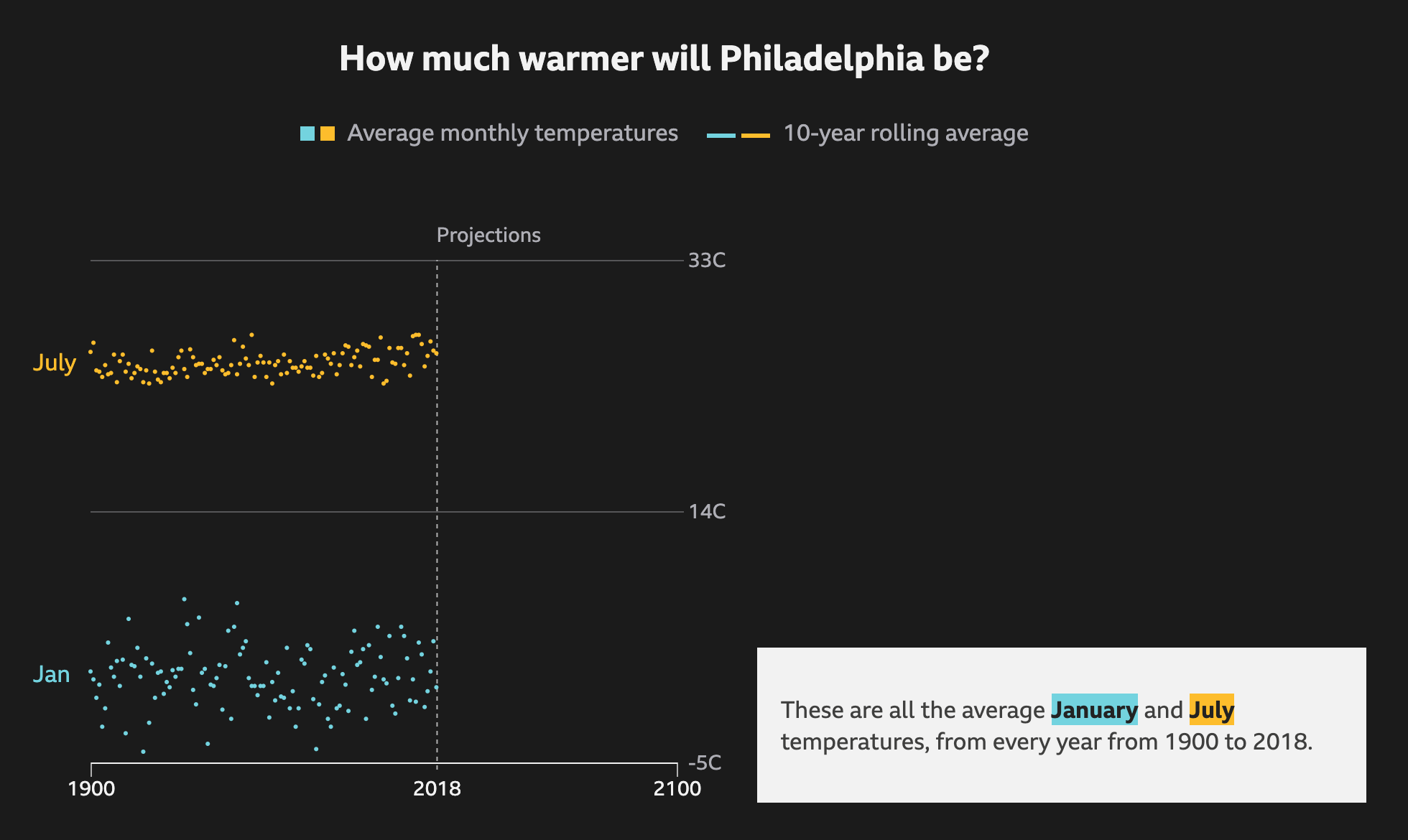
It does a nice job via scrolling of showing how the averages work as a rolling average and the increase over time. It runs through each scenario, from best case to worst case, as a dotted line and then plots each in comparison to each other to show the range of possible outcomes.
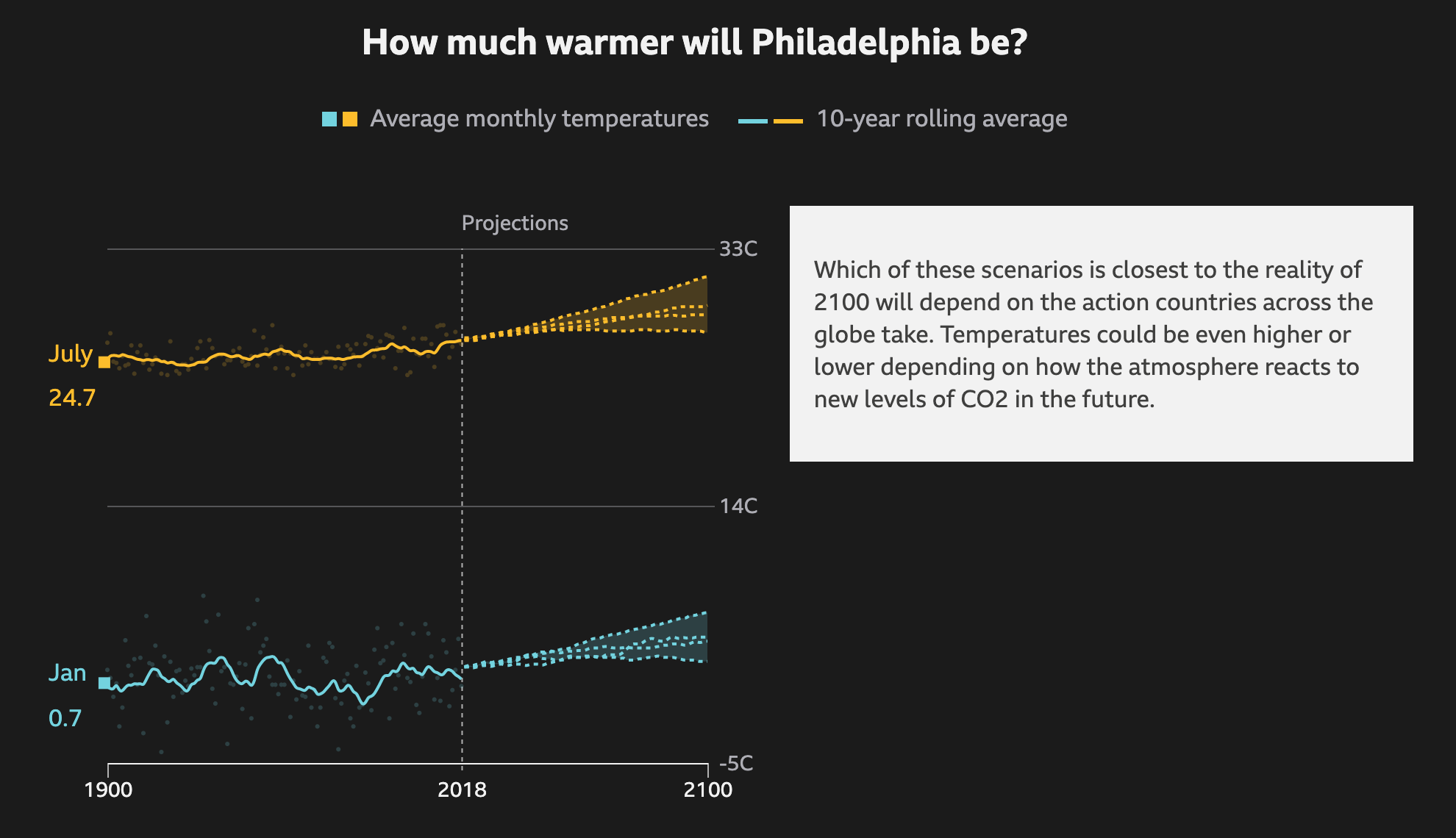
I know that dark or black background is in style for big pieces. But I still do not love them. Thankfully the choice of these two colours work here. The dotted lines also work for showing the projections. And in the intermediate steps, not screencaptured, the previous projections go dark and only the current one is highlighted.
Thankfully the text boxes to the right capture the critical numbers: the actual projection numbers for the monthly average. And they tie them to the lines via the colours used.
Not shown here are a few other elements of the piece. The top of the article starts with a spinning globe that shows how the average temperature across the globe has already changed. Spoiler: not well. While the spinning globe adds some interactivity to the article, it by definition cannot display the entire world all at once, like flat, two-dimensional projections do. This makes it difficult to see impacts across the globe simultaneously. A more standard projection map could have worked really well.
Lastly, the article closes with a few stories about specific locations and how these temperature increases will impact them. These use more illustrations and text. The exception, however, is a graphic of the Arctic that shows how summer sea ice coverage has collapsed over the last few decades.
Overall this is a strong piece that shows some global impacts while allowing the user to dive down into the more granular data and see the impact on some of the world’s largest cities.
Credit for the piece goes to BBC Visual and Data Journalism team.
Leave a Reply
You must be logged in to post a comment.