Tag: maps
-
Baby You Can Drive My Car
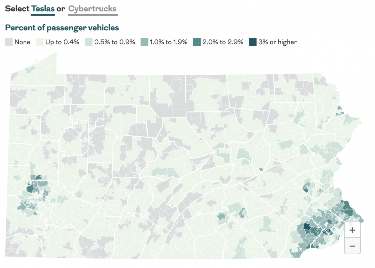
Last month the Philadelphia Inquirer published an article examining the geographic distribution of Teslas and Cybertrucks and whether or not your car is liberal or conservative. The interactive graphics focused more on a sortable table, which allowed you to find your vehicle type. The sortable list offers users option by brand and body type—not model.…
-
Sudan Side by Side
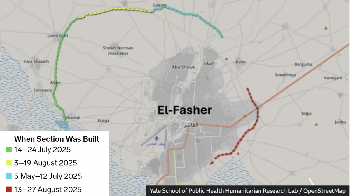
Conflict—a brutal civil war—continues unabated in Sudan. In the country’s west opposition forces have laid siege to the city of el-Fasher for over a year now. And a recent BBC News article provided readers recent satellite imagery showing the devastation within the city and, most interestingly, one of the most ancient of mankind’s tactics in…
-
MLB’s Realignment
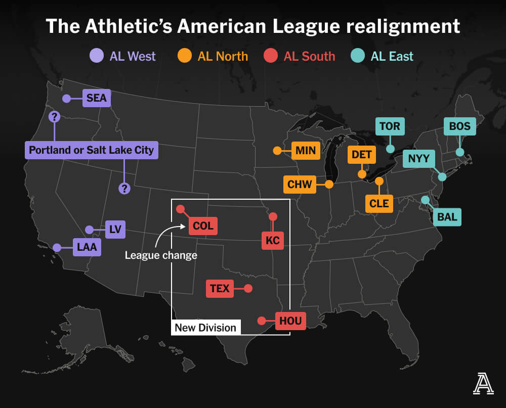
Last weekend, Major League Baseball Commissioner Rob Manfred created a mild furore when he discussed the sport’s looming expansion and how it would likely prompt a geographic realignment. I am old enough I still recall baseball’s two leagues—the American and National—organised into only two divisions—East and West. In the early 1990s, baseball expanded and created…
-
You Get a War, You Get a War, You Get a War…
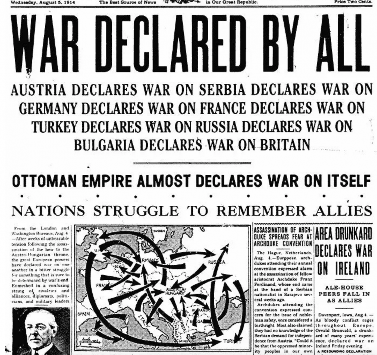
A good friend of mine sent me this graphic earlier this week. The World Wars fascinate me—to be fair, most history does, and yes, that even includes the obligatory guy thinking of the Roman Empire—and I can see on my bookshelf as I type this post up my books on naval warships from World War…
-
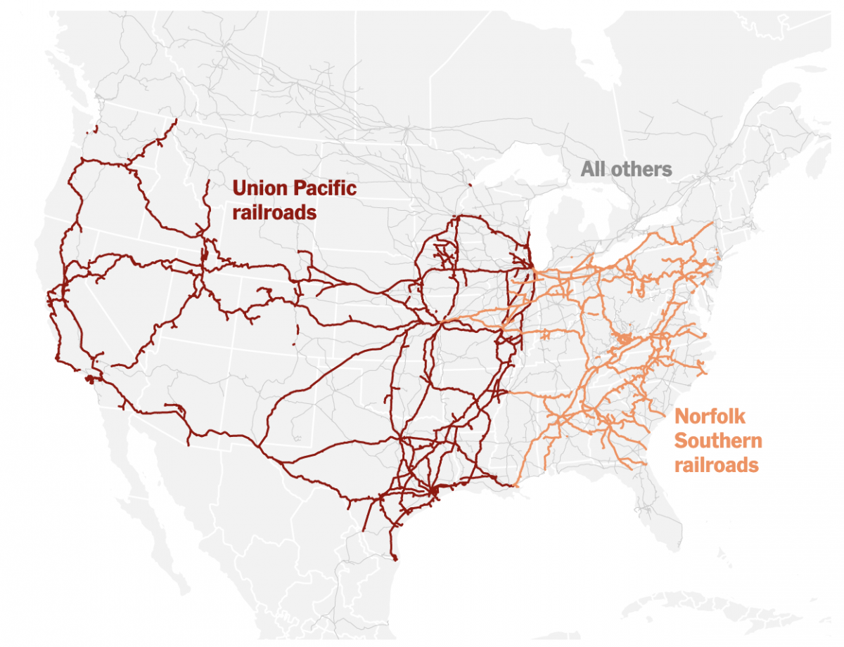
Truly Transcontinental
Last week two of the largest American freight railroads agreed to a merger with Union Pacific purchasing Norfolk Southern. Railroads have long played an important part in the history of the United States, from the Second Industrial Revolution to settlement and development of the West, through to the time zones in which we live and…
-
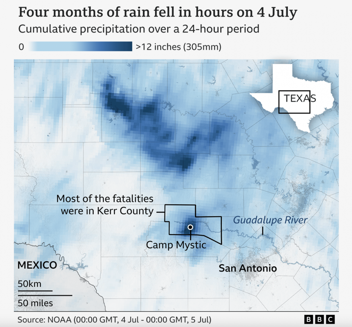
A Warming Climate Floods All Rivers
Last weekend, the United States’ 4th of July holiday weekend, the remnants of a tropical system inundated a central Texas river valley with months’ worth of rain in just a few short hours. The result? The tragic loss of over 100 lives (and authorities are still searching for missing people). Debate rages about why the…
-
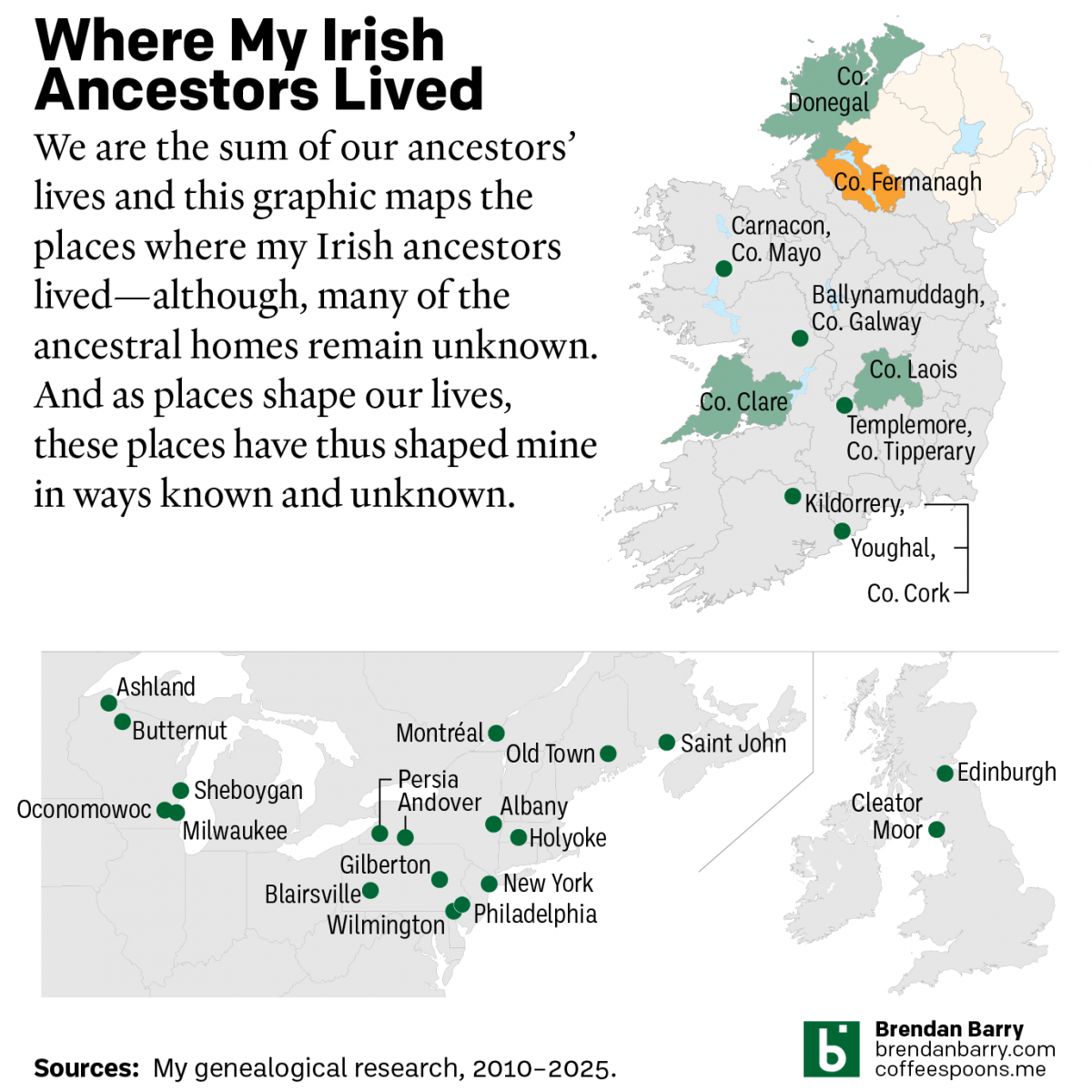
My Irish Heritage
This week began with Saint Patrick’s Day, a day that here in the States celebrates Ireland and Irish heritage. And I have an abundance of that. As we saw in a post earlier this year about some new genetic ancestry results, Ireland accounts for approximately 2/3 of my ancestry. But as many of my readers…
-

I Need My Sharpie. Where’s My Sharpie?
Because who does not recall the great Sharpie forecast track by the National Hurricane Center (NHC)? Earlier this summer, in the middle of the hurricane season, the National Oceanic and Atmospheric Administration’s (NOAA’s) NHC released a new, experimental warning cone map. For those unfamiliar, these are the maps that have a white and white-shaded forecast…
-
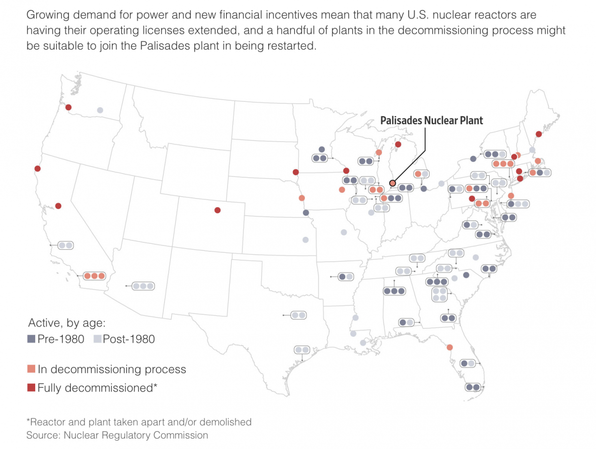
The Dawn of a New Nuclear Age?
I grew up less than 15 miles away from the Limerick Nuclear Generating Station, located on the banks of the Schuylkill River northwest of the city of Philadelphia. Our house sat on the north-facing slope of the Great Valley and the cooling towers of Limerick were a ridge line and river valley away from view.…
-
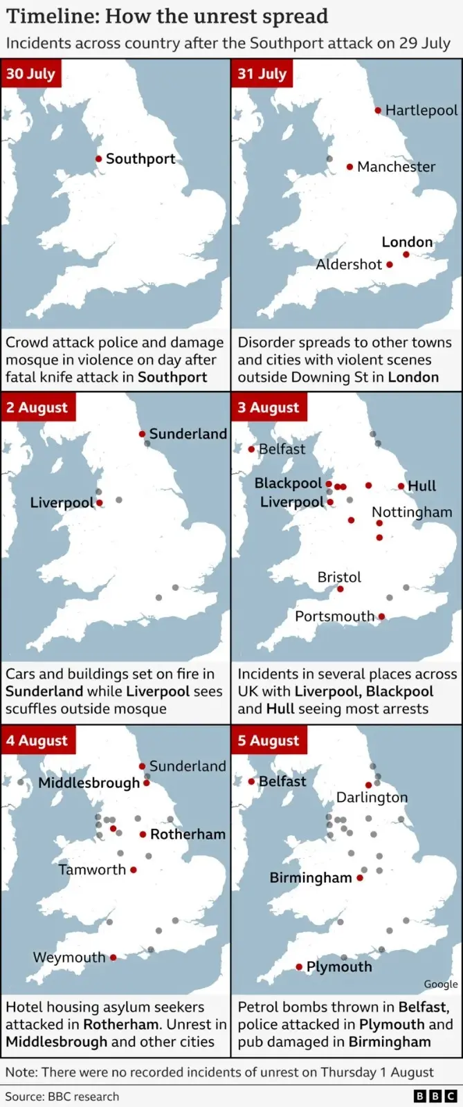
I Didn’t Predict a Riot
Yesterday I wrote about a BBC graphics locator map that was perhaps not as helpful as possible. Well today I want to talk about another BBC map, though not in as critical a fashion. I landed upon this map whilst reading a series of updates about last month’s anti-immigrant riots throughout the United Kingdom—principally England.…