First, as we all should know, climate change is real. Now that does not mean that the temperature will always be warmer, it just means more extreme. So in winter we could have more severe cold temperatures and in hurricane season more powerful storms. But it does mean that in the summer we could have more frequent and hotter heat waves.
Enter the United States, or more specifically the North American continent. In this article from the BBC we see photographs of the way the current heatwave is playing out across the continent. But it opens up with a nice map. Well, nice as in nicely done, not as in this is actually nice weather.
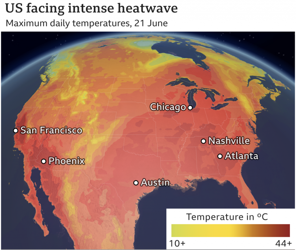
The only complaint most of my American readers might have is that the numbers make no sense. That’s because it’s all in Celsius. Unfortunately for Americans most of the rest of the world uses Celsius and not Fahrenheit. Suffice it to say you don’t want to be in the dark reds. 44C equals 111F. 10C, the greenish-yellow side of the spectrum, is a quite pleasant 50F.
And that can relate to a small housekeeping note. I’m back after a long weekend up in the Berkshires. I took a short holiday to go visit the area near that north–south band of yellow over the eastern portion of the United States. It was very cool and windy and overall a welcome respite from the heat that will be building back in here across the eastern United States later this week.
At least yesterday was the summer solstice. The days start getting shorter. And in about five weeks or so we will reach the daily average peak temperature here in Philadelphia. At that point the temperatures begin cooling towards their eventual mid-January nadir.
I can’t wait.
Credit for the piece goes to the BBC graphics department.