Housekeeping first, as you may have noticed, I haven’t been publishing as much lately. That’s because I’ve been on holiday. After a tremendously busy year, I need to use up all the time I didn’t spend on holiday. Consequently, I’m only going to be posting a handful or so more times before the end of the year. The plan is to return in early January to my regular posting schedule. For this week that means the next few days before I’m off for American Thanksgiving.
But on with the show.
One of the things I haven’t been doing too much of is travelling. There are many reasons for this, but one is that air travel in the United States has, of late, been, shall we say unreliable. Hundreds if not thousands of flight cancellations, sometimes with no obvious cause. And in one notorious case, Southwest claimed inclement weather cancelled flights in Florida, but it was the only airline to cancel significant numbers of flights. In other words, it wasn’t the weather.
The Wall Street Journal recently posted an article that explored the issue, doing so via a great example. It followed the literal path of one Southwest aircraft over one long holiday weekend. The screenshot below captures two of the graphics with a wee bit of text between.
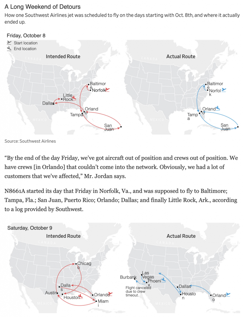
What’s nice about the graphics’ design is how they use small multiples and consistent colours. The intended route is always on the left and what actually happened is on the right. Red and blue colours depict those throughout.
The only thing I quibble with is the embedded HTML text. Sometimes the page loads fine for me, other times it looks like it did this morning for this screenshot. Note how for some city labels the final letters get dropped to a second line, e.g. the “o” in Chicago or the “e” in Baltimore.
This is far from a deal breaker on this being a good graphic, but I find it mildly annoying, especially when in situations like the bottom left Orlando, there’s no obvious reason as to why, because the little airplane departure icon sits atop the final letter.
I understand the idea behind using native HTML text in graphics, but when things like this happen, I wonder if it wouldn’t simply be better to include the text as part of the graphic and avoid these potential mishaps altogether.
Credit for the piece goes to Emma Brown.
Leave a Reply
You must be logged in to post a comment.