Examining Growth in the G-20

On Sunday the New York Times featured a small graphic highlighting the disparity in growth rates across the G-20 if broken into the ‘core’ G-8 and then what one might call the emerging markets of the G-11.
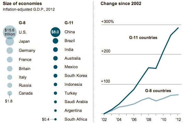
NYT Coverage of G-20 Growth

The charts are small yet compelling in telling the story of how the two different groups are performing. However, I was left wanting to better understand the comparisons between the sizes and growth of the various countries. The areas of circles are difficult to compare and aggregates mask interesting outliers. So, using what I imagine to be the same data from the IMF, I took a quick try at the data to create my own infographic.
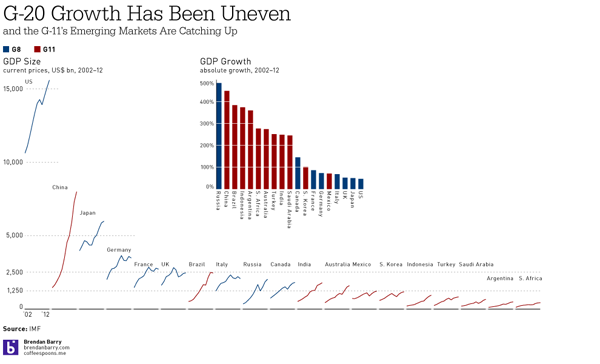
My G-20 Size and Growth Graphic; click for the full-size view

Indeed, interesting stories began to appear as I plotted the data. Russia is a member of the G-8, but perhaps has more in common with the G-11. After all, Russia’s growth was nearly 500%. Similarly interesting were Canada and Australia. The former, a G-8 country, was the only G-8 country besides Russia to have greater than 100% growth. And Australia, certainly not an emerging market in most senses, experienced nearly 300% growth. Whereas the emerging markets of Mexico and South Korea lag behind the rest of the G-11.

Then, when plotting the sizes of the economies, China was no surprise as the second-largest economy. However, that Brazil has managed to already surpass the G-8 economies of Italy, Russia, and Canada was a bit shocking. And Brazil looks nearly ready to surpass the UK, but for its apparent recent downturn. Also interesting to note are the Financial Crisis dips in GDP across most countries. Some countries, like China, unsurprisingly did not suffer greatly. However, that Japan and South Africa kept on a steady pace of growth was unexpected.

All of that would have been missed but for a slightly deeper dive into the IMF data. And a few hours of my time.

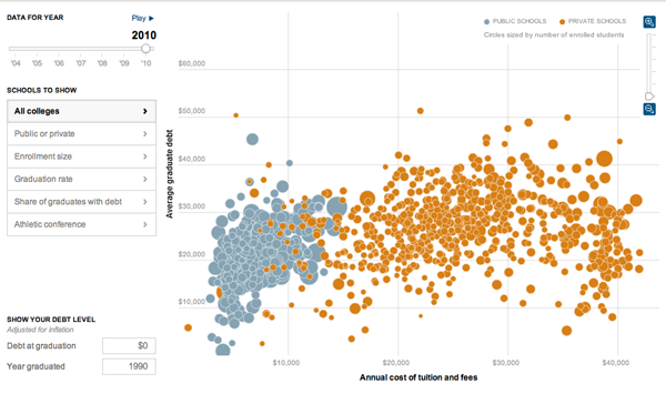
Congratulations, College Grads. Now Pay Up.

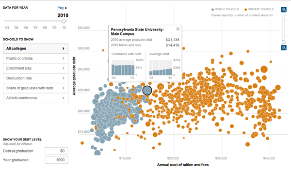
It’s that time of year when young men and women step outside into the big, real world and realise just how much money they owe to various creditors. Yay. The problem, however, has continued to get worse for students. This interactive infographic by the New York Times explains just how so by comparing student debt to costs.

The overall view of indebtedness

While the bubble chart is also available in map form—though I don’t find that particularly useful myself—the more interesting added layer of complexity comes from the data displayed when the user selects a specific university.

Debt at Penn State, which I attended for all of two semesters

Credit for the piece goes to Jeremy White, Andrew Martin, Andrew W. Lehren, and Archie Tse.

Battleground States

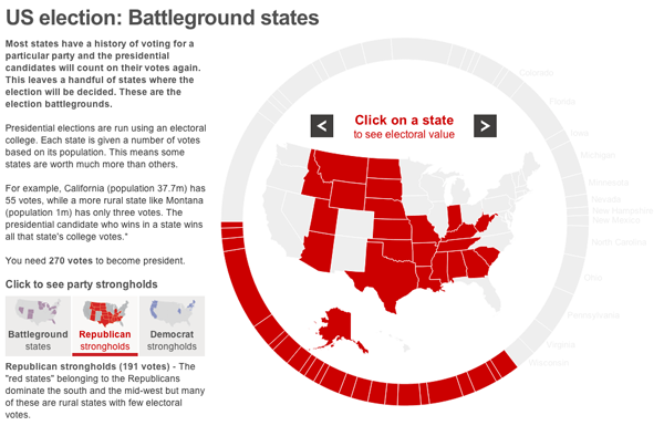
The BBC provides an interactive tool to explore the battleground states in the forthcoming election. A giant donut chart with 50 segments maps a segment to a state and its total number of electoral votes. The larger the electoral vote, e.g. California, the larger the segment. Beyond just a giant chart, however, the BBC has placed the states into different camps, the Democrats, the Republicans, and the Battleground states.

Republican strongholds

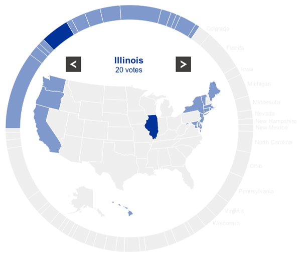
Selecting either the Democrat strongholds or the Republican strongholds highlights the states for each respective party. Not a lot of functionality is to be had. Clicking on a state merely displays its name and number of votes. But this is not the main function of the piece.

A Democrat stronghold

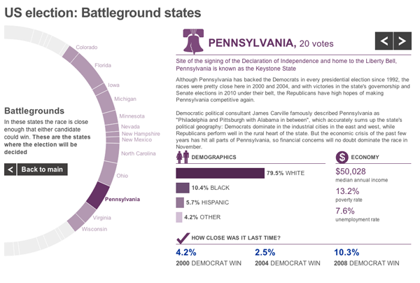
The main goal of the piece is to explore the Battleground states. When the user selects one, he or she is presented with a new view that moves the chart partially off-screen—while keeping the Battlegrounds in view—and moves a profile piece on-screen. This view contains both a text summary of the state and its challenges along with important demographic statistics.

Battleground profile

For an American audience, there is probably little to be gained from the piece unless one is wholly unfamiliar with American politics. But for the more international part of the BBC News audience, this piece gives them quick insights into the various states that will be so important over the course of the next few months.

Merry F*%#-ing Christmas

The title is from perhaps my favourite Christmas song

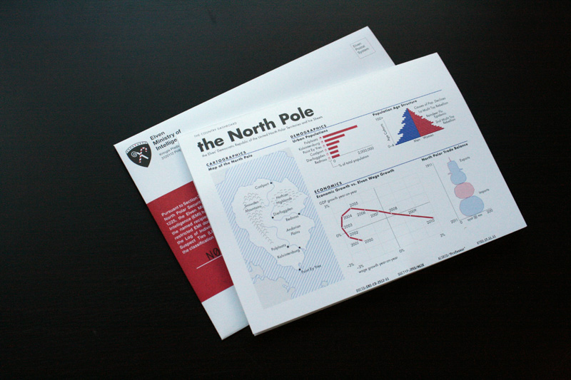
But the song relates to this post because earlier this week the print design blog For Print Only featured my annual Christmas card. I typically design and print a card to mail (as in a physical copy through the postal service, none of that e-card non-sense) to my friends and family. This past year I took to infographics to explore the realm of Santa and his North Pole dictatorship.

My Christmas Card
My Christmas Card

Credit for the photographs goes to FPO.

Executive Compensation

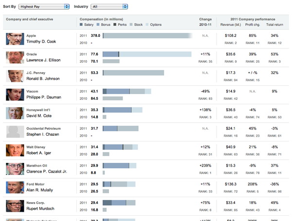
Everybody knows that executives make a lot of money. But not all of it comes from just salary, some comes from bonuses, stocks, options, and other perks. So who makes the most?

The New York Times put together an interactive piece with data from Equilar about the 50 most-highly paid chief executives from companies over $5 billion in size. The data is arranged as stacked bars, with—when available—2010 data to compare to 2011. The order can be sorted a number of different ways and the executives on display can be filtered by what industry his or her—granted only 3/50 are women—company works in.

Executive compensation

Credit for the piece goes to Lisa Waananen, Seth Feaster, and Alan McLean.

Chocolate All Over the World

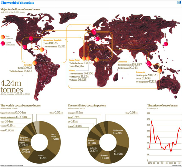
There are a few things in this world that I really dislike. Two of them are coffee and chocolate. So this map from the Guardian, a map made of real melted chocolate, is not quite to my liking.

Chocolate map
Chocolate map

While I can appreciate the concept behind it—regardless of the chocolate-ness—I am left to wonder if from a data visualisation point a world map might not have been the best choice. Only fourteen countries are shown, if I count melted chocolate correctly.

I am just thankful that at the bottom of the piece I am not looking at chocolate doughnuts.

Credit for the piece goes to Jenny Ridley.

Rising Seas

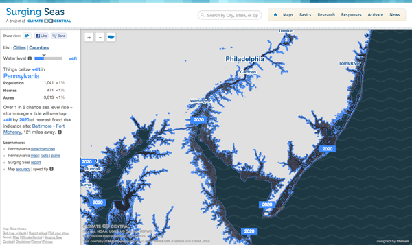
Via the Guardian, Stamen Design has teamed up with Climate Central to create an interactive piece that maps the potential effects of rising sea levels. The user has control over the amount of the rise—this graphic says four feet—after which the coastline recedes to reveal the devastation. This is complemented by statistics of the land, including the population potentially affected along with the number of homes and total acres. In this case you see South Jersey, which is where I spent my summers. As you can see, the coastal beach towns I called home would be underwater. (And the little blue specks inland in Pennsylvania near my hometown, those are quarries; nobody lives there. No need to worry.)

Changing coastline
Changing coastline

The problem, of course, is that a large percent of the Earth’s population lives near the ocean. There are not, after all, many people living in the interiors of the continents. So receding coasts may very well be a problem in the coming years.

21st Century Prohibition

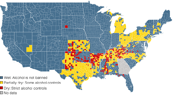
This map comes from the BBC, which investigates prohibition in the 21st century at the local level, as the national policy ended in the early decades of the 20th century.

Dry vs Wet Counties
Dry vs Wet Counties

Credit for the map goes to John Walton, Harjit Kaura, and Nadzeya Batson.

Bringing 19th Century Mapping Techniques to the 21st Century

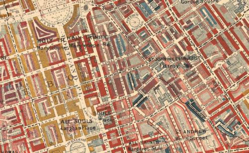
Charles Booth was a 19th century social scientist living in Britain. He famously investigated poverty and mapped out which parts of London were teeming with vicious, lower-class criminals or well-to-do upper class folks. Today, one might use a simple choropleth style to paint whole swathes of London by postal districts or constituencies or some such. But, Booth went street-by-street and house-by-house colouring blocks of London’s residential areas until he arrived at a map far more complex—and thus ultimately more telling—of the intricacies of London’s social structure.

from Booth's original map

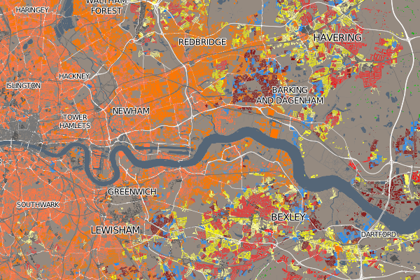
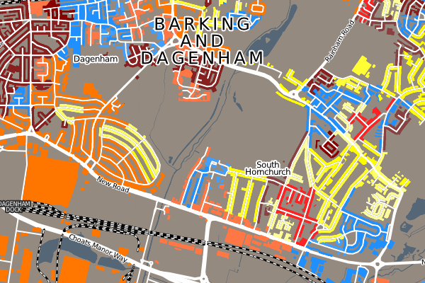
Oliver O’Brien has created a modern take on Booth’s approach to investigate the housing demographics of the UK, which ignores the large areas of the British countryside that are devoid of homes and thus focuses on the denser residential areas of the UK’s major cities.

Eastern London
Eastern London
Barking and Dagenham

Censuses seem to be a natural dataset for such work, but I wonder if in the future we will be able to apply such data visualisations to other geographically-tied data.

A Not So Smart Smartphone Chart

This piece in the Globe and Mail of Toronto looks at smartphone usage by operating system through a comparison of Canada to both the United States and Japan.

Smartphone use in Canada

While I understand the need for aesthetic distinction from having an entire page of bar charts, these ring or donut charts are a touch misleading. Because of the space between rings, the radius of each circle from the central Android icon is significantly increased. This of course proportionally scales up the length of each segment within the rings. In short, it becomes difficult to compare segments of each ring to the corresponding segments on the other rings without looking at the datapoint. And if you need to look at the datapoint, one could argue that the infographic has failed from the standpoint of communication of the data.

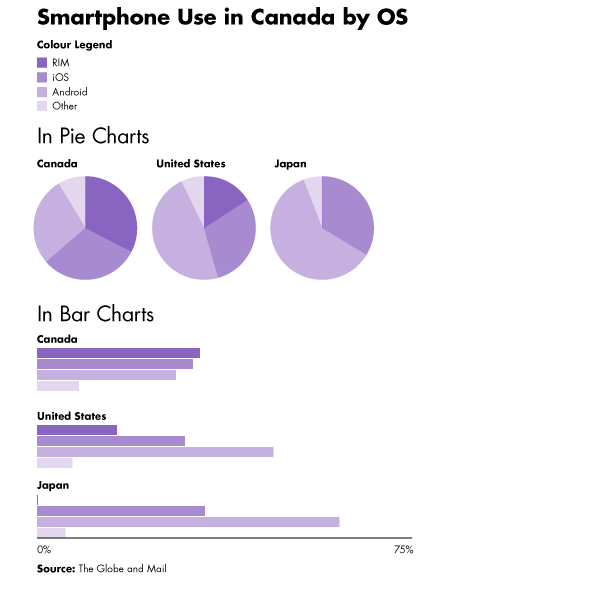
Beneath is the original (with the legend edited to fit into my cropping) with two very simple (and hasty) reproductions of the data as straight pie charts placed next to each other and then as clusters of bar charts grouped beneath each other. I leave it to you the audience to decide which is easiest to decode.

The original ring chart with legend moved
Alternate visualisation types

Credit for the Globe and Mail piece goes to Carrie Cockburn.