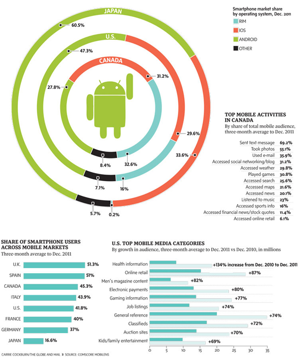
This piece in the Globe and Mail of Toronto looks at smartphone usage by operating system through a comparison of Canada to both the United States and Japan.

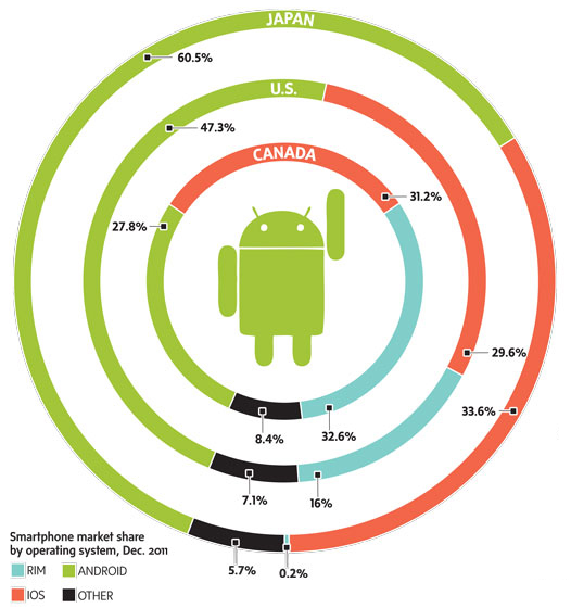
While I understand the need for aesthetic distinction from having an entire page of bar charts, these ring or donut charts are a touch misleading. Because of the space between rings, the radius of each circle from the central Android icon is significantly increased. This of course proportionally scales up the length of each segment within the rings. In short, it becomes difficult to compare segments of each ring to the corresponding segments on the other rings without looking at the datapoint. And if you need to look at the datapoint, one could argue that the infographic has failed from the standpoint of communication of the data.
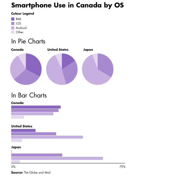
Beneath is the original (with the legend edited to fit into my cropping) with two very simple (and hasty) reproductions of the data as straight pie charts placed next to each other and then as clusters of bar charts grouped beneath each other. I leave it to you the audience to decide which is easiest to decode.


Credit for the Globe and Mail piece goes to Carrie Cockburn.
Leave a Reply
You must be logged in to post a comment.