Graduate Degrees

Many of us know the debt that comes along with undergraduate degrees. Some of you may still be paying yours down. But what about graduate degrees? A recent article from the Wall Street Journal examined the discrepancies between debt incurred in 2015–16 and the income earned two years later.

The designers used dot plots for their comparisons, which narratively reveal themselves through a scrolling story. The author focuses on the differences between the University of Southern California and California State University, Long Beach. This screenshot captures the differences between the two in both debt and income.

Pretty divergent outcomes…

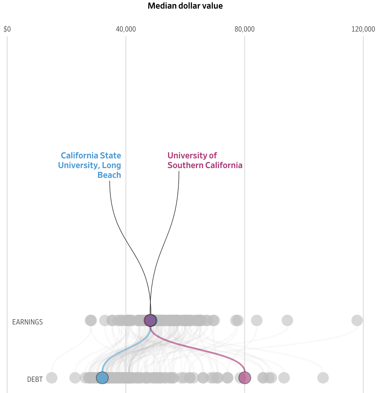
Some simple colour choices guide the reader through the article and their consistent use makes it easy for the reader to visually compare the schools.

From a content standpoint, these two series, income and debt, can be combined to create an income to debt ratio. Simply put, does the degree pay for itself?

What’s really nice from a personal standpoint is that the end of the article features an exploratory tool that allows the user to search the data set for schools of interest. More than just that, they don’t limit that tool to just graduate degrees. You can search for undergraduate degrees.

Below the dot plot you also have a table that provides the exact data points, instead of cluttering up the visual design with that level of information. And when you search for a specific school through the filtering mechanism, you can see that school highlighted in the dot plot and brought to the top of the table.

Fortunately my alma mater is included in the data set.

Welp.

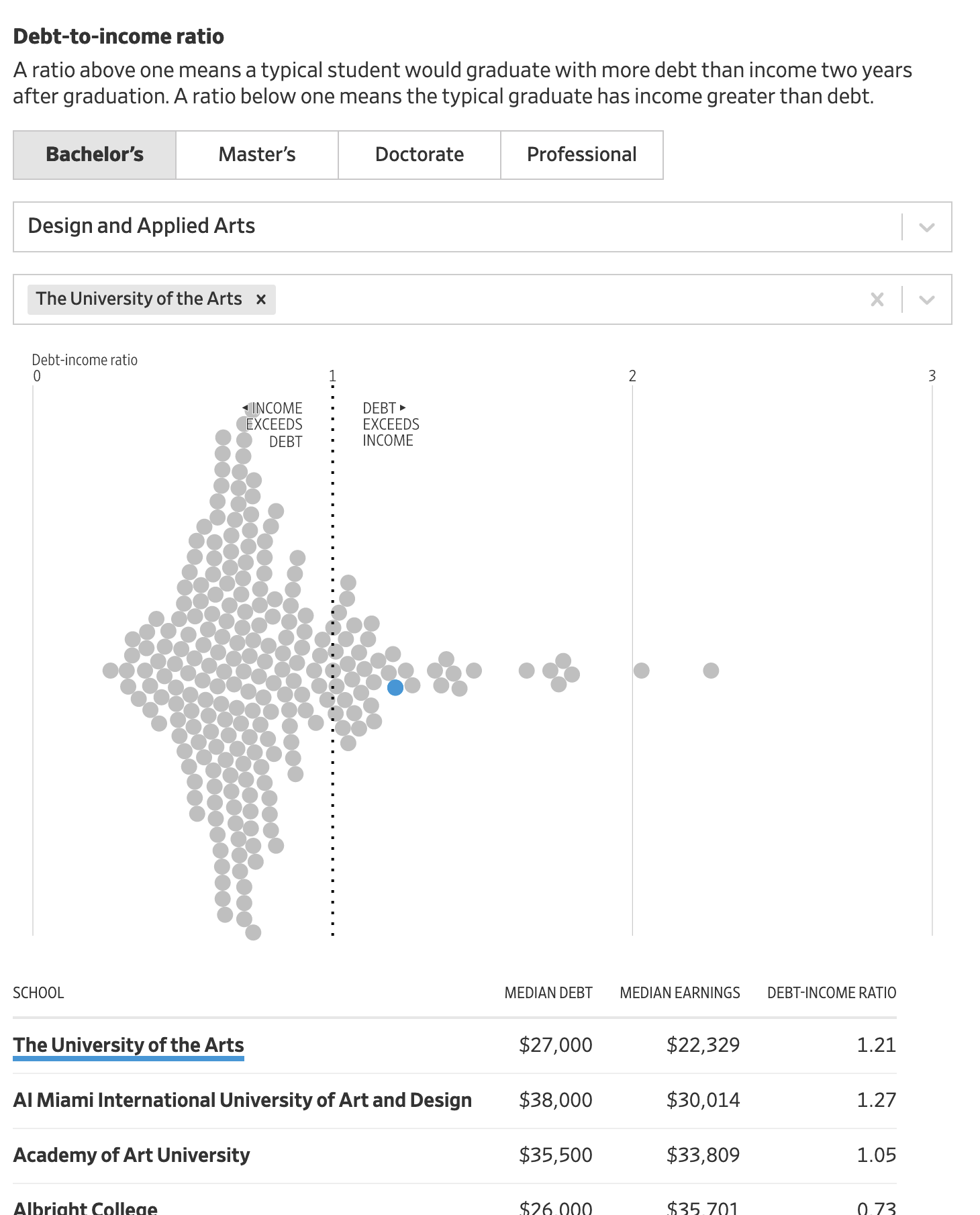
Unfortunately you can see that the data suggests that graduates with design and applied arts degrees earn less (as a median) than they spend to obtain the degree. That’s not ideal.

Overall this was a really nice, solid piece. And probably speaks to the discussions we need to have more broadly about post-secondary education in the United States. But that’s for another post.

Credit for the piece goes to James Benedict, Andrea Fuller, and Lindsay Huth.

Making America Save Again

For years, one issue with the American economy had been that we did not save enough. It’s understandable, as it’s hard to keep up with the image of the carefree American without profligate spending. But that’s also not great long-term. But thanks to Covid-19, we’ve now swung to the other side of the spectrum: Americans may be saving too much.

Saying that sounds callous to the devastation the pandemic has wrought upon large swathes of the economy. But it’s true in the aggregate as this New York Times piece explains. In particular, the authors highlight one example. Consider a corporate CEO who earned a $100,000 bonus for keeping the company he runs afloat during the recession. He adds $100k to the aggregate American income. But at a restaurant shuttered by the pandemic, owners lay off a hostess, a server, a bartender, and a dishwasher, each earning $25,000. Their collective lost income is $100,000 and so balances out that one CEO. And as CEOs are more able to work remotely than servers, it’s not hard to see how the upper-income earning cohorts of the economy have done well. In human-terms, four unemployed service industry people is terrible. But statistically, it’s a wash. Once we understand that, it makes the piece sensible.

It uses decomposition charts, basically stacked bar charts broken apart, to show what constitutes the two sides of the American household budget: earning and spending. I’ve taken a screenshot of the spending side of the ledger.

This is the aggregate, I’d be curious how this relates to you, my readers.

We see that starting from the baseline, the solid line, American households spent more money this year on durable goods. A dotted line then carries that adjusted baseline to the right for the next component of the ledger: nondurable goods. We spent more on those too, so the baseline moves up. The designers annotated the graphic, adding descriptions of what each bar represents in a casual, lighthearted tone. I’ve definitely been cooking for myself a lot more.

Here I wish we had some more traditional charting elements, e.g. axis lines and labels. Now this piece is published under the Upshot, a more conversational and less formal brand than the Times as a whole. That probably explains the casual annotations. But I think some basic axis labels, e.g. spending more vs. spending less, could add some context without the need for the annotations.

Where the piece might lose people is what happens after durable goods. Americans stopped spending on services, a decline of over half a trillion dollars. That’s a lot of money. And so the adjusted baseline shifts to well below where we started. Add on savings from things like interest rates (Jay Powell is the chair of the Federal Reserve, for whose Philadelphia bank I work in full disclosure) and Americans have spent more than half a trillion dollars less. And as the article explains, we’ve also saved an enormous amount, to the tune of $1 trillion. Add it together and you’ve got America saving $1.5 trillion in 2020.

That money has to go somewhere. And you can see where some of it went when you look at surging prices in GameStop. Longer term, when the pandemic begins to end, we are going to have a pent up demand from people who have had their lives on hold for a year or more. And if there is insufficient supply for whatever’s in demand, prices will rise and we could see a sharp jump in inflation. But that’s a post for another day.

Back to this graphic, as a statistical graphic, it works. But without axis labels and data definitions, barely so. However, I think it’s meant to be more casual and illustrative than data-driven. If I look at this piece through that lens, I do think it works.

Credit for the piece goes to Neil Irwin and Weiyi Cai.

Urban Heat Islands

Yesterday was the first day of 32º+C (90º+F) in Philadelphia in October in 78 years. Gross. But it made me remember this piece last month from NPR that looked at the correlation between extreme urban heat islands and areas of urban poverty. In addition to the narrative—well worth the read—the piece makes use of choropleths for various US cities to explore said relationship.

My neighbourhood's not bad, but thankfully I live next to a park.
My neighbourhood’s not bad, but thankfully I live next to a park.

As graphics go, these are effective. I don’t love the pure gradient from minimum to maximum, however, my bigger point is about the use of the choropleth compared to perhaps a scatter plot. In these graphics that are trying to show a correlation between impoverished districts and extreme heat, I wonder if a more technical scatterplot showing correlation would be effective.

Another approach could be to map the actual strength of the correlation. What if the designers had created a metric or value to capture the average relationship between income and heat. In that case, each neighbourhood could be mapped as how far above or below that value they are. Because here, the user is forced to mentally transpose the one map atop the other, which is not easy.

For those of you from Chicago, that city is rated as weak or no correlation to the moderately correlated Philadelphia.

I lived near the lake for eight years, and that does a great deal for mitigating temperature extremes.

Granted, that kind of scatterplot probably requires more explanation, and the user cannot quickly find their local neighbourhood, but the graphics could show the correlation more clearly that way.

Finally, it goes almost without saying that I do not love the red/green colour palette. I would have preferred a more colour-blind friendly red/blue or green/purple. Ultimately though, a clearer top label would obviate the need for any colour differentiation at all. The same colour could be used for each metric since they never directly interact.

Overall this is a strong piece and speaks to an important topic. But the graphics could be a wee bit more effective with just a few tweaks.

Credit for the piece goes to Meg Anderson and Sean McMinn.

The Rent Is Too Bloody High

This is a graphic from the Guardian that sort of mystified me at first. The article it supports details how the rising rents across England are hurting the rural youth so much so they elect to stay in their small towns instead of moving to the big city.

But all those segments?

The first thing I noticed is that there really is no description of the data. We have a chart looking at something from 1997 and comparing it to 2018. The title is more of a sentence describing the first pair of bars. And from that title we can infer that these bars are income changes for the specified move, e.g. Sunderland to York, for the specified year. But a casual reader might not pick up on that casual description.

Then we have the issue of the bars themselves. What sort of range are we looking at? What is the min? The max? That too is implied by the data presented in the bars. Well, technically not the bars, but in the numbers at the end of each bar. I will spare you the usual rant about numbers in graphics defeating the purpose of graphics and organisation vs. visual relationship. Instead, the numbers here are essential because we can use them to suss out the scale of the grey bars. After looking at a few bars, we can tell that the white lines separating the grey boxes are most likely 10% increments. And from that we can gather the minimum is about -40% and the maximum 100%. But instead of making the reader work to figure this out, would not some min/max labels at the bottom of the chart be far clearer?

And then there is the issue of the grey boxes/bars themselves. Why are they there in the first place? If the dataset were more about an unmet value, say reservoirs in towns were only at x% of capacity, the grey bars could relate the overall capacity and the coloured bars the actual values. But here, income is not a capacity or similar type of value. It could expand well beyond the 100% or decline beyond the -40%. These bars imply the values are trapped within these ranges. I would instead drop the grey bars entirely and let the coloured bars exist on their own.

Overall this is a confusing graphic for a fascinating article. I wish the graphic had been a little bit clearer.

Credit for the piece goes to the Guardian’s graphics department.

First Florence, Now Michael

You may recall a few weeks ago there was a hurricane named Florence that slammed into the Carolina before stalling and dumping voluminous amounts of rain that inundated inland communities in addition to the damage by the storm surge in the coastal communities. At the time I wrote about a New York Times piece that explored housing density in coastal areas, specifically around the Florence impact area.

Well today the New York Times has a print graphic about something similar. It uses the same colours and styles, but swaps in a different data set and then uses a small multiple setup to include the Florida Panhandle. Of course the Florida Panhandle was just struck by Hurricane Michael, a Category 4 storm when it made landfall.

Of course that track for Michael also brought significant rainfall to the areas recovering from Florence for a double whammy

This one instead looks at median income per zip code to highlight the disparity between those living directly on the coast and those inland. In these two most recent landfall areas, the reader can clearly see that the zip codes along the coast have far greater incomes and, by proxy, wealth than those just a few zip codes further inland.

The problem is that rebuilding lives, communities, and infrastructure not only takes time, but also money. And with lower incomes, some of the hardest hit areas over the past several weeks could have a very difficult time recovering.

Regardless, the recoveries on the continental mainlands of the Carolinas and Florida will likely be far quicker and more comprehensive than they have been thus far for Puerto Rico.

The only downside with this graphic is the registration shift, which is why the graphic appears fuzzy as colours are ever so slightly offset whereas the single ink black text in the upper right looks clear and crisp.

Credit for the piece goes to the New York Times graphics department.

The Global Middle Class

Even the Washington Post admits there sort of is no such thing, because standards vary across the world. But broadly speaking, you have enough for the essentials and then a little extra to spend discretionarily. The concept really allows us to instead benchmark global progress in development. Regardless, yesterday the Post published a calculator that allows you to compare household income across the world to that global middle class.

A 40k earning American is at the very top of the global middle class

The catch, however, is that income is priced in US dollars, which is the currency of very few countries. But thankfully, the Post gives the methodology behind the calculator at the end of the piece so you can understand that and the other little quirks, like rural vs. urban China.

From a design standpoint, there is not much to quibble with. I probably would not have opted for red vs. green to showcase global middle and global lower-than-middle class. But the concept certainly works.

Credit for the piece goes to Leslie Shapiro and Heather Long.

The Middle Income Trap?

Last week I covered a lot of Red Sox data. And your feedback has been fantastic. I think you can look forward to more visualisation of sportsball data. But since this is not a sports blog, let us dive back into some other topics. Like today’s piece on economic growth.

It comes from the Economist and explores the development history of national economies relative to that of the United States. The point of the chart was to illustrate what the researchers determined was the middle income trap, a space in which countries develop and become semi-rich, but then can never quite escape.

It's a trap! (Unless it isn't.)
It’s a trap! (Unless it isn’t.)

The Economist makes the point that the definition of middle income matters. The range is enormous and one statistic says that it could take 48 years to graduate at a healthy rate of economic growth. I wonder is this bit, however, could also have been charted. The show don’t tell mantra works well here for setting up the problem, but a chart or two showing that exact range could have supplemented the text and perhaps made it more digestible.

Credit for the piece goes to the Economist Data Team.

Income Inequality

On the lighter side of things we have today’s post on income inequality. Always a lighter subject, no? Thanks to Jonathan Fairman for the link.

Herwig Scherabon designed the Atlas of Gentrification as a project at the Glasgow School of Art and it was picked up by Creative Review. It displays income as height and so creates a new cityscape of skyscrapers for the wealthy and leaves lower income residents looking straight up. His work covered the US cities of New York, Los Angeles, and Chicago. The image below is of Chicago. I probably was living in a cluster of mid-rise buildings despite living in a five-story building.

A look at Chicago
A look at Chicago

Credit for the piece goes to Herwig Scherabon.

The Price of Petrol

How much does a gallon of milk cost? That, of course, is one of the classic election questions asked of candidates to see how in touch they are with the common man. But the same can be understood by enquiring whether or not they know how much a gallon of petrol or gasoline costs. And Bloomberg asked that very same question of the United States relative to the rest of the world. And as it turns out, here in the States, fueling our automobiles is, broadly speaking, not as painful as it would be in other countries.

The piece includes the below dot plot, where different countries are plotted on the three different metrics and the dots are colour coded by the country’s geographic region. But as is usually the case with data on geographies, the question of geographic pattern arises. And so the same three metrics presented in the dot plot are also presented on a geographic map. Those three maps are toggled on/off by buttons above the map.

How the US ranks compared to the rest of the world

A really nice touch that makes the piece applicable to an audience broader than the United States is the three controls in the upper-right of the dot plot. They allow you to control the date, but more importantly the currency and the volume. For most of the world, petrol is priced in litres in local currencies. And the piece allows the user to switch between gallons and litres and from US dollars to the koruna of the Czech Republic.

Credit for the piece goes to Tom Randall, Alex McIntyre, and Jeremy Scott Diamond.

If the Government Were a Household

One of the things that irritates me about when people complain about government spending is the comparison against household budgeting. The two are very different. I mean on the surface, I suppose yes, both have income and both spend on stuff and services. But, to put it all in context there is this nice piece from the Washington Post that shows what US federal government monthly spending looks like from the perspective of a household earning $64k.

The government-is-a-household budget

I wish I could get away with that level of spending on housing and transportation…

Credit for the piece goes to the Washington Post graphics department.