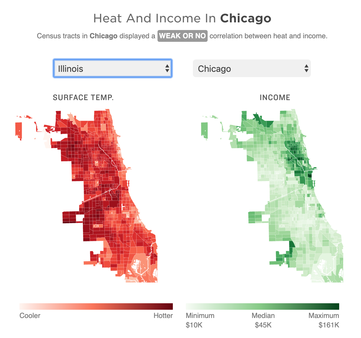
Yesterday was the first day of 32º+C (90º+F) in Philadelphia in October in 78 years. Gross. But it made me remember this piece last month from NPR that looked at the correlation between extreme urban heat islands and areas of urban poverty. In addition to the narrative—well worth the read—the piece makes use of choropleths for various US cities to explore said relationship.
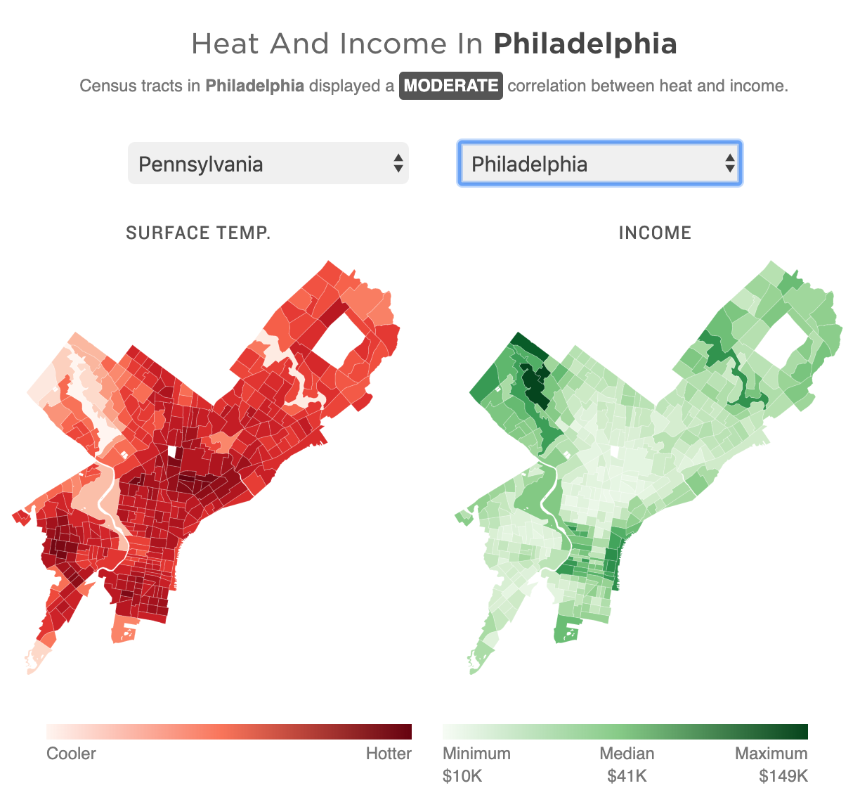
As graphics go, these are effective. I don’t love the pure gradient from minimum to maximum, however, my bigger point is about the use of the choropleth compared to perhaps a scatter plot. In these graphics that are trying to show a correlation between impoverished districts and extreme heat, I wonder if a more technical scatterplot showing correlation would be effective.
Another approach could be to map the actual strength of the correlation. What if the designers had created a metric or value to capture the average relationship between income and heat. In that case, each neighbourhood could be mapped as how far above or below that value they are. Because here, the user is forced to mentally transpose the one map atop the other, which is not easy.
For those of you from Chicago, that city is rated as weak or no correlation to the moderately correlated Philadelphia.
Granted, that kind of scatterplot probably requires more explanation, and the user cannot quickly find their local neighbourhood, but the graphics could show the correlation more clearly that way.
Finally, it goes almost without saying that I do not love the red/green colour palette. I would have preferred a more colour-blind friendly red/blue or green/purple. Ultimately though, a clearer top label would obviate the need for any colour differentiation at all. The same colour could be used for each metric since they never directly interact.
Overall this is a strong piece and speaks to an important topic. But the graphics could be a wee bit more effective with just a few tweaks.
Credit for the piece goes to Meg Anderson and Sean McMinn.
Leave a Reply
You must be logged in to post a comment.