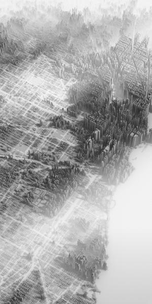
On the lighter side of things we have today’s post on income inequality. Always a lighter subject, no? Thanks to Jonathan Fairman for the link.
Herwig Scherabon designed the Atlas of Gentrification as a project at the Glasgow School of Art and it was picked up by Creative Review. It displays income as height and so creates a new cityscape of skyscrapers for the wealthy and leaves lower income residents looking straight up. His work covered the US cities of New York, Los Angeles, and Chicago. The image below is of Chicago. I probably was living in a cluster of mid-rise buildings despite living in a five-story building.

Credit for the piece goes to Herwig Scherabon.
Leave a Reply
You must be logged in to post a comment.