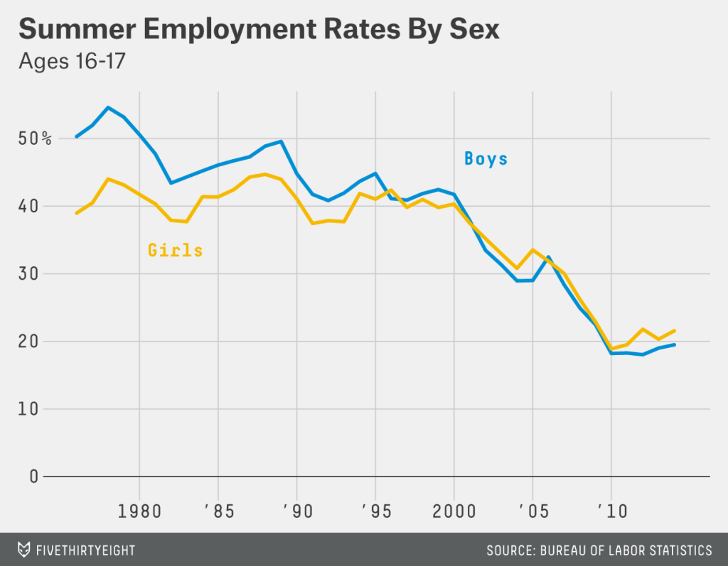
Sorry (American) folks, but Labour Day just came and went. And for us (Americans) that means summer has “officially” ended. Back in the day, for your humble author, that meant preparing to wrap up my summer employment at the Jersey Shore. The Sidewalk Sale was the great clearing of summer stock and most of us teenagers’ last working day. Fast-forward a decade and it turns out most teenagers are no longer working summer jobs. Five Thirty Eight put together a small set of graphics to support an article explaining the decline. (It’s not all recession-related.)
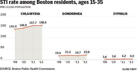
Your humble author has returned to Chicago from several days spent in Boston—among other places. So what better way to follow up on yesterday’s post about prostitution than a small piece from the Boston Globe about the increase in sexually transmitted infections (STIs) in Boston. The cause? Hook-up apps. Because, technology and young people.
Rise in STIs in Boston
Credit for the piece goes to the Boston Globe’s graphics department.
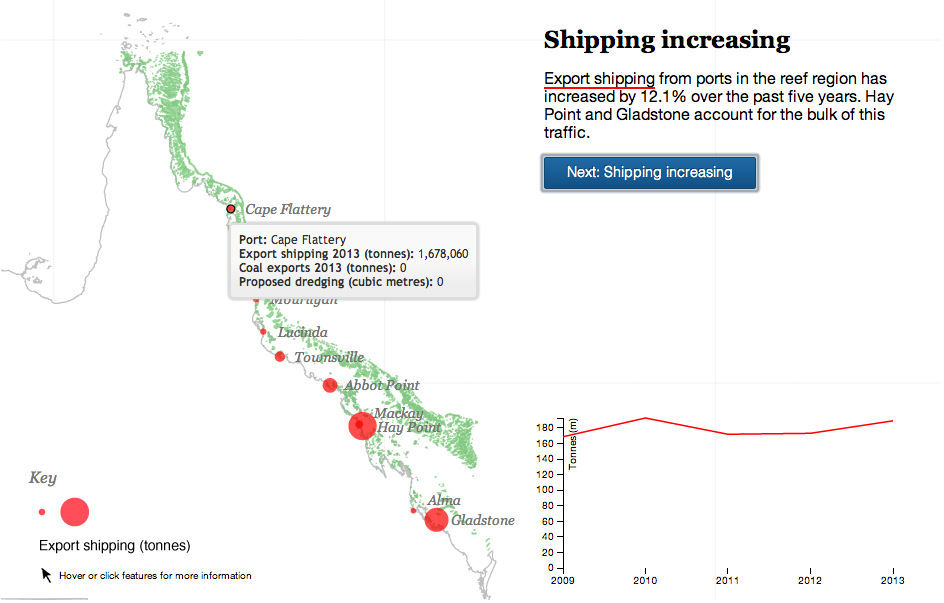
Your humble author is away this week. But the Great Barrier Reef in Australia is still here. For now. The Guardian takes a look at the growing threat to the World Heritage site from the coal industry in Queensland, Australia. The author takes you through the narrative in a chapter format, using charts and maps to illustrate the points in the brief bit of text. A really nice job altogether.
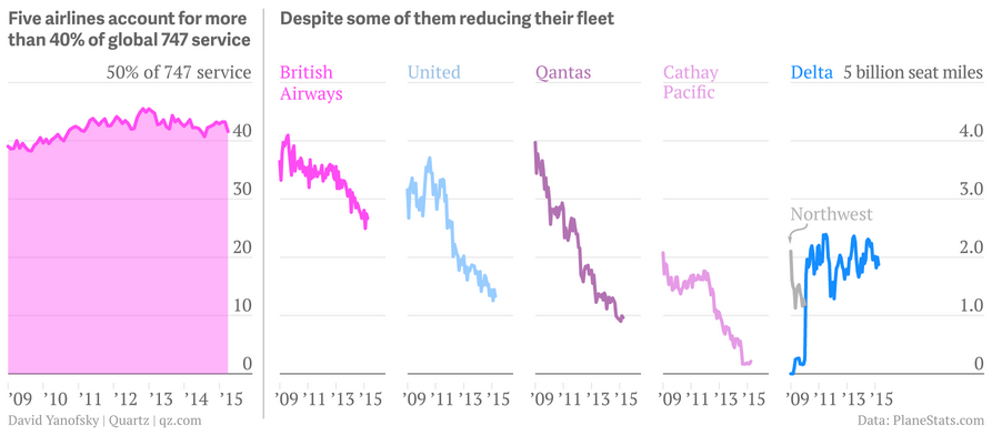
This weekend I flew to and from Philadelphia—that is when my flights were not delayed. So I decided to select an aircraft-related graphic for today’s piece, originally from Quartz. It looks at the phasing out of the iconic Boeing 747. (And as for me, well I was on a 737-900 and a CRJ-700—neither as iconic as the 747.)
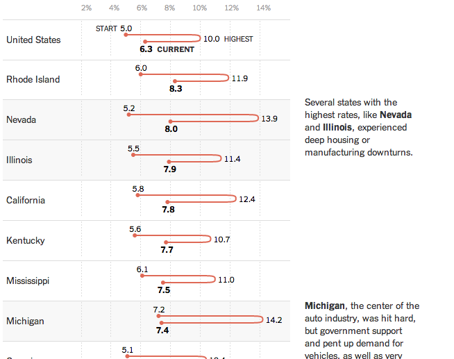
Today’s post is a New York Times piece that looks at state levels of unemployment. In particular, whether states have returned to pre-Recession levels of employment. (Spoiler, they have not.)
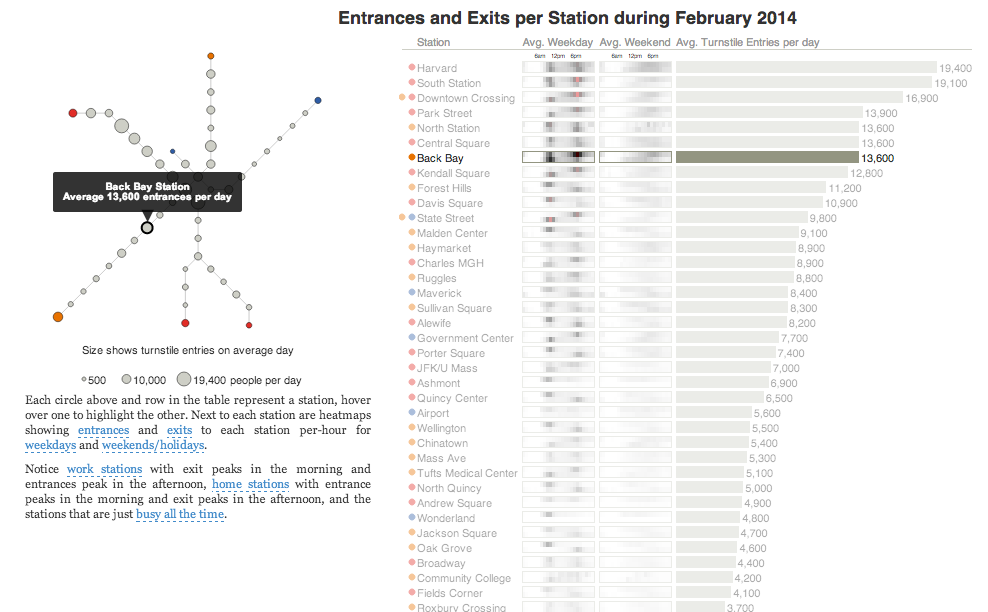
Today’s post is the graduate work of Michael Barry and Brian Card of Worcester Polytechnic Institute. The two looked at the available public data of the Massachusetts Bay Transportation Authority (MBTA)—the T to those that know—to better understand the Boston area subway system. Here the subway system refers to the heavy rail lines, i.e. the Blue, Orange, and Red lines.
T stations
In short, the piece has a lot to look at that is worth looking at. This particular screenshot is an analysis of the stations across all times on average weekdays and weekends. You can see how in this particular selection, the size of the station markers pulse depending upon the time of day and the number of turnstile entries. Meanwhile the charts to the right show you the density through time of said entries and then compares the average number of turnstiles entries per day. Text beneath the system map to the left provides a short analysis of the data, highlighting work vs. home stations.
Credit for the piece goes to Michael Barry and Brian Card.
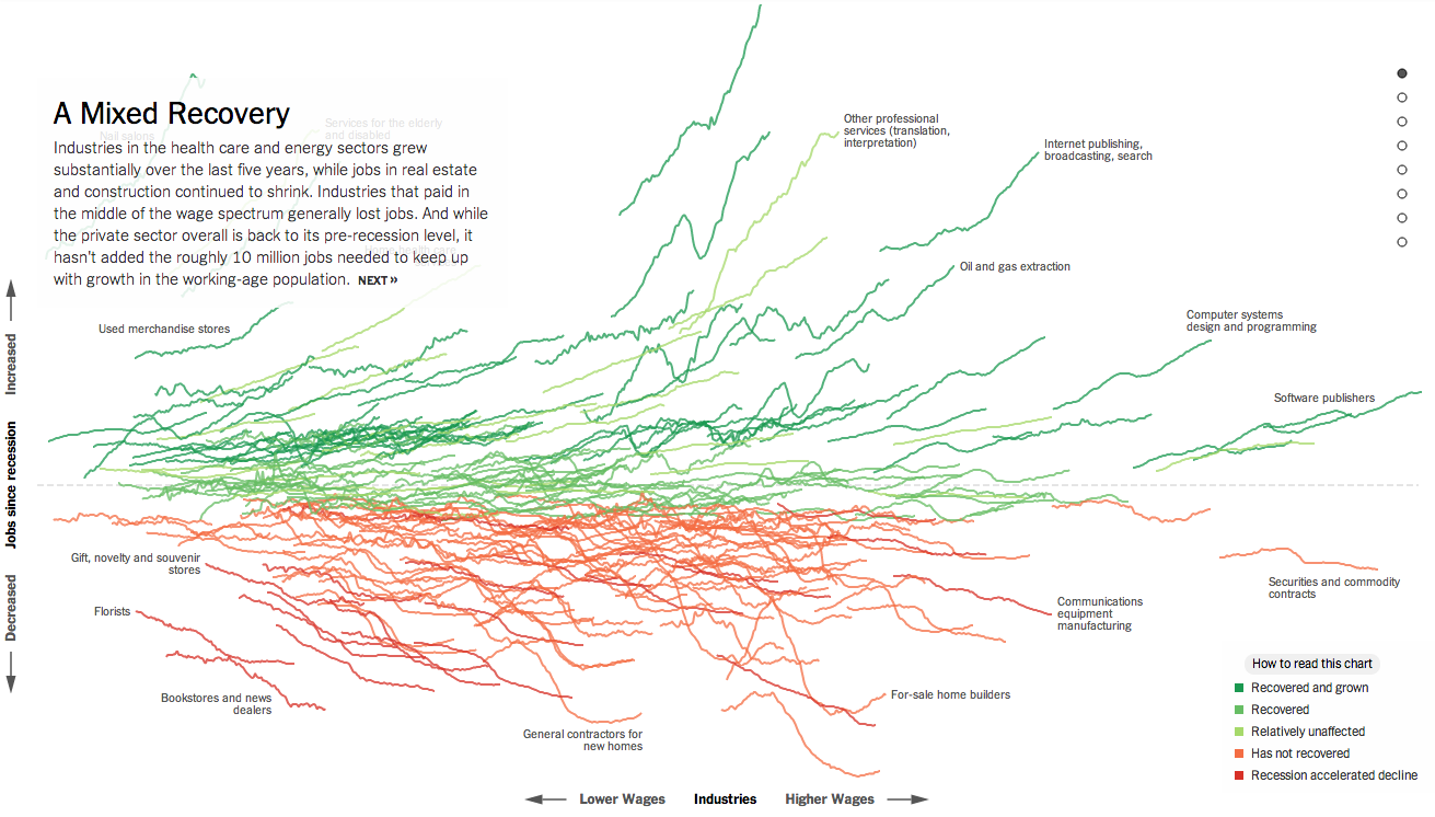
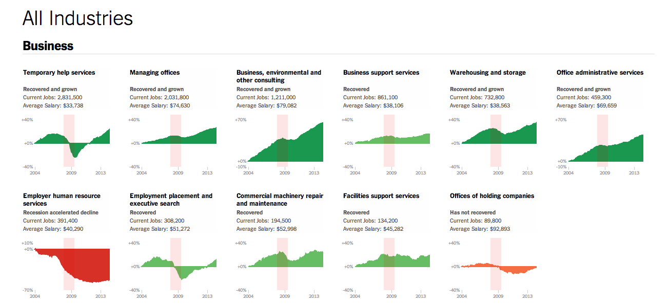
Normally I try to reserve Fridays for the lighter stuff. But yesterday, the New York Times published a really fantastic piece about how the Great Recession changed the American economy through job growth or loss in each sector of the economy. Naturally this sounds very difficult because the American economy is both very large and very diverse.
Job growth in the American economy
If you check the piece out, however, you will find that you are offered a guided tour with analysis to provide context to an otherwise jumble of coloured lines. As a bonus, highlighted words in the text bring up small charts showing the actual job growth history for the particular sector. The jumble, however, is also organised along the x and y axes by two important metrics: wages and jobs since the Great Recession. This allows you to see whether low wage jobs have performed better than higher paying and whether either has created more jobs than the other. Line colouration denotes whether a particular sector has grown and recovered, recovered, not recovered, or recession accelerated a previous decline.
Then at the very end is another really great part of the piece. This is a collection of all the small charts arranged by areas of the economy.
View sectors individually as small multiples
Lastly, for those of you who have to work on smaller screens, don’t worry, they made it responsive. Overall, a great piece.
Credit for the piece goes to Jeremy Ashkenas and Alicia Parlapiano.