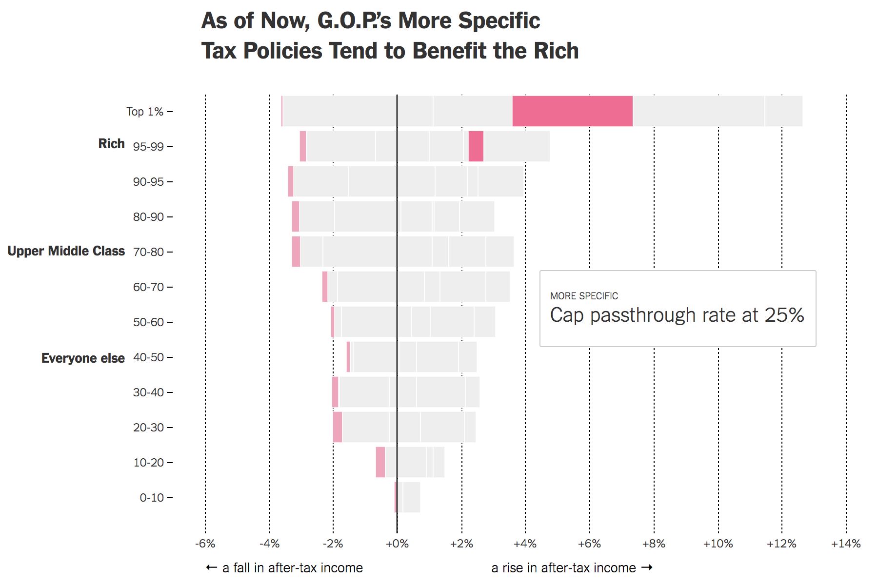
Yesterday the New York Times published a piece looking at the potential impacts of the proposed tax reforms on Americans. Big caveat, not a lot has been detailed about what the reforms entail. Instead, much remains vague. But using the bits that are clear, the Tax Policy Centre has explored some possible impacts and the Times has visualised them.
RIch do richly
I like the opening graphic, though all are informative, that cycles through various proposals. It highlights which group benefits most from the proposals. The quick takeaway is that while all would moderately benefit, the rich do really well.
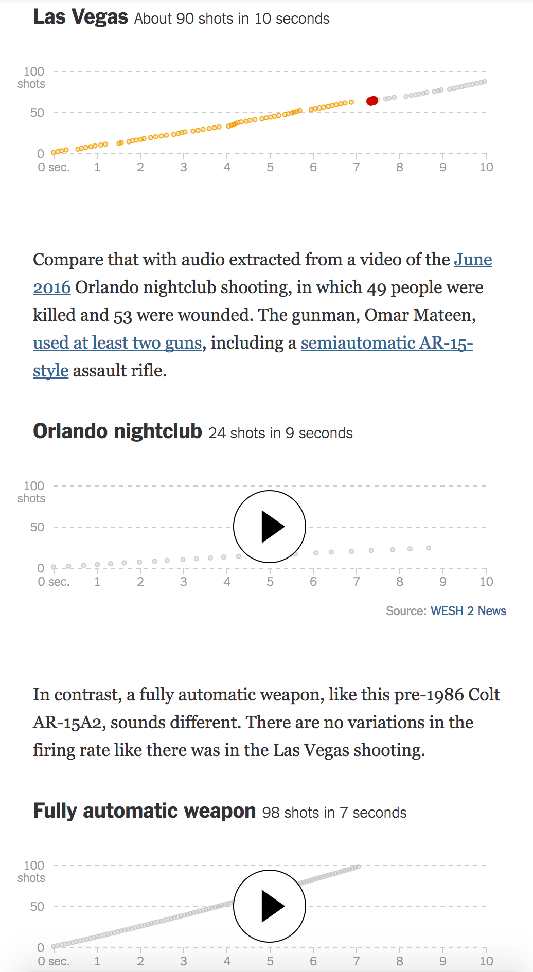
Well news definitely happened whilst your author was on holiday. So today we look at an informative piece from the New York Times that compares the weapons fire from the Las Vegas shooting to that of Orlando and a fully automatic weapon.
This piece makes good use of both audio and motion graphics to show how the bump stock makes a semi-automatic rifle more like what we might call a machine gun. It also includes some nice illustrations that demonstrate how the stock does what it does.
Eerie hear it
From an audio standpoint, I do want to point out that the designers made a wise decision in opting not to use authentic sounds. Instead they chose an abstracted sound, allowing the user to focus on the rapidity and steadiness of the sound.
Credit for the piece goes to Larry Buchanan, Evan Grothjan, Jon Huang, Yuliya Parshina-Kottas, Adam Pearce, Karen Yourish, C.J. Chivers, and Thomas Gibbons-Neff.
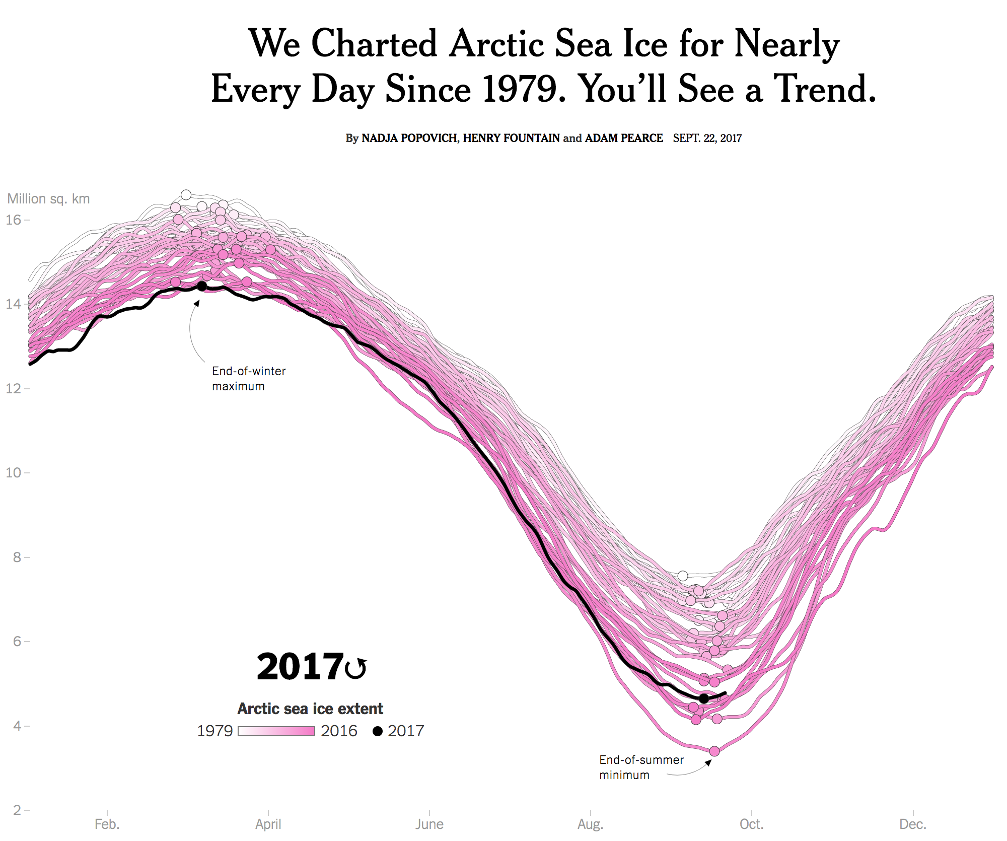
You may recall how over two years ago I posted about a piece from the New York Times that explored the levels of Arctic sea ice. It showed how the winter sea ice of 2015 was the lowest level ever recorded. Well last week the Times updated that piece with new data. And instead of the static graphic we enjoyed last time around, this time the piece began with a nice animation. It really helps you see the pattern, so you should click through and check out the whole piece.
Go hit play and you’ll see the trend
But this isn’t just a visually top heavy piece. No, the remainder of the article continues to explore the state of Arctic sea ice through a number of other charts and maps.
Credit for the piece goes to Nadja Popovich, Henry Fountain, and Adam Pearce.
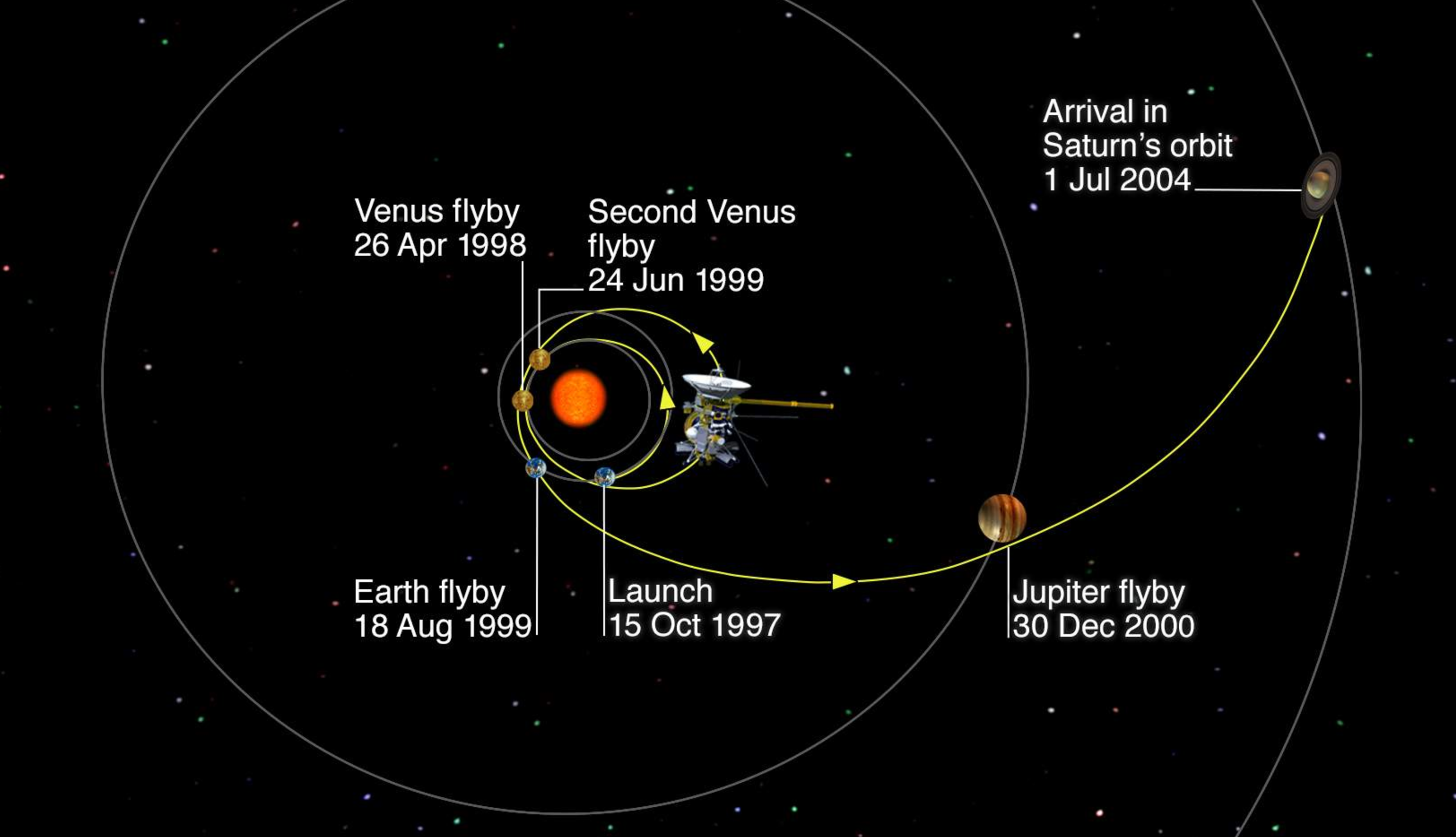
Today’s post is a sad post, hence why I did not run with it on Friday. But on Friday, we bid adieu to the little space probe that could, Cassini. This piece is not terribly heavy on the information design, but it does include one diagram—so it counts.
The BBC put together a piece reflecting on the Cassini mission, including its little lander Huygens. If you, like your author, are interested in space-y things, this article is worth the read.
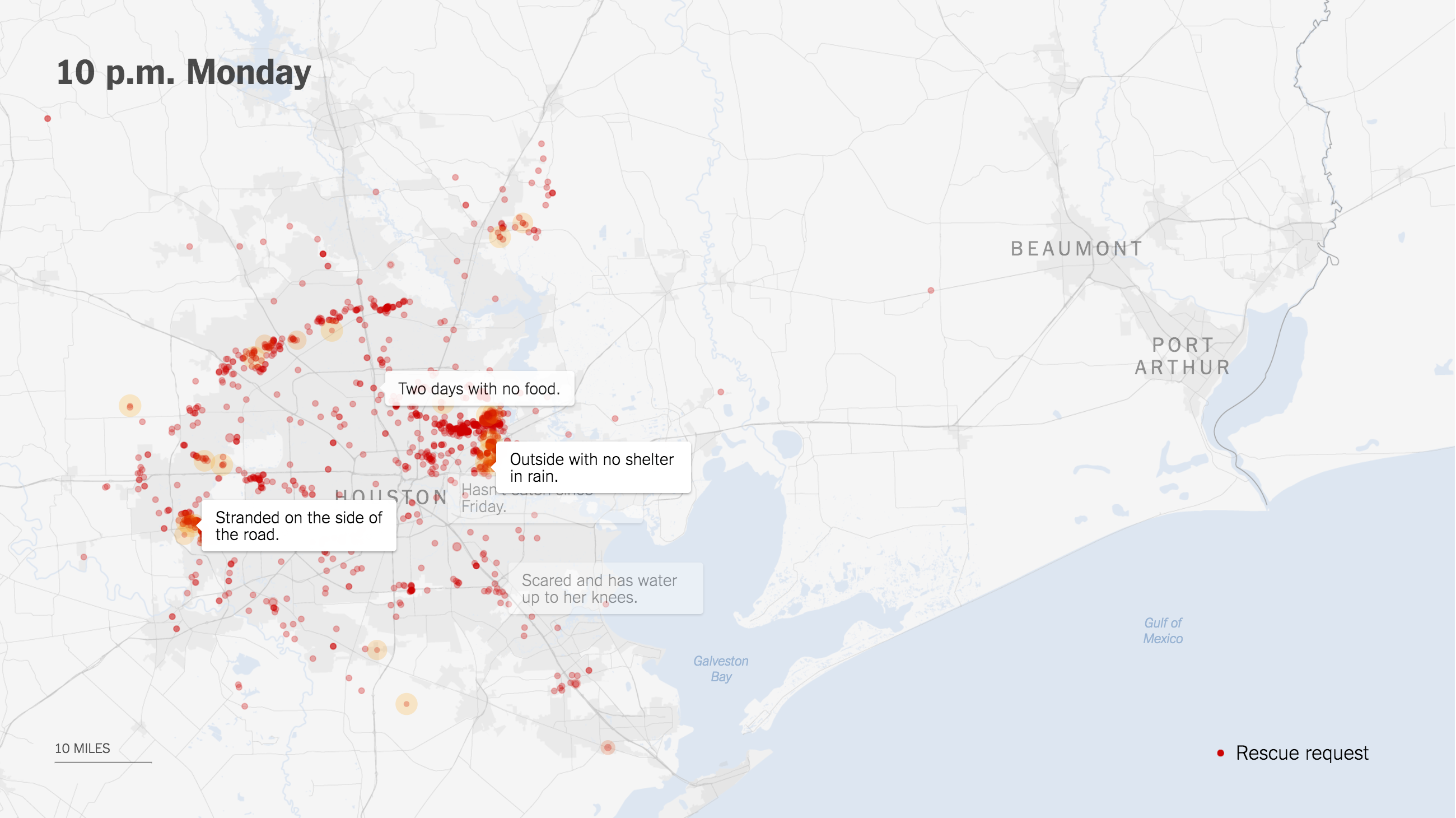
So I thought I would be done with Harvey coverage, but this morning I saw this map from the New York Times that plotted out requests for aid throughout the storm.
You can really see the storm’s movement through the impacts upon the people. It’s especially true later in the timeline as the storm moved further to the east.
Early on the focus was in Houston
Credit for the piece goes to Gregor Aisch, Sarah Almukhtar, Jeremy Ashkenas, Matthew Bloch, Audrey Carlsen, Jose A. Delreal, Ford Fessenden, K.K. Rebecca Lai, Adam Pearce, Anjali Singhvi, and Karen Yourish.
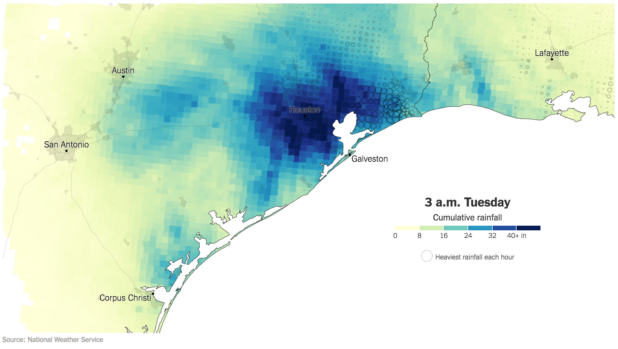
Let’s consider today a follow-up to yesterday’s piece. (No, I do not believe I have ever done a follow-up piece, but why not start now all these years later.)
Yesterday we looked at the Post, Journal, and Times for their coverage of the fallen rain amounts in southeast Texas. But at the time, we only had actual totals from the Post and Journal. The Times had only produced a projection map. The Times piece yesterday was perhaps the most underwhelming of the three, though it certainly did some things correctly, namely it was small, simple, and quick to get the reader to the point that Houston was likely to be flooded by storm’s end.
What is different about this piece? Well this one is an animated .gif showing the cumulative rainfall. In other words, Texas starts dry and every hour just makes the map bluer and bluer. An additional feature that I find particularly useful is the dot map, which indicates where the heaviest rain was falling in each hour. Especially early on in the event, you can see the bands of rain sweeping in from the Gulf.
The bins also work better here, though I wonder if more segregation or a different palette would have worked a bit better. But, my biggest critique is the same I have with many animated .gifs: the looping. And unfortunately I do not have an easy solution. You certainly need to see it loop through more than once to understand the totality of the rainfall. But then I really do want to be able to examine the final map, or at least final as of 03.00 today.
Anyway, this was a really nice piece that should have been showcased alongside the others yesterday.
Credit for the piece goes to Gregor Aisch, Sarah Almukhtar, Jerey Ashkenas, Matthew Bloch, Joe Burgess, Audrey Carlsen, Ford Fessenden, Troy Griggs, K.K. Rebecca Lai, Jasmine C. Lee, Jugal K. Patel, Adam Pearce, Bedel Saget, Anjali Singhvi, Joe Ward, and Josh Williams.
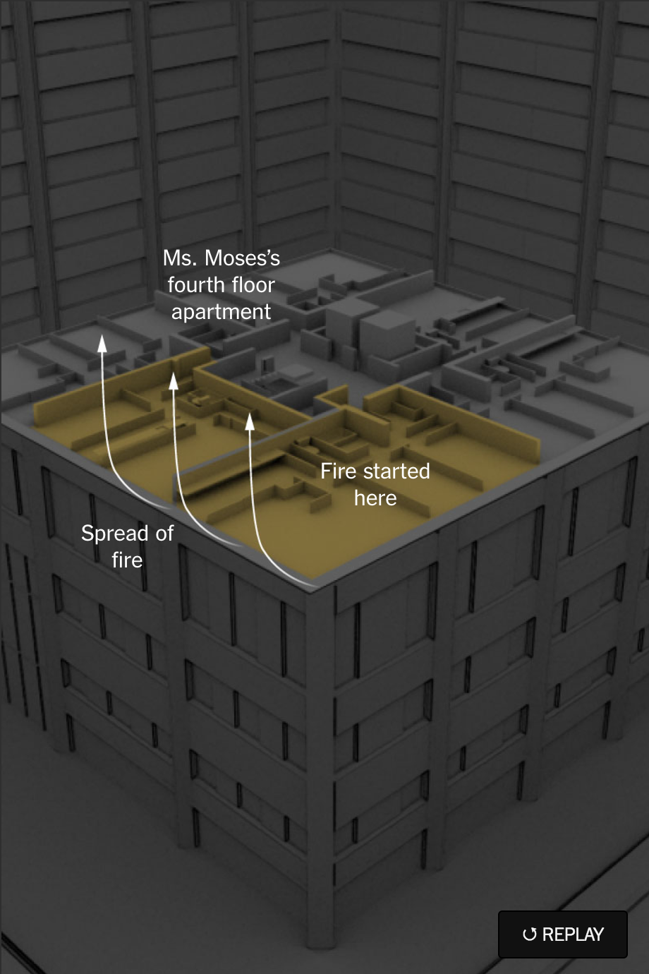
This weekend, the New York Times published an online piece explaining the spread of the Grenfell Tower fire in London. The story uses small animated graphics and videos to show the origin and progression of the fire from an exploding refrigerator on the fourth floor to its trapping of residents on the 23rd and final floor.
Where it began
Credit for the piece goes to Troy Griggs, Mika Gröndahl, Josh Keller, Jamine C. Lee, Anjali Singhvi, Megan Specia, Derek Watkins, and Jeremy White.
I am in Chicago today, visiting friends and former coworkers. Generally taking a break from my team’s recentfantasticwork at my new gig. But don’t think that I wouldn’t leave you without some sort of light-hearted Friday content.
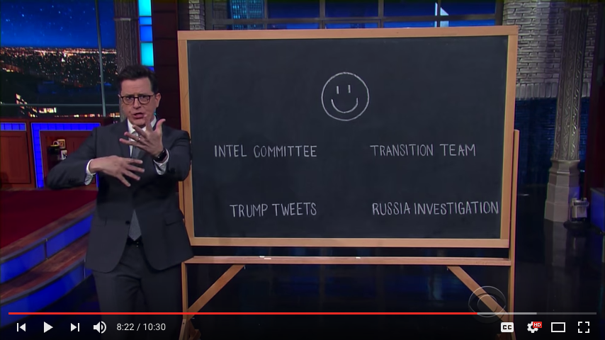
My Tuesday post was about Monday’s news about another connection between Donald Trump and Vladimir Putin. Today’s post is a screen capture from the Late Show with Stephen Colbert from last week. Do you recall the weird story about Devin Nunes, Republican Chair of the House Select Committee on Intelligence and, don’t forget a member of the Trump transition team, receiving news from the White House about the White House to tell to the President (of the White House) before telling members of his own committee? Yeah, it was weird.
Colbert put together a great little monologue segment about the entire thing. And that’s what I’m going to share with you today. You should watch the entire thing, but I’ve keyed you into the referenced segment.
This does link to a video with sound. You’re warned.
I suspect this won’t be the last time over the next four years we take a look at what the Figure-It-Out-a-Tron is telling us…
Credit for the piece goes to the graphics department of the Late Show with Stephen Colbert.
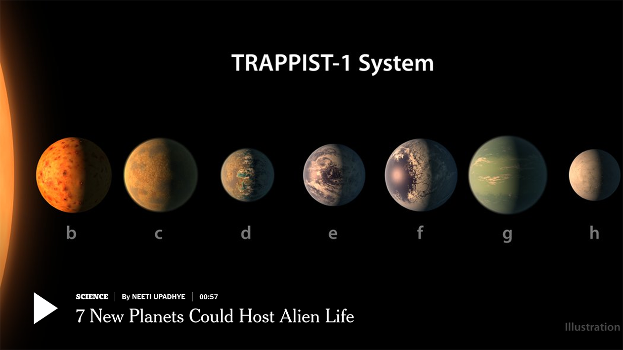
What else did you guys think I was going to cover today? The by-elections in Copeland and Stoke? Well, yeah, we’ll likely get back to that tomorrow when we have some results. In the meantime…space!
This is an animation from the New York Times about the Trappist-1 system that has seven Earth-sized planets, a few of which could support liquid water. And since life as we know it depends upon liquid water…well, you get the idea. Go space.
So there’s Doc, Dopey, Bashful…wait, wrong group of seven
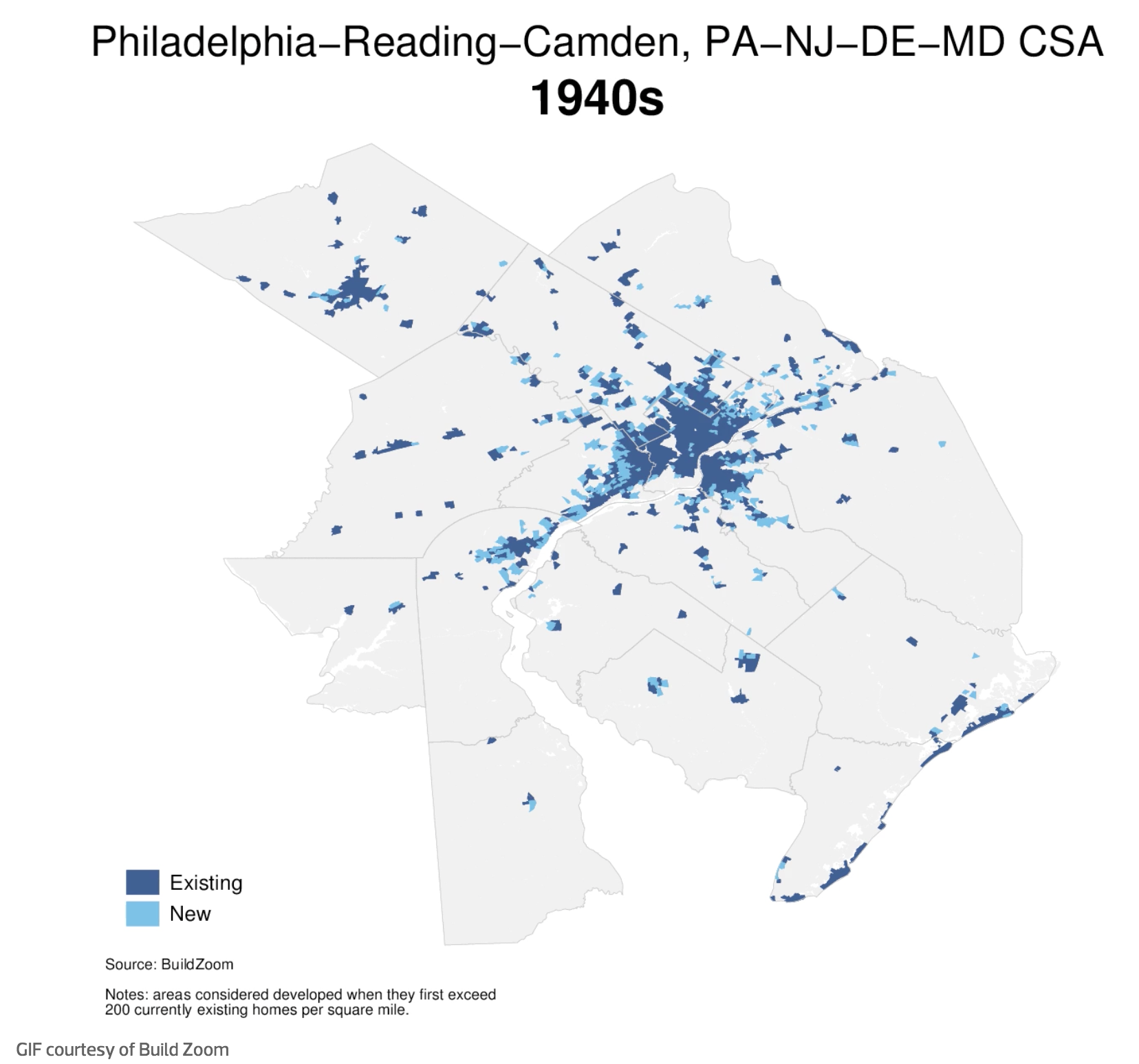
I stumbled upon this article last night on philly.curbed.com that takes a look at the growth and slowdown in said growth in Philadelphia. For the purposes of this blog, that included an animated .gif that showed the expansion in the metro area since the 1940s.
At this point I was far from being born…let alone living in the city
My quibble with the piece is that the lighter blue loses out to the darker. And so one really sees the presence of the city at the expense of the growth. I wonder if reversing the two colours or in some other way de-emphasising the areas built up would allow the new growth areas to come to the forefront of the map.