Philadelphia’s Growth Since the 1940s

I stumbled upon this article last night on philly.curbed.com that takes a look at the growth and slowdown in said growth in Philadelphia. For the purposes of this blog, that included an animated .gif that showed the expansion in the metro area since the 1940s.

At this point I was far from being born…let alone living in the city

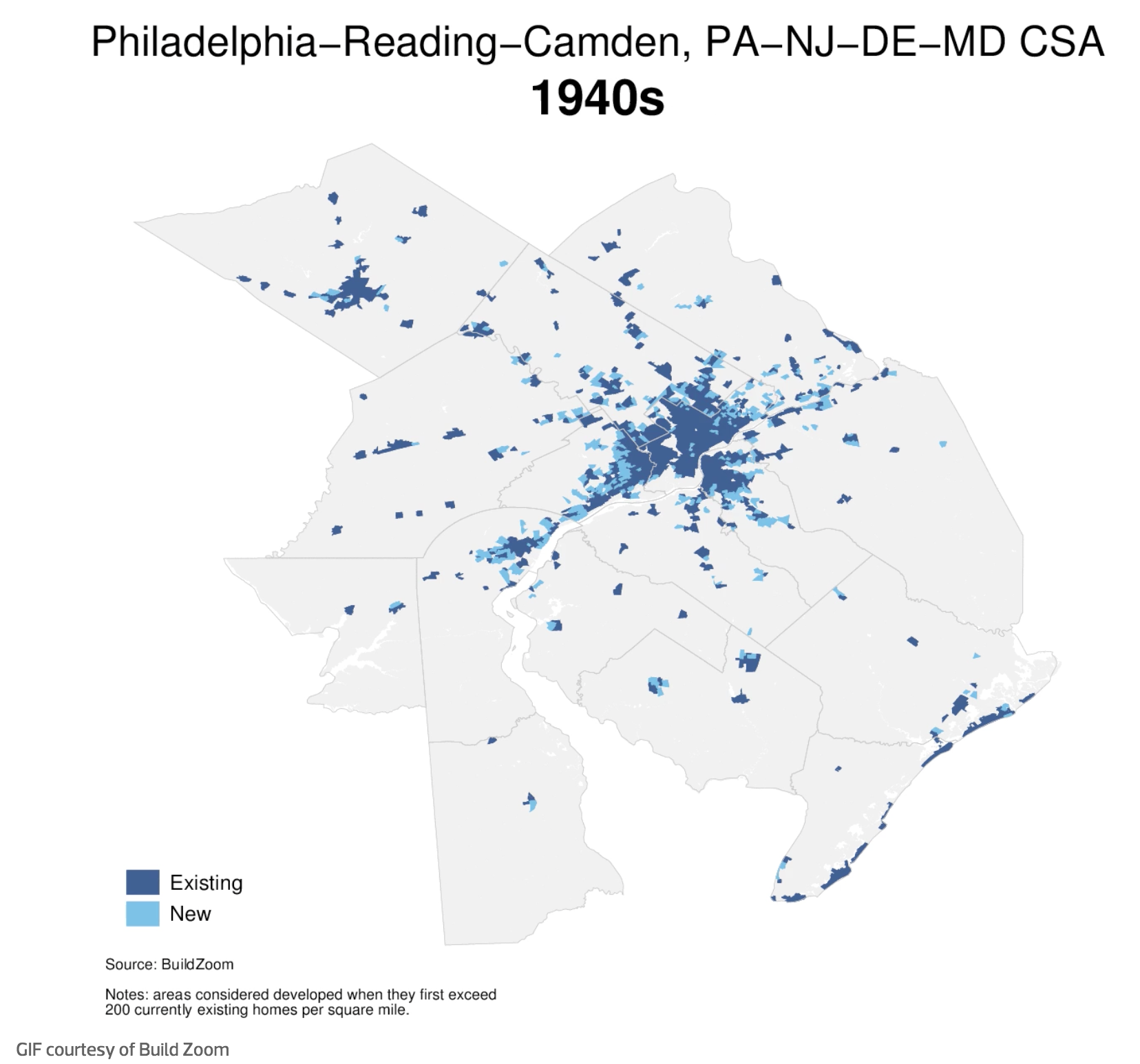
My quibble with the piece is that the lighter blue loses out to the darker. And so one really sees the presence of the city at the expense of the growth. I wonder if reversing the two colours or in some other way de-emphasising the areas built up would allow the new growth areas to come to the forefront of the map.

Credit for the piece goes to BuildZoom.

Author: Brendan Barry

I am a graphic designer who focuses on information design. My day job? Well, they asked me not to say. But to be clear, this blog is my something I do on my own time and does not represent the views of…my employers. I think what I can say is that given my interest in information design—be it in the shape of clear charts, maps, diagrams, or wayfinding systems—I am fortunate that my day job focuses on data visualisation. Outside of work, I try to stay busy with personal design work. Away from the world of design, I have become an amateur genealogist and family historian. You will sometimes see that area of work bleed into my posts.

Leave a Reply