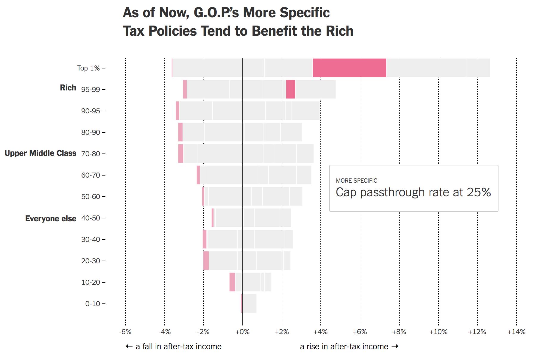
Yesterday the New York Times published a piece looking at the potential impacts of the proposed tax reforms on Americans. Big caveat, not a lot has been detailed about what the reforms entail. Instead, much remains vague. But using the bits that are clear, the Tax Policy Centre has explored some possible impacts and the Times has visualised them.

I like the opening graphic, though all are informative, that cycles through various proposals. It highlights which group benefits most from the proposals. The quick takeaway is that while all would moderately benefit, the rich do really well.
Credit for the piece goes to Ernie Tedeschi.
Leave a Reply
You must be logged in to post a comment.