Let’s follow up yesterday’s good news story about measles with lynchings. The New York Times mapped and charted historical lynchings from 1877 to 1950 across 12 states in the South.
Locations of lynchings across the South, 1877–1950
Credit for the piece goes to the New York Times graphics department.
People, science is your friend. Vaccinations are not only for the benefit of yourself, but for others. Anyway, let us take a look at the measles outbreak through some graphics produced by the New York Times. It started in Disneyland. Because we had eliminated the disease about 15 years ago. Science, people.
Where the outbreak had spread as of 6 February
Credit for the piece goes to Jonathan Corum, Josh Keller, Haeyoun Park, and Archie Tse.
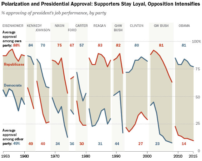
Yesterday was Presidents Day and I had the day off. So today’s post is a bit late, but it still works. Pew Research Centre pulled together data they had on presidential popularity from Eisenhower to Obama. The data point was job approval.
There has been a widening polarity gap
Credit for the piece goes to the graphics department of the Pew Research Centre.
Choropleths are not always a good idea. For example, look at election maps. Highly populated but geographically small cities appear as mere drops of ink on paper or pixels on a screen. Meanwhile, vast deserts appear gigantic empires. Nothing new there. But even within cities, these issues exist. London is one such city and one design studio has been working on a means of changing that. London Squared Map converts the boroughs of London into almost all squares of equal area. Each is placed in the appropriate space to represent geographic location. But to convey actual geography and familiarise the audience, not all squares are equal. Instead, just like the city itself, the squares are divided by a simplified shape of the Thames.
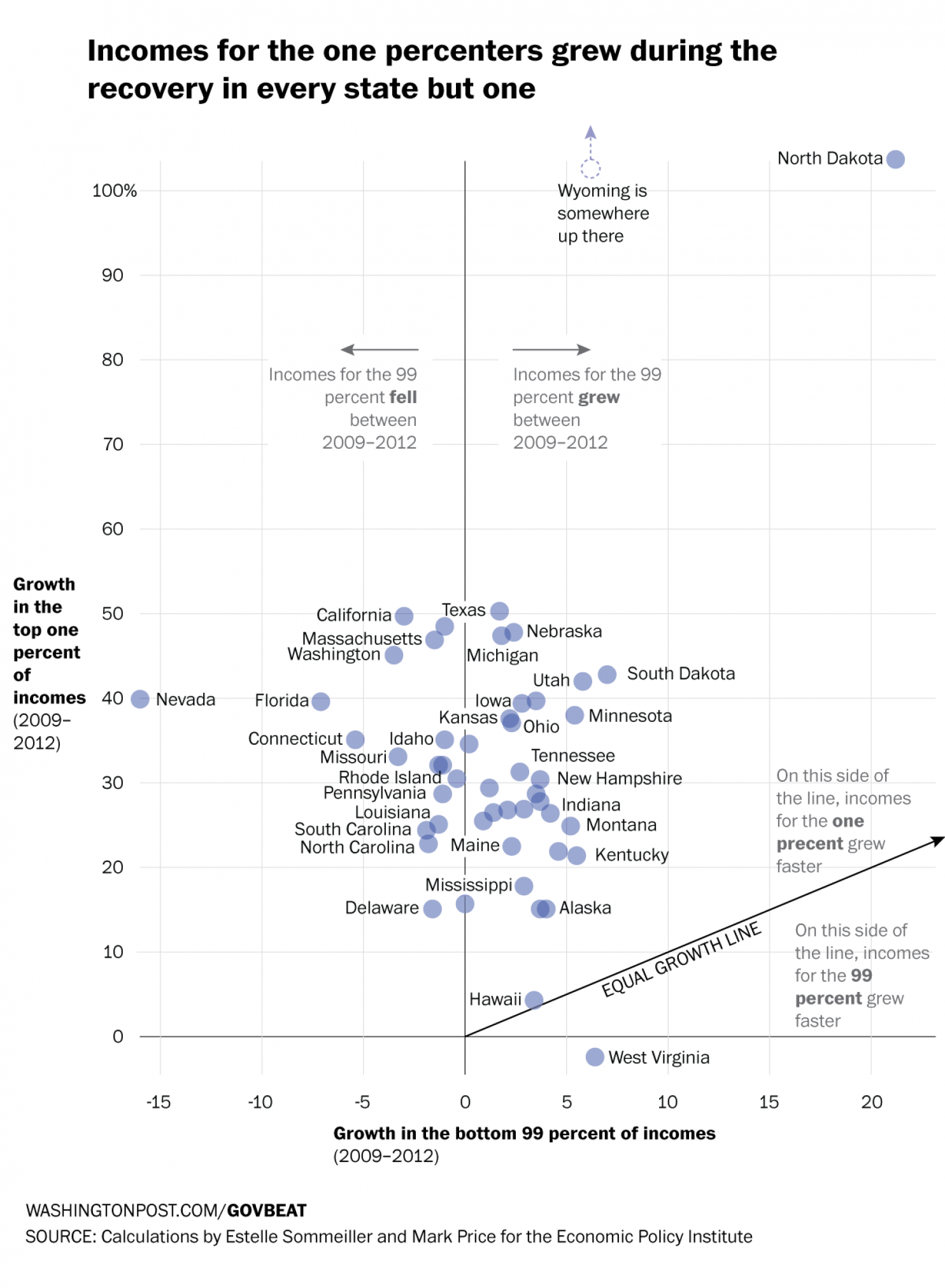
The Recession was not great for the 99%. It was, however, good for the 1%. How good? Well as data put together by the Economic Policy Institute indicates—and as reported by the Washington Post—it was very good. In only 1 of 49 states did the 99% fare better than the 1%. One state’s data was unavailable. This scatter plot compares the growth over the period of the two income groups. And as the reader can see, the growth was generally speaking not even close to being equal.
Comparing income growth
Credit for the piece goes to Niraj Chokshi and Jeff Guo.
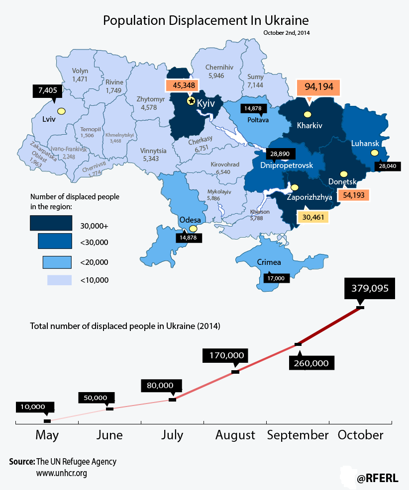
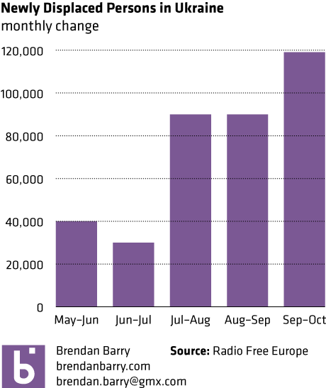
Ukraine continues to suffer the effects of a Russian invasion. Though we won’t call it that. This piece from Radio Free Europe looks at the displaced persons in the country. Unfortunately, it is not quite the best example of what to do.
Displacement in Ukraine
The line chart looks at the cumulative number of displaced persons. But, a monthly growth or absolute number for that month would tell a different story. See below. Hint, it slowed down, and then got pretty bad again.
Monthly population change
I am also not a fan of labelling every data point on the map. Maybe call out a few interesting ones, the outliers perhaps. But do we need to know to the person how many people are in Ternopil. Probably not.
Credit for the piece goes to the graphics department of Radio Free Europe.
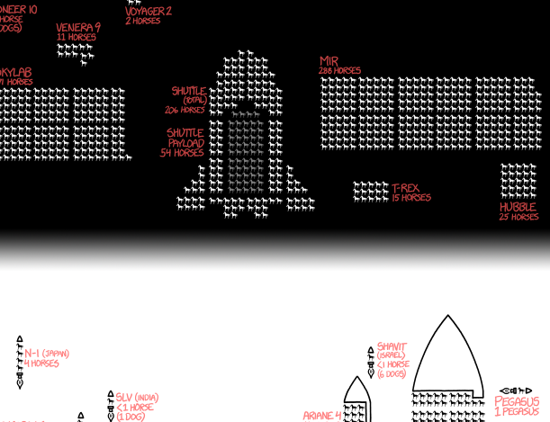
While last week ended with an xkcd post, I want to start this week with an older one I missed about spacecraft. Because spacecraft are awesome every day of the week. In particular it looks at mass and payload capacity of spacecraft and rockets over time.
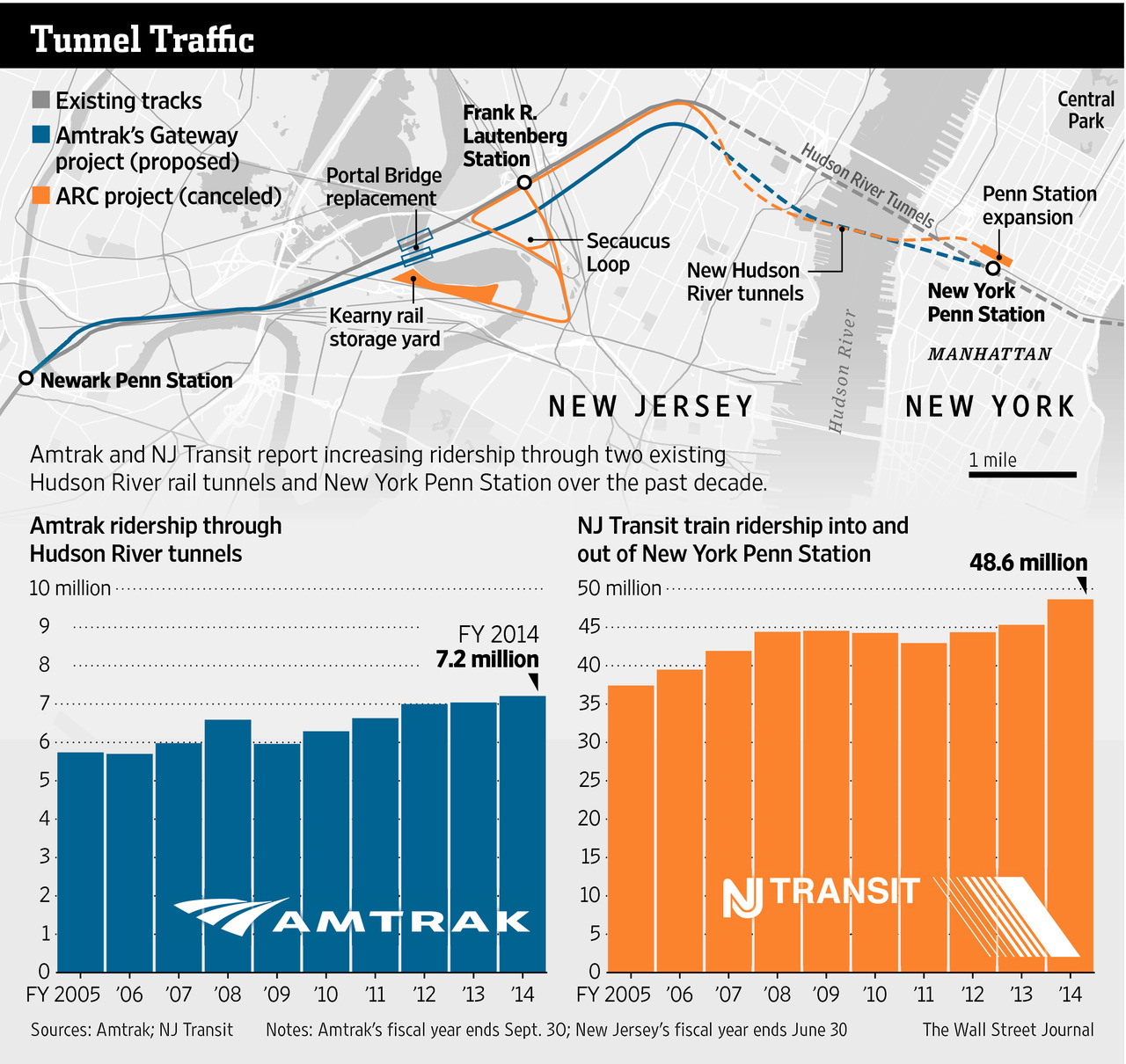
Readers of this blog know that I am a fan of rail travel. And in particular, how the rail system on the East Coast is brilliant when compared to anywhere else in the States. Unfortunately, the railway system on the East Coast is also old and in need of serious capital investment. The tunnels linking New York and New Jersey beneath the Hudson River are a prime example. But a few years ago, Governor Christie of New Jersey killed Amtrak’s plans to build new tunnels to provide a backup to the existing infrastructure and increase overall capacity. The Wall Street Journal takes a look at Amtrak’s new plan to cross the Hudson. Let’s hope this venture is a bit more successful.
The new project
Credit for the piece goes to the Wall Street Journal graphics department.
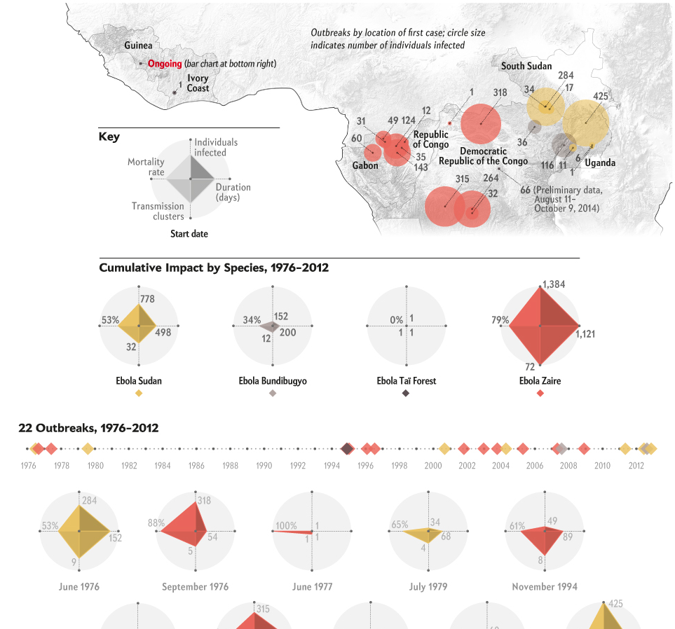
Spoiler alert, it’s big. Thankfully Scientific American has attempted to put the West African outbreak in the context of all other Ebola outbreaks. I think the one thing missing, rather the one thing I would have done differently, is to include some kind of background element to show the difference in scale. A giant circle behind the whole graphic. Or a giant diamond. Of course the designer may not have had the space to do that, because the scale difference is just that extreme.
Putting the ongoing outbreak in context
Credit for the piece goes to Pitch Interactive for Scientific American.