Federal Reserve Actions

Line charts can be a great way of looking at the impact of event over a metric over a set period of time. But what happens when you want to look at multiple metrics over that same period of time?

In this example from the New York Times, we have a series of line charts examining the impact of Federal Reserve actions over several years. Instead of attempting to conflate and confuse the issue by combining multiple charts into one, the designers chose to construct a vertical-running story that is linked by running narration. The final piece looks at four metrics: Federal Reserve assets, the S&P 500 index, the unemployment rate, and the labour force participation rate.
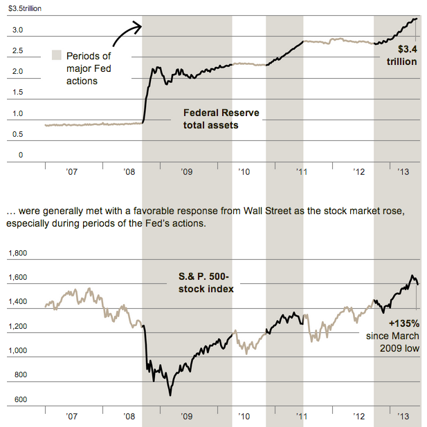
Federal Reserve actions

The use of the coloured bars in particular works to create and enforce the vertical narrative. The colour consistency across the four charts also aids in that effort. While an option like four small charts could have worked in one visual screen space, you would likely lose much of the detail and fidelity in the lines.

Credit for the piece goes to the New York Times graphics department.

Alcohol-related Traffic Fatalities

Earlier this year the National Transportation Safety Board (NTSB) recommended changes in the current blood alcohol limits to reduce youth drunk driving. The NTSB wants the limit dropped/increased from 0.08 to 0.05. Fun side note, technically, the NTSB needs to have the states enact this on their own accord because such limits are not federal power. Instead, the federal government uses the threat of witholding federal transport money as a means of urging states to comply.

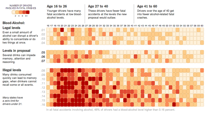
Anyway, the New York Times took a look at the data on fatal crashes and blood alcohol in two heat charts. The first looks at the ages of drivers. The youth problem is self-evident.

Alcohol-related traffic fatalities by age

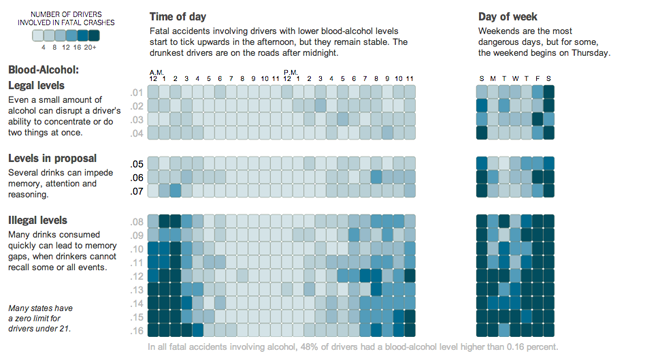
Toggling to time of day shows perhaps a more commonly thought pattern: drunk driving rises significantly after midnight.

Alcohol-related fatalities by time of day

In general I think the piece is very successful. In particular, the breakout or separation of the new limits shows in clear relief how important those three hundredths could be in lowering alcohol-related traffic fatalities. And as seems to be increasingly the case with at least the Times, the use of annotations makes the story told by the data far clearer.

Perhaps the only design quibble I have is the shape of the squares. The rounded corners create weird, little white gaps between cells. And especially in the darker fields, they distract me more so than small, thin borders otherwise would.

Credit for the piece goes to Alastair Dant, Hannah Fairfield, and Andrew W. Lehren.

Canadian Fur

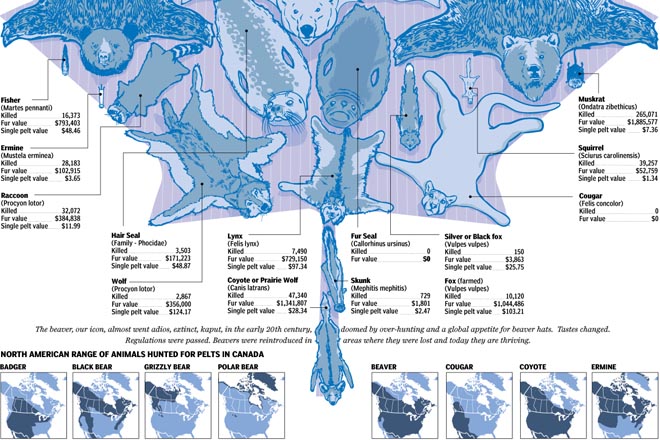
The National Post published this fascinating infographic on the Canadian fur industry. Historically speaking, that industry is one of the most important to Canada being one of the primary reasons for Canada’s colonisation by France and later the United Kingdom (to a lesser extent). The graphic provides illustrations of the pelts to scale along with data on the volume and value of the trade in each type of fur. Then it maps the ranges for each of the animals with a matrix of small multiples.

Canadian Fur
Canadian Fur

While it may not be a mistake, I am curious about the two areas of polar bears in the northern United States. Methinks that the Rockies, while snowcapped, would be a bit warm for the bears.

Credit for the piece goes to Joe O’Connor, Andrew Barr, Mike Faille, and Richard Johnson.

Gay Acceptance

Last week I looked at a piece from the Washington Post about the possible impact of the Supreme Court rulings on gay marriage in the United States. But with the rulings yesterday, we step back and look at globally how the progression of gay rights has taken steps forward or backward.

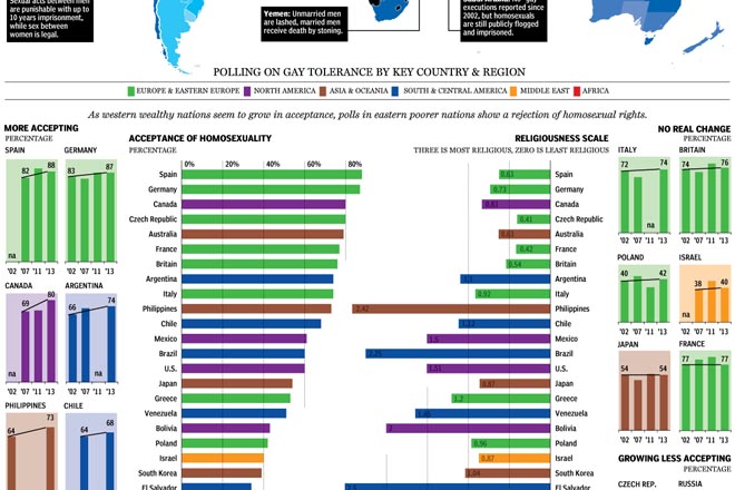
The National Post looked at the reversal of bans of gay marriage as well as polling from several countries to look at changing opinions and perspectives across the world. Fascinating/horrifying are some of the stories about specific countries in the map.

Gay acceptance
Gay acceptance

My only real criticism is that the colour-coding of regions seems a bit jarring. I wonder if grouping countries by region would not have allowed the same data to be presented in a bit quieter tone.

Credit for the piece goes to Richard Johnson.

The Massachusetts Special Election

As I have been blogging the past several days, today the Supreme Court will announce its rulings on the two gay marriage cases. But, I have already looked at that twice now. Today I want to look at the results of the Massachusetts special election for the US Senate, necessitated by John Kerry resigning from the seat to become Secretary of State.

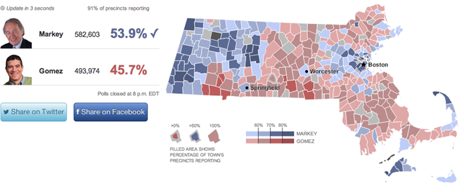
This work comes from the Huffington Post. It offers the usual map fare with towns coloured by the victor and tinted by the share of the vote. Though do note the interesting—is this novel?—means of filling in the town with colour to represent the percent of the town reporting. My screenshot is a bit late, but check out Warren near Springfield or Boston and Cambridge—a bit harder to see because of their size and shape.

Looking across the state for the results

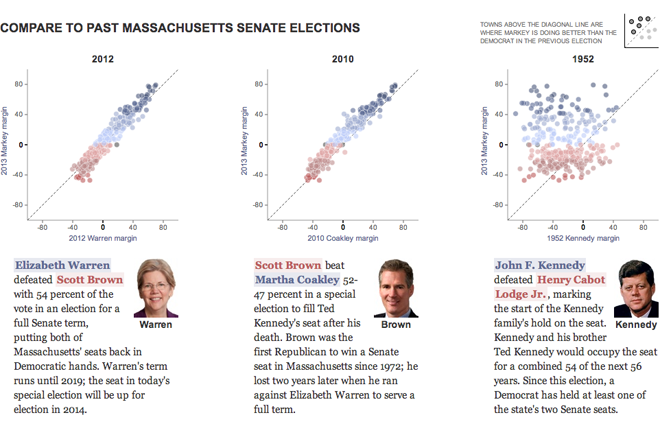
However, the fascinating thing is the use of the small multiples of scatter plots to look at historic elections. The designers included a small key in the upper-right explaining that dots above the line represent towns where Ed Markey, the Democrat who won, outperformed the historic Democrat. I have not seen anybody attempt to portray the data in this fashion before.

Using a scatter plot to chart the results

Credit for the piece goes to Aaron Bycoffe and Jay Boice.

Tax Breaks for the Wealthy

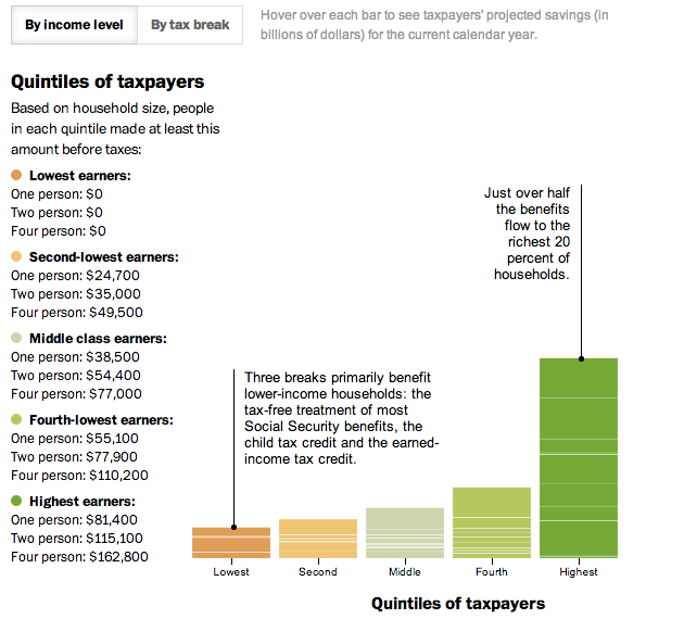
In today’s post we look at a small interactive piece from the Washington Post. Everybody pays taxes. And everybody seeks to find ways to pay less in taxes. This interactive stacked bar chart (and bar matrix) examines how much the different available tax benefits help Americans, grouped into income quintiles. The measure is dollars, not percentage of income (either personal or national), so clearly highest income Americans are the big winners in tax benefits while low income Americans lose out. For example, most low income people do not make enough money to invest in the stock market. Therefore they cannot reap the benefit of preferential tax treatment of dividend income as opposed to wage income.

A look at tax benefits in the US

Credit for the piece goes to Darla Cameron.

Mapping Boston’s Neighbourhoods

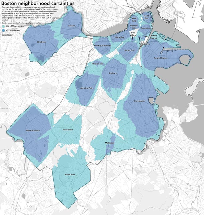
Ever wonder what neighbourhood you really live in? In every city I have ever visited, neighbourhoods have clear cores but murky, fuzzy borders. Last year, bostongraphy.com took a stab at defining Boston’s neighbourhoods with a survey. If you read through the description and don’t just look at the pretty pictures, you will see they talk a bit about the methodology, which is quite nice. But either way, here’s a map of Boston’s neighbourhoods.

Boston neighbourhoods

And the phrase that wins the day: “…hexagons had slightly more carto-hipster cachet.”

Credit for the piece goes to Andy Woodruff.

Plastic Surgery

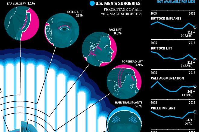
This Friday we look at plastic or cosmetic surgery. Because you should always feel better about yourself before the weekend begins. The work comes from the National Post and it looks at the popularity of specific types of surgeries for men and women over the last several years.

Plastic surgery
Plastic surgery

It’s a nice use of small multiples, line charts, and bar charts to explore the issue. I take issue with only one chart near the end of the piece. It looks at minimally invasive procedures and uses bar charts to compare the numbers. However, the bars do not sit on a common baseline and but for the addition of data labels, they would be useless in comparing the numbers of procedures.

Unaligned bar charts

Credit for the piece goes to Mike Faille and Richard Johnson.

Black and White Maps

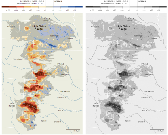
Rarely do I have criticism for infographics or pieces published by the New York Times, and admittedly this time I no longer have the original. However, in May, the Times published a map that was printed in black and white in their paper. I could not make heads or tails of what the map was attempting to say. I later found the online (and full-colour) version of the graphic. Because I no longer have the paper on me, I took the image and then discarded the colour information to simulate the effect.

Comparing colour to black-and-white, link to the colour version

One must always beware of the ultimate use of their designed work, be it an infographic or something else entirely. If one designs for digital, online display, he or she can rest relatively assured that colour will be available for their piece. However, in a black and white print environment, the colour here in a divergent palette fails to communicate the split between increases and decreases in aquifer levels. I would have expected a different palette or the use of patterns for the print version of this story.

Credit for the piece goes to the New York Times Graphics Department

Campaign Contributions

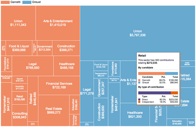
On 21 May, Angelenos went to the polls to elect the next mayor of Los Angeles. The contest followed an earlier vote that prompted the day’s run-off election. This graphic from the Los Angeles Times examined the contributions to the campaigns of the two finalists, Eric Garcetti and Wendy Greuel.

The overall piece features an interesting interactive component that allowed the user to switch from a scatter plot view to a stacked bar chart view and then filter those results based on whether they were direct or indirect contributions. Generally speaking, that element worked. However, I want to focus on the second big component: an interactive tree map.

Tree map with rollover

While not all tree maps have to be squarified, by converting datapoints to (roughly) similar shapes the user should have an easier time comparing the area of the objects. This tree map is not squarified and so the user must strain to convert all the different shapes into roughly equal shapes for a visual comparison. Nor is there an inherent ranking within the map—at least not that I can find. That would also help.

So while the tree map is not a success in and of itself, the rollover condition makes for a more interesting overview of the different sectors of contributions. But despite this added value in the rollover,  the data powering the tree map would still be better presented in a different format.

Credit for the piece goes to Maloy Moore and Anthony Pesce.