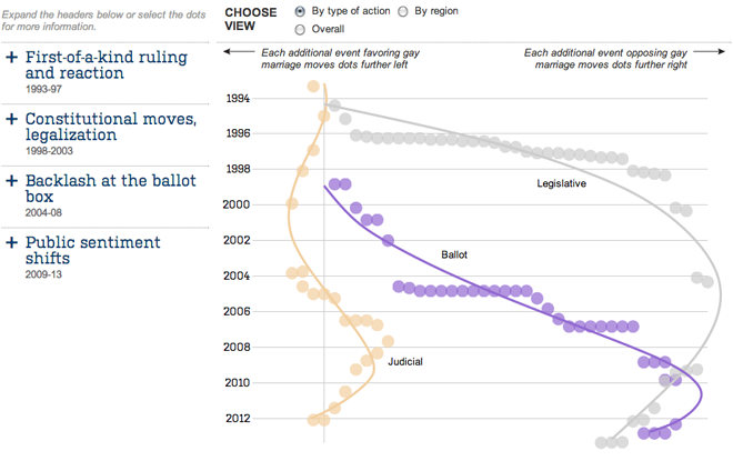
We are (still) waiting for a ruling on many things this week from the Supreme Court, including the rulings on DOMA and Prop 8. Today, we look at an interactive chart by the Wall Street Journal that plots different ballot measures, legislative actions, and court rulings regarding gay marriage. Lines of best fit provide a general trend line, and as the default view shows, the trend is clearly in favour of legalisation.

The piece is quite nice. After the default view, you can change the view to look at events not by type of action but by geographic region. This is one of those instances where the regional data provides an interesting look at the story. Additionally, the headlines on the left expand to provide not just context, but highlight the events plotted from that era.
Credit for the piece goes to Randy Yeip, Colleen McEnaney, and Chris Canipe.
Leave a Reply
You must be logged in to post a comment.