Category: Datagraphic
-
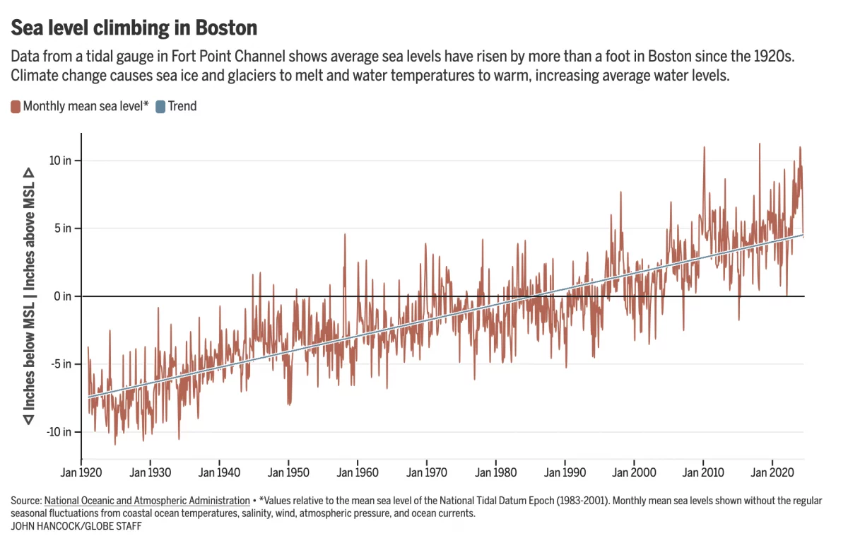
Fear the Floodwaters
This past weekend saw some flooding along the East Coast due to the Moon pulling on Earth’s water. In Boston that meant downtown flooding, including Long Wharf. The Boston Globe’s article about the flooding dwelt with more impact, causes, and long-term forecasts—none of which really warranted data visualisation or information graphics. Nonetheless, the article included…
-
Labelling Line Charts
Today I have a little post about something I noticed over the weekend: labelling line charts. It begins with a BBC article I read about the ongoing return to office mandates some companies have been rolling out over the last few years. When I look for work these days, one important factor is the office…
-
Twelve-Mile Circle
As a wee lad I grew up south of Downingtown, Pennsylvania, an old mill town situated along the banks of the East Branch of the Brandywine Creek. Drop a little stick in the Brandywine and it would float downstream until it joins the Christina River in Wilmington, Delaware and thereafter shortly into the Delaware River.…
-

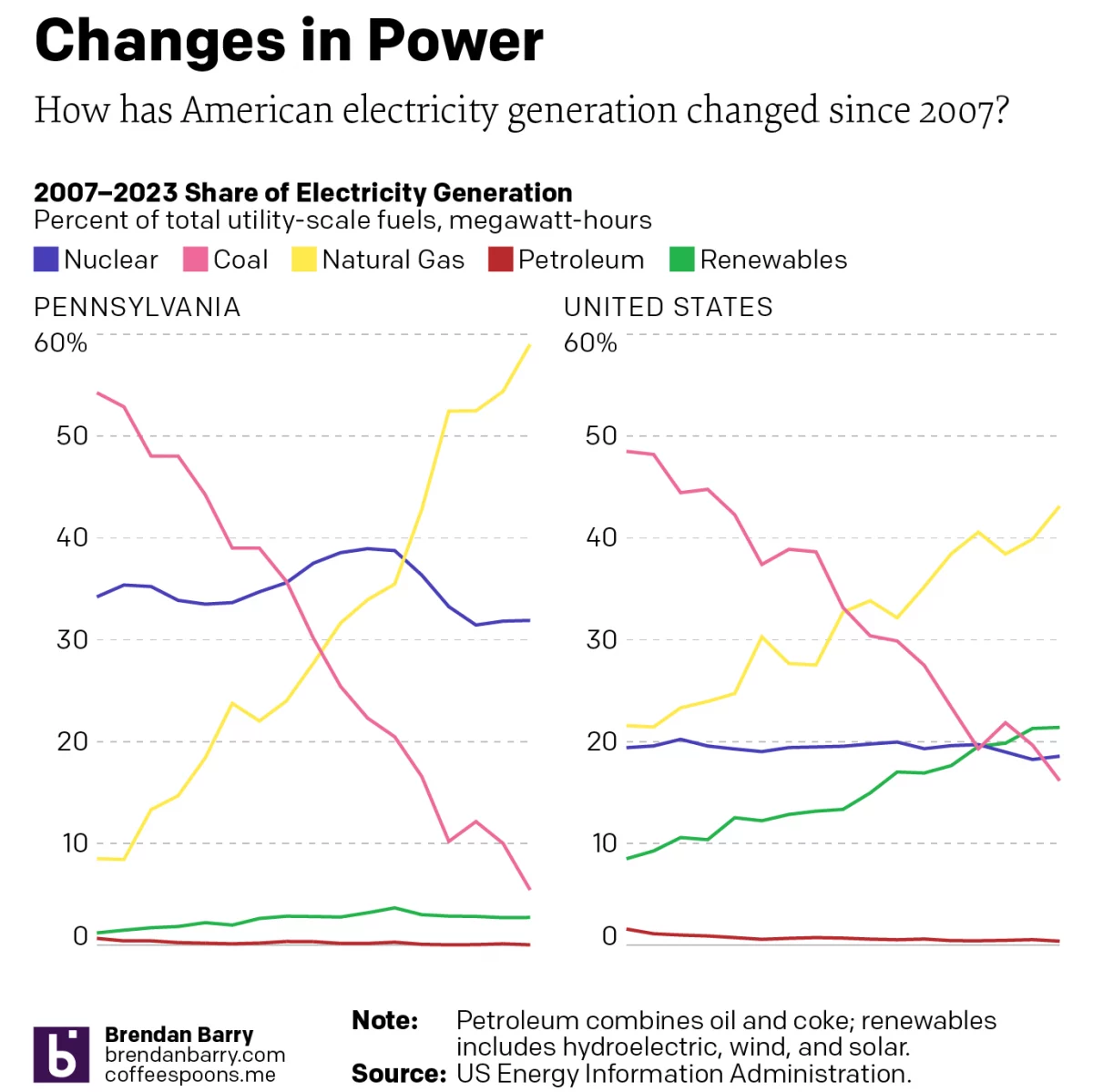
The Dawn of a New Nuclear Age?
I grew up less than 15 miles away from the Limerick Nuclear Generating Station, located on the banks of the Schuylkill River northwest of the city of Philadelphia. Our house sat on the north-facing slope of the Great Valley and the cooling towers of Limerick were a ridge line and river valley away from view.…
-
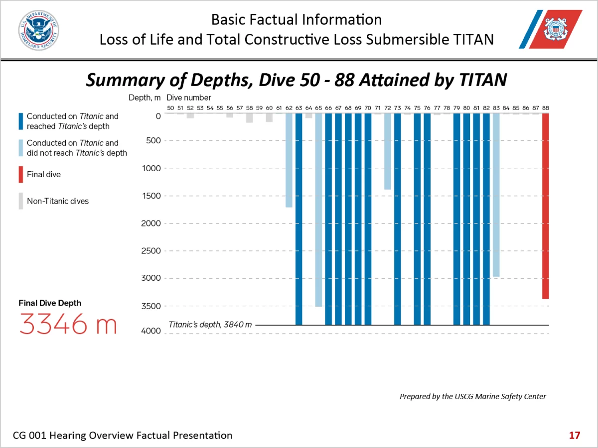
Three-dimensional Charts Are Back, Baby
I thought three-dimensional charts died back in the 2010s. Alas, here we are in 2024 and I have to discuss one once again. have been following the Titan Inquiry this week and the opening presentation included this gem of data visualisation. To be fair, I do not know how many designers, let alone specialist information…
-

To X or Not to X
As it happens, the Latino culture largely remains x’ed out on using the term Latinx, according to a new survey from Pew Research. The issue of supplanting Latino/Latina with Latinx as a gender neutral replacement—or as a complementary alternative—emerged in the general discourse in that oh-so-fun year of 2020 when everything went well. One common…
-

Life Aboard the International Space Station
This weekend I read a neat little article from the BBC about astronauts’ lives aboard the International Space Station (ISS). This comes on the heels of two NASA astronauts being left on the station due to some uncertainty about their Boeing spacecraft’s safety. The article featured a number of annotated photographs and illustrations, but this…
-
248 Years Later, Philadelphia’s Still Hosting Debates
For those of you living under a rock, 2024 is a presidential election year in the United States and the campaign for the November election truly kicks off post-Labour Day. And post-Labour Day here we are. Tonight features a presidential debate between the two candidates, Vice President Kamala Harris and former president Donald Trump. Harris…
-
Electric Throat Share
For the last few weeks I have been working on my portfolio site as I update things. (Note to self, do not wait another 15 years before embarking upon such an update.) At the University of the Arts (requiescat in pace), I took an information design class wherein I spent a semester learning about the…
-
Electing An Expert in Nameology
Congratulations on making it to Friday. Though it was a short week for my American audience. Now that the State’s Labour Day holiday has passed, the 2024 electoral season can begin in earnest. And to begin the insanity we have a helpful graphic from xkcd. Clearly I’m not cut out for high office with a…