Tag: data visualisation
-
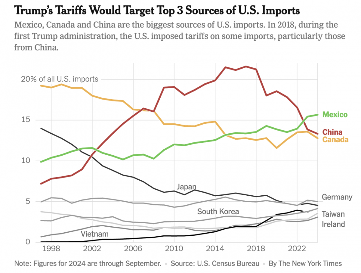
Imports, Tariffs, and Taxes, Oh My!
Apologies, all, for the lengthy delay in posting. I decided to take some time away from work-related things for a few months around the holidays and try to enjoy, well, the holidays. Moving forward, I intend to at least start posting about once per week. After all, the state of information design these days provides…
-
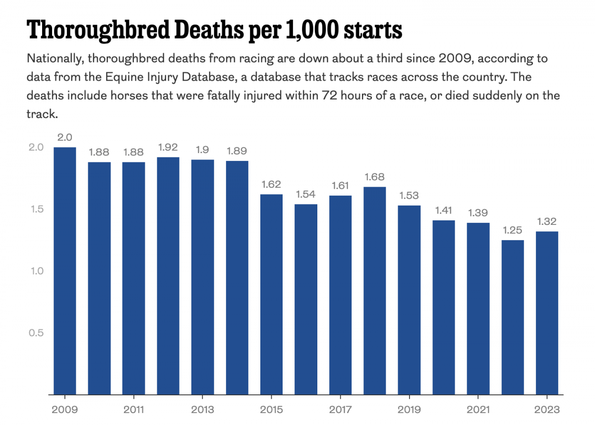
Racing to the Final Finish Line
Thoroughbred racing is big business. And Philadelphia’s Parx Casino owns a racing track that, in a recent article in the Philadelphia Inquirer, has seen a number of horse deaths. The article includes a single graphic worth noting, a bar chart showing the thoroughbred death rate. The graphic contrasts rising deaths at Parx with a national…
-
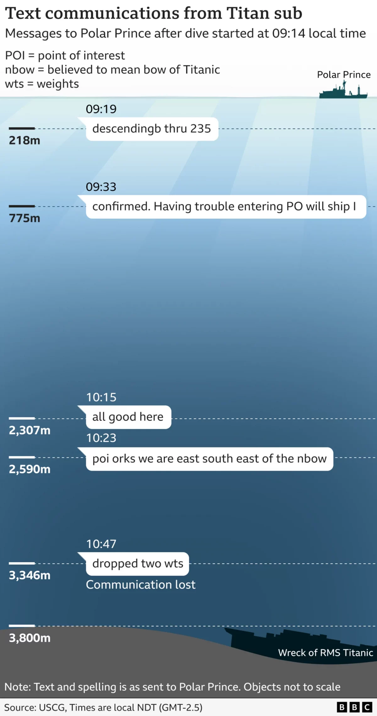
Titan’s Final Words
Last week wrapped up the Coast Guard’s two-week inquiry into the sinking of the submersible Titan, which imploded on a dive to the wreck of Titanic. The BBC summarised the findings in an article at the weekend. It included a number of fascinating annotated photographs identifying parts of the wreckage. But it also included the…
-

I Need My Sharpie. Where’s My Sharpie?
Because who does not recall the great Sharpie forecast track by the National Hurricane Center (NHC)? Earlier this summer, in the middle of the hurricane season, the National Oceanic and Atmospheric Administration’s (NOAA’s) NHC released a new, experimental warning cone map. For those unfamiliar, these are the maps that have a white and white-shaded forecast…
-
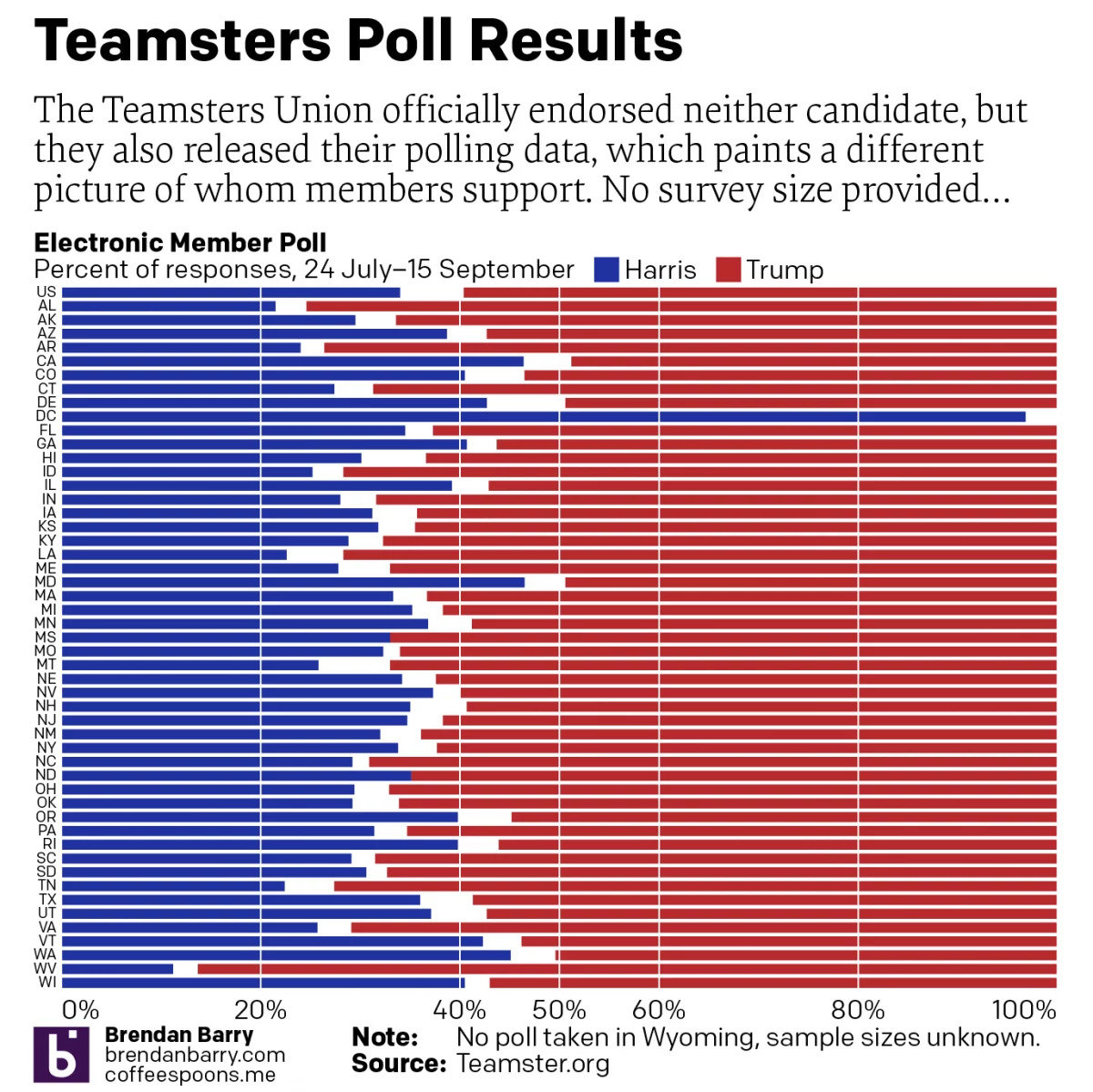
For Whom the Teamsters Poll Tolls
The Teamsters Union decided to officially endorse neither candidate in the 2024 US presidential election. Prior to their non-announcement announcement, however, the union surveyed its members and then released the polling data ahead of the announcement. Of course, the teamsters represent but a single union in a large and diverse country. More importantly, the survey…
-
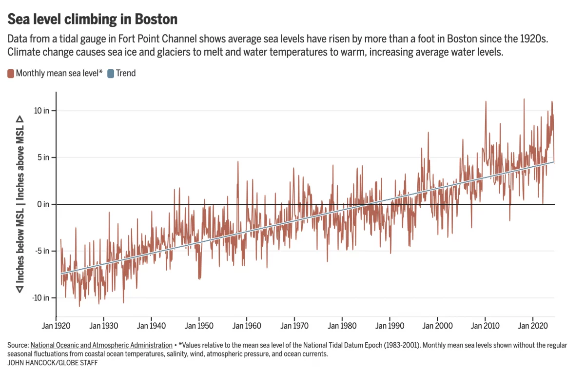
Fear the Floodwaters
This past weekend saw some flooding along the East Coast due to the Moon pulling on Earth’s water. In Boston that meant downtown flooding, including Long Wharf. The Boston Globe’s article about the flooding dwelt with more impact, causes, and long-term forecasts—none of which really warranted data visualisation or information graphics. Nonetheless, the article included…
-
Labelling Line Charts
Today I have a little post about something I noticed over the weekend: labelling line charts. It begins with a BBC article I read about the ongoing return to office mandates some companies have been rolling out over the last few years. When I look for work these days, one important factor is the office…
-
Twelve-Mile Circle
As a wee lad I grew up south of Downingtown, Pennsylvania, an old mill town situated along the banks of the East Branch of the Brandywine Creek. Drop a little stick in the Brandywine and it would float downstream until it joins the Christina River in Wilmington, Delaware and thereafter shortly into the Delaware River.…
-
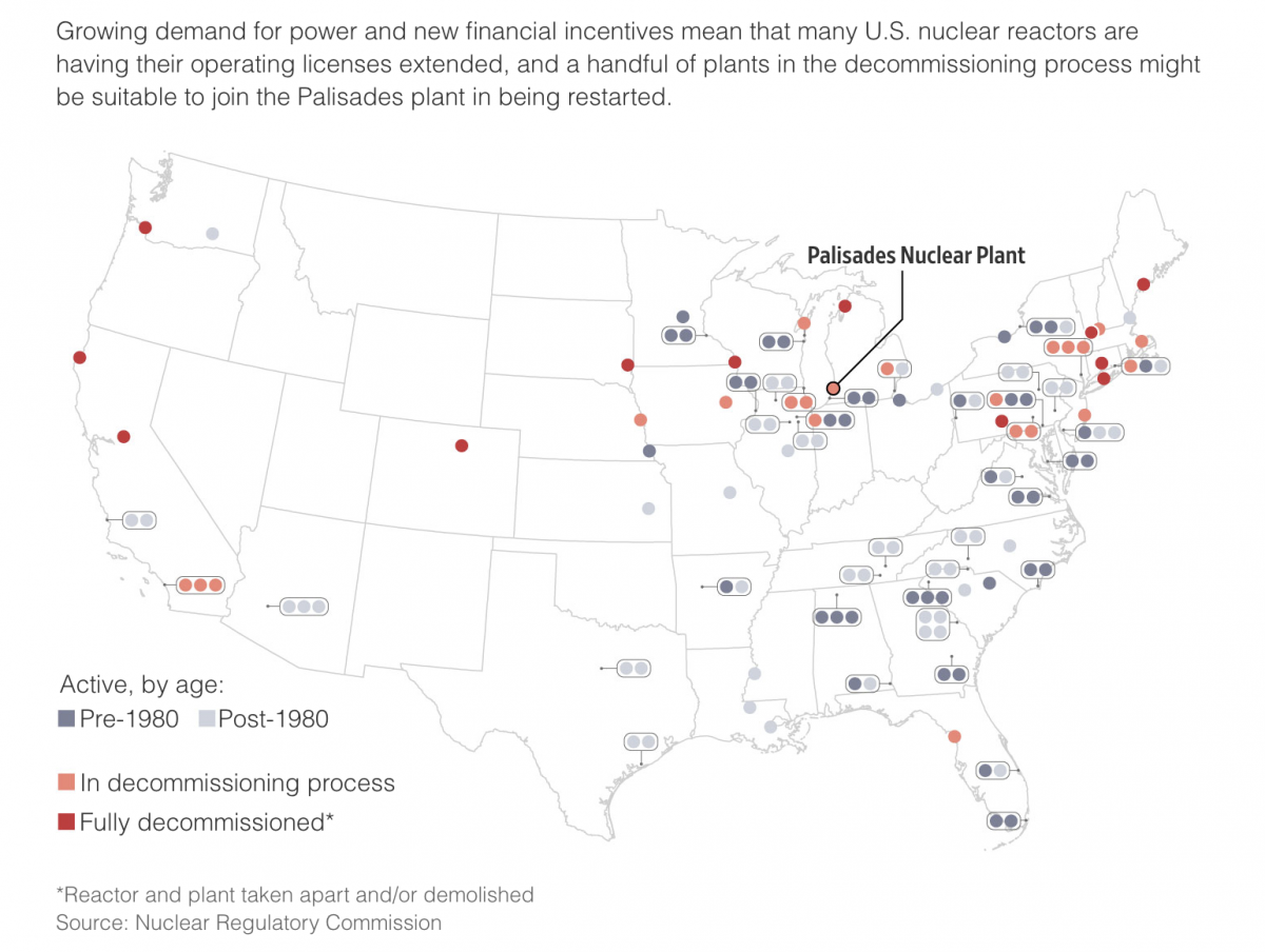
The Dawn of a New Nuclear Age?
I grew up less than 15 miles away from the Limerick Nuclear Generating Station, located on the banks of the Schuylkill River northwest of the city of Philadelphia. Our house sat on the north-facing slope of the Great Valley and the cooling towers of Limerick were a ridge line and river valley away from view.…
-
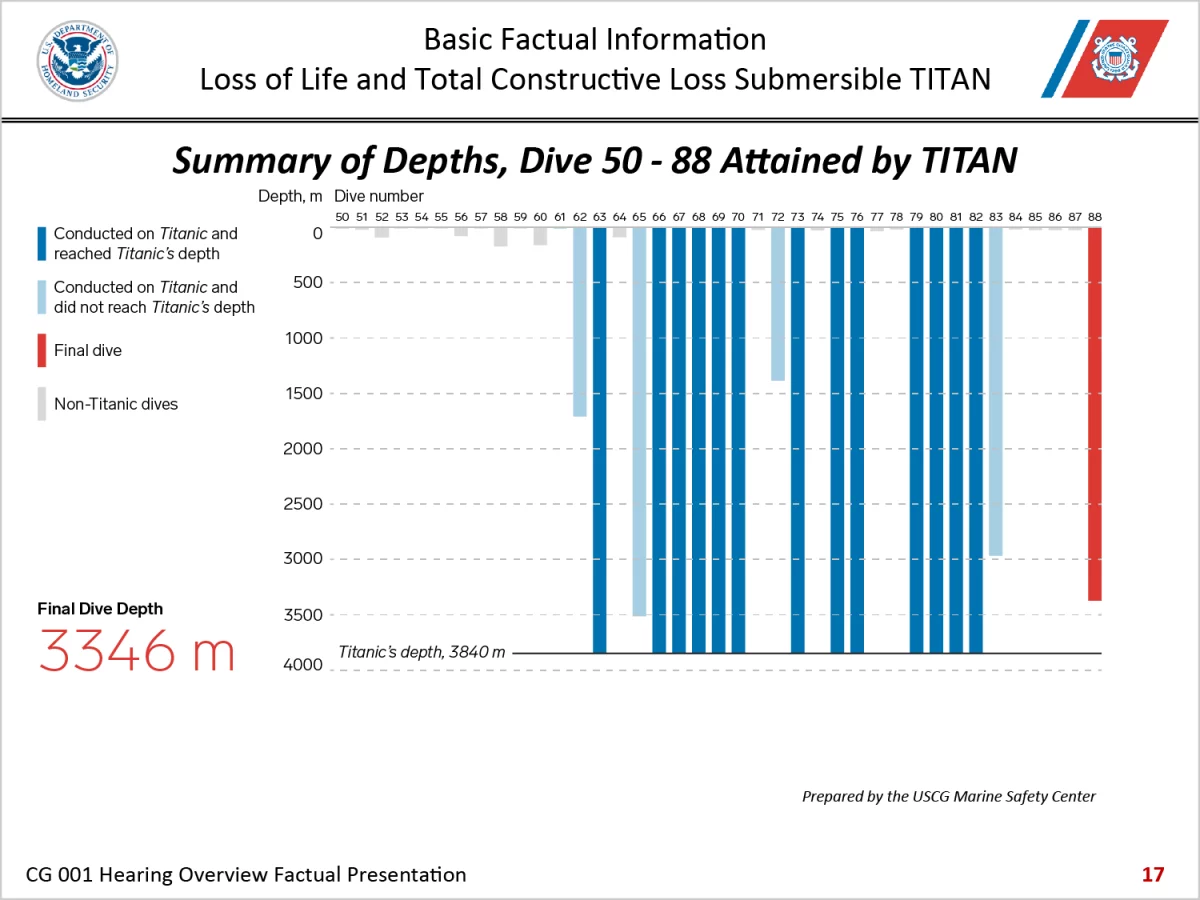
Three-dimensional Charts Are Back, Baby
I thought three-dimensional charts died back in the 2010s. Alas, here we are in 2024 and I have to discuss one once again. have been following the Titan Inquiry this week and the opening presentation included this gem of data visualisation. To be fair, I do not know how many designers, let alone specialist information…