All in the Family (and the Friends and the Neighbours)

Recently my hobby of my family’s history has focused on my Rusyn (or Ruthenian) roots. However, this recent work out of Stanford University piques my interest in my English heritage, even though much of it is very far back in time. Using my 23 × great-grandfather Reynold de Mohun you can begin to see how it links persons within families, how those lives intersected over time, and the geographical areas where that person lived. In Reynold’s case, it was the 12th–13th centuries in Somerset, England.
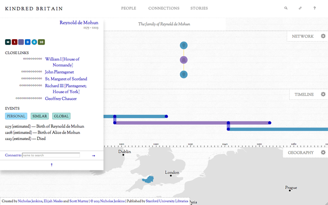
Reynold de Mohun
Reynold de Mohun

But as the title kindred implies, this piece is not just about direct family connections, but also the marriages and close cultural links between certainly the elite of British society. Below is how Reynold is connected to King William I, better known as William the Conqueror.
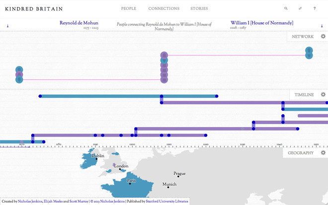
Connecting Reynold de Mohun to William I

Family history or genealogy is a topic ripe for data visualisation and information design because it is all about connections. But I have found beyond the common family tree diagram little interesting has been created. This work is a solid start in the right direction.

Credit for the piece goes to Nicholas Jenkins, Elijah Meeks, and Scott Murray.

Mars or Bust…Wait a Minute…

We already got to Mars. At the end of a week of maps and map-related things. Here’s a map of Mars. Well, sort of. It’s more of a map of Mars as explored by Curiosity. (Remember that guy?)

It’s an interactive piece from the New York Times that charts out just where the rover has driven and photographs of the stops along the way. There’s also a nice little chart that shows just how much of the trip has consisted of driving.

A day in the life…on Mars…

Credit for the piece goes to Jonathan Corum and Jeremy White.

Doctor Who?

I don’t often link to FlowingData because I figure that most of my audience is already looking there. But, sometimes, Nathan’s work is just that good. And sometimes the subject matter is just so fantastic that I have no other choice. (It doesn’t hurt that I was looking to do something like this over the weekend.)

Last weekend, the BBC announced that Peter Capaldi will succeed Matt Smith as the actor behind the lead role in the British science fiction show Doctor Who. The show celebrates its 50th anniversary later this year—quite a feat for a television show from what I gather—as it is enjoying popularity not just in the United Kingdom but now increasingly across the world. But in those 50 years, 11 other actors have held the lead role and Nathan plots out when they had the role . And who.

Who?
Who?

Credit for the piece goes to Nathan Yau.

Mapping Nuclear Reactors

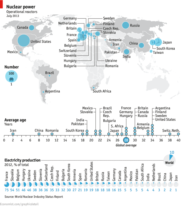
Today’s piece is a map from the Economist. It looks at the state of nuclear energy across the world. Slovakia caught my eye because when I recently traveled across that country I glimpsed from my train the massive complex near (I think) Trnava. Apparently those are also some of the youngest reactors out there.

Map of reactors
Map of reactors

Credit for the piece goes to O.M. and L.P.

Queue for the British Throne

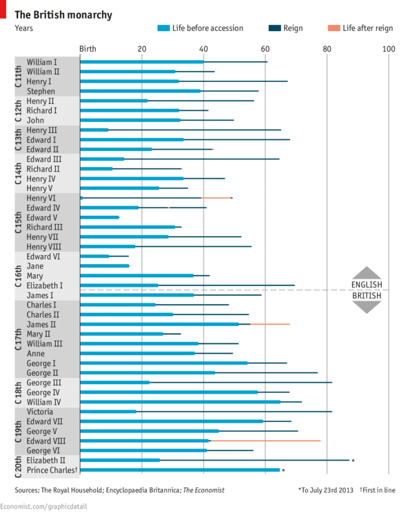
So apparently a baby was born in London…as was another who is likely to become the future King of the Great Britain and Northern Ireland (not of England). But the British love their queues and so this infant will have to wait in line just like everyone else (in the royal line of succession). The Economist visualised just how long these waits have been for English and British monarch vis-a-vis their time spent on the throne.

The Queue for the British throne

Credit for the piece goes to R.L.W. and G.D.

Delivery Delays

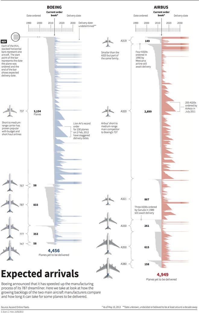
Today’s graphic looks at the backlog of aircraft delivery, i.e. the manufacturing of civilian aircraft. Why? Because Boeing is attempting to increase production of its 787 Dreamliner. And this weekend I arrived in Chicago from Warsaw via a 787.

This is a really nice piece from Thomson Reuters that looks at the manufacturing lines for both Boeing and Airbus and how many planes have yet to be delivered. The annotations really help to explain some of the stories behind some of the aircraft and their delayed deliveries.

Aircraft manufacturing backlog

Credit for the piece goes to Simon Scarr and Christian Inton.

Hong Kong and Hongkonger Identity

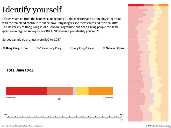
Hong Kong—and to a similar extent Macau—is part of China, but at times not so much. Because of the long history of British control through their colony, the people of Hong Kong, Hongkongers, are accustomed to a more liberal, democratic, and perhaps Western lifestyle than those of mainland China. Since the British handover, a local university has been asking the inevitable question of “Are you Hongkonger or Chinese?”. This interactive piece from the South China Morning Post looks at how that answer has evolved over nearly 20 years.

Hongkonger identity
Hongkonger identity

The piece presents a broad overview on the right with the specific survey results displayed larger on the left. Broadly speaking, the piece is successful. In particular, the decision to highlight the particular survey on the right brings that into focus without losing the context of the historical results. And providing a timeline beneath the larger stacked bar chart on the left offers a second means of choosing a survey of interest.

Yet I think the piece lacks two, perhaps three, elements that would improve the piece. First, sometimes I like to see the numbers for data visualisations. Adding a hover or mouseover state would help with that. Second, while the chart on the left includes a 50% line, I wonder if that would not also be helpful in the historical display on the right. Thirdly, and perhaps not too important for those not terribly interested in the data, the overall piece states the sample size for all surveys being within a range. People wanting more data on the survey responses might be interested in seeing the sample size per survey.

Credit for the piece goes to Simon Scarr and Joe Lo.

Extraditing Snowden

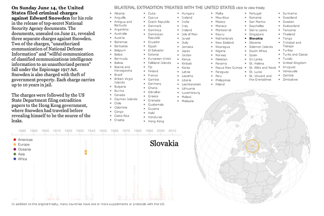
Edward Snowden is still on the run; he is still in the transit area of Moscow’s Sheremetyevo Airport without a passport to enter Russia. But if ever succeeds in extricating himself from his current predicament, Snowden presumably will seek to land in a country without an extradition treaty with the United States.

So in this interactive piece, the Guardian explores which countries have such treaties. The list serves as an index to the actual treaty texts. Beneath the globe are samples of different texts that show how an extradition treaty is drafted. The last piece highlights three countries that are possible options, but also options that have extradition treaties in place.

Extradition Treaties with the United States

Credit for the piece goes to the Guardian US Interactive Team.

Trending Towards Gay Marriage

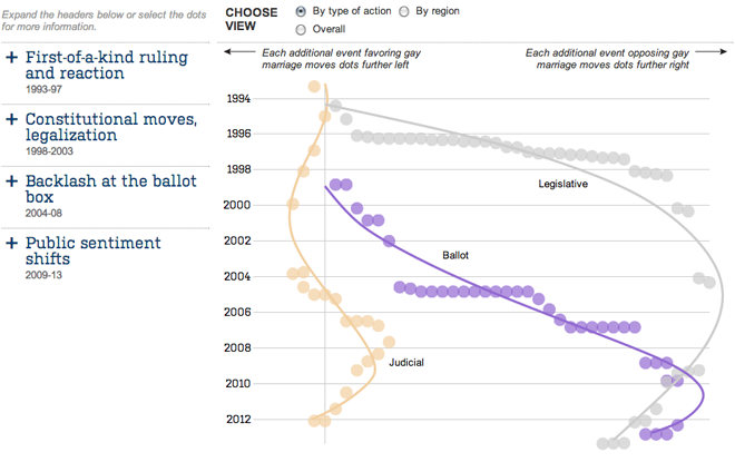
We are (still) waiting for a ruling on many things this week from the Supreme Court, including the rulings on DOMA and Prop 8. Today, we look at an interactive chart by the Wall Street Journal that plots different ballot measures, legislative actions, and court rulings regarding gay marriage. Lines of best fit provide a general trend line, and as the default view shows, the trend is clearly in favour of legalisation.

Trends for ballot measures, legislative actions, and court rulings for/against gay marriage

The piece is quite nice. After the default view, you can change the view to look at events not by type of action but by geographic region. This is one of those instances where the regional data provides an interesting look at the story. Additionally, the headlines on the left expand to provide not just context, but highlight the events plotted from that era.

Credit for the piece goes to Randy Yeip, Colleen McEnaney, and Chris Canipe.