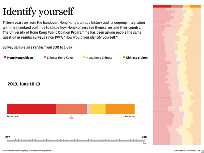
Hong Kong—and to a similar extent Macau—is part of China, but at times not so much. Because of the long history of British control through their colony, the people of Hong Kong, Hongkongers, are accustomed to a more liberal, democratic, and perhaps Western lifestyle than those of mainland China. Since the British handover, a local university has been asking the inevitable question of “Are you Hongkonger or Chinese?”. This interactive piece from the South China Morning Post looks at how that answer has evolved over nearly 20 years.

The piece presents a broad overview on the right with the specific survey results displayed larger on the left. Broadly speaking, the piece is successful. In particular, the decision to highlight the particular survey on the right brings that into focus without losing the context of the historical results. And providing a timeline beneath the larger stacked bar chart on the left offers a second means of choosing a survey of interest.
Yet I think the piece lacks two, perhaps three, elements that would improve the piece. First, sometimes I like to see the numbers for data visualisations. Adding a hover or mouseover state would help with that. Second, while the chart on the left includes a 50% line, I wonder if that would not also be helpful in the historical display on the right. Thirdly, and perhaps not too important for those not terribly interested in the data, the overall piece states the sample size for all surveys being within a range. People wanting more data on the survey responses might be interested in seeing the sample size per survey.
Credit for the piece goes to Simon Scarr and Joe Lo.
Leave a Reply
You must be logged in to post a comment.