Sunday night, the US House of Representatives passed a bill that you may not have heard about. The bill goes towards addressing universal healthcare coverage for US citizens. As I said, you may not have heard of it…
The bill was passed largely along partisan lines with about 30 conservative Democrats joining the conservative Republicans in voting against the legislation. This morning, the GOP unveiled a new website called Fire Nancy Pelosi that seeks to capitalise on the anger against—and perhaps even hatred for—providing healthcare to all Americans by collecting donations to capture 40 House seats in the forthcoming mid-term election. The website uses a map of the United States to show “who wants to fire Nancy Pelosi most”. According to the map, states are ranked by donation totals.
Without attempting to talk about the politics, the problem with the map is that it is attempting to equate the state’s supposed anger against Speaker Pelosi and healthcare for Americans with the sum of donations per state. As of the time when I captured my screen, the interesting visual is that many traditional red states are blue and purple, e.g. West Virginia and North Dakota, whereas many traditional blue states are purple and red, e.g.California and Illinois. The problem however, is that one state may be able to provide more donations than another.
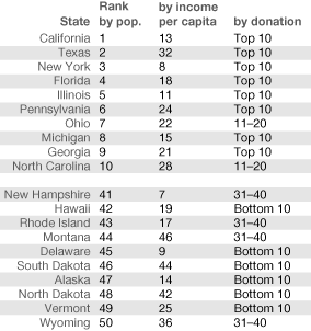
The most obvious difference is in terms of population. Without access to the data I cannot state facts about exact donation totals. However, the map does break down the states into deciles and so I have quickly pulled from Wikipedia some rankings on population (from 2009) and income per capita (from 2000). What is quite clear is that the states donating the least are among the states with the smallest population. Six of the Bottom 10 donating states are from the ten smallest states. Conversely, eight of the GOP’s Top 10 Donating States are among the ten largest states in the country by population.

If you compare income per capita, I find the message a bit more confusing, but still quite interesting. I do not claim to be a statistician and an analytic review of the numbers is a bit outside my area of expertise. However, for the Top 10, not a single state is ranked 40 or below in terms of income. And only one state is ranked in the 30s. One Top 10 Donating State is also found in the top ten by income per capita and a total of five of the Top 10 Donating States are in the top twenty by income per capita. Among the Bottom 10 Donating States we also find five states from the top twenty states by income per capita. However, we also find four of the last twenty states by income.
What strikes me is that the Top 10 Donating States have a larger population base from which to draw donations and, loosely, earn more per capita and thus, perhaps presumptuously, have more disposable income for contributions. The Bottom 10 Donating States have among the smallest populations and while some are seemingly quite wealthy, a significant number are among the least well-off in terms of income per capita.
And none of this critique discusses how the Top 10 Donating States use a bright and vivid red to draw attention whereas the Bottom 10 use a fairly dark and almost dull blue to push forward the bright red.

