Analysing the Urban Environment

Via the Guardian comes an interactive piece from researchers at MIT and the Technical University of Lisbon that allows users to examine urban environments to compare population, energy use, and building material intensity for a select set of 42 different cities. The screenshots below are of neighbourhoods in Philadelphia.
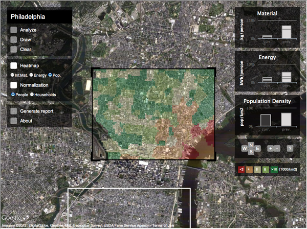
Population density
Population density

Once the user has chosen an area, he or she can move on and analyse a different section of the city. This behaviour generates a comparison on the right of the current area to the previous area.
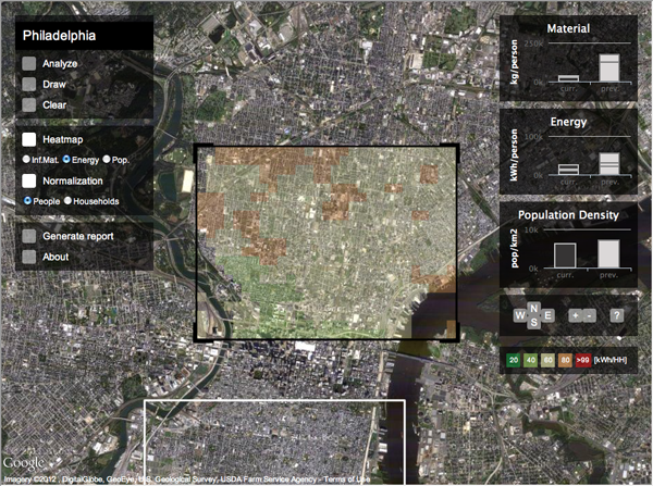
Energy use
Energy use

After the user has found an area of particular interest, he or she can generate a graphical report that summarises the findings for the selected area and compares that to other areas of similar scale in the city.
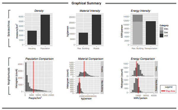
Graphical report
Graphical report

Credit for the piece goes to David Quinn and Daniel Wiesmann.

Author: Brendan Barry

I am a graphic designer who focuses on information design. My day job? Well, they asked me not to say. But to be clear, this blog is my something I do on my own time and does not represent the views of…my employers. I think what I can say is that given my interest in information design—be it in the shape of clear charts, maps, diagrams, or wayfinding systems—I am fortunate that my day job focuses on data visualisation. Outside of work, I try to stay busy with personal design work. Away from the world of design, I have become an amateur genealogist and family historian. You will sometimes see that area of work bleed into my posts.

Leave a Reply