Covering the New York Mayoral Primaries

Tuesday was election day in New York (among other places) where voters went to the polls for the mayoral primary (among other positions). For those living underneath what I can only presume was a very comfortable rock, this is the whole Anthony Weiner comeback election. Anyway, a bunch of different websites, most tied to the New York area, were covering the election results. So I wanted to share just a few.

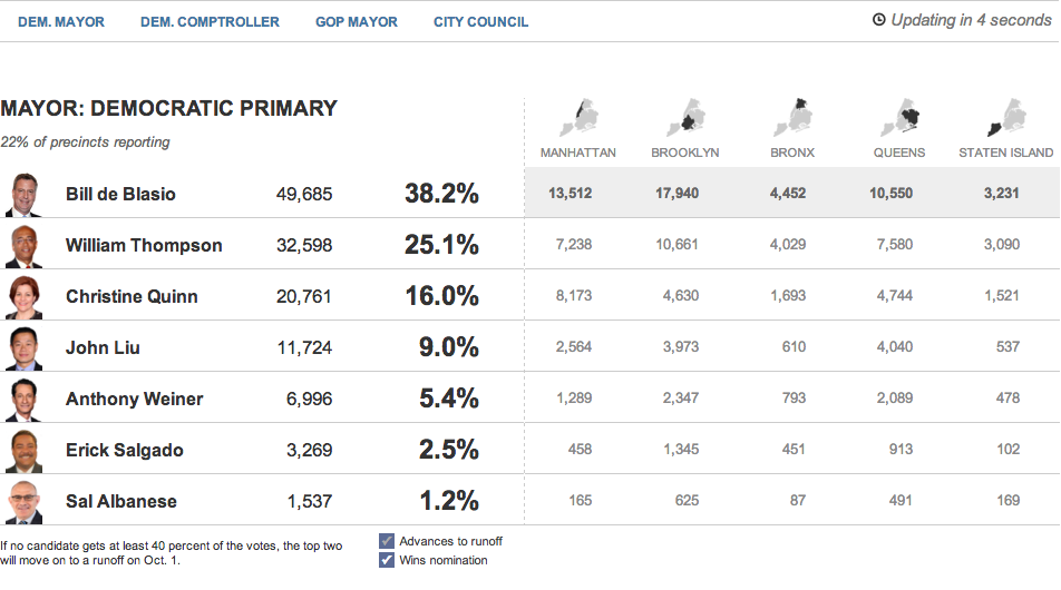
First we have the Huffington Post with the most straightforward presentation. Their table covers the main candidates and their results at a borough level and at a city-wide level.

The Huffington Post's tabular results
The Huffington Post’s tabular results

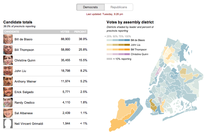
The second is from the Wall Street Journal. This uses a choropleth map with different colours assigned to a select few persons running—also the only ones with a real chance of winning. Tints of these colours in each district indicate how much of the district has voted.

The Wall Street Journal reports at the district level

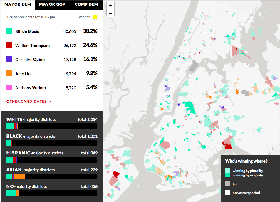
From WNYC we have our third example—another choropleth where different colours represent different candidates. However, unlike the Wall Street Journal, the colours here have only one tint. And instead of showing assembly districts, WNYC provides a further level of data and looks at precinct results. It does not represent the amount of the precinct that has voted, but rather whether the candidate is winning by a plurality or by a majority. Beneath the legend a second charting element is used; this details the breakdown of the vote by districts as separated into racial majority. This is an interesting addition that hints at filtering results by related data.

WNYC looks at who's winning and how
WNYC looks at who’s winning and how

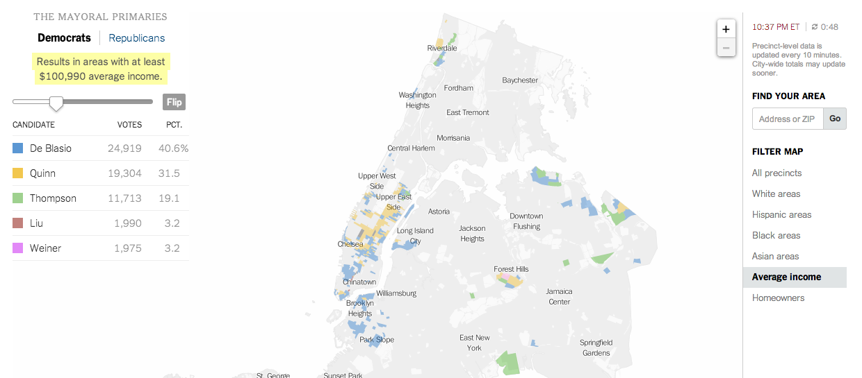
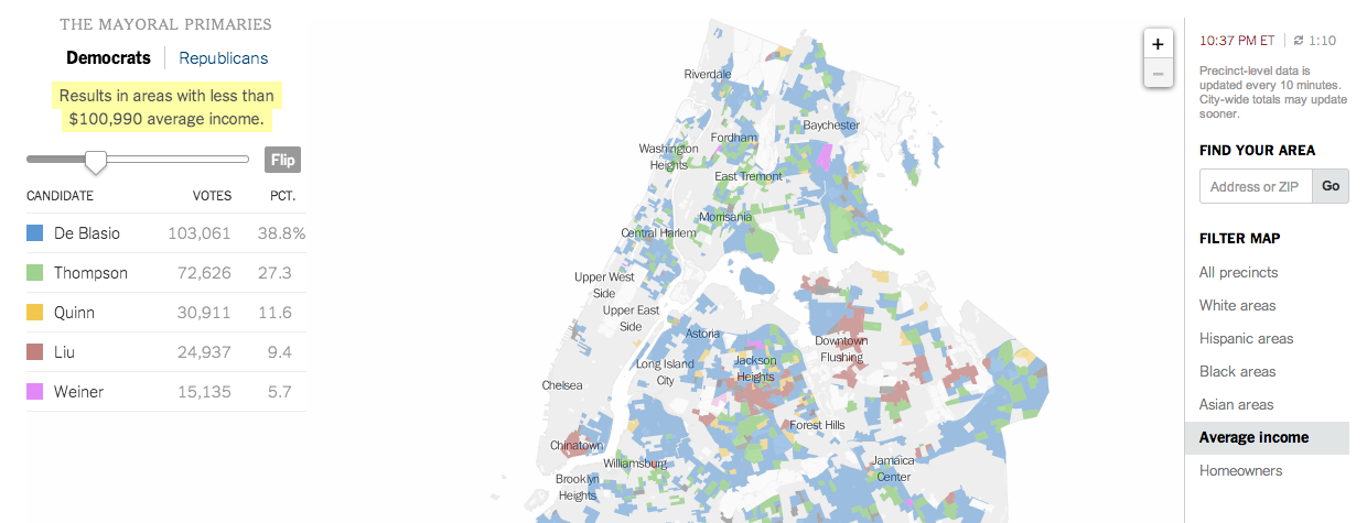
And that filtering brings us to the New York Times’ piece, which does offer filtering. It highlights districts on its maps—also precinct-level and not district aggregates—based upon the metric and the specific properties of said metric. In this case, I have chosen income. And the story of different voting patterns (at this particular point in the evening) based on income is quite clear. Look at Christine Quinn’s support.

Results from people earning more than $100k
Votes from people earning less than $100k


Credit for these:

Huffington Post: Aaron Bycoffe, Jay Boice, Andrei Scheinkman, and Shane Shifflett

Wall Street Journal: the Wall Street Journal’s graphics team

WNYC: Steven Melendez, Louise Ma, Jenny Ye, Marine Boudeau, Schuyler Duveen, Elizabeth Zagroba, and John Keefe

New York Times: New York Times’ graphics department

Women Bankers

…and not just any bankers but central bankers (the ones who establish policies at a national level), are rather under represented as this graphic from the Economist details. It is a nice use of small multiples with bar charts over time. Each bar is a 0–50% of the total membership of a central bank board and the share that is dark represents the number of women. Clearly for the countries selected not a single one has had a board of more than 50% women. Sweden and South Africa are the only two countries shown that have had 50% participation from women central bankers—though Norway and Denmark (for a period of time) have been consistently close.

Women central bankers

Credit for the piece goes to C.W., P.A.W., L.P., and P.K.

Whip Counts to Authorise Force in Syria

I was catching up on some news tonight and I came upon an unhelpful graphic that was supposed to be helping me understand the whip count (who is voting yes or no) for authorising the use of force in Syria. Below is the original graphic from Think Progress.

The whip count as of 15.30 on 3 September

I struggled, however, to directly compare the yes and no votes. While I certainly understand that the splits within both parties are a fascinating subplot to the greater issue of will we bomb Syria, the traditional congressional arc visualisation is not helpful here. So using the same numbers, I simply plotted what is essentially a stacked bar chart. In truly heretical, i.e. independent, fashion I mixed the two parties together and placed them at either ends of the chart. The first to reach 50% wins. (If I were updating this live of course.)

My visualisation of the whip count…

Credit for the original goes to Igor Volsky and Judd Legum.

Watching Weekday Football (of the American Variety)

Admittedly I am a one-sport kind of guy; baseball is my thing. But I am at least aware that as Labour Day demarcates the border between summer and fall, it simultaneously signifies the beginning of the seasonal transition from baseball to football. (Though I am still pulling to see the Red Sox in October.)

This graphic comes from the New York Times from an article looking at the sports network ESPN. Specifically, the article focuses on the network’s strategy of working with smaller schools desiring national attention to fill in open spaces on their weekly broadcast calendar. In short, weekday nights are not big nights for college football; usually people watch their alma maters on Saturday. But, if your school is willing to make schedule adjustments, ESPN is apparently willing to throw you some money. This interactive bar chart looks at whether your alma mater (or in my case the only university I attended that had sports—yay art school) has begun to play weekday games.

Weekday football by conference and compared to Penn State

Credit for the piece goes to the New York Times graphics department.

Cutting the Cable

We have all heard talk about cutting cable, i.e. unsubscribing from cable television. But the question is what is replacing it if anything? Fortunately, this really nice graphic produced by Quartz shows the market over the course of the last five years.

Cutting the cable
Cutting the cable

It is a really nice use of small multiples and the power of not overlapping size and growth charts, or combo-charts, just because you can. Different metrics deserve different charts. The important part is placement, and that’s where a good designer can make sure to place relevant data near its partner.

Credit for the piece goes to Ritchie King.

Coffee Pie Charts

Fear not, this graphic makes about as much sense as the title. The concept is actually a worthwhile exploration of the variation in caffeine across cups of coffee from different cafes and coffee shops. But, this visualisation fails at showing it.

Coffee Pie Charts
Coffee Pie Charts

Remember, pie charts show the piece amongst the whole. What is the whole in this case? A cup of coffee? No, the data labels indicate milligrams per fluid ounce. It appears as if 60mg./fl. oz. is the whole. A bit arbitrary that. So what happens if you lose the trite pie as a cup of coffee device and simply chart the values. Oh wait, that’s not very hard to do. (I also threw in what I believe to be the benchmark for an average cup of brewed coffee, though I could be wrong.)

Coffee Bar Chart
Coffee Bar Chart

Much clearer. More concise (I used less than the original’s dimensions).

Credit for the original piece goes to Dan Gentile.

Consumer Spending by Store Type

Today’s post is a small interactive from the Wall Street Journal that allows the user to explore consumer spending not by category of spending, but rather the type of store in which they are spending, e.g. grocery retailers. Consumer spending is a fairly important measure of the US economy since so much of our economy depends upon it (I want to say roughly two-thirds, but I cannot recall exactly).

Comparing retail spending by type of store

This piece has a few interesting things going for it. Firstly is the ability to compare and contrast three different retail channels (My screenshot compares only two). An unlimited amount would have been far too many, but three is a manageable number, especially in the various charting components used.

The tree map is interesting. I like the idea of using them, but I am not sure this is the best application. First, a tree map is fantastic for showing hierarchy. If, for example, there were sub-channels of the big retailing types, they could be nested within, well, squares or rectangles. But here the size and growth could have been compared perhaps more easily in a scatter plot. Secondly, I cannot determine the order for which the channels have been arranged. Clearly it is not by size, because the small ones are near the top. Nor is it reverse, because there are smaller ones where there should be larger ones.

Then the bar chart. An interesting idea, to be sure, of aggregating the sales per channel to see their total value. But if the goal is to compare them, would not a line chart looking at both separately not in aggregate show size and relative gains/declines against the other?

Credit for the piece goes to Dan Hill.

Road Kill

Driving can be dangerous. But perhaps most so in the developing world. The Pulitzer Center created this interactive map to allow users to explore just how dangerous driving can be.

A look at road deaths in Kenya

Little windows provide details on countries the user rolls over. This data looks at deaths per 100,000 people, killer/victims, and lastly a rating of law enforcement across several different issues. The map also includes links to stories on the website as well as an information panel that related small bits of information about selected countries.

Credit for the piece goes to Tom Hundley and Dan McCarey.

16 Useless Infographics

Happy Friday, everyone. Today’s post comes via colleagues of mine in London, who shared with me the Guardian’s selection of 16 useless infographics. They are shit infographics. Well, at least one is. Check them out and you’ll understand.

Using maps to explain maps…

Credit for the selection goes to Mona Chalabi. Credit for each infographic belongs to the infographic’s respective designer.

Delivery Delays

Today’s graphic looks at the backlog of aircraft delivery, i.e. the manufacturing of civilian aircraft. Why? Because Boeing is attempting to increase production of its 787 Dreamliner. And this weekend I arrived in Chicago from Warsaw via a 787.

This is a really nice piece from Thomson Reuters that looks at the manufacturing lines for both Boeing and Airbus and how many planes have yet to be delivered. The annotations really help to explain some of the stories behind some of the aircraft and their delayed deliveries.

Aircraft manufacturing backlog

Credit for the piece goes to Simon Scarr and Christian Inton.