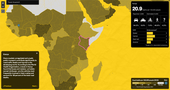
Driving can be dangerous. But perhaps most so in the developing world. The Pulitzer Center created this interactive map to allow users to explore just how dangerous driving can be.

Little windows provide details on countries the user rolls over. This data looks at deaths per 100,000 people, killer/victims, and lastly a rating of law enforcement across several different issues. The map also includes links to stories on the website as well as an information panel that related small bits of information about selected countries.
Credit for the piece goes to Tom Hundley and Dan McCarey.
Leave a Reply
You must be logged in to post a comment.