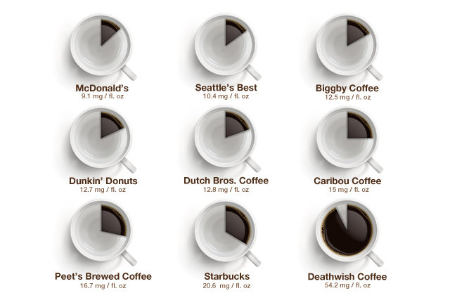
Fear not, this graphic makes about as much sense as the title. The concept is actually a worthwhile exploration of the variation in caffeine across cups of coffee from different cafes and coffee shops. But, this visualisation fails at showing it.

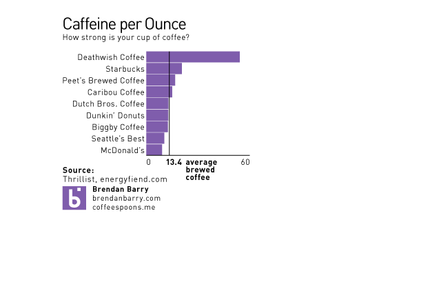
Remember, pie charts show the piece amongst the whole. What is the whole in this case? A cup of coffee? No, the data labels indicate milligrams per fluid ounce. It appears as if 60mg./fl. oz. is the whole. A bit arbitrary that. So what happens if you lose the trite pie as a cup of coffee device and simply chart the values. Oh wait, that’s not very hard to do. (I also threw in what I believe to be the benchmark for an average cup of brewed coffee, though I could be wrong.)

Much clearer. More concise (I used less than the original’s dimensions).
Credit for the original piece goes to Dan Gentile.
Leave a Reply
You must be logged in to post a comment.