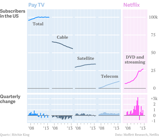
We have all heard talk about cutting cable, i.e. unsubscribing from cable television. But the question is what is replacing it if anything? Fortunately, this really nice graphic produced by Quartz shows the market over the course of the last five years.

It is a really nice use of small multiples and the power of not overlapping size and growth charts, or combo-charts, just because you can. Different metrics deserve different charts. The important part is placement, and that’s where a good designer can make sure to place relevant data near its partner.
Credit for the piece goes to Ritchie King.
Leave a Reply
You must be logged in to post a comment.