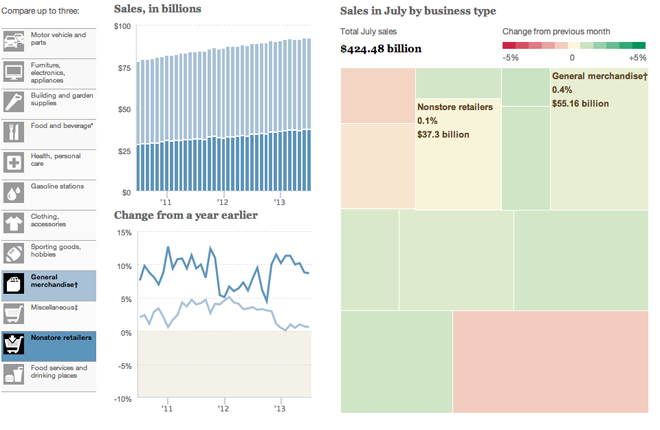
Today’s post is a small interactive from the Wall Street Journal that allows the user to explore consumer spending not by category of spending, but rather the type of store in which they are spending, e.g. grocery retailers. Consumer spending is a fairly important measure of the US economy since so much of our economy depends upon it (I want to say roughly two-thirds, but I cannot recall exactly).

This piece has a few interesting things going for it. Firstly is the ability to compare and contrast three different retail channels (My screenshot compares only two). An unlimited amount would have been far too many, but three is a manageable number, especially in the various charting components used.
The tree map is interesting. I like the idea of using them, but I am not sure this is the best application. First, a tree map is fantastic for showing hierarchy. If, for example, there were sub-channels of the big retailing types, they could be nested within, well, squares or rectangles. But here the size and growth could have been compared perhaps more easily in a scatter plot. Secondly, I cannot determine the order for which the channels have been arranged. Clearly it is not by size, because the small ones are near the top. Nor is it reverse, because there are smaller ones where there should be larger ones.
Then the bar chart. An interesting idea, to be sure, of aggregating the sales per channel to see their total value. But if the goal is to compare them, would not a line chart looking at both separately not in aggregate show size and relative gains/declines against the other?
Credit for the piece goes to Dan Hill.
Leave a Reply
You must be logged in to post a comment.