Gerrymandering Again

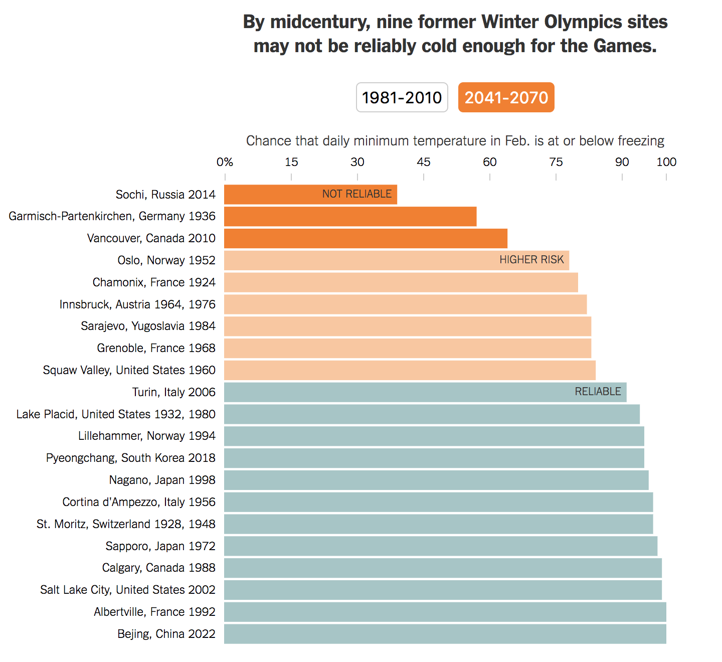
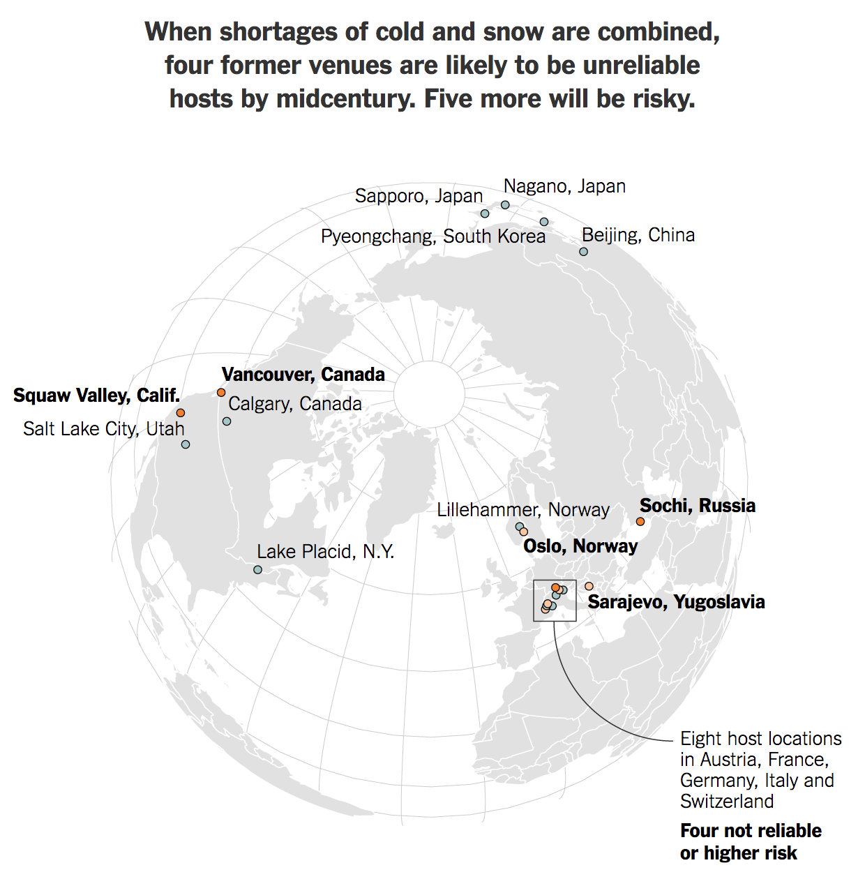
The last two weeks we twice looked at gerrymandering as it in particular impacted Pennsylvania, notorious for its extreme gerrymandered districts. And now that the state will have to redraw districts to be less partisan, will Pennsylvania usher in a series of court orders from other state supreme courts, or even the federal Supreme Court, to create less partisan maps?

To that specific question, we do not know. But as we get ever closer to the 2020 Census that will lead to new maps in 2021, you can bet we will discuss gerrymandering as a country. Maybe to jumpstart that dialogue, we have a fantastic work by FiveThirtyEight, the Gerrymandering Project.

Since we focus on the data visualisation side of things, I want to draw your attention to the Atlas of Redistricting. This interactive piece features a map of House districts, by default the current map plan. The user can then toggle between different scenarios to see how those scenarios would adjust the Congressional map.

The setup today
The setup today

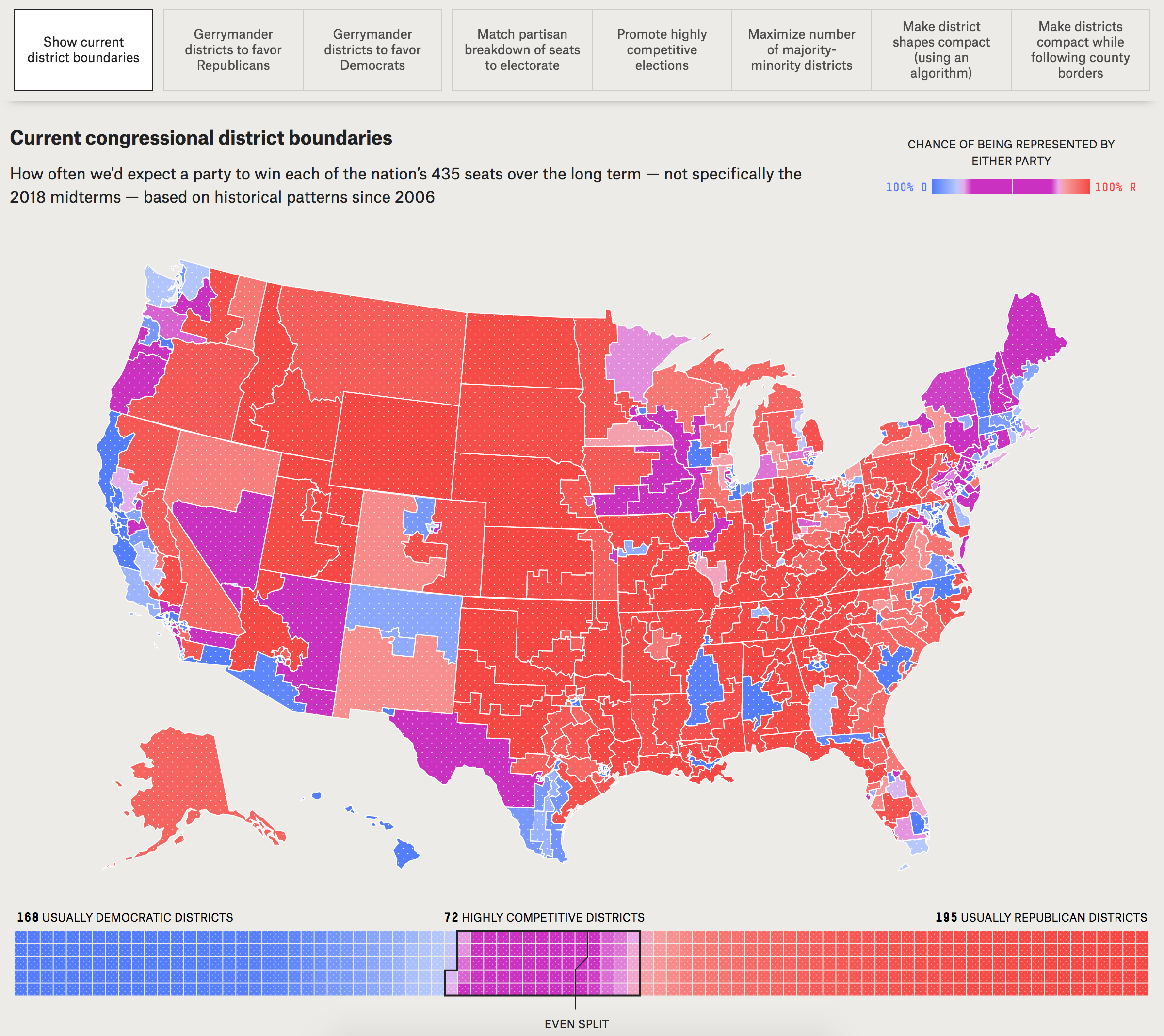
If, like me, you live in an area with lots of people in a small space, you might need to see Pennsylvania or New Jersey in detail. And by clicking on the state you can quickly see how the scenarios redraw districts and the probabilities of parties winning those seats. And at the bottom of the map is the set of all House seats colour-coded by the same chance of winning.

But what I really love about this piece is the separate article that goes into the different scenarios and walks the user through them, how they work, how they don’t work, and how difficult they would be to implement. It’s not exactly a quick read, but well worth it, especially with the map open in a separate tab/window.

Overall, a solid set of work from FiveThirtyEight diving deep into gerrymandering.

Credit for the piece goes to Aaron Bycoffe, Ella Koeze, David Wasserman and Julia Wolfe.

Where It’ll Be Too Warm for the Winter Olympics

The Winter Olympics are creeping ever closer and so this piece from the New York Times caught my eye. It examines the impact of climate change on host cities for the Winter Olympics. Startlingly, a handful of cities from the past almost century are no longer reliable enough, i.e. cold and snow-covered, to host winter games.

This screenshot is of a bar chart that looks at temperatures, because snow and ice obviously require freezing temperatures. The reliability is colour-coded and at first I was not a fan—it seemed unnecessary to me.

At first I did not care for the colours in the bars

But then further down the piece, those same colours are used to reference reliability on a polar projection map.

But then this map changed my mind

That was a subtle, but well appreciated design choice. My initial aversion to the graphic and piece was changed by the end of it. That is always great when designers can pull that off.

Credit for the piece goes to Kendra Pierre-Louis and Nadja Popovich

The World Grows On

January is the month of forecasts and projections for the year to come. And the Economist is no different. Late last week it published a datagraphic showcasing the GDP growth forecasts of the Economist Intelligence Unit. I used to make this exact type of datagraphic a lot. And I mean a lot. But what I really enjoy is how successfully this piece integrates the map, the bar chart, and the tables to round out the story.

Take a note at how the chart distributes the bins as well

The easy thing to do is always the map, because people like maps. They can be big, and if the data set is robust, full of data and colour. But maps hide and obscure geographically small countries. And then you have to assume that people know all the countries in the world. Problem is, most people do not.

So the bar chart does a good job of showing each country as equals, a slim vertical bar. In such a small space, labelling every country is impossible, but the designers chose a select number of countries that might be of interest and called them out across the entire series.

Lastly, people always like to know who is #winning and who is a #loser. So the tables at the extreme ends of the chart showcast the top and last five.

I may have rearranged some of the elements, and dropped the heavy black rules between the bins on the legend, but overall I consider this piece a success.

Credit for the piece goes to the Economist Data Team.

Jones–Moore Election Results

Apologies for the lack of posts over the last week or so, I have alternately been on holiday or sick while spending other time on my annual Christmas card. This will also be the last post for 2017 as I am on holiday until the new year. But before I go, I want to take a look at the election night graphics for the Alabama US Senate special election yesterday.

I am going to start with the New York Times, which was where I went first last night after returning from work. What was really nice was there graphic on their homepage. It provided a snapshot fo the results before I even got to the results page.

The homepage of the New York Times last night

The results page then had the standard map and table, but also this little dashboard element.

I'm spinning my wheels…
I’m spinning my wheels…

We all know how I feel about dashboard things. To put it tersely: not a fan. But what I did enjoy about the experience was its progression. The bars below filled in as the night progressed, and the range in the vote-ometers narrowed. But that same sort of design could be applied to other graphics representing the narrowing of likely outcomes.

The second site I visited was the Washington Post. Like the Times, their homepage also featured an interactive graphic, another choropleth map.

A different page, a different map

There are two key differences between the maps. The Times map uses four bins for each party whereas the Post simplifies the page to two: leading and won. The second difference is the placement of the map. The Post’s map is a cropping of a larger national map versus the Times that uses a sole map of the state.

For a small homepage graphic, bits of both work rather well. The Times cuts away the unnecessary map controls and neighbouring states. But the space is small and maybe not the best for an eight-binned choropleth. In the smaller space, the Post’s simplified leading/won tells the story more effectively. But on a larger space that is dedicated to the results/story, the more granular results are far more insightful.

On a quick side note, the Post’s page included some context in addition to the standard results graphics. This map of the Black Belt and how it correlates to regions of Democratic votes in 2016 provides an additional bit of background as to how the votes played out.

Note, the Black Belt was named for the black soil, not the slaves.

Credit for the piece goes to the design teams of the New York Times and the Washington Post.

So Much for Jamaica, (Ger)Man

Last week we saw a lot of news break, and then here at Coffeespoons we had the usual American Thanksgiving holiday with which to contend. So now that things are creeping back to a new normal, let us dive back into some of the things we missed.

How about those German coalition government talks?

Remember two months ago when we looked at Die Welt and the German election results? Well it turns out that the FDP, the liberal (in the more classical sense that makes them more centre-right) Free Democrats, have walked away from coalition talks with Chancellor Angela Merkel’s CDU/CSU party (it’s actually two separate parties that have an alliance) and the Green Party. That leaves Merkel with the the Social Democrats as the only other option to form a majority government. (She could attempt to hold a minority government, but from her own statements that appears unlikely.) But the Social Democrats do not appear too keen on joining up in a grand coalition.

So where does Germany stand? Well thankfully the Economist put together a short article with a few graphics to help show just how tricky putting together a new coalition government will be.

Crossing the finish line…

In terms of design, there is not too much to stay here. The colours are determined by the colours used by the political parties. And the 50% vote threshold is a common, but very useful and workable, convention. The only thing I may have done to emphasise the lack of change in the polling data is a line chart to show the percentage point movement or lack thereof.

Credit for the piece goes to the Economist Data Team.

Trumping (Most) All on Twitter

Initially I wanted today’s piece to be coverage of the apparent coup d’état in Zimbabwe over night. But while I have found some coverage of the event, I have not yet seen a single graphic trying to explain what happened. Maybe if I have time…

In the meantime, we have the Economist with a short little piece about Trump on Twitter and how he has bested his rivals. Well, most of them at least.

Trumping one's rivals
Trumping one’s rivals

The piece uses a nice set of small multiples to compare Trump’s number of followers to those of his rivals. The multiples come into play as the rivals are segmented into three groups: political, sport, and media. (Or is that fake media?)

Small multiples of course prevent spaghetti charts from developing, and you can easily see how that would have occurred had this been one chart. But I like the use of the reddish-orange line for Trump being the consistent line throughout each. And because the colour was consistent, the labelling could disappear after identifying the data series in the first chart.

And worth calling out too the attention to detail. Look at the line breaks in the chart for the labelling of Fox News and NBA. It prevents the line from interfering with and hindering the legibility of the type. Again, a very small point, but one that goes a long way towards helping the reader.

I think the only thing that could have made this a really standout, stellar piece of work is the inclusion of another referenced data series: the followers of Barack Obama. At 97 million followers, Obama dwarfs Trump’s 42.2 million. Would it not be fantastic to see that line soaring upwards, but cutting away towards the side of the graphic would be the text block of the article continuing on? Probably easier for them to do in their print edition.

Regardless, this is another example of doing solid work at small scale. (Because small multiples, get it?)

Credit for the piece goes to the Economist Data Team.

Phillip’s Curves are Flatlining

I’ve worked on a few scatter plots of late and so this piece from the Economist grabbed my attention. It examines the correlation between unemployment rates and inflation rates. Broadly speaking, the theory has been that low unemployment rates lead to high inflation rates. But the United States has had low unemployment rates now for a few years, but inflation is around that ideal 2% realm. This theory is called the Phillips Curve.

Straightening out the curve…

The graphic does a nice job of showing three data series all in one plot. Normally, I would argue for splitting the chart into three smaller plots, a la the small multiples. But here, the data aligns just well enough that the overlapping is minimal. And smart colour choices mean that each data range appears clearly separate from the rest. A nice thoughtful addition is the annotations to the time period are set in the same colour as the dots themselves.

My only two quibbles: One, I would probably increase the height of the chart to better show the trend line. I find that for scatter plots, a more squarish profile works better than the long rectangle. Overall, though, a really well done chart. Second, I would consider adding a zero line to the x-axis to show 0% cyclical unemployment. But that might also not be terribly useful, because you can see how the curve should move regardless of that natural line.

Full disclosure: the Economist article cites a paper from the Philadelphia Fed Research Department, which employs me.

Credit for the piece goes to the Economist Data Team.

An Ailing Graphic on the Healthcare Labour Force

I know I have said it before, but I like the increasing number of graphics-led articles published by Politico. Many policy and politics stories are driven—or should be driven—by data. But, myself included, we cannot hit it out of the park at every plate appearance. And that is what we have from Politico today, actually last week.

The graphic focuses on the healthcare industry and its need for a larger labour force in coming years as the baby boomers continue to age and start to retire. If their own doctors retire along with them, who will be their new doctors?

But there are two components of the graphic on which I want to focus. The first is the projection of the number of registered nurses (RNs) in 2024 compared to a 2014 baseline.

We need more. Just more.

The story focuses on the future condition, but that colour is set to the lighter green thus drawing the reader’s eyes to the 2014 data point. Flipping those two colours would shift the focus of the chart to the 2024 timeframe, which would better match the text above.

Then we have the design decision to include a line chart for the growth rate, presumably total, for each category of RN from 2014 to 2024. The problem is that the chart itself does not sit on any baseline. While I do not care for the dual axis chart, that format at least keeps an axis legend on the right side of the chart. (You still have the problem of implying certain things based on what scale you choose to use relative to the first data series.) Here, because there is no chart lines associated with the growth data, I wonder if a table below the x-axis labels would be more efficient? Home health care, a very small category, will have the highest growth (a small change from a small base will beat the same small change or even slightly bigger changes from a far larger base) but the eye has the furthest to travel to reach the 61% number from the top of the bars or the labelling.

The other component I wanted to discuss is the scatter plot that compares the number of jobs to their average salary.

Bursting these bubbles…

But this is a bubble chart, not a scatter plot, and so we have a third variable encoded in the size of the dot/bubble. The first thing I looked for was a scale for the size of the circles. What magnitude is the RN circle vs. the Personal Care Aides circle? There is none, but unfortunately that seems to be a common practice with bubble chart. But after failing to find that, I noticed that the circles decrease in size from right to left. That was when I looked to the legend and saw the y-axis in numbers of jobs and the x-axis in average salary. But then the circles are sized in proportion to the average salary of each profession to the other. In other words, the circles are basically re-plotting the x-axis. The physical therapist circle should be roughly twice as large, by area, than the vocational nurses. But we can also just see by the x-axis coordinates. The bubble chart-ness of the chart is unnecessary and the data could be told more clearly by stripping that away and making a straight-up scatter plot where all the circles are sized the same.

Credit for the piece goes to Christina Animashaun.

The Economic Impact of Hurricanes

Yesterday Hurricane Ophelia hit Ireland and the United Kingdom. Yes, the two islands get hit with ferocious storms from time to time, but rarely do they enjoy the hurricanes like we do on the eastern seaboards of Canada, Mexico, and the United States.

Earlier this hurricane season the US had to deal with Harvey, Irma, and Maria. And in early October the Wall Street Journal published a piece that looked at the economic impact of the former two hurricanes as exhibited in economic data.

Overall the piece does a nice job explaining how hurricanes impact different sectors of the economy, well, differently. And wouldn’t you know it that leisure and hospitality is the hardest hit? But then they put together this stacked bar chart showing the impact of the hurricanes on both Florida/Georgia and Texas for Irma and Harvey, respectively.

I just want a common baseline…

The problem is that the stacked bar chart does not allow us to examine each hurricane as a specific data set. Because the Harvey data set is first, we have the common baseline and can compare the lengths of the magenta-ish bars. But what about the blue sets for Irma? How large is natural resources and mining compared to professional and business services? It is incredibly difficult to tell because neither bar starts at the same point. You must mentally move the bars to the same baseline and then hope your brain can accurately capture the length.

Instead, a split bar chart with each sector having two bars would have been preferable. Or, barring that, two plots under the same title. Then you could even sort the data sets and make it even easier to see which sectors were more important in the impacted areas.

Stacked bar charts work when you are trying to show total magnitude and the breakdowns are incidental to the point. But as soon as the comparison of the breakdowns becomes important, it’s time to make another chart.

Credit for the piece goes to Andrew Van Dam.

How Bad is the Rohingya Crisis?

Pretty bad.

Less than a week after posting about the satellite views showing entire villages razed to the ground, we have a piece from the Economist looking at refugee outflows. And they are worse than the outflow of refugees during the Rwandan genocide back in 1994.

To be clear, they are not saying that nearly a million people have been killed—though there is quite a bit of evidence to say the Burmese security forces are cleansing the state of Rakhine of one of its primary ethnic groups.

That is a lot of people fleeing Burma

But when it comes to the chart, I am not quite sure what I feel about it. It uses both the x and y axis to show the impact of the refugee outflow. But the problem is that we are generally rubbish at comparing areas. Compounding that, we have the total number of refugees represented by circles, another notorious way of displaying areas. (Often people will confuse the circle’s area with its radius or diameter and get the scale wrong.)

I wonder, would a more straight forward display that broke the dataset into two charts would be clearer? What if the designers had kept the Marimekko-like outflow display, but represented each crisis and its total outflow as a straight bar chart to the right of the timeline? (I do think the timeline is particularly good context, especially since it highlights the earlier persecution of the Rohingya.)

Credit for the piece goes to the Economist’s Data Team.